While most trends seem to wax and wane over time, open floor plans have remained a trend throughout the past decade, and they don’t seem to be going anywhere soon. With a wide range of advantages that include an expansive living environment and a setting that brings together the entire family, open floor plans are easy to fall in love with. But when it comes to color and paint choices, they present a whole new conundrum.
If you can identify, you aren’t alone. One of the most frequent questions I’m asked is what colors to paint in an open floor plan. Homeowners love the spacious flow of their house and want to make each area look unique, while staying color-coordinated. Easier said than done, right?
Don’t let this common color challenge prevent you from creating your perfect space. Choosing paint colors for an open floor plan may seem exhausting, but it doesn’t have to be. Here are a few helpful tips.
Select a harmonious palette.
Choose one color palette to flow throughout your entire space. A good general rule is to select and stick to one palette of three to five colors – one white or light color, one to two neutrals, and one to two supporting colors – that can relate to each other. One way to do this is to connect colors through their families, such as pairing blues with blues, or whites on whites. Another way is to coordinate colors that have the same intensity, or degree of brightness. For example the palette I chose consists of multiple color families, but they are all soft neutralized tones. Same color family or different, bright or muted, deep or light, establishing a common thread within your palette will help you create continuity and harmony from one room to the next.
[sciba leftsrc=”https://www.behr.com/colorfullybehr/wp-content/uploads/2018/04/Open-Living-Mono-1.jpg” leftlabel=”” rightsrc=”https://www.behr.com/colorfullybehr/wp-content/uploads/2018/04/Open-Living-Combo-1-1.jpg” rightlabel=”” mode=”vertical” width=””]
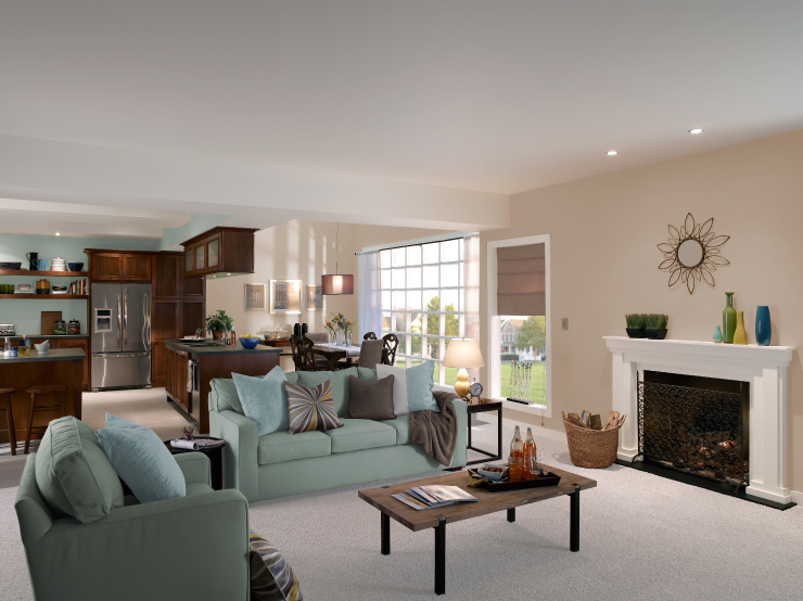
For my open floor plan challenge for the BEHR® Color Clinic, I used Swiss Coffee 12 as my foundation color in the kitchen and beams, and Urban Raincoat N440-2 on the walls and ceiling in my living room. These bright and airy colors helped open the space and created a subtle division between the two rooms – all while maintaining a cohesive vibe.
Want to replicate my open floor plan color palette? Go here.
Use different color concentration combinations in your spaces.
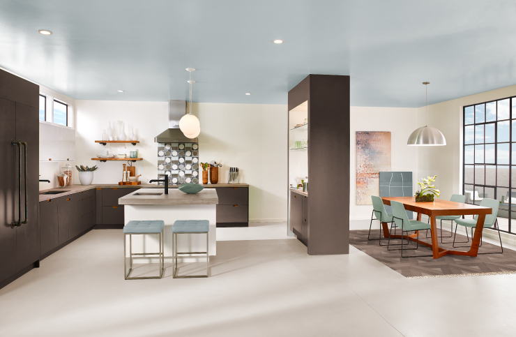
The secret to keeping the space integrated without painting it all the same color everywhere is to use your palette in varying concentration of colors throughout the rooms. Furnishing, decor, and artwork will be your greatest ally in achieving this. In the room below the soft sage green Riverdale N410-3 was used as a furniture accent in one room, and as the main wall in the kitchen. The rooms, though completely different colors, are now connected by this bridge of color. In an adjoining space perhaps the light blue-gray of Urban Raincoat N440-2, which we see as a small accent in our living area, is the starring wall color. Weaving your palette in, out and throughout is key to create separate visual spaces, all while keeping a consistent theme through the open layout.
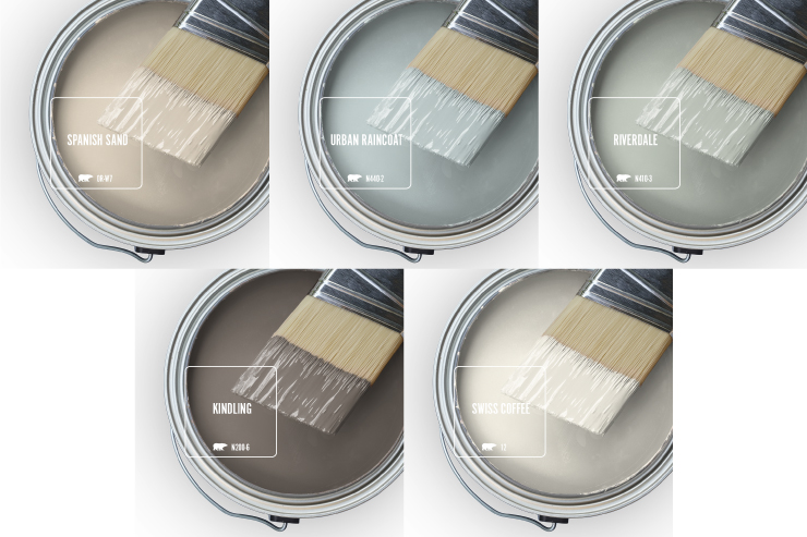
Walls: Spanish Sand OR-W07, Trim and Ceiling: Swiss Coffee 12, Kitchen Wall: Riverdale N410-3
Let architecture guide you.
The floor plan may be open, but often the spaces within it are distinct and can be defined by features like archways, variations in flooring and changes in room dimension. Look to corners and transition areas for natural places to stop and start a paint color. Each of these features offers an inherent transition place and many times an excellent option to add an accent.
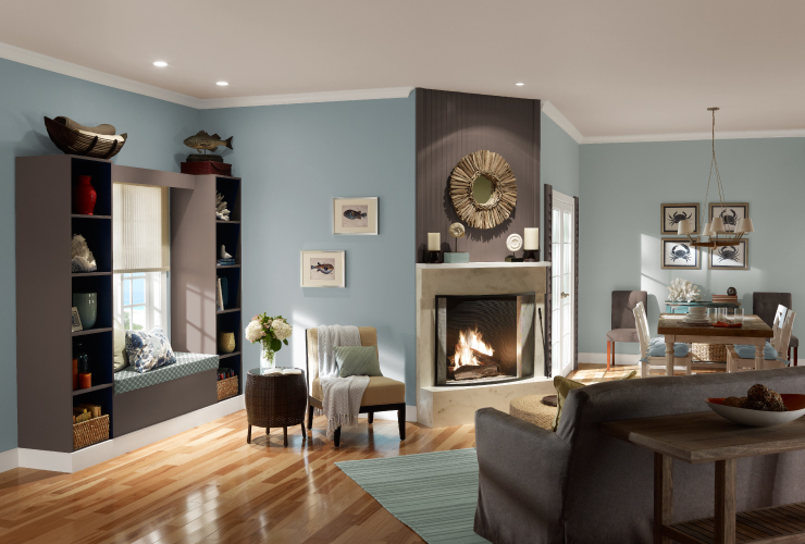
Left wall: Urban Raincoat N440-2, Right wall: Riverdale N410-3, Ceiling; Spanish Sand OR-W07, Trim: Swiss Coffee 12, Mantle and Shelf: Kindling N200-6
Incorporate color in unexpected places.
Add color from your palette where you normally wouldn’t. Work with the space’s fixed features, not against them. Change the things that you can and incorporate the things you can’t. You can easily create a feeling of cohesiveness if you keep your accent colors and décor in the same color palette. Don’t be afraid to paint your cabinets or ceiling, both are great areas to showcase color.
[sciba leftsrc=”https://www.behr.com/colorfullybehr/wp-content/uploads/2018/04/Gray-Open-Kitchen-1.jpg” leftlabel=”” rightsrc=”https://www.behr.com/colorfullybehr/wp-content/uploads/2018/04/Open-Kitchen-Combination-2-1.jpg” rightlabel=”” mode=”vertical” width=””]
Want more color options and inspiration? Visit our Color Studio on behr.com.
Colorfully Yours,
Quinn
Hero image: Walls and trim: Swiss Coffee 12, Cabinets: Kindling N200-6, Celing: Urban Raincoat N440-2
Slider Image 1: Kitchen and Dining walls: Spanish Sand OR-W07, Living room walls and Ceiling: Urban Raincoat N440-2, Trim: Swiss Coffee 12
Slider Image 2: Walls: Spanish Sand OR-W07, Cabinets: Riverdale N410-3, Ceiling and Trim: Swiss Coffee 12