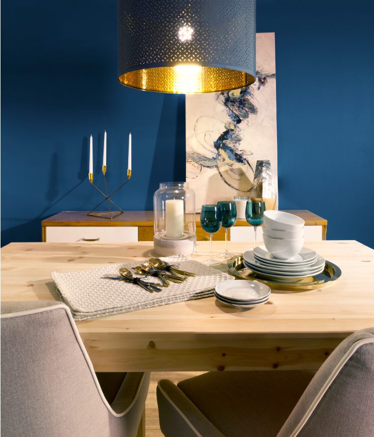
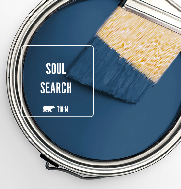
When selecting color for a dining room, the first thing that might come to one’s mind is the thought that warm hues such as yellow, orange and red stimulate the appetite and are the ideal colors to use. Though this is true, to some extent, it isn’t a constraint on what colors can be used in a dining room. Don’t be afraid to break away and run with a bold blue like Soul Search T18-14 -a deep, soothing, aquatic blue inspired by the ocean depths.
Dining rooms should be convivial, welcoming and comfortable, a place to converge, dine, entertain and bond with your family. Soul Search can bring all this and more. The warm undertone of this blue, makes it a perfect pairing for gold metallic accents and blonde woods, creating a dining room with a beautiful and contemporary yet–eclectic feel.
Colorfully yours,
Diana

I’ve had them search this color in two separate stores and neither could find it??
Hello Marcy, thank you for reaching out!
Soul Search is from our trend brochure of 2018. We no longer have that brochure in store however that color can still be tinted at your local Home Depot.
You can also start off with an 8oz sample of it to give you a nice representation of the color on your walls.
Hope this helps!
Colorfully Yours,
Deanna
When you take this color, from this article and compare it back to behr.com site it’s TWO different colors. Just as one of the other comments said.
I sadly sent someone with this name, color number and screenshot of this, and it was labeled correctly on the paint can brought home, but it was indeed, not the same color.
I’ve spent $50 on a can of paint, i can’t return, because your site and this article where i found the Pinterest pin from, did not match.
I saw your preciously explanation, color screens, lighting blah blah blah, but no, this article depicts a very different color from your website. And as i mentioned lost the money, and still don’t know the color in this article!
Hi Rose – we apologize for the inconvenience, we have forwarded your contact information to our customer service team, they will reach out you soon.
Diana
I completely agree with Roses assessment and am beyond disappointed. We purchased this color over the weekend based on this article and sadly it could not be further from what we were looking for. Unfortunately I put to much faith in it “drying darker” and now have a very bright blue bedroom door. A waste of time, energy, effort, supplies, and money!
Hi Rebeca – thanks for sending us you comment regarding Soul Search and we apologize for the inconvenience, we have forwarded your contact information to our customer service team and they will reach out you soon.
I completely agree with the other comment assessment and am beyond disappointed. We purchased this color over the weekend based on this article and sadly it could not be further from what we were looking for. Unfortunately I put to much faith in it “drying darker” and now have a very bright blue bedroom door. A waste of time, energy, effort, supplies, and money!