
An inquiry came in from a reader named James, who is in search of some some exterior door paint colors to accent the exterior color of his home. Front doors can be vibrant and playful, being the perfect exterior accent choice when it comes to color that will stand out for trendy curb appeal.
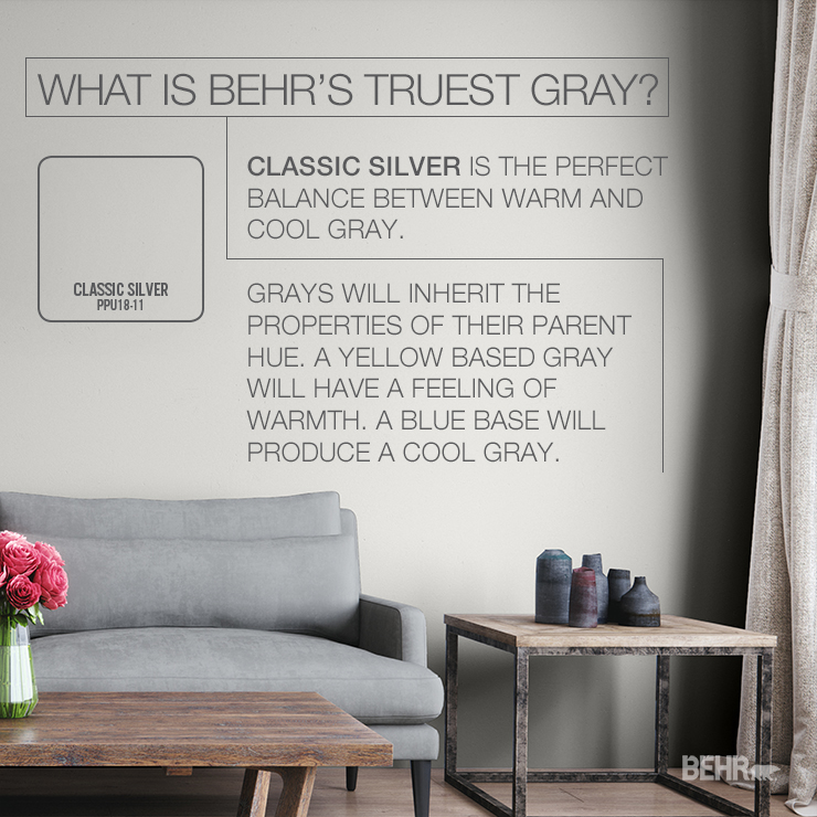
Hello Color Experts! I just got done painting my house in Classic Silver PPU18-11 and trim is Palais White GR-W18. I am in search of a couple ideas to paint my front door that will serve as an accent. I do not want it to be your average brown color. Please advise!
-James
To James and others who are interested in bold accent color suggestions for your front door, you’ve come to the right place!
Vibrant exterior door colors can make a bold statement, convey a sense of playfulness, enhance curb appeal (or all of the above). Looking for a good place to start? We’ve got some exterior door paint colors that can serve as the perfect accent to your home.
A front door can be vibrant and playful with the perfect exterior accent choice when it comes to color that will stand out for trendy curb appeal.
In general, grays are super versatile and pair beautifully with just about any other color, from muted neutrals to rich jewel tones to vivid brights. When considering your color palette visually pleasing “vibrant” exterior door color is the result of how a given color works in combination with your home’s exterior, not against it.
Accent colors are the 10% in the timeless 60-30-10 color rule. While serving as only 10% of your overall color scheme, the complementary contrast inherent in this 10% is why we often refer to accents as “pops of color.”
That said, here are three eye-catching exterior paint colors to stretch your imagination a bit when it’s time to get that front door painted!
Royal Gold adds a rich, neutral color to your entrance. It’s a great color that will warm you up on cold winter days and invite you to cool off inside on a hot summer day.
Caribe is a deep blue that adds welcoming sophistication to your home. This gem toned color paint is the perfect backdrop to watch the sun’s shadows dance across your front door throughout the day.
Spiced Wine is a deep crimson red that adds a lush tone to your home. This cozy front door paint color adds a charming pop of color against a gray home.
For more color ideas for a front door, click here.
Colorfully yours,
Deanna
Hi, I would like to paint my double door entry October leaves s210-6 by behr. I am hoping it is not going to look red, as I am looking for that tone that comes off more a brown tone. and Dark Cherry Mocha by behr was a contender, but I felt it was a bit too dark.
My pillars outside of the entry are cream, my paint on the outside walls are taupish, and there is also on the trim what I would consider a blush color. Right now the doors are such a dark green that they look black, not a colour that appeals to me, as we just move into this house. Thank you
Hi, I would like to paint my double door entry October leaves s210-7 by behr. I am hoping it is not going to look red, as I am looking for that tone that comes off more a brown tone. and Dark Cherry Mocha by behr was a contender, but I felt it was a bit too dark.
My pillars outside of the entry are cream, my paint on the outside walls are taupish, and there is also on the trim what I would consider a blush color. Right now the doors are such a dark green that they look black, not a color that appeals to me, as we just move into this house. Thank you
Hi Lori,
Thank you for your interest in BEHR Products!
October Leaves is more of a red-orange brown. I will recommend testing it first to see how it appears on your door. If you would like it more of a brown please also take a look at Molasses S220-7.
Due to differences in monitors and technical factors, the colors here cannot be represented with
their true qualities. These color samples should only be considered a guide. Please refer to actual swatches for true color. We strongly recommend beginning with an 8 oz. sample container of the color you choose and apply it to a small area on your wall to ensure your satisfaction with the color choice. It is always a good idea to see how the light and ambient conditions affect the color at different points in the day.
Colorfully yours,
Deanna