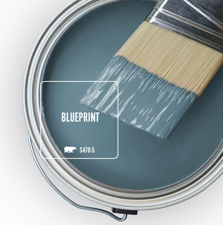
Behr was proud to have just released our 2019 color of the year Blueprint S470-5 along with a supporting trend color palette. Announcements and flowery descriptions aside, lets take a closer look at this color to show you its beauty, versatility, why we love it, and why it was chosen.
Blueprint in it’s essence is a denim blue, but not just any denim blue. If you’ll allow me to draw a parallel to blue jeans, it’s that perfect middle of the road blue denim color- not too dark, not too light, slightly worn to keep it comfortable, but with enough color to be easily dressed up. When you find a pair in this color you start scrambling to find your size in the stack. This color on your walls, or on your accessories, feels just as good. You can go casual, modern, country, formal, moody, light, you name it -all possible with this color.
We knew from the get go that this color was going to be big for 2019, so we designed the trend palette a little differently. To illustrate Blueprint’s versatility we created a supporting cast of trend colors divided in to four themes: Monochromatic- a layering of blue on blues, Earthtones- nature inspired hues, Pastels- soft delicate tones and Jewel Tones- color rich hues with depth.
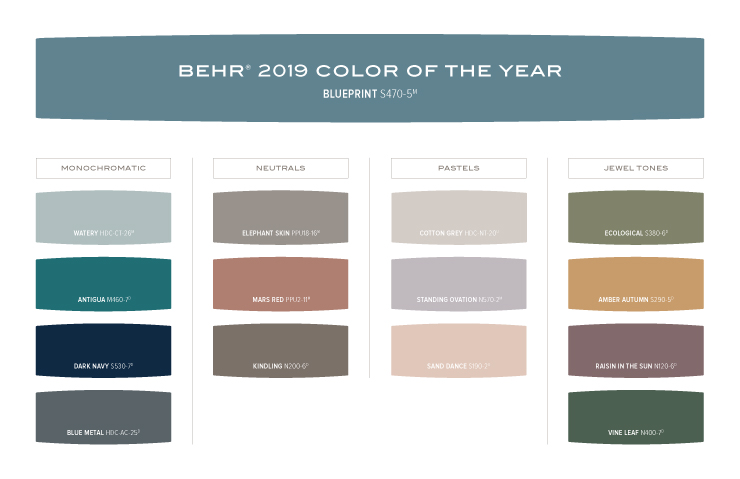
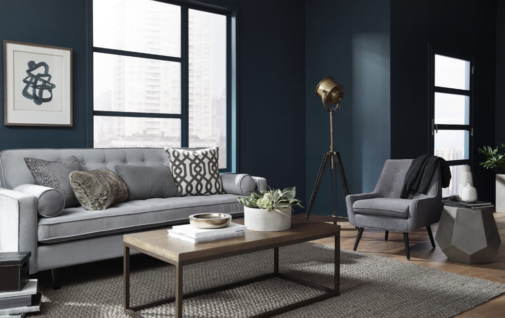
Monochromatic themes can appear to be challenging, but they are actually quite simple. Yes, they do take a fair amount of searching for decor in just one color family, but include/exclude decisions are much easier to make. In this kitchen we have paired Blueprint with Dark Navy S530-7, a deep inky blue, on the cabinets. To add some levity and keep the space from feeling weighed down we painted the walls in the dusty aqua Watery HDC-CT-26.
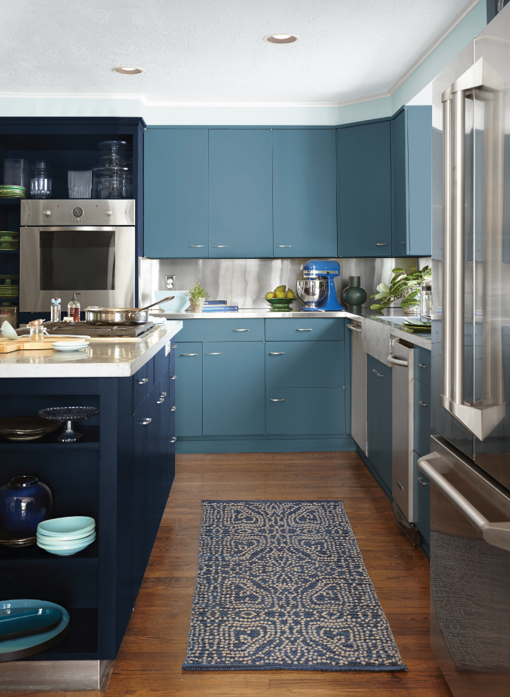
Cabinets: Blueprint S470-5 and Dark Navy S530-7, Walls: Watery HDC-CT-26, Trim: Swiss Coffee 12
Neutrals are so hot right now that they are actually transitioning their definition. We see the traditional- go with everything neutrals of white, gray, beige etc… infusing themselves with greater color presence. The new neutrals emerge- tempered colors that retain their versatility and color identity. In this bedroom Blueprint’s delicate cool, subtlety makes it a perfect accent against the warm, chalky brown of Kindling N200-6.
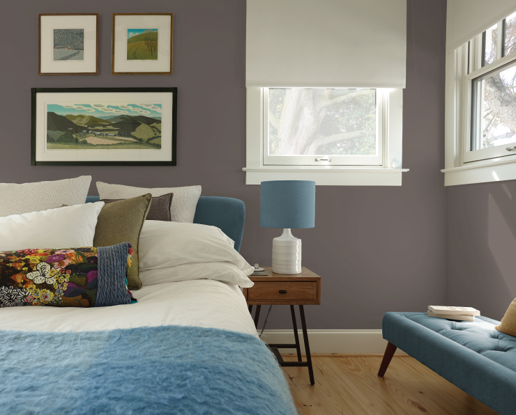
Walls: Kindling N200-6, Trim: Swiss Coffee 12
Another color category where we see a lot of interest and movement is with pastels. The journey into a world of color starts with a single step. Pastels have been the historical go to family for those ready to make that step. Though that role has not changed, we see these hues becoming a choice for those already comfortable with color. Color champions of this change are using pastels with greater color depth and in unexpected pairings. Blueprint effortlessly steps in here as an accent, or to be accented by these light and lovely tones. Sand Dance S190-2, a warm peachy-pink, adorns the body of this coastal home, while Blueprint accents the entrance with welcoming appeal.
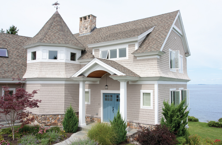
House body: Sand Dance S190-2, Trim: Swiss Coffee 12, Door: Blueprint S470-5
We’ve seen Blueprint hold it’s own within its own family, immerse itself in the world of neutrals, and pair with pastels as if it was designed to. Let’s see how this perfect blue holds up against bold color!
For those with a passion for color this might be the most important test of the mettle for our color of the year. Can it hold its own with the bright and bold? We respond with a resounding, YES! The chameleon quality of this blue is really quite amazing. When paired with Jewel tones, it too becomes a brilliant color, lifting both itself and its companion to beautiful heights of color harmony. This is easy to see in the below room where, when paired with Ecological S380-6, Blueprint is a capable counterpart.
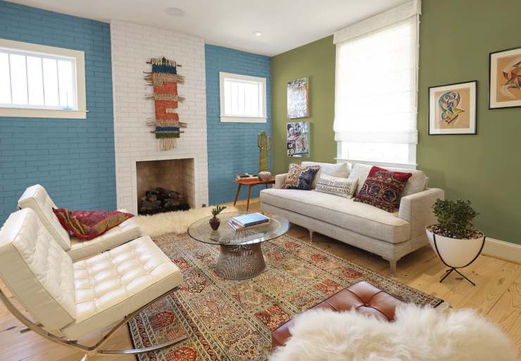
Wall: Ecological S380-6, Brick wall: Blueprint S470-5, Swiss Coffee 12, Trim/ceiling: Swiss Coffee 12
If you have enjoyed this deeper dive into Blueprint and the color trends palette, please be sure to check out our article on behr.com. This is only the beginning for Blueprint, be sure to check in from time to time to see what’s new with the Behr 2019 Color Trends.
Colorfully yours,
-Quinn

YUCK! Why is this 80s color being recycled as something brand new? We just finished getting it all OUT of the house we moved into. I’d rather see something fresh and interesting.
Love it..
Keep sending ideas