Choosing a Front Door Color
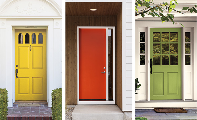

When it’s time to paint your house, color choice can be a personal, complicated decision. Whether you want to fit in, stand out, or simply complement the architecture of your home, there are thousands of possibilities.
While your home’s exterior siding color is likely to be neutral or subdued, the front door is a common element for self expression and a strong accent to your home’s design. Negotiating and deciding on this color, which is often updated more often than the home’s main exterior paint colors, has many decision factors. The good news is that you don’t need to know everything about color to pick the right paint for your door. In fact, for this and most home improvement projects, it can help to limit your focus to just four key areas:
- Practicality and Curb Appeal
- How Colors Affect Your Mood
- Regional Considerations
- Home Size & Features
For Best Results:
While it will be helpful to read through all three subjects below, remember: The only true rule for choosing the perfect color for your front door is choosing one that speaks to you.
Practicality and Curb Appeal
The search for a perfect front door color likely begins and ends right at home. The style of your home and those in your neighborhood can inform color selection in their own pragmatic ways:
Assessing Your Home's Sense of Style
-
 Your Home's Architecture
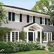
Is the style of your home contemporary, or traditional? Often, front doors that are painted dark, rich hues benefit the style of traditional homes. Contemporary homes on the other hand are well-complemented by brighter, more playful tones.
Different exterior styles often have unique architectural features. Colonial, craftsman, farmhouse or ranch homes may have porches, shutters, windows, and roofing materials that help give the home its character. All of these can uniquely impact the color you choose for your front door.
When deciding how to choose a color for a brick house vs. white house, take both material and architectural style into account. Brick homes often carry warm red, brown, or mixed undertones, so classic shades like deep green, navy, charcoal, or black tend to coordinate beautifully without competing with the masonry. White houses offer a more neutral backdrop, allowing you to choose anything from bold red or yellow to rich blue or even a saturated green for a striking focal point.
-
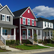 Your Personal Style & Goals
While you should of course take the color of your home into account, pay attention to your neighbor’s homes as well. Ask yourself, “Do I want to stand out? Or fit in?” For instance, if the houses on your street are all a dark color, painting your door a light color will definitely pop to passers-by. Just remember, it’s smart to ensure the front door color you choose still makes sense with your home’s architectural style.
-
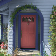 Trim and Accents
Coordinating your front door with house siding and trim colors is a big factor in a successful color scheme. Trim is commonly either a darker or lighter shade of the main siding color. Think about how the door will make the other colors pop or subside depending on how much of an affect you want to have for guests and passers-by.
A common question homeowners ask is: should the front door match the shutters and trim? The answer depends on the look you want to achieve. Matching the door to shutters can create a polished, symmetrical appearance, especially on traditional homes. However, using a contrasting door color can help the entry stand out as a focal point while the shutters and trim frame the home more subtly. The key is to ensure all colors share complementary undertones for a cohesive exterior palette.
Accents to your home’s color scheme include landscaping, trees and flowers, lights that shine on the door at night, and even how much sunshine or shadows hit your door throughout the day.
When choosing the best colors for a north-facing vs. south-facing front door, consider how light affects color. North-facing doors tend to receive cooler, indirect light, which can make colors appear darker or muted, so warmer shades like red, coral, mustard, or warm green can help brighten the entry. South-facing doors receive strong, direct sunlight throughout the day, which can intensify bold colors, making cooler tones like navy, teal, deep green, or even charcoal feel balanced and refined. Testing a sample in your specific lighting conditions is always recommended.
Sheen and Finish
The color is crucial of course, but choosing a glossy or flat finish can have a big effect on the result of your front door paint work. A shiny sheen is reflective and is good for darker areas, whereas a flat or matte finish showcases the color more and it isn’t as vibrant. If you have a dark color choice, a high gloss is often popular, but with a brighter color often people choose a lower sheen.
Sheen can also be important for the type of door you have, such as a wooden door with many windows might benefit from a high-gloss to complement the windows. A mid-century modern door with a few windows might benefit from a lower sheen to highlight the prominence of the color you’ve chosen that covers the vast majority of the door.
How a Front Door Color Affects Your Mood
-

The psychology of first impressions plays a powerful role in how door colors influence the vibe of a home. Your front door is often the first detail guests and passersby notice, instantly shaping how welcoming, bold, calm, or refined your home feels.
Animals that can see color have access to more information about the world around them, and color helps us see more nuance and detail in that information. In humans, this means our brains have evolved to have very specific reactions to color. These universal reactions are the focus of the field of color psychology, or in other words, how colors make us feel.
If you have ever wondered why big bold reds are so often found in fast food restaurants or why fine dining establishments tend to feature dark, earthy colors, there’s plenty of science behind why these specific color choices are made. While no degree is needed to paint a front door, the study of color psychology can be a helpful way to narrow down a specific color you’re looking for.
Here, however, we’re looking specifically for front door color inspiration. What will help the most is to focus how your basic primary and secondary front door color choices are known to make people feel differently.
-
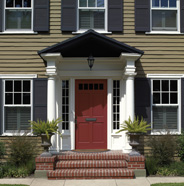 Red
RedA color of intensity that conveys strong reactions including:
- • Daring
- • Energy
- • Passion
- • Stimulation
- • Strength
- • Love
- • Excitement
-
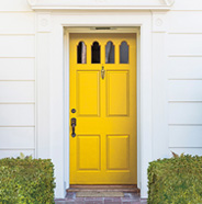 Yellow
Yellow is an optimistic color, perhaps because of its association with sunlight. It conveys emotions such as:
- • Competence
- • Happiness
- • Creativity
- • Sincerity
- • Optimism
- • Cheerfulness
-
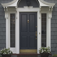 Blue
BlueBlue is a deep color people associate with the life-giving nature of water and the vastness of the sky. Emotions people feel with blue include:
- • Authority
- • Security
- • Trust
- • Sophistication
- • Sincerity
- • Calmness
- • Relaxation
-
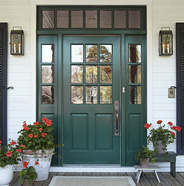 Green
GreenGreen is the color of nature and life, inspiring unique emotions including:
- • Health
- • Calm
- • Harmony
- • Hope
- • Serenity
- • Tenderness
-
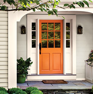 Orange
Orange is a color of energy and associated often with harvest. This brings emotions such as:
- • Abundance
- • Warmth
- • Excitement
- • Comfort
- • Extraversion
- • Fun
-
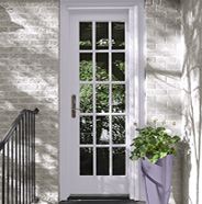 Purple
Purple is a color of depth and strength that conveys the following feelings:
- • Authority
- • Power
- • Authenticity
- • Cheeriness
- • Tranquility
-
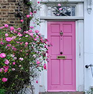 Pink
PinkPink is a bright color associated with much more than baby girls. It elicits feelings such as:
- • Hope
- • Sincerity
- • Charm
- • Cheerfulness
- • Softness
-
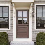 Brown
BrownBrown is the color of the earth, so unsurprisingly it conveys feelings including:
- • Ruggedness
- • Nature
- • Security
- • Reliability
- • Grounding
- • Warmth
-
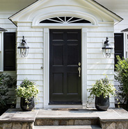 Black
BlackBlack is timeless color that represents strength and authority:
- • Luxury
- • Power
- • Sophistication
- • Versatile
- • Classic
Regional Considerations
Where you live has a huge impact on color trends and the type of color you can use to blend in or stand out on your block. Here are some tips for homes in different geographical regions.
-
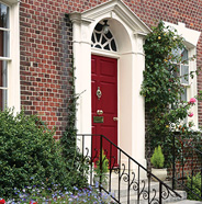 Northeast
Northern climates often have seasonal changes that influence the appearance of exterior wall and door colors. Lighting will be different in summer and winter. The green cast of summer foliage can reflect on doors differently than it will in winter with a white landscape.
-
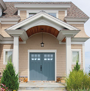 Coastal
Homes in warm climates near the ocean often have light colored exterior paint because there’s so much sunshine. Bright front doors in sea tones like light blue and orange can be good options here.
-
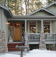 Colder Regions
In cold climates there is more dense tree shade and green foliage in general, not to mention a lot of snow in the winter. It can be good to think about how your door reflects light from green trees and white snow. This means a high gloss paint sheen (maybe change to “sheen” instead of “paint” since this is a wood stained door?) can be a good idea if you have a colorful door.
-
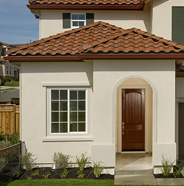 Southwest
In the sundrenched southwest United States, there are lots of homes with earth toned exteriors, and front door styling complements that by either having bright blues, greens, and pinks, or by going subdued with brown wood stains.
Home Size and Features
A strong consideration for curb appeal is the size of your home and where the door is on the home in relation to other features that stand out.
-
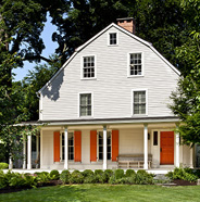 Large Home
If you have a home that is quite large, a bright door can draw attention well to the entryway
-
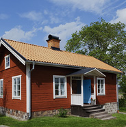 Small Home
With small homes, front doors stand out more in the design, so bright colors aren’t always as popular, but rather choosing a complementary color palette that integrates trim and main body color is the best way to go.
-
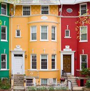 Home’s Alignment to the Street
Proximity of home to the street is a consideration. A home set further back from the street may benefit from brighter door color. The door will appear smaller and the color less bold from a distance.
For privacy reasons, a home closer to the street may not want a strong front door color which may draw passersby attention at a shorter distance. When deciding between a bold front door vs. blending in with the neighborhood, consider how visible your entry is from the street and how much attention you want it to attract. If the home is not parallel to the curbside, it could have the door on a corner or an entryway that juts out from the main structure. These alignments have different effects on where the door is in relation to the street, and makes color choices different from traditional lot layouts.

PAINT AND STAIN CALCULATOR
Inside or outside; paint or stain: Let’s figure out how much you’ll need to make amazing happen.
Calculate
ASK AN EXPERT
Every project is unique: Keep small wrinkles from becoming big problems by letting the Behr Technical Experts lend a hand.
Get Expert Help
CONNECT WITH PRO REFERRAL - POWERED BY THE HOME DEPOT
Let Pro Referral do the leg work and match you with quality local painters.
Find a Painter Back to Interior Painting How-To's
