Contact a Pro Rep
Trends

Find trending paint colors for commercial and residential buildings and explore color trends to stay up to date on popular interior and exterior paint colors.

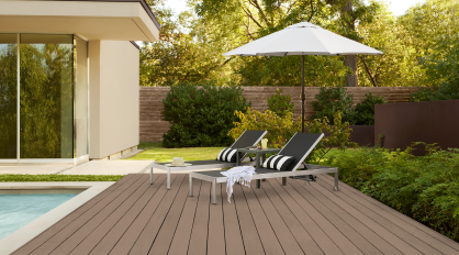
Wood stains shape both the look and longevity of outdoor surfaces while highlighting the natural character of the material. For the 2026 Exterior Stain Color of the Year, Taupe introduces a balanced neutral that blends soft brown and gentle gray undertones for a refined, versatile finish perfect for your clients’ outdoor spaces.   House body: Spanish Sand, wood deck: Taupe (solid wood stain), roof trim: Baronial Brown, fence: Taupe (semi-transparent wood stain) ​    The balanced blend of muted tones brings subtle color to exterior surfaces, allowing the natural wood grain to show through for a timeless finish. The versatility of Taupe helps to create cohesive residential or commercial outdoor environments across a wide range of exterior applications, making it easy to carry a consistent look across different project types.     Taupe Featured in Solid Color (SC-153) & Semi-Transparent (SC-153) Stain   Both solid and semi-transparent finishes offer a polished look on decks, fences, porches, patio ceilings, railings and more.   House body: Taupe, wood deck: Taupe, ceiling: Chocolate (Semi-transparent Wood Stain), railing: BLACK (Spray Paint)   Apply Taupe in a semi-transparent finish to highlight the natural character of the wood while adding contrast and dimension across the surface.   Or choose Taupe in a solid finish for outdoor structures to create a strong architectural feature that anchors the surrounding space.   House body: Boreal, trim: ULTRA PURE WHITE®, deck: Cordovan Brown, railings & pergola: Taupe (Solid Wood Stain)     Outdoor Accent Color Collection   This year’s Exterior Stain Color of the Year launches alongside the Outdoor Accent Color Collection, a curated palette of 18 exterior paint colors designed to complement Taupe and personalize outdoor spaces whether it’s a residential or commercial location, making it easier to tailor each job to your client’s style.       Taupe acts as a grounding neutral for larger exterior wood surfaces such as decks, fencing, siding, and pergolas. While Outdoor Accent Color Collection introduces intentional pops of color for doors, shutters, trim, and outdoor décor, creating a cohesive, customized look across each project.   House body: Boreal, trim: ULTRA PURE WHITE®, deck: Cordovan Brown, railings & pergola: Taupe (Solid Wood Stain)   To support quick updates on the job, select colors from the collection are also available in spray paint, offering a convenient way to introduce coordinated accents and refresh patio furniture, planters, and outdoor accessories.   House body: Muted Sage, floor: Taupe SC-153, trim: ULTRA PURE WHITE®, swing: Park Picnic   The 2026 Exterior Stain Color of the Year and Outdoor Accent Color Collection is available exclusively at The Home Depot. Consumers can find Taupe in a variety of BEHR® products, including the #1 rated exterior stain, according to a leading independent consumer publication, BEHR PREMIUM® Solid Color Waterproofing Stain & Sealer. The color is also available in BEHR PREMIUM® Semi-Transparent Waterproofing Stain & Sealer, BEHR® DECKplus Waterproofing Wood Stain, BEHR® Solid Color House & Fence Wood Stain, and BEHR PREMIUM® ADVANCED DECKOVER®.   To explore the 2026 Exterior Stain Color of the Year and the Outdoor Accent Color Collection, visit behr.com/2026staincoty.  
2026 Exterior Stain Color of the Year: Taupe
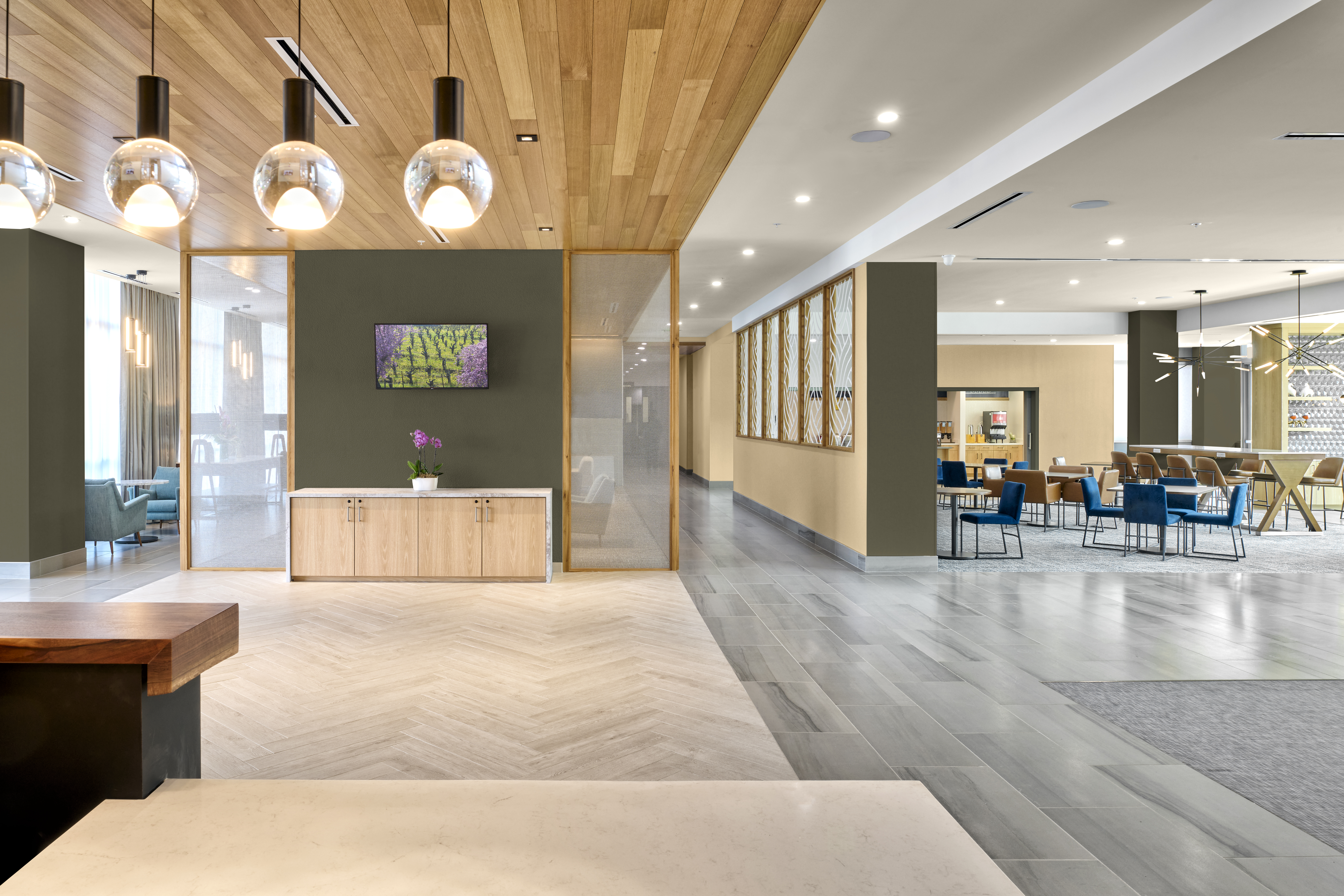
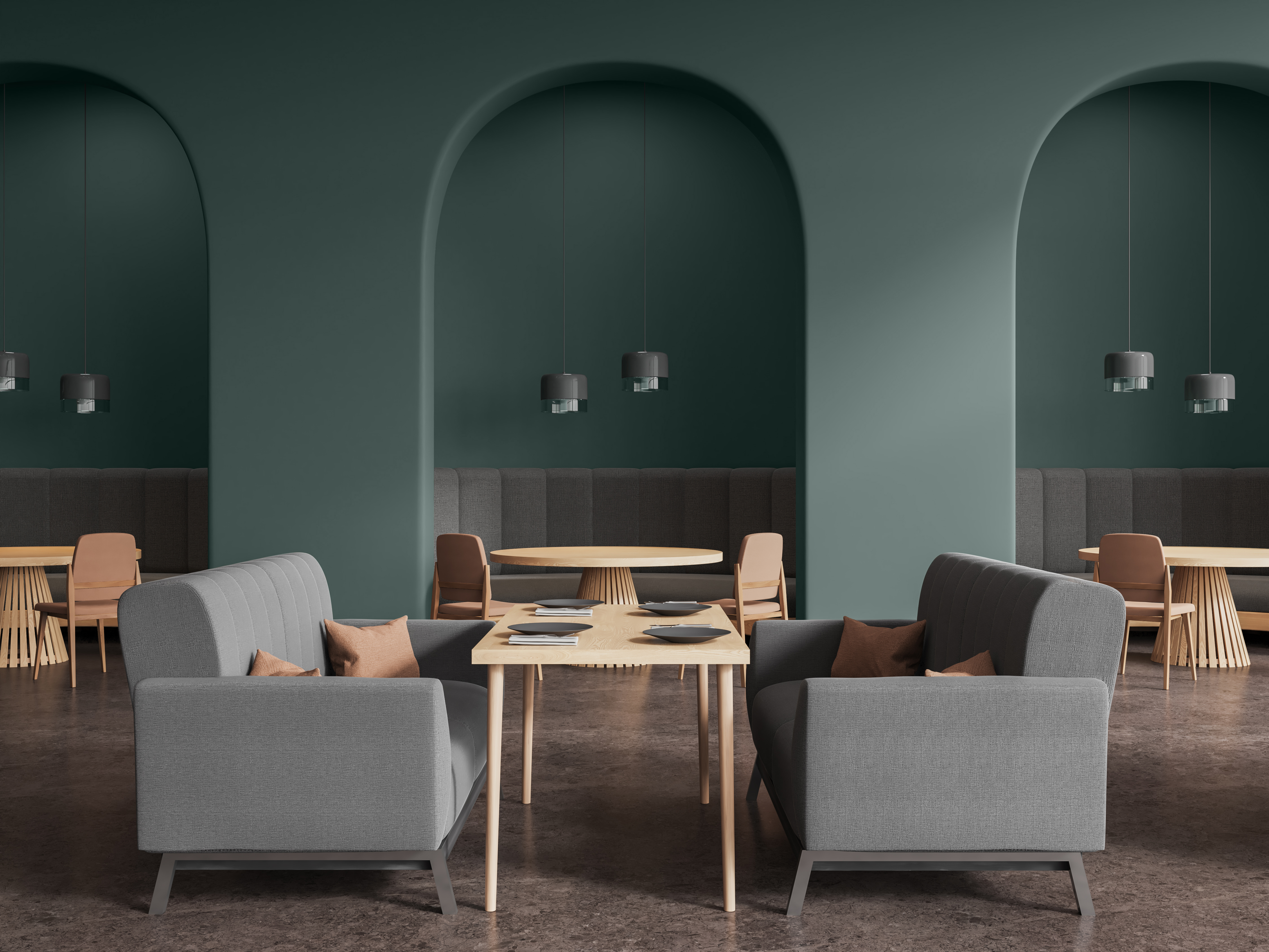
While neutral paint colors like beiges and grays have dominated for decades, darker colors have been trending as people look to incorporate more personality and depth in their spaces that are bold, elegant, and full of possibility. Darker neutrals are also becoming increasingly prominent as the industry shifts to an overall dark and warmer aesthetic across colors, finishes, and materials.   Walls: Dark Everglade HDC-CL-21A Darker colors can make a statement in residential and commercial color schemes in a multitude of ways, ranging from small, dramatic accents to full color-drenched spaces. BEHR® Paint is available in several curated collections like the Designer Collection and 2026 Color Trends Palette with dark hues your clients are craving this year. Hear from Behr Paint Company’s VP of Color and Creative Services, Erika Woelfel, on how to play with bolder color in interesting and unique ways.   A New Era of Elegance The BEHR Designer Collection is designed to highlight the go-to colors that can be used anywhere,” says Woelfel.   It includes many classic, light neutrals that your clients know and love, but it also features some darker, deeper colors to elevate and personalize your clients’ spaces.   Some of the notable colors in the designer collection include Dark Everglade, a shady blackened green that exudes luxury, while Rumors, our 2025 Color of the Year, brings deep, ruby red allure. Dark browns are also trending, including Espresso Beans, which packs a bold and beautiful punch.   Cracked Pepper, our 2024 Color of the Year, remains in the spotlight for both interiors and exteriors as a soft black with timeless and modern appeal.   There’s just amazing versatility with that color,” says Woelfel.   Walls: Cracked Pepper PPU18-01; Ceiling: Winter White DC-004   She also calls out Midnight Blue, “which is the darkest a blue can be before it turns to black. It’s just beautiful. It has this nice saturation to it, and you can use it with camel-colored neutrals or caramel-colored leather tones.”   Right Building: Midnight Blue N480-7; Left Building: Dove HDC-MD-21   Using Dark Colors Darker colors naturally create cozier and more intimate spaces than lighter colors.   People are often afraid or nervous that a darker color will make their room feel smaller,” says Woelfel.   If your client is concerned about this, Woelfel recommends two strategies. The first is color-drenching, which can create a more expansive feeling.   Woelfel explains, “When the walls and the ceiling are the same color, it becomes a cohesive whole. Done well, it actually pushes the boundaries out to make a space appear larger.”   Walls & Ceiling: Rumors MQ1-15   If color-drenching doesn’t fit your client’s style, another option is to skillfully balance the darker colors with light/neutral colors.   “This avoids the feeling of heaviness that can come with darker colors.”   A wall split with a chair rail or wainscoting can have a darker color below and a lighter color on top (or vice versa). This approach allows for two different sheens to create dimension and depth, for example a matte finish on upper wall and a satin sheen on wainscoting—as seen in our Paint Sheen Differences blog.   Upper Wall: Perfect Taupe PPU18-13; Lower Wall: Aubergine N100-7; Trim & Ceiling: Blank Canvas DC-003   As always, architectural features of a room are a great opportunity to create a splash of drama.   Painting the kitchen island or a bathroom vanity with a dark color is a small way to make a big statement for your client’s space.”   A Note on Dark Colors Often times, darker colors can be more challenging to apply than lighter colors. It’s important to remember that an experienced painting contractor and high-quality paint are essential to achieving a flawless finish for your client’s space. Choosing a top-quality paint like BEHR® MARQUEE Interior Paint or BEHR® DYNASTY Interior Paint can ultimately result in a more vivid finish and keep the surfaces of your projects looking newer longer—all with one-coat hide guaranteed in over 1,000 colors.*   In addition, stunning, dark colors can be a major commitment for residential and commercial spaces. Done poorly, they can sometimes be overwhelming and distracting in an environment.   Sometimes it’s a good idea to start with a big, bold color in a smaller room before using it in a big room,” says Woelfel.     Finally, Woelfel doesn’t recommend darker colors in rooms that don’t have enough natural light.   She says, “The best way to use these colors is if you’re getting plenty of natural light during the daytime and terrific lighting at night that really plays up the color.”   She also says it’s important to balance darker colors out with lighter furniture, flooring, and/or artwork.   Take the risk. It can be amazing.”   To learn more about the beautiful, bold colors Behr offers, contact your local Behr Architectural & Design Rep.   *Limitations apply. One-coat hide in 1,000+ colors. One-coat hide excludes untinted bases, colors outside of the Interior One-Coat Color Collection and all other colors that have not been selected as one-coat hide from other BEHR® palettes. Not valid when painting over uncoated, porous or repaired interior surfaces; over woods that contain tannins such as redwood or cedar; or when painting over heavy stains, which may require spot-priming, multiple coats, and/or longer dry time.  
Dark Paint Color Trends
Have you uncovered the BEHR® 2026 Color of the Year? Hidden Gem is a smoky jade that’s redefining design in both residential and commercial spaces.      With its elegant balance of blue and green, Hidden Gem delivers a rich and dynamic shade that resonates across interiors—from multifamily living rooms to boutique hotel lobbies and modern office suites. This subtle yet captivating hue offers professionals a sophisticated option that’s as timeless as it is trend-forward, making it the perfect choice to elevate any environment with ease and intention.      Crafted by BEHR® Color Experts to reflect growing demand for grounded, nature-inspired tones; Hidden Gem shows how subtle color choices can redefine commercial interiors.       In high-touch environments like this modern washroom, Hidden Gem transforms an everyday utility space into an intentional design statement.          Designed to bring a quiet confidence to open layouts, this shade offers visual interest without overwhelming the space. The result is an elegant, polished look that works across a wide range of modern workplaces.          Pair with muted neutrals and grounded accents to bring calm sophistication and create a welcoming first impression in healthcare spaces.         Now’s the time to show your clients how subtle color can make a stunning statement with BEHR® Hidden Gem.    To explore more of the 2026 Color of the Year, visit behr.com/2026coty.  
2026 Color of the Year: Hidden Gem
Today’s commercial and residential design landscape is ever-evolving. Rising movements such as technology, nature, travel and more continue to influence the built environment. With current macro design trends blending futurism and nostalgia, traditional color boundaries are dissolving to create spaces that feel balanced and connected to both our heritage and our future.   The desire to achieve this harmonious design in commercial environments is the foundation of Behr Paint Company’s second annual BEHR® 2026 Commercial Color Forecast. The curated collection centers around elemental harmony – which includes 50 colors that balance nature, nostalgia, and technology.   We’re thrilled to introduce our second annual Commercial Color Forecast. These colors honor traditional color elements while embracing contemporary aesthetics that reflect forward-thinking design trends in the commercial space,” says Erika Woelfel, Head of Color & Creative at Behr.     The collection is organized into five distinctive themes, each designed to create harmonious spaces across a diverse range of commercial settings such as workplaces, healthcare facilities, hospitality suites, multifamily spaces, and more.   EVOLVEDNeutrals Credit: Original photography and design by Bethany Nauert and Michelle Sprauer. Paint color by Behr Paint Company.Walls: Sculptor Clay PPU5-08; Roof Trim: Shoelace OR-W13   Designed to be a foundational element, these dynamic neutrals range from “pure” to “toned” to anchor spaces that exude balance and harmony. Sculptor Clay (PPU5-08) and Shoelace (OR-W13) help create a balanced exterior for this modern multi-family home.   SOULScape Credit: Original photography and design by Bethany Nauert and Stina Funch at Atwater Inc. Paint color by Behr Paint Company.Walls: Eastern Bamboo PPU9-25; Trim/Ceiling: Nano White HDC-MD-06   Inspired by the Mediterranean, these soulful and moody hues create an inviting environment with a warm, coastal feel. This hotel room features Eastern Bamboo (PPU9-25) for a fresh pop of color that brings dimension and visual appeal to the space.   MYSTICWave Credit: Original photography by John Sutton. Paint color by Behr Paint Company.Siding Walls: Coral Cloud M200-4; Ceiling Accent: Mayan Treasure P490-7; Side Building Walls: Beach Foam S450-1; Window Accent: Coral Cloud M200-4; Skinny Window Trim: Deep Fire M180-7   Drawing off the tranquil nature of aquatic hues, these soothing colors help promote well-being and comfort within a space. Coral Cloud (M200-4) and Mayan Treasure (P490-7) give this elementary school a vibrant, playful aesthetic that inspires creativity and joy.   METROChic Credit: Original photography and design by Bethany Nauert and Allie Bell. Paint color by Behr Paint Company.Walls: Nano White HDC-MD-06; Accent: Extreme S530-6   This selection of colors combines Parisian charm with New York City’s energy that can add both classic elegance and a modern flair to interiors. Create subtle beauty in a patient room by opting for a grayed blue like Extreme (S539-6) for a refined aesthetic.   FUSIONDream Credit: Original photography by John Sutton. Paint color by Behr Paint Company.Back Wall: Eon N370-2; Outer Wrap-Around Walls: Sultana P100-7; Inner Accent: Coveted Gem N560-2   Featuring a blend of frosted pastels and edgy bright tones, these hues create a striking blend of allure and mystique. This workspace features Sultana (P100-7), a bold purple hue for eye-catching impact.   Behr Designer Council The colors in this forecast palette were inspired by the expertise and insights from our first-ever Behr Designer Council. The Council includes eight designers whose expertise spans across commercial and residential markets.     We gathered feedback from our Council to ensure we were providing a collection that could be a go-to resource for designers to leverage for their projects,” says Woelfel. “By uniting a curated collective of visionary talent, we are better positioned to understand the desires of the designer community and shape the future of color and design together.”     To learn more about the 2026 Commercial Forecast Palette, click here. To learn more about the Designer Council, click here.  
BEHR® 2026 Commercial Color Forecast
Behr Paint Company is excited to announce the winners of its first-ever Student Design Competition. The competition was created in partnership with MattoBoard, a 3D virtual sampling platform, to champion emerging designers by providing opportunities to showcase and celebrate their talents.   About the Design Competition Behr invited design students to submit an original design plan for any commercial space such as hospitality, workplace, healthcare, multifamily and more. The design theme, “No Clear Boundaries,” drew inspiration from the BEHR® 2025 Commercial Color Forecast, which celebrates the fluidity between designed environments that reflect the intersection of the past and future, digital and physical, and timeless and modern.   Entrants were required to incorporate colors from the BEHR 2025 Commercial Color Forecast in their design along with Behr’s 2025 Color of the Year, Rumors, a deep and timeless shade of ruby red.     Judging criteria included: Originality, Creativity and Style of Overall Design Plan (40%) Creative Expression in Use of Behr Paint Colors (40%) Creativity of MattoBoard in Entry (20%)   The judging panel included Erika Woelfel, VP of Color & Creative at Behr; Adam Ailion, Architect and CEO / Co-Founder of MattoBoard; Kayla Kratz, Director of Color & Designer Segment at Behr; and Amber Jones, Director of Architect & Designer Strategic Initiatives at Behr.   Grand Prize Winner: Leanne Hlavka BOUNDLESS Women’s Work and Play Center​ BOUNDLESS is a women’s work and play center that blends work, childcare, and social settings into a seamless, multi-functional environment. Inspired by Behr’s design theme, “No Clear Boundaries,” the space removes traditional divisions between work, motherhood, and social life, creating a space where working women and mothers can be productive, supported, and fulfilled.     The center incorporates timeless mid-century modern design elements—open floor plans, clerestory windows, and materials like wood and raw finishes—while fluidly connecting indoor and outdoor areas. This style uses color to define the spaces where there are otherwise “no clear boundaries”, reinforcing the concept’s openness to blur the boundaries of the spaces women work, play, live, and learn in.     With color paramount to the design, a palette was curated in timeless earth tones and bold saturation for a modern touch. Rumors MQ1-15 was prioritized in the workspace for its sophistication to create a feeling of intimacy for focused work, with Wild Berry P110-6 adding a pop of femininity and playfulness to this non-traditional center. Colorful Leaves M190-7, Flaming Torch PPU3-03 and Wild Ginger M270-7 create an ascending transition, while Boreal N420-5 and Fresh Artichoke M340-5 work in synergy in the outdoor courtyard. Audition MQ5-36 brings a calming presence to the nursing room, and Baronial Brown N170-7 and Leather Work S240-7 add depth to the beam ceiling, altogether bringing BOUNDLESS to life.   3D Materials Board Using MattoBoard   About LeAnne LeAnne Hlavka is a Bachelor of Arts student at the Interior Designers Institute in Newport Beach, CA. She is passionate about commercial design, biophilic design, and historic preservation. Balancing studies with motherhood, she is excited to pursue interior design as her second career. For her Grand Prize entry, LeAnne was awarded a $3,000 cash prize and a one-year MattoBoard Pro subscription. Her design school also received $1,000.     First Prize Winner: Mary Dilanchian “Aeternum” Echoes in Mauve- The Eternal Glow of Rumors​ Featuring colors from the BEHR 2025 Commercial Color Forecast, the Schiaparelli-inspired fashion pavilion in Rotterdam comes alive as the sun begins to set, transforming with the fading light. At its heart, Behr’s 2025 Color of the Year: Rumors MQ1-15, glows as dusk falls, reflecting the muted hues of a Rotterdam sunset. It becomes a beacon, interacting with reflective surfaces to create a dynamic play of color and shadow while paying homage to the natural beauty of the site and enhancing the pavilion’s presence.     Supporting this central glow, Behr’s Wild Ginger M270-7 adds depth and richness with warm, earthy undertones. Baronial Brown N170-7 serves as an anchor, grounding the design in a sense of stability and connection to the earth. Even Better Beige DC-010, used on the pavilion’s supportive skin structure, provides a soft, neutral backdrop, enhancing the pavilion’s skeletal design, and Limo-scene N560-7 acts as an accent, adding a subtle coolness to the pavilion.     Together, these colors transform the pavilion into a cohesive, living organism that shifts with the changing light, creating a vibrant and harmonious interplay that honors the themes of rebirth, transformation, and layered experiences. This palette elevates the pavilion from a mere structure to an evolving masterpiece that embodies the essence of fashion, architecture, and the Rotterdam landscape.   3D Materials Board Using MattoBoard   About Mary Mary is an Interior Architecture student at Woodbury University in Burbank, CA, driven by a passion for creating immersive designs that connect people to their spaces. She thrives on creating meaningful experiences and has a keen eye for detail and experiential design. Mary was awarded a $1,500 cash prize and a one-year MattoBoard Pro subscription for her First Place Prize entry.     Second Prize Winner: Brittany Marie Ott Urban Sipology From Grapes to Glass: Urban Sipology redefines wine tasting in Chicago, blending the city’s industrial history with a sleek, modern aesthetic for today’s youthful, vibrant audience. This innovative venue reimagines tradition while catering to diverse, modern tastes.     The venue offers a warm, sophisticated atmosphere with oxidized steel, earthy leather, and bronzed metals, complemented by ambient lighting that creates an inviting environment. Designed with fluidity in mind, the space echoes the winemaking process—filtration, flow, and bottling—to create a sense of graceful movement. Behr’s Rumors MQ1-15 provides a sultry and sophisticated energy—perfect for a wine venue.     Guests can enjoy a trendy, inclusive space featuring an extensive wine display, casual tasting bar, private nooks, seasonal patio, and soft background music, making it ideal for winding down with friends. The design begins with a narrow retail corridor, guiding visitors into an expansive tasting area that mirrors the richness and joy of each sip. This intentional layout reflects the progression of wine tasting—starting with anticipation, leading to discovery, and ending with delight.   3D Materials Board Using MattoBoard   About Brittany Brittany Ott, a senior at East Carolina University, is pursuing a Bachelor of Science in Interior Design. She’s passionate about designing functional, impactful spaces that elevate human performance and leave lasting impressions. Brittany was awarded a $500 cash prize and a one-year MattoBoard Pro subscription for her Second Place Prize entry.     Learn more about the Student Design Competition here.  
2024 BEHR Student Design Competition_Banner_418x232
2024 Student Design Competition Winners Announced
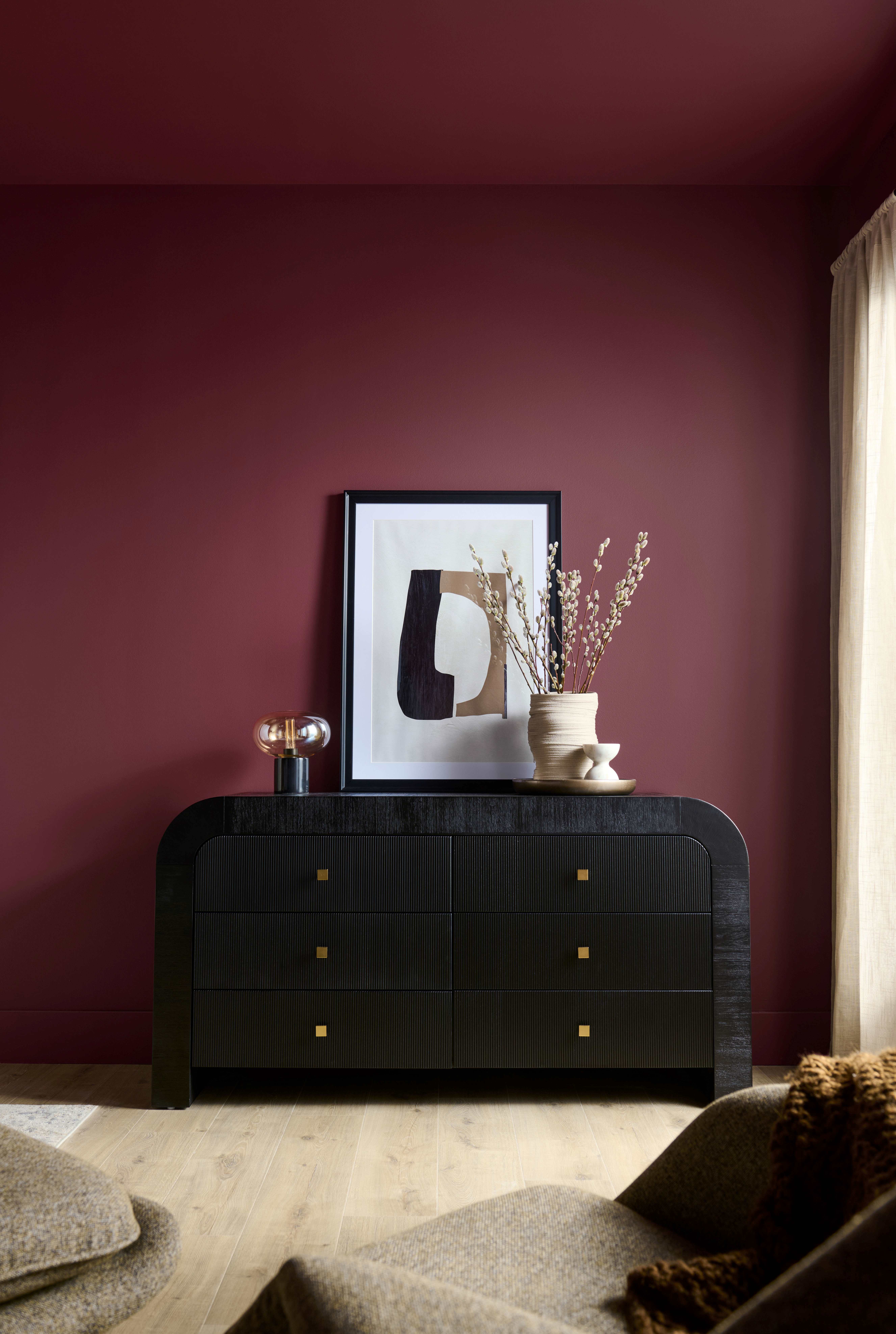
Have you heard about the BEHR® 2025 Color of the Year? Rumor has it, it’s the perfect hue to make a statement in any commercial or residential space.     It’s true, our Color of the Year, Rumors, is a deep red that adds warmth and draws a rich allure to hospitality, retail and other dynamic spaces. Designers and paint professionals alike can offer Rumors with confidence on projects to make a powerful and fearless statement. This tone is the perfect shade that captivates and enhances the built environment.     Let this elevated color speak volumes, no matter the scale of your project. Rumors will create an energy that evokes beauty and vitality.         With its vibrant tone, Rumors is a great choice for creating a dramatic and charming environment. Whether the space is large or small, Rumors packs a punch with a touch of luxe.         Pair Rumors with light neutrals like greige, tan and gray to balance hospitality spaces and create depth.         Or create a sense of enclosure by drenching the color in a room for a rich and modern look. This can be particularly effective in larger rooms where your client wants a space that fuels productivity.         Now’s the time to give your clients a compelling look with BEHR Rumors.   Rumors is part of fifteen distinct hues in the BEHR 2025 Color Trends collection. Create an inviting atmosphere with these nostalgic and personal colors. Pair warm neutrals with jewel tones and nature-based hues for timeless charm in commercial and residential spaces.     WORKPLACE | Walls: Aerial View S530-3   MULTIFAMILY | Walls: Boreal N420-5   EDUCATION | Walls: Jackfruit PPU6-07   RESIDENTIAL | Walls: Even Better Beige DC-010     To explore the 2025 Color of the Year and Color Trends, visit behrpro.com/2025coty.  
BEHR 2025 COTY Rumors
2025 Color of the Year: Rumors
Load More