Today’s commercial and residential design landscape is ever-evolving. Rising movements such as technology, nature, travel and more continue to influence the built environment. With current macro design trends blending futurism and nostalgia, traditional color boundaries are dissolving to create spaces that feel balanced and connected to both our heritage and our future.
The desire to achieve this harmonious design in commercial environments is the foundation of Behr Paint Company’s second annual BEHR® 2026 Commercial Color Forecast. The curated collection centers around elemental harmony – which includes 50 colors that balance nature, nostalgia, and technology.
We’re thrilled to introduce our second annual Commercial Color Forecast. These colors honor traditional color elements while embracing contemporary aesthetics that reflect forward-thinking design trends in the commercial space,” says Erika Woelfel, Head of Color & Creative at Behr.
The collection is organized into five distinctive themes, each designed to create harmonious spaces across a diverse range of commercial settings such as workplaces, healthcare facilities, hospitality suites, multifamily spaces, and more.
EVOLVEDNeutrals
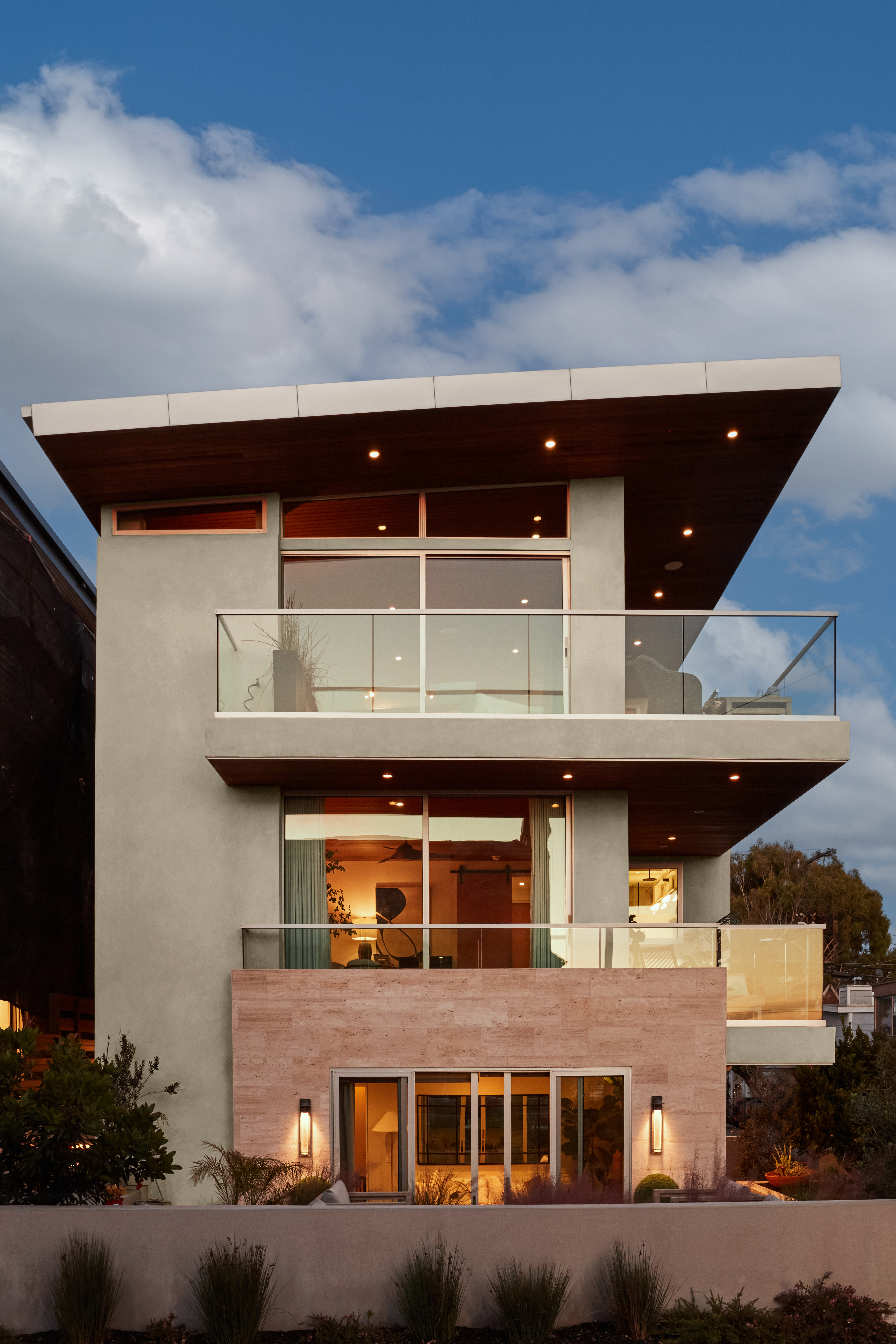
Credit: Original photography and design by Bethany Nauert and Michelle Sprauer. Paint color by Behr Paint Company.
Walls: Sculptor Clay PPU5-08; Roof Trim: Shoelace OR-W13
Designed to be a foundational element, these dynamic neutrals range from “pure” to “toned” to anchor spaces that exude balance and harmony. Sculptor Clay (PPU5-08) and Shoelace (OR-W13) help create a balanced exterior for this modern multi-family home.
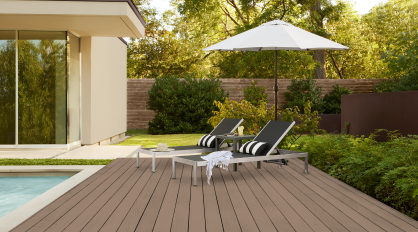
SOULScape
Credit: Original photography and design by Bethany Nauert and Stina Funch at Atwater Inc. Paint color by Behr Paint Company.
Walls: Eastern Bamboo PPU9-25; Trim/Ceiling: Nano White HDC-MD-06
Inspired by the Mediterranean, these soulful and moody hues create an inviting environment with a warm, coastal feel. This hotel room features Eastern Bamboo (PPU9-25) for a fresh pop of color that brings dimension and visual appeal to the space.
MYSTICWave
Credit: Original photography by John Sutton. Paint color by Behr Paint Company.
Siding Walls: Coral Cloud M200-4; Ceiling Accent: Mayan Treasure P490-7; Side Building Walls: Beach Foam S450-1; Window Accent: Coral Cloud M200-4; Skinny Window Trim: Deep Fire M180-7
Drawing off the tranquil nature of aquatic hues, these soothing colors help promote well-being and comfort within a space. Coral Cloud (M200-4) and Mayan Treasure (P490-7) give this elementary school a vibrant, playful aesthetic that inspires creativity and joy.
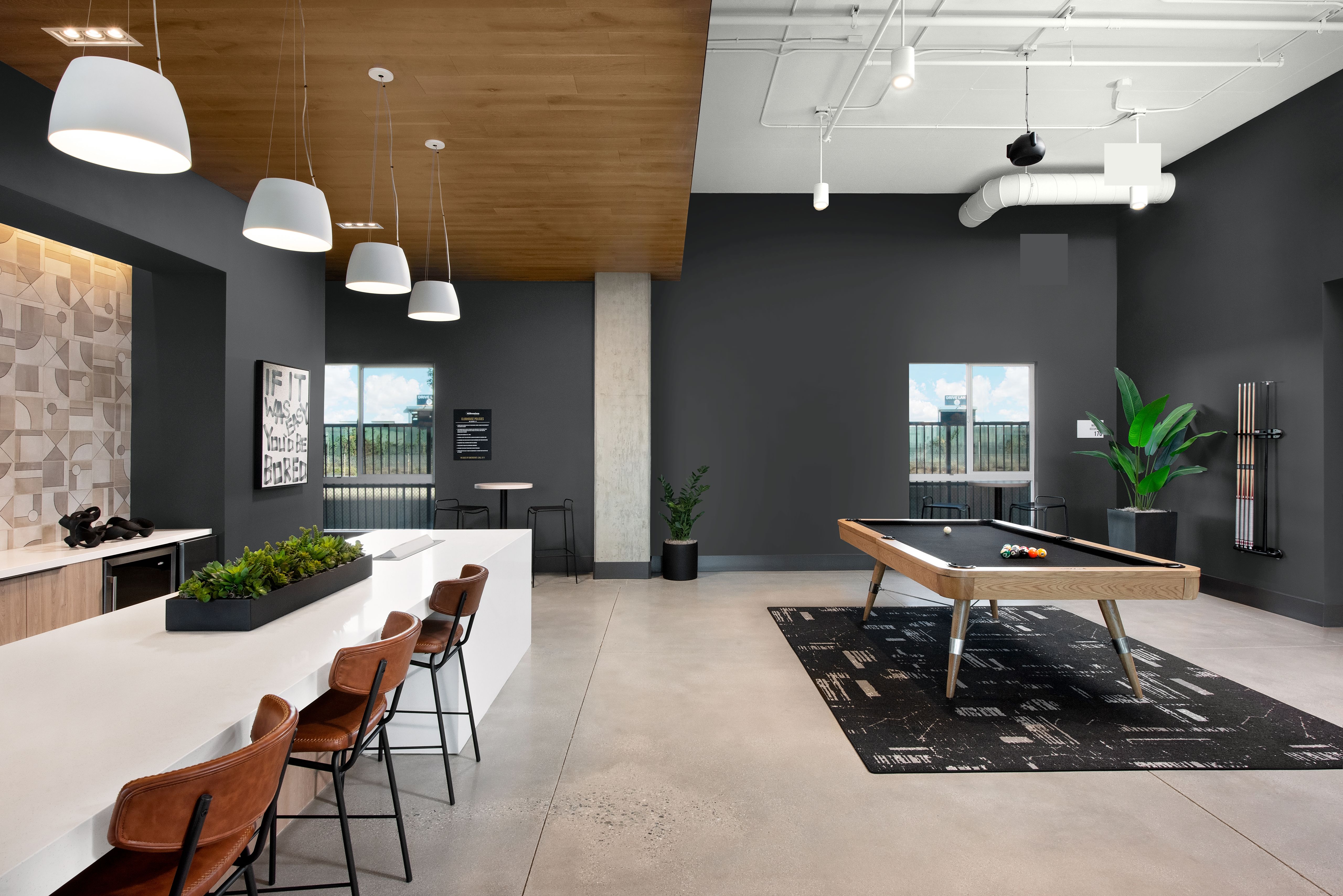
METROChic
Credit: Original photography and design by Bethany Nauert and Allie Bell. Paint color by Behr Paint Company.
Walls: Nano White HDC-MD-06; Accent: Extreme S530-6
This selection of colors combines Parisian charm with New York City’s energy that can add both classic elegance and a modern flair to interiors. Create subtle beauty in a patient room by opting for a grayed blue like Extreme (S539-6) for a refined aesthetic.
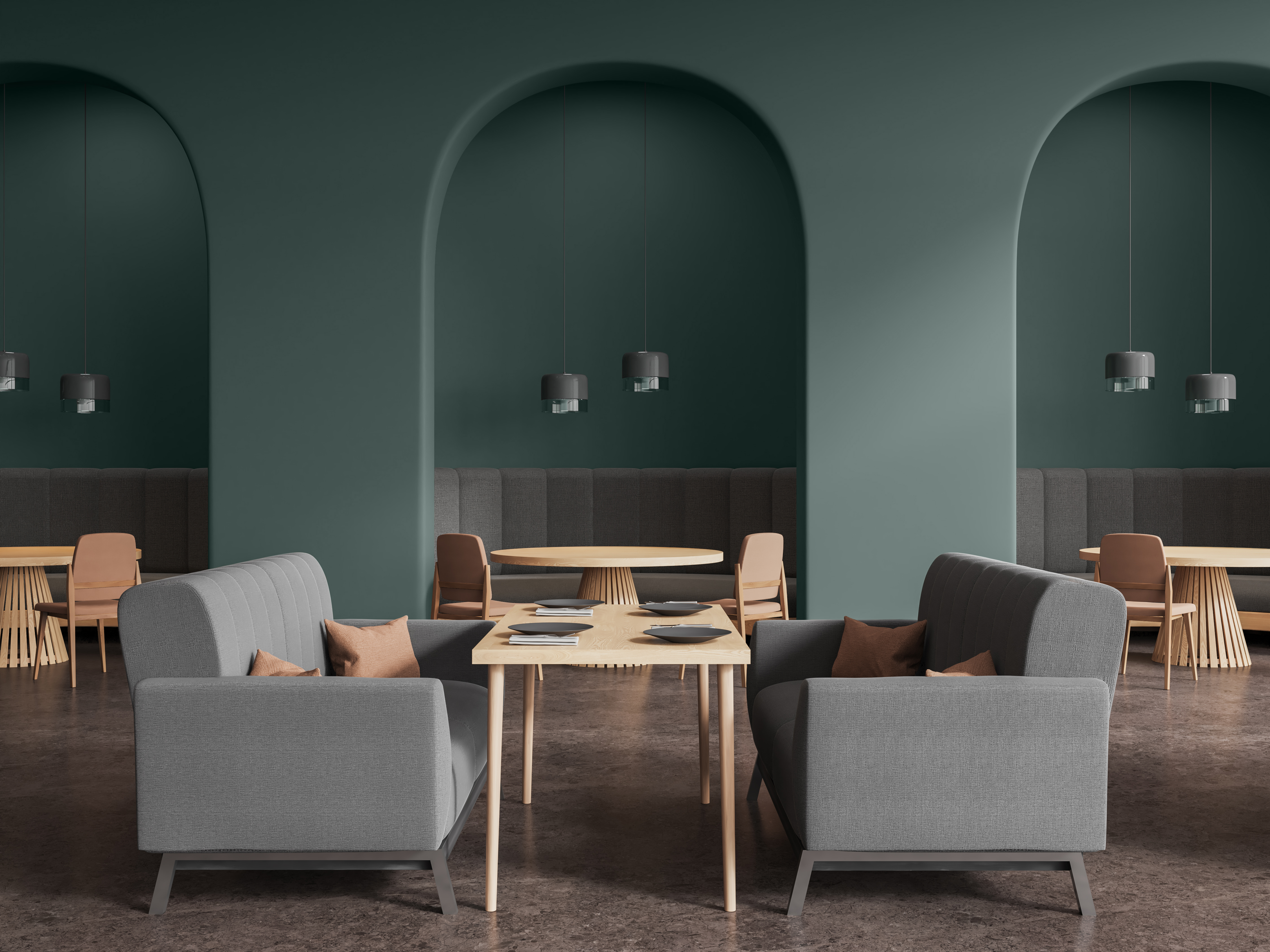
FUSIONDream
Credit: Original photography by John Sutton. Paint color by Behr Paint Company.
Back Wall: Eon N370-2; Outer Wrap-Around Walls: Sultana P100-7; Inner Accent: Coveted Gem N560-2
Featuring a blend of frosted pastels and edgy bright tones, these hues create a striking blend of allure and mystique. This workspace features Sultana (P100-7), a bold purple hue for eye-catching impact.
Behr Designer Council
The colors in this forecast palette were inspired by the expertise and insights from our first-ever Behr Designer Council. The Council includes eight designers whose expertise spans across commercial and residential markets.

We gathered feedback from our Council to ensure we were providing a collection that could be a go-to resource for designers to leverage for their projects,” says Woelfel. “By uniting a curated collective of visionary talent, we are better positioned to understand the desires of the designer community and shape the future of color and design together.”
To learn more about the 2026 Commercial Forecast Palette, click here.
To learn more about the Designer Council, click here.