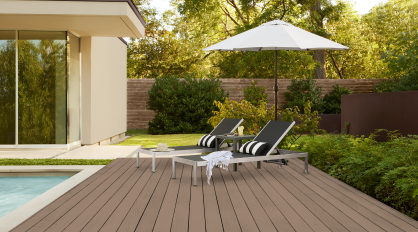
While neutral paint colors like beiges and grays have dominated for decades, darker colors have been trending as people look to incorporate more personality and depth in their spaces that are bold, elegant, and full of possibility. Darker neutrals are also becoming increasingly prominent as the industry shifts to an overall dark and warmer aesthetic across colors, finishes, and materials.
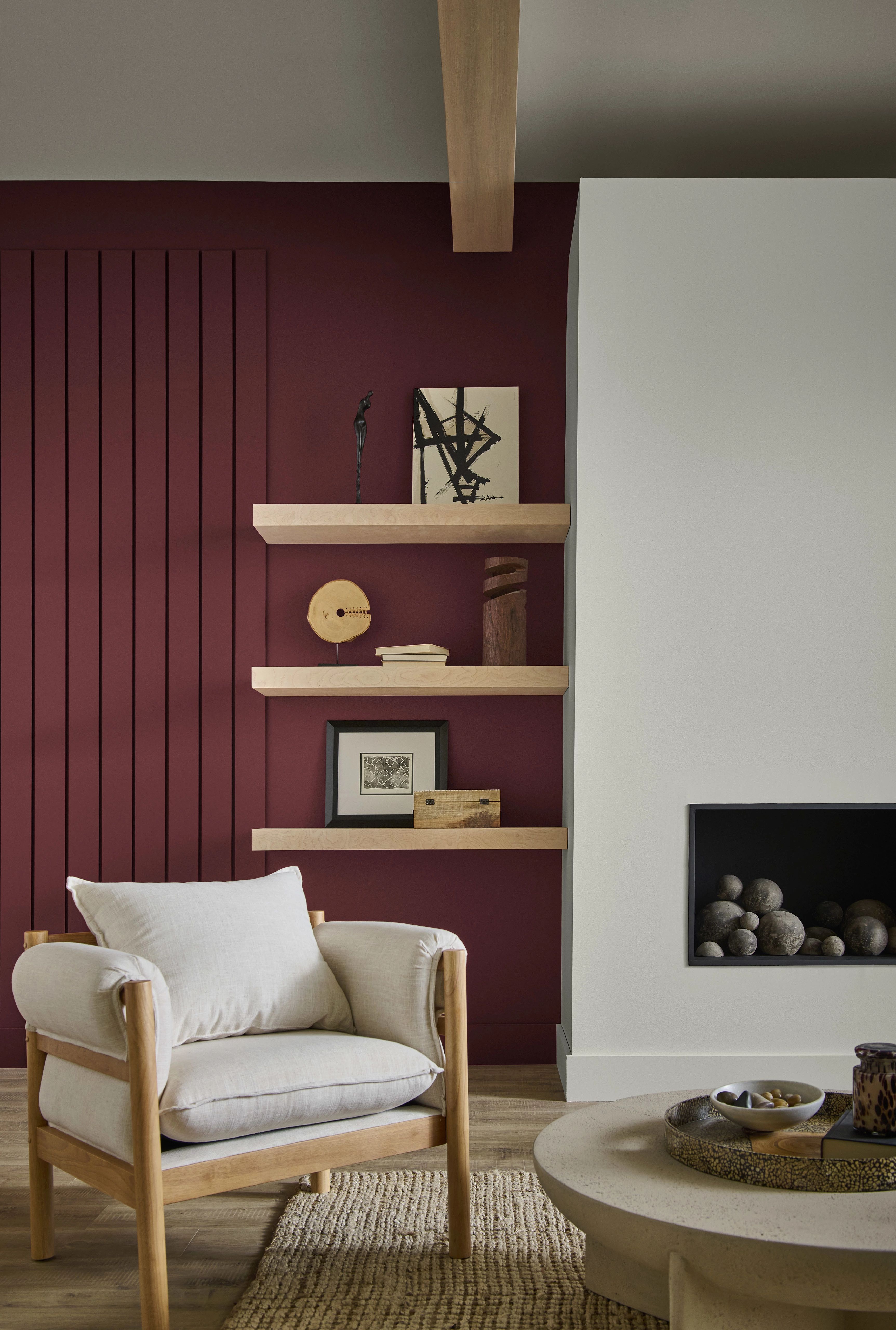
Walls: Dark Everglade HDC-CL-21A
Darker colors can make a statement in residential and commercial color schemes in a multitude of ways, ranging from small, dramatic accents to full color-drenched spaces. BEHR® Paint is available in several curated collections like the Designer Collection and 2026 Color Trends Palette with dark hues your clients are craving this year. Hear from Behr Paint Company’s VP of Color and Creative Services, Erika Woelfel, on how to play with bolder color in interesting and unique ways.
A New Era of Elegance
The BEHR Designer Collection is designed to highlight the go-to colors that can be used anywhere,” says Woelfel.
It includes many classic, light neutrals that your clients know and love, but it also features some darker, deeper colors to elevate and personalize your clients’ spaces.
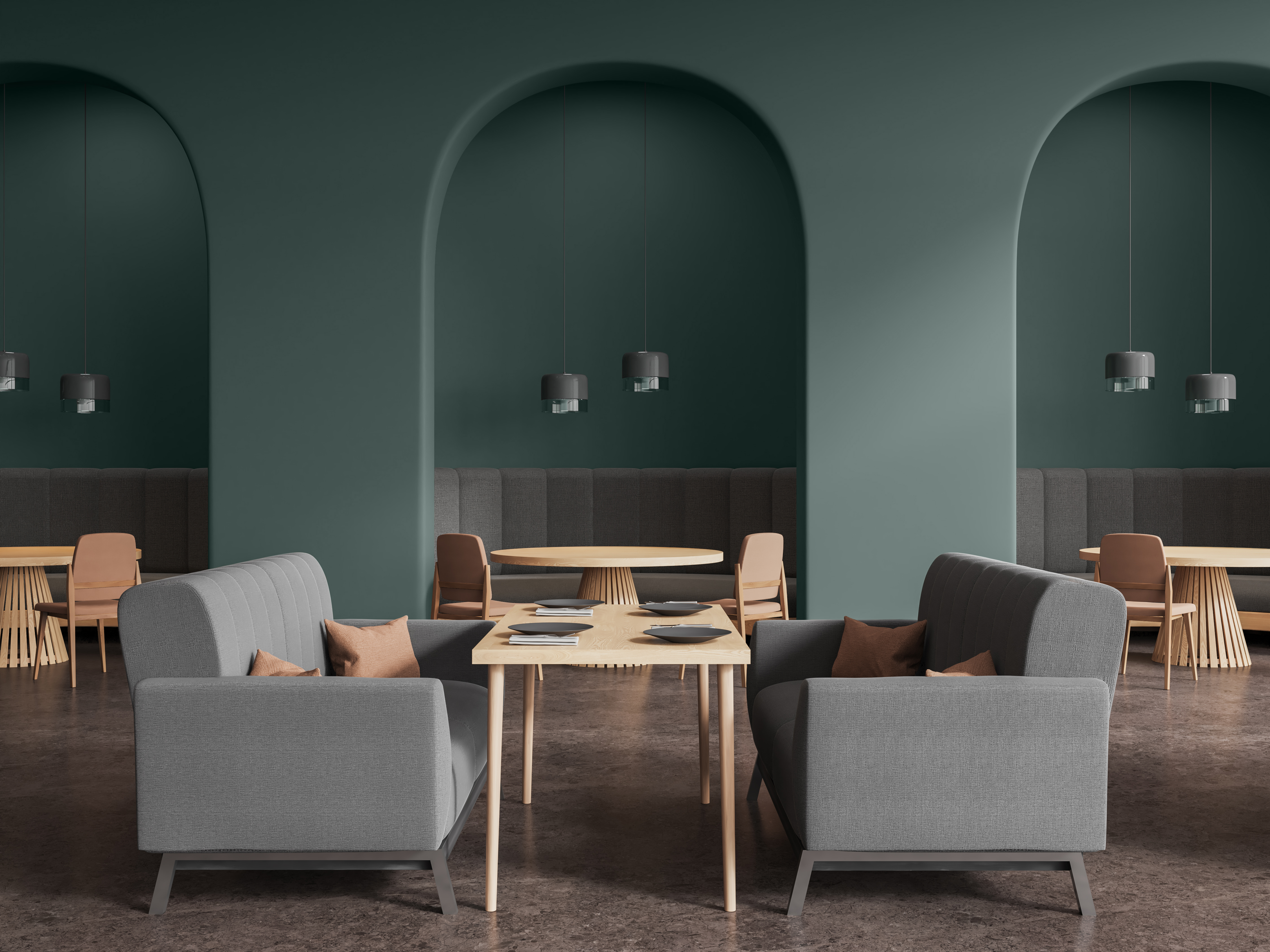
Some of the notable colors in the designer collection include Dark Everglade, a shady blackened green that exudes luxury, while Rumors, our 2025 Color of the Year, brings deep, ruby red allure. Dark browns are also trending, including Espresso Beans, which packs a bold and beautiful punch.
Cracked Pepper, our 2024 Color of the Year, remains in the spotlight for both interiors and exteriors as a soft black with timeless and modern appeal.
There’s just amazing versatility with that color,” says Woelfel.
Walls: Cracked Pepper PPU18-01; Ceiling: Winter White DC-004
She also calls out Midnight Blue, “which is the darkest a blue can be before it turns to black. It’s just beautiful. It has this nice saturation to it, and you can use it with camel-colored neutrals or caramel-colored leather tones.”
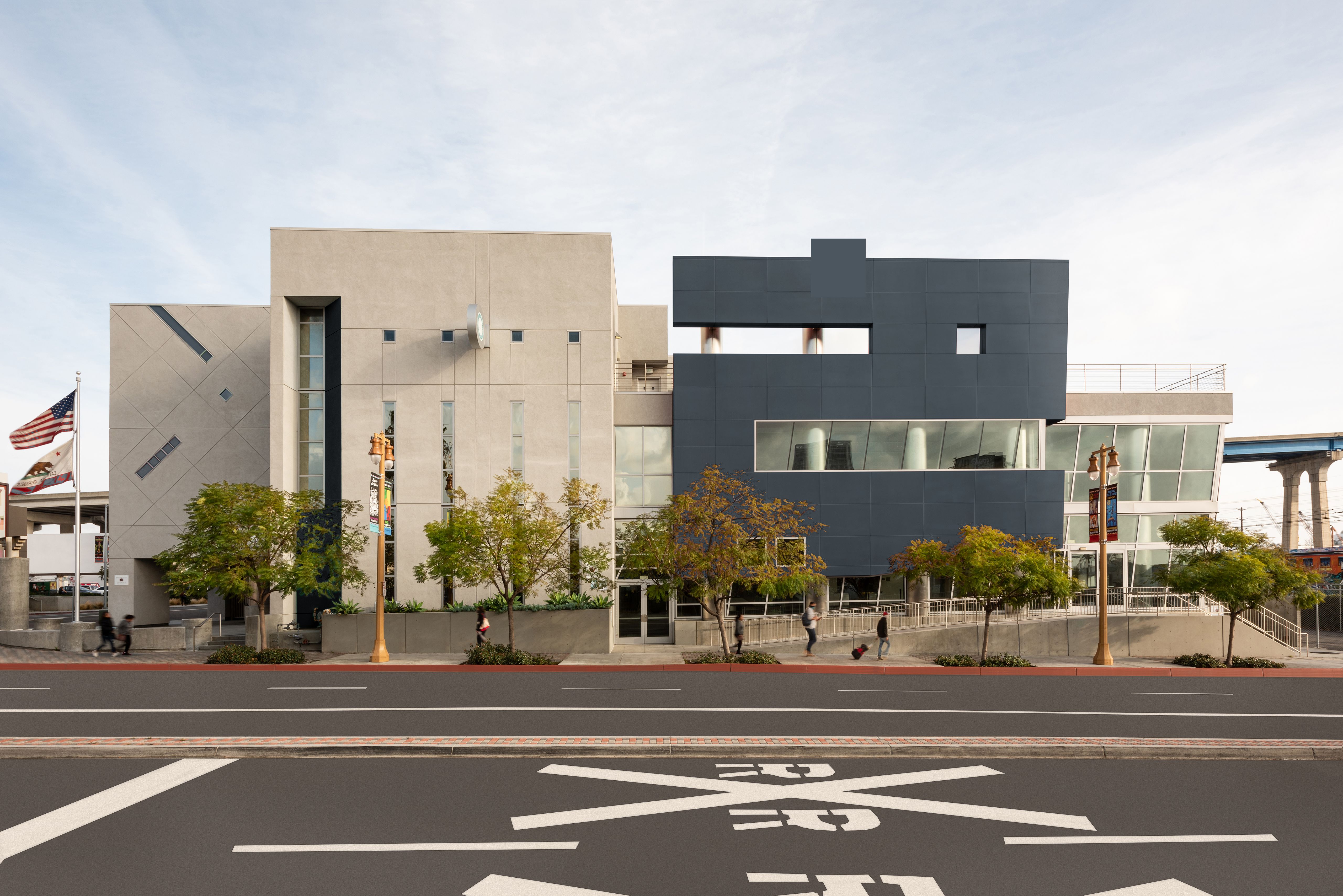
Right Building: Midnight Blue N480-7; Left Building: Dove HDC-MD-21
Using Dark Colors
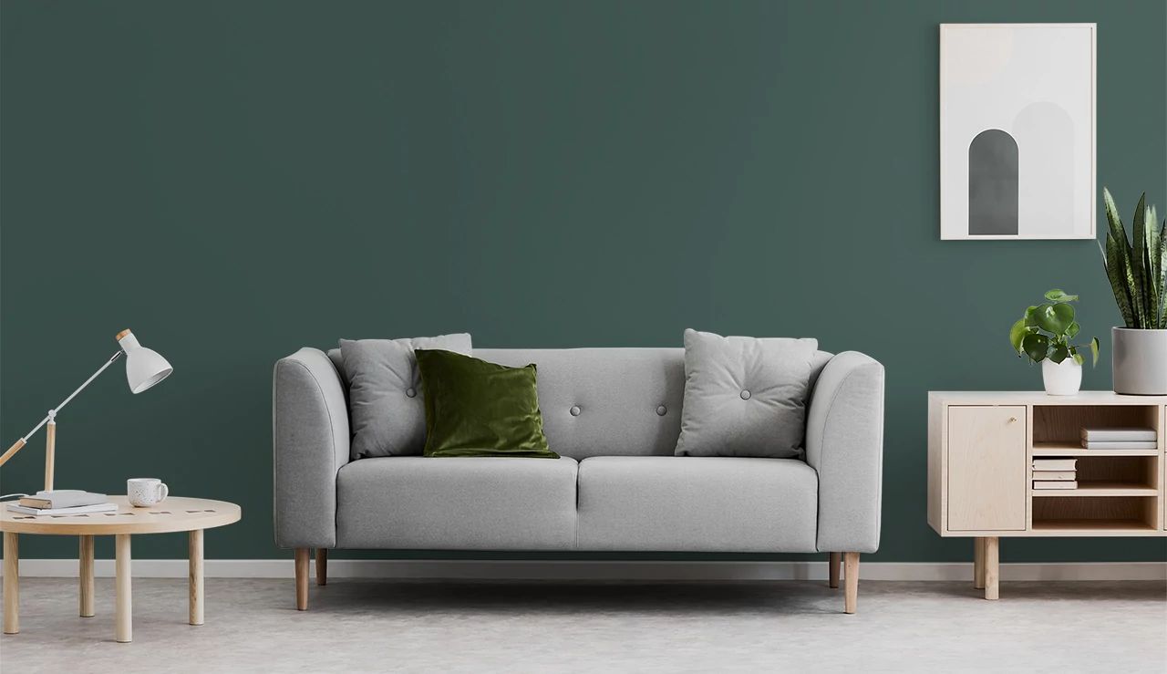
Darker colors naturally create cozier and more intimate spaces than lighter colors.
People are often afraid or nervous that a darker color will make their room feel smaller,” says Woelfel.
If your client is concerned about this, Woelfel recommends two strategies. The first is color-drenching, which can create a more expansive feeling.
Woelfel explains, “When the walls and the ceiling are the same color, it becomes a cohesive whole. Done well, it actually pushes the boundaries out to make a space appear larger.”
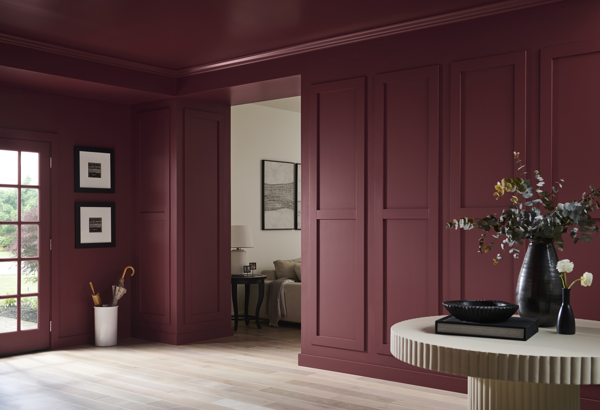
Walls & Ceiling: Rumors MQ1-15
If color-drenching doesn’t fit your client’s style, another option is to skillfully balance the darker colors with light/neutral colors.
“This avoids the feeling of heaviness that can come with darker colors.”
A wall split with a chair rail or wainscoting can have a darker color below and a lighter color on top (or vice versa). This approach allows for two different sheens to create dimension and depth, for example a matte finish on upper wall and a satin sheen on wainscoting—as seen in our Paint Sheen Differences blog.
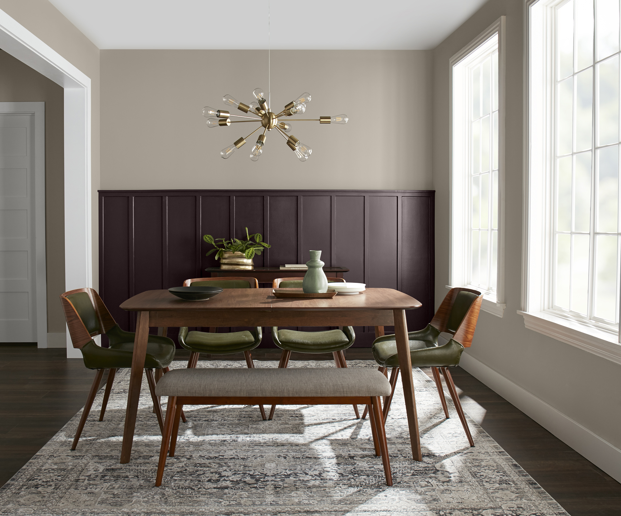
Upper Wall: Perfect Taupe PPU18-13; Lower Wall: Aubergine N100-7; Trim & Ceiling: Blank Canvas DC-003
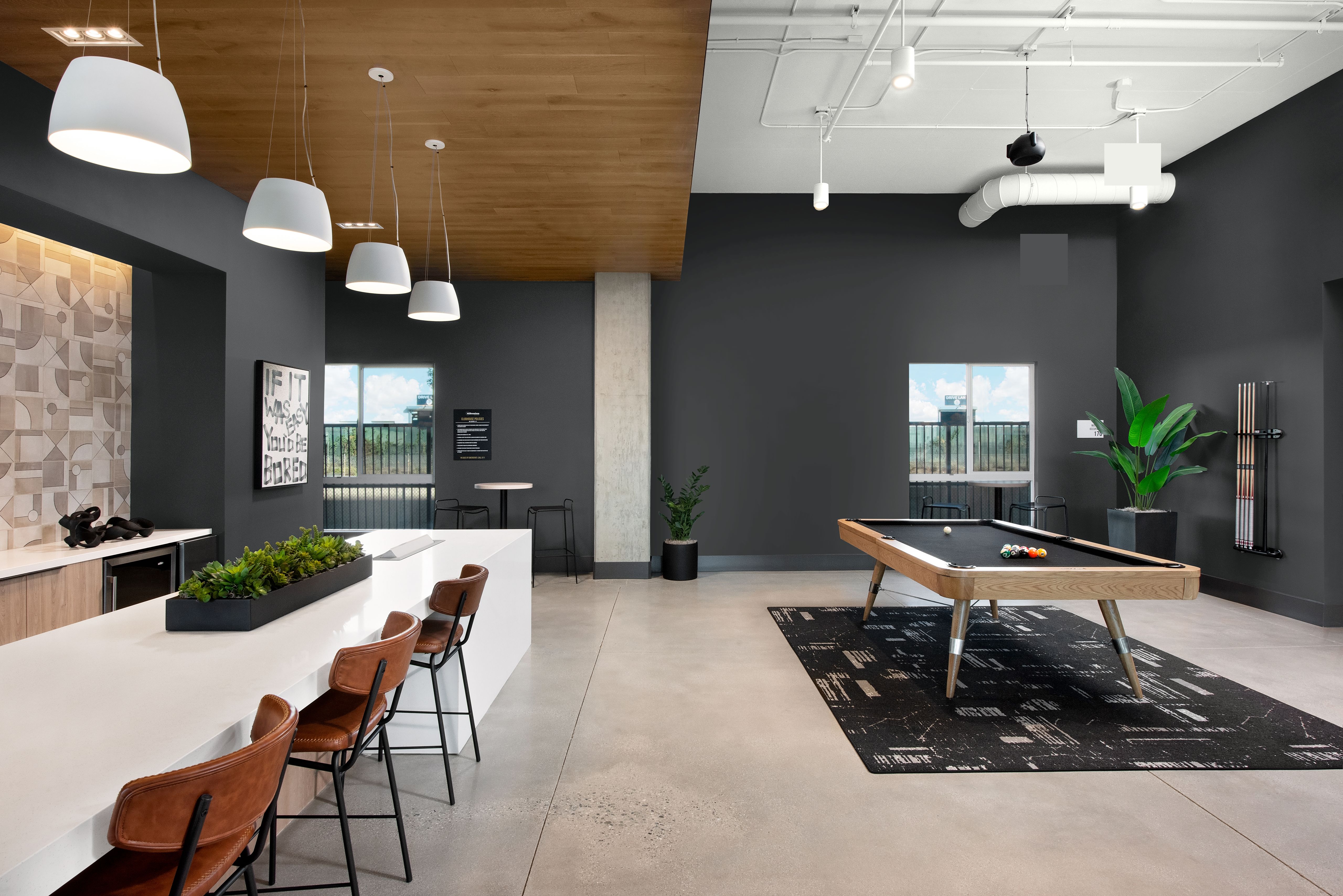
As always, architectural features of a room are a great opportunity to create a splash of drama.
Painting the kitchen island or a bathroom vanity with a dark color is a small way to make a big statement for your client’s space.”
A Note on Dark Colors
Often times, darker colors can be more challenging to apply than lighter colors. It’s important to remember that an experienced painting contractor and high-quality paint are essential to achieving a flawless finish for your client’s space. Choosing a top-quality paint like BEHR® MARQUEE Interior Paint or BEHR® DYNASTY Interior Paint can ultimately result in a more vivid finish and keep the surfaces of your projects looking newer longer—all with one-coat hide guaranteed in over 1,000 colors.*
In addition, stunning, dark colors can be a major commitment for residential and commercial spaces. Done poorly, they can sometimes be overwhelming and distracting in an environment.
Sometimes it’s a good idea to start with a big, bold color in a smaller room before using it in a big room,” says Woelfel.
Finally, Woelfel doesn’t recommend darker colors in rooms that don’t have enough natural light.
She says, “The best way to use these colors is if you’re getting plenty of natural light during the daytime and terrific lighting at night that really plays up the color.”
She also says it’s important to balance darker colors out with lighter furniture, flooring, and/or artwork.
Take the risk. It can be amazing.”
To learn more about the beautiful, bold colors Behr offers, contact your local Behr Architectural & Design Rep.
*Limitations apply. One-coat hide in 1,000+ colors. One-coat hide excludes untinted bases, colors outside of the Interior One-Coat Color Collection and all other colors that have not been selected as one-coat hide from other BEHR® palettes. Not valid when painting over uncoated, porous or repaired interior surfaces; over woods that contain tannins such as redwood or cedar; or when painting over heavy stains, which may require spot-priming, multiple coats, and/or longer dry time.