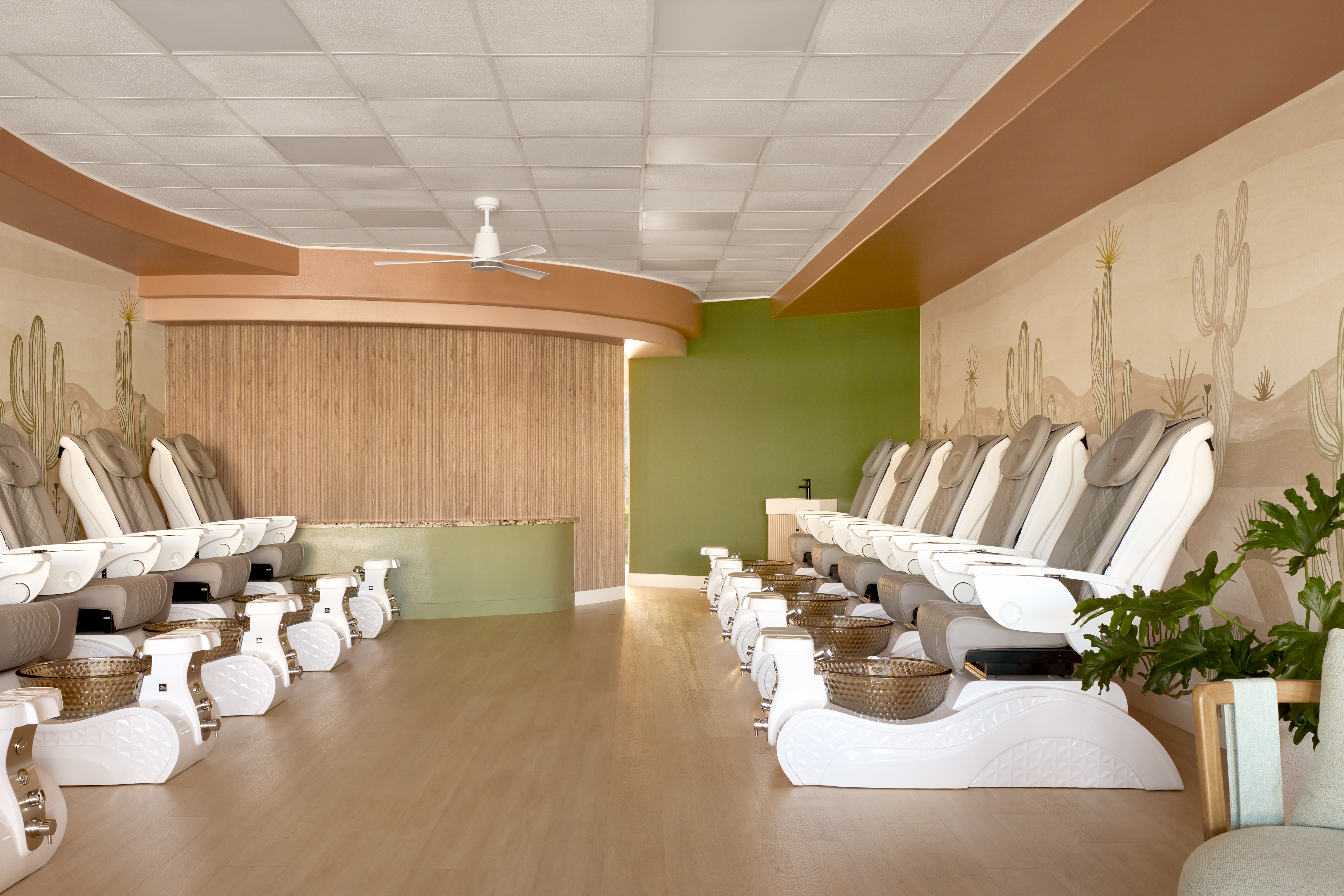
In a standard retail space with limited architectural detail, thoughtful color selection can do more than enhance a design, it can define it. That was exactly the case for Stone Petal Salon in Palm Springs, CA, where color became the primary tool for creating a relaxing, spa-like environment that still feels fresh and inviting.
Designed by Christopher Kennedy Inc., this project demonstrates how strategic paint choices can elevate both the aesthetic and the client experience, without requiring major structural changes.
Creating a Spa-Like Experience Through Color
The client’s goal was to create a space that feels calm and restorative, while still offering a sense of energy and personality. Without strong architectural features to rely on, the design team turned to color to establish mood and visual interest.
Warm, earthy tones were used to create a welcoming atmosphere, while subtle contrasts ensure the space remains dynamic rather than overly neutral. In the main salon areas, these tones wrap the walls and ceilings, creating a cohesive envelope that immediately sets a tranquil tone upon entry.
A Palette Inspired by the Natural Desert Landscape
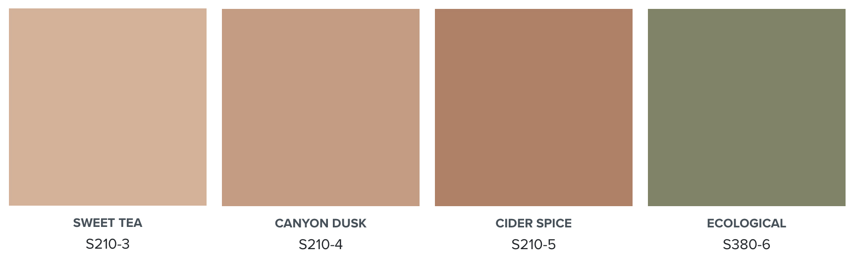
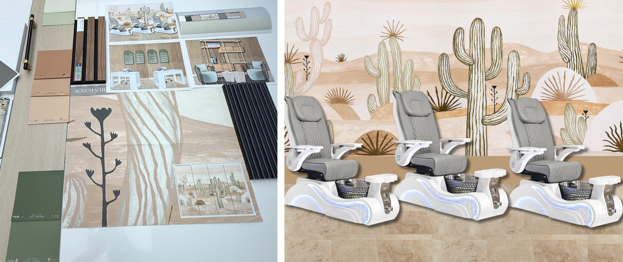
Rather than leaning into traditional Palm Springs design clichés, the palette draws inspiration from the surrounding environment. The design centers around a desertscape mural, which informed the overall color direction.
The mural acts as both a focal point and a guide, pulling in soft blush tones reminiscent of desert sunsets and muted greens inspired by native cacti. This visual anchor helps unify the space, allowing surrounding paint colors to feel intentional and connected.
The result is a cohesive palette that reflects the natural beauty of the desert while maintaining a refined, modern feel.
Enhancing Architecture with Paint
One of the most impactful design decisions involved the salon’s existing soffits. Instead of removing them, the design team used paint to highlight these architectural elements.
By applying three tonal variations of the same hue, from darkest to lightest, an ombre effect was created across the ceiling and walls. This approach not only draws the eye upward but also visually softens the transitions between surfaces, making the space feel larger and more fluid.
Importantly, this design solution required no additional materials demonstrating how paint alone can deliver high-impact results in a cost-effective way.
Supporting the Client Experience
Color plays a key role in shaping how clients feel within the space. The use of dusty, earthy pinks helps create a calming environment while also being flattering across a wide range of skin tones, an important consideration in a beauty-focused setting.
To balance these warmer hues, shades of green were introduced in select areas, including private treatment spaces. These greens provide a visual reset and reinforce the salon’s spa-like atmosphere, offering clients a sense of calm and privacy.
Together, these colors create an environment that feels both relaxing and rejuvenating.
Balancing Color with Natural Materials
To ensure the palette remains sophisticated, the design incorporates walnut wood accents. These darker elements provide contrast and structure, preventing the lighter tones from feeling overly soft.
In styling stations and millwork, the wood tones ground the space and add a layer of warmth that complements the painted surfaces demonstrating how paint and material selection work hand in hand.
Designing for Functionality
In task-focused areas like the manicure stations, color was used more strategically. A lighter pink tone was paired with bright white tables to ensure that nail polish displays remain the focal point.
This approach allows the design to support the salon’s services while maintaining visual consistency throughout the space.
In waiting areas, soft, enveloping tones create a calming backdrop for clients, while subtle shifts in color help define zones without the need for physical partitions. Every corner of the salon, from open styling areas to more intimate spaces was considered, ensuring a cohesive experience throughout.
Design Takeaways
Color can enhance character and architecture to shape the overall customer experience. By leveraging a cohesive, nature-inspired palette and using color strategically, this design delivers a high-impact result without increasing project complexity or cost.
When architectural detail is limited, paint becomes your most powerful tool. Layering tones, defining zones through color, and drawing inspiration from the surrounding environment can elevate even the most standard retail space.
Colorfully yours,
Christopher Kennedy
Want to know more about Christopher Kennedy? Check out his web and social sites.
Designer: Christopher Kennedy
Instagram: @christopherkennedyinc
BehrPro: Behr Designer Council
Photography: Public311 Design