As a paint professional, you know that some jobs go more smoothly than others. Sometimes, clients are ready to go — colors in hand, knowing exactly what they want and where. And sometimes, they are overwhelmed by color choices with only a vague notion of what they want.
Sure, every job has its up and downs, but the latter scenario is ripe for delays, as well as frustration on both sides. While it’s not your job to pick colors for them, paint is your profession, and this should be a positive experience for the both of you (translation: glowing referrals). Help them discover their perfect color, and everybody wins!
Ask… and Listen
While clients may have a style or theme in mind… some may not. To kick things off, schedule an in-person or virtual meeting to understand their vision. While looking through fan decks, here are some questions you may want to ask:
- What is the area’s purpose?
- What fixtures or décor elements in the room will stay and require a coordinating color – furniture, cabinetry, tile, countertops, window treatments, etc.?
- What kind of “look” or style do you envision for the space? Elegant? Casual? Traditional? Modern?
- How do you want the room to “feel”? Calm? Energizing? Creative? Relaxing? Fun?
- Do you have children? Grandchildren? Furry friends?
- What inspires you? Is there a room in your home you love? What about items such as art, heirlooms or other treasured items, fabrics, or photos?
At the end of the meeting, perhaps suggest that your client stop by The Home Depot® and pick up color cards/chips of hues that resonate with them. Advise them to sit with the chips for a few days and view them under different lighting conditions to see the colors at all times of the day. For example, the color undertone (yellow, blue, green, pink, brown, etc.) of whites and neutrals can be easily discovered by placing them on a piece of white paper.
Narrow the Field
Once you’ve helped your client go through their top selections as well as review color cards, it’s time to pick the final colors to sample! Don’t be surprised if your clients bring in a whole new box full of color chips. Choosing the right color is a process, and they may depend on your expertise. Plus, you may find that taking extra time to guide them through choosing paint color pays off in great returns and referrals.
If your clients need some inspiration, show them Behr Paint Company’s Top 10 Neutrals!
ANTIQUE WHITE 23
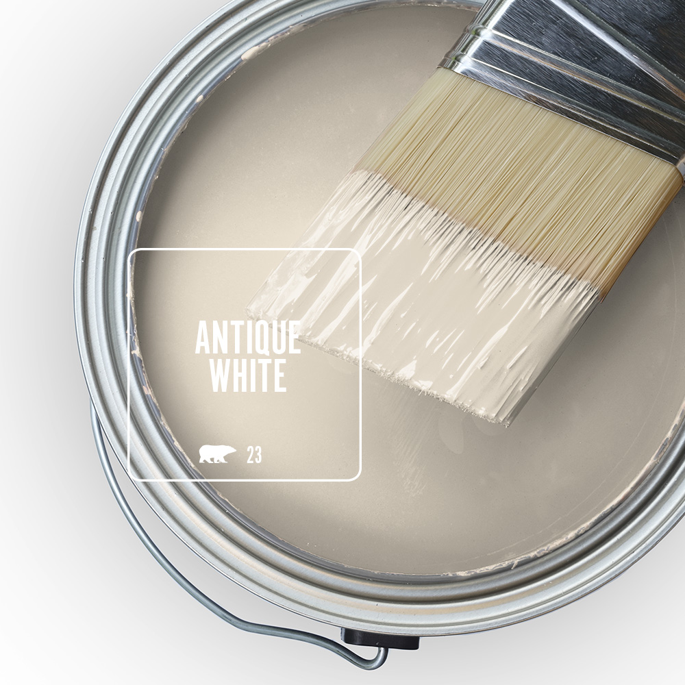
Soft, timeless and versatile, Antique White emanates a nostalgic feel.
Antique White was born to adorn kitchen and dining room walls, as its warmth perfectly counterbalances pure white accents. Perhaps your clients want to integrate other colors in living rooms, bedrooms, or baths. If so, Antique White works beautifully with dusty purple, green and blue tones, as well as mid-tans and dark browns.
OFF WHITE 73

With hints of yellow, Off White is often paired with pure whites, grays, or browns — all of which can be used just about anywhere. That said, this hue loves subdued accent colors — from light pink, peach and purple; to mid-olive and plum; to dark blue, teal, and earthy red. Stick to traditional hues for dining rooms and kitchens but go ahead and bring on the colors elsewhere, via accent walls, furnishings, throw pillows, artwork, rugs, linens, and more — with Off White as the connective thread that ties it all together.
NAVAJO WHITE

The go-to of go-to neutrals, Navajo White is a warm, classic, hue that works best with traditional styles — inside and out.
This silky hue pops when coupled with bright whites but also pairs well with earthy browns, rust reds, and blues. Consider suggesting this for an office, bonus room, or kitchen.
Navajo White’s natural companion colors include Lunaria, Spun Wool, and Antique White, which — when combined with dark-brown and wood decor — gives living and dining rooms an elegant feel.
LINEN WHITE 70
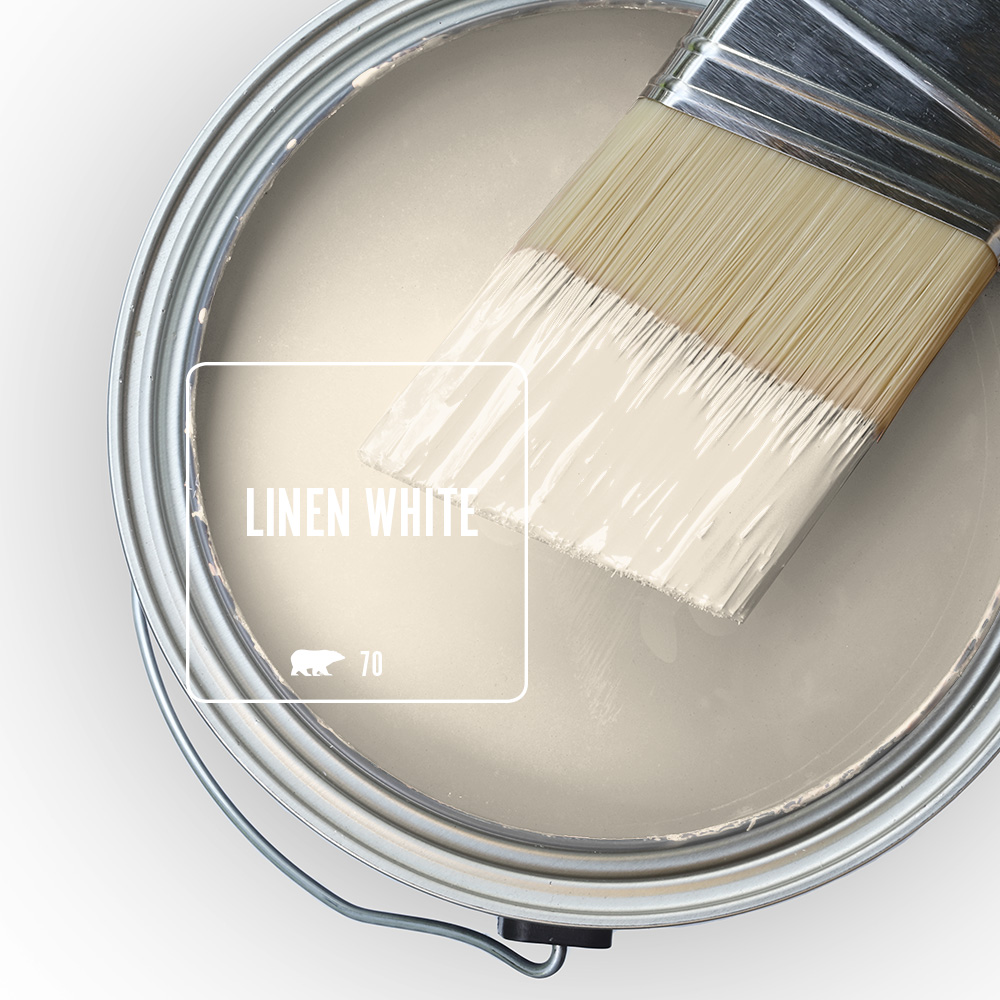
Warm and welcoming, Linen White is a blank slate, ready to be transformed into a work of art with colorful accents, furnishings, and décor.
Whether your clients lean toward subdued elegance, casual comfort, or free-spirited creativity, White Linen abides. In fact, its versatility pretty much gives total freedom when it comes to pairing. Let your clients play with colors — grays and beiges; or dusky light blues lilacs and tans; or black for sophistication; or even go bold with deep yellows, pinks, purples, and blues!
DOVE HDC-MD-21✦
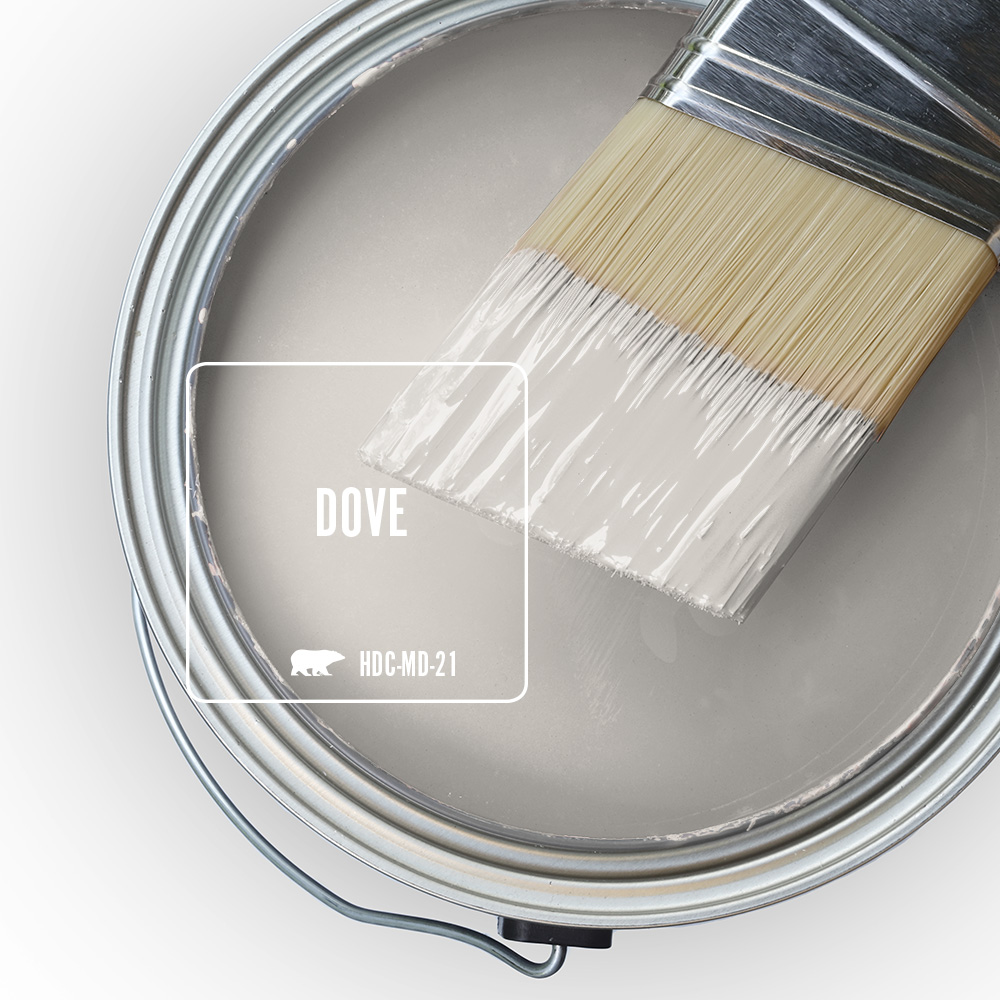
A warm greige that almost appears like a soothing gray, Dove radiates a peaceful and gentle mood that lifts the spirit. Highly versatile, this hue walks the middle ground between warm and cool, which means it works just about anywhere with gorgeous results.
Living and dining rooms, as well as kitchens, are the perfect candidates for combining Dove with an accent wall. Dove features light undertones of orange and red — so it partners well with warmer accents, such as purples, pinks, yellows, or deeper red hues. Bottom line: Your client can’t go wrong with this gem of a neutral.
COTTAGE WHITE 13

Cottage White, a soft and creamy tone kissed by unmistakable honey-gold notes, emanates a gentle warmth, as well as a sense of peace, anywhere it’s used.
In a master or guest bedroom, its subtle undercurrents bring out the allure and timelessness of pristinely white linens. Cottage White is the ideal neutral for those looking for a robust off-white to contrast with pure white accents, creating a sophisticated ambiance in living and dining rooms. It also pairs well with colors ranging from pale dusty purple to dramatic, dark teal. Cottage White is neither too cool nor too warm, providing traditional and modern exteriors an appealing and inviting look.
WHITE VEIL OR-W14
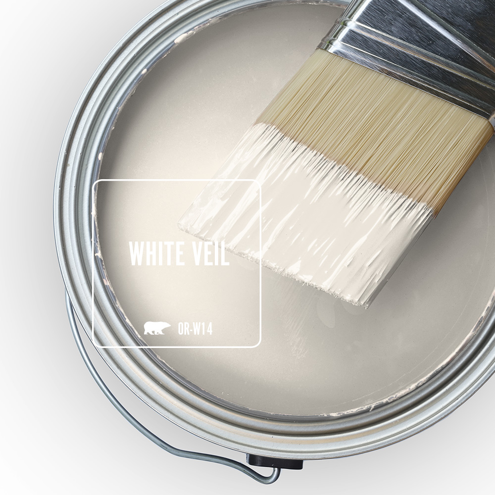
White Veil is a dreamy white inspired by the lace of a vintage wedding gown touched with notes of gold.
This amiable hue boasts a hint of beige and is a great color for a family room or bedroom, as it is both airy and grounded. In fact, because of its neutrality, White Veil pairs well with nearly any décor and furniture. It’s ideal for people who want a light, bright dining or living room, without having to go with a stark tone. White Veil has only the faintest hints of orange and red, making it upbeat and youthful – yet it needs a strong accent color to bring out those gorgeous undertones.
SPANISH SAND OR-W07
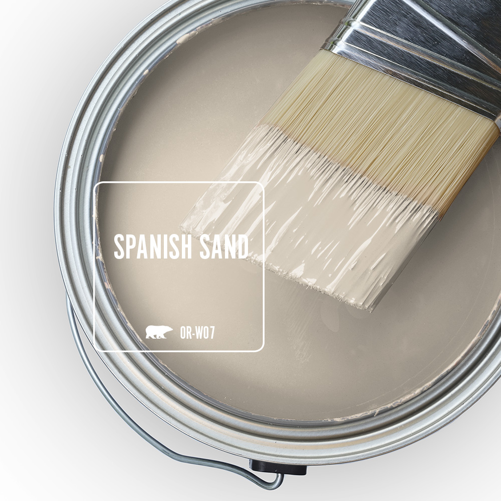
A rich beige highlighted by hints of warm, light to mid-brown and understated gray undertones, Spanish Sand is an impressive, soft greige that can transform a home’s exterior with its range of subtle tones.
Inside, suggest using Spanish Sand on the kitchen cabinets and — depending on your client’s style — pairing it with a complementary color such as a pale peach, dusty yellow-green, or deep brown… or how about stirring up some drama by putting this neutral on the bathroom walls, accented by dark gray or muted teal.
CRISP LINEN MQ3-13✧
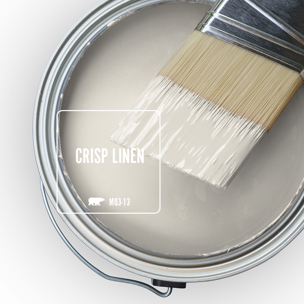
Inspired by nature, Crisp Linen is a true beige that’s warm and balanced yet clean and fresh, like laundry after it’s dried in the sunshine.
Crisp Linen pairs well with other neutrals, as well as subtle, light- to mid-tone pinks, greens, blues, and purples. For a casual, organic vibe, infuse color via accent walls in the home’s social space, including kitchens and living/family rooms. If a more traditional look is in order, pair Crisp Linen with grays and pure whites, as well as with dark wood furniture and décor.
EVEN BETTER BEIGE DC-010✧ *
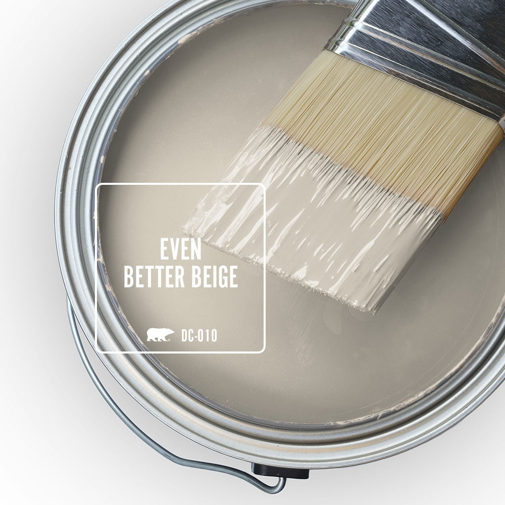
Give your neutral game a boost with Even Better Beige — a versatile neutral that imparts a warm, distinctive feeling wherever it’s used. A true beige with yellow undertones, Even Better Beige not only works well with other neutrals — but colors ranging from orange-golds and earthy yellows to mid-tone greens and blues, and dark browns.
In the living room, this hue serves as a flawless backdrop that allows architectural elements, such as a fireplace, exposed beams, and board-and-batten paneling, to really shine. And depending on your client’s style, kitchens and dining rooms can be anything from elegantly monochromatic to imaginatively multihued.
Comparable to Sherwin Williams’ Accessible Beige*
Custom Color Matching
Does your client have a specific color in mind? Bring their inspiration to The Home Depot® — a sample of the color that’s about 1″ x 1″ in size: a paint chip from a surface, a piece of fabric, a competitor’s paint swatch or even leftover paint — and we’ll match it. The color your client wants is the color they’ll get.
One-Coat Hide
Both BEHR DYNASTY® Interior Paints and BEHR MARQUEE® Interior & Exterior Paints guaranteed* one-coat when tinted to colors from the One-Coat Hide Color Collection. Check out all the neutral colors that are one-coat.
*Limitations apply. For more information, visit Behr.com/onecoathide
✧Denotes One-Coat Hide when tinted into BEHR DYNASTY® INTERIOR & MARQUEE® Interior Paint.
✦Denotes One-Coat Hide when tinted into BEHR DYNASTY® INTERIOR & MARQUEE® INTERIOR or EXTERIOR Paint.


I’m getting ready to paint the interior of my home. I have narrow the colour to cream. Could you provide names of cream paint colours without yellow and green undertones.
Thank you.
Hi Angela,
Most cream paint colors have a yellow undertone that can vary depending on the colorant formula or even the lighting conditions in which they are viewed. If you’re looking for an off-white cream color, we suggest White Moderne PPU24-14 or Diamonds Therapy BWC-30.
Kindly,
The BEHR PRO Team
I will be painting my living room and hallway and possibly dining room and am considering Even Better Beige.
The only furniture staying in the room is the sofa, which I would describe as a muted pistachio green. The rooms have a western exposure, can this color work for me.
Hi Gerry,
Yes, Even Better Beige DC-010 would be an excellent choice for your living room and hallways as it is a versatile color that can work well with a variety of décor styles and furnishings. It acts as a neutral backdrop, allowing you to mix with different colors without clashing.
Kindly,
The BEHR PRO Team
Hi.
Painted most of interior walls BLANK CANVAS. Flooring is beige porcelain tile with slight peach undertone. Looking for a dark blue for the foyer ceiling…cathedral. Receives lots of natural light throught the day. Any suggestions would help.
Hi Annette,
Consider painting the ceiling with one of BEHR’s best-selling dark blues, here are some of our favorites:
Midnight Blue N480-7
English Channel PPU14-19
Compass Blue MQ5-54
Kindly,
The BEHR PRO Team
Hi Team!
We have recently moved and our home has the yellow brick. Can you point me in the direction of a neutral (not white-ish) color that would possibly look good or even a Taupe to paint the interior of our carport and garage.
Hi Jessica,
A warm gray or “greige” with subtle undertones could work well with the yellow brick exterior. It will provide a balanced and sophisticated look without being too cool or too warm. Consider one of the following: Cotton Grey HDC-NT-20, Tranquil Gray DC-007 or Toasty Gray N320-2.
Kindly,
The BEHR PRO Team
What is your most popular white? I am finishing a house to sell. I have white cabinets, white trim, white wall tile and aged honey oak floors. What would be your suggestion for a neutral paint color. Thank you
Hi Amy,
BEHR’s top selling whites are Swiss Coffee 12 and Polar Bear 75.
You can create a modern and sophisticated look with a soft gray that has warm undertones, such as Tranquil Gray DC-007 or Toasty Gray 790C-3. These colors provide subtle contrast against the white elements while still maintaining a neutral backdrop.
Kindly,
The BEHR PRO Team
My walls are Swiss Coffee and I would like a darker neutral white coordinating white to contrast for trim and baseboard. Any suggestions?
Hi Patty,
Please consider using one of the following lighter whites with a warm undertone for some contrast with the trim and baseboard: Polar Bear 75 or Whipped Cream DC-001.
Kindly,
The BEHR PRO Team
My dining room is west facing with a chair rail and one wall that continues into the living room (no chair rail in living room). Planning on Urban Legend below the chair rail and Warm Marshmellow on top and on the one living room wall. Color guide suggests Swiss Coffee but I want something warmer with a touch of yellow. Then the other 3 living room walls in Riviera Beach or Casual Khaki. Floors are hardwood and neutral furniture. What do you think? Option :There is a marble top table in the living room so I was looking at 3 walls of Mink Haze to pull that in. ?? Thank you.
Hi Ellen,
Your color choices sound lovely, and it seems like you have a good sense of how you want to create a warm and inviting atmosphere in your dining and living rooms. Let’s break down your color choices and consider how they might work together:
BEHR’s Urban Legend N100-6 is a deep and rich color choice. This can create a cozy and intimate feel in your dining room. Since it’s below the chair rail, it won’t overwhelm the space.
Warm Marshmallow HDC-NT-11A is a nice choice for above the chair rail. Just keep in mind that there will be a lot of contrast if used next to Urban Legend. You might want to consider a slightly darker shade to make a smoother transition from one color to the other. Consider using one of the following instead: Even Better Beige DC-011 or Sand Pearl PPU7-18.
As for the other three living room walls, we think either Riviera Beach PPU7-07 or Casual Khaki N300-3 will work best.
If you need additional advice on paint color selection, consider scheduling a free virtual color consultation with one of our Behr experts: https://colorconsult.behr.com/
Kindly,
The BEHR PRO Team
Is there another paint like Dove that is lighter colored for my cabinets.
Hi Susan,
If you prefer Dove, you might also like one of the following lighter variations: Smoky White BWC-13, Cotton Knit PPU7-11, or Weathered White HDC-NT-21.
Kindly,
The BEHR PRO Team
Greetings,
I am going to paint my south facing two story foyer. I am considering Even Better Beige for walls with Blank Canvas as the trim color. Would these two work well together? Also there are section of the walls that are uneven. These walls may need a darker color. Would you please recommend some brown colors that would work well next to the Even Better Beige?
Thanks,
Grace
Hi Grace,
Even Better Beige is technically a darker variation of Blank Canvas. And both are considered warm neutrals, so they complement each other well. Darker variations of Even Better Beige include Pasha Brown MQ2-51 and Smoked Tan HDC-NT-14. Additionally, these browner, darker colors would coordinate well with Even Better Beige: Abbey Stone MQ2-56 and Studio Taupe PPU5-07.
Kindly,
The BEHR PRO Team
Hello, I painted my bright white 10 x 10 bedroom room to cotton knit (flat) which gave a warm, cozy, modern and inviting feel. I am looking for a complimentary darker color (in the grey to charcoal family) for an accent wall and a nice complimentary white for the baseboards. Any suggestions would be greatly appreciated.
Hi Erick,
Consider using BEHR’s 2024 Color of the Year Cracked Pepper PPU18-01 for an accent wall. For the baseboard, check out one of BEHR’s best-selling whites – Polar Bear 75 or Whisper White HDC-MD-08 – for subtle contrast against Cotton Knit.
Kindly,
The BEHR PRO Team
I have to paint a north, facing bedroom and living room , I was thinking kind of Dove or White veil… north, facing dove what do you recommend?
Hi Ana,
North facing rooms generally receive cooler, less direct sunlight. Therefore, you might want to consider choosing a white with warm undertones. White Veil OR-W14 is a warm White with a slight yellow undertone. Other good options to consider include Swiss Coffee 12 or an even warmer light tone like Linen White 70 to counterbalance the cooler light and create a cozy aesthetic.
Kindly,
The BEHR PRO Team
I’m painting my whole apartment Boreal by Behr and I’m trying to determine what colour I should paint my bathroom. My bathtub surround has a soft Calcutta Marble look and my floor is this ivory natural stone look. What paint colour will look best to tie it all in – I want to make sure the undertones match.
Hi Jemima,
We are glad you like Boreal as much as we do! Boreal is a deep green gray that is equally awe-inspiring and calming. It sounds like you might need a warm tone with enough weight to tie everything together. Consider choosing one of the following colors: Grey Envelope DC-011 or Vintage Pewter DC-009.
Kindly,
The BEHR PRO Team
Your descriptions here were very helpful, as to what types of colors each of these neutrals would go with. The photos of the paint brush above the open can of paint also were helpful. But to take this one step further, in the spirit of a picture painting a thousand words, to the right of the paint brush and can, why not include small squares of 4-5 colors you say would go with each of these well? THIS WOULD MAKE IT EASIER TO ENVISION, AND TO SELL TO THE SHOPPER’S SIGNIFICANT OTHER !
Hi there,
Thank you for your message! We’re glad you found the content helpful. If you click on a paint color on the behrpro.com ColorSmart tool, every color includes similar and coordinating colors to view.
Kindly,
The BEHR PRO Team
Hello! Could you please indicate which two colors are in the first image of this article? Loving the darker color on the bottom and we’ve painted most walls with Spanish Sand, thinking to do something similar to that color in the first photo in this article for trim, etc. thank you!
Hi Ann,
Here are the BEHR Paint Colors in the header image:
Walls: Roman Plaster PPU7-10, Creamy Mushroom PPU5-13
Trim: Shiitake N220-4
Fireplace: Basswood MQ2-46
Kindly,
The BEHR PRO Team
Does studio clay have a yellow tone
Hi Lisa,
Studio Clay MQ2-27 has more of a warm peachy tan undertone. We recommend buying an 8oz sample so you can test this color on your walls to see how you like it at different times of the day.
Kindly,
The BEHR PRO Team
Hello, my kitchen has a ton of southwest facing light. Cabinets will be a dark olive green with white counters. Is there an off white you would suggest for the walls? Thanks.
Hi Lisa,
We recommend the paint color Cotton Knit PPU7-11 for your kitchen. This off-white color will keep your kitchen light and bright while complementing your cabinets and counters.
Kindly,
The BEHR PRO Team
What are the 2 paint colors of the dining room on the cover of this page ?
Hi Regina,
Here are the BEHR Paint Colors in the header image:
Walls: Roman Plaster PPU7-10, Creamy Mushroom PPU5-13
Trim: Shiitake N220-4
Fireplace: Basswood MQ2-46
Kindly,
The BEHR PRO Team
Hello!
I currently have white distressed kitchen cabinets (from the early 2000’s), and Im looking to lighten the room without making the cabinets look yellow or darker. Preferably with an LRV of 55 or less. I do not have a back splash and the tops have brown, black and tan speckles. What are your suggestions?
Hi Shelly Anne,
If you’re looking to lighten the room, it’s best to opt for a lighter paint color on the walls. We recommend Roman Plaster PPU7-10 – a light creamy beige – or Baja PPU7-08 – a light tan with a golden sepia undertone – for your cabinets and countertops.
Kindly,
The BEHR PRO Team
Hello!
I am having a hard time choosing colors wall/trim colors. What shade of white would look best with distressed white cabinets with glaze? So far, I believe I like “antique white” for the wall. But I am not sure of a trim color to post it with. I want to brighten the room without making the built in’s look yellow.
Hi Shelly Anne,
You can absolutely choose Antique White 23 on the walls if you want to keep the room brighter. As for the trim, we suggest Swiss Coffee 12 to brighten the space even further.
Kindly,
The BEHR PRO Team
I am painting kitchen walls that include a dark stained chair rail and baseboard. Below the rail will be painted Grey envelope. What warm white will compliment for above the rail?
Hi Denise,
A warm white that may complement Gray Envelope is Swiss Coffee 12.
Kindly,
The BEHR PRO Team
Hello!
I have darked wood floors with the dark brown furniture. I want to brighten up the space, but not too white. I’d like an off-white warm neutral tone. What do you recommend?
Hi Sam,
If you’re looking to brighten up your space with an off-white color, we recommended choosing Cotton Knit PPU7-11.
Kindly,
The BEHR PRO Team
Hi,
My basement floor is in the light grey tone. I’d like to paint the wall in the white family. What white color is best that has a relaxing, calming, friendly vibe but looks bright; also, will make the room looks bigger. My sectional sofa is color light silver.
Thank you,
Hi Cathy,
We recommend choosing White 52 or Silky White PPU7-12 for your basement to brighten the space and create a relaxing atmosphere.
Kindly,
The BEHR PRO Team
Hi I love them all❤️Im looking for a cream similar to Benjamin Moores “Natural Cream”.. What would you recommend?
Hi Salema,
The closest visual match is Wax Sculpture PPU7-17.
Kindly,
The BEHR PRO Team
Hi we bought a home with the colors already set Cabinets a toffee color tile , carpet and wood flooring all go really well. We repainted whle house before we moved in. Ended up with Behr Almond Looks very nice but i would like to have a couple walls painted green for a little contrast I love green do you have colors you would suggest to go with the almond paint. thankyou
Hi Lori,
Here are some recommendations you can try, Royal Orchard PPU11-01, Conifer Green PPU10-19, or Secret Meadow S360-6. You can purchase 8oz paint samples at The Home Depot to test these colors.
Kindly,
The BEHR PRO Team
I’m painting my 3600sq.ft, south facing Lakehouse. The lake is north facing. The interior is 10 ft ceiling with Cathedral’s in the upstairs great room.
Please suggest a white with a blue tent and a trim and ceiling color.
Thanks
Hi Wayne,
A white paint color with a blue tint that we recommend is Frost 57. A nice pairing for the trim and ceiling is Ultra Pure White.
Kindly,
The BEHR PRO Team
Hi, i was having a hard time choosing colors for our living room with adjacent kitchen. It has a NE facing large window (with large green grass backyard) and it currently painted SW Agreeable Gray. I want to repaint it with more of a beigy color. I have tried several BEHR sample paints (sentimental Beige, Painters White, Off White) and it is all casting green undertones which i dont like. The Silky White and Swiss coffee tends to be too white for the wall. The one that i see that works is the Sculptor Clay with little cast of green. Is there a lighter color of Sculptor Clay that will be a true beige and will not cast green undertone? Thanks for your help.
Hi Victoria,
Thank you for the information. We suggest trying Cotton Knit PPU7-11.
Kindly,
The BEHR PRO Team
Hi,
First time landlord here, I have a rental property that I want to paint the walls with a single neutral color. But there are too many options, white, cream, grey, I’m not sure which one to choose. I prefer something modern and welcoming and won’t make the room dark.
For the baseboard and trim, I will use ultra pure white semi gloss, for ceiling I think flat ultra pure white is the recommended color. Just don’t know about what i should go for the walls.
Do you have a top selling rental property paint color list or some recommendations?
Thank you!
Hi Ken,
For a rental property, it is best to pick a neutral tone. A few options to try are Silky White PPU7-12, Cotton Knit PPU7-11, Swiss Coffee 12 or Weathered White HDC-NT-21.
Kindly,
The BEHR PRO Team
I have orange toned wood cabinets and orange toned floors in my dining room. The room has tinted windows that make the light like a northern facing room. Which Behr white would look good in this room?
Hi Bettina,
A white paint color that will complement your room is Whipped Cream DC-001 or Swiss Coffee 12. We do have 8oz paint samples so you can test both of these whites and see which one you like best.
Kindly,
The BEHR PRO Team
My master bedroom is in the back of our house and no matter the time of day has a darkish cast even with the blinds open. The furniiture is white and bedding and chair are in shades of blue. What light color of yellow for the walls would be best.
Hi Helen,
We recommend one of these light-yellow hues for your walls: Candlewick HDC-CT-03, Pearly White M270-1 or Honied White YL-W03.
Kindly,
The BEHR PRO Team
I am thinking of painting my basement walls Dolphin Fin or some kind of neutral color. Currently the walls are beige with more of a yellow tint to them. I wanted to stay away from that color. Any recommendations for colors? (also, I have one sliding door down there so there’s not much natural light shining in.) I cant really decied since i have more of a tan carpet
Hi Anthony,
Dolphin Fin would be a great color to test on your basement walls. We do have 8oz paint samples so you can see how the color will look. You can also try Weathered White HDC-NT-21 or Poetic Light BWC-21.
Kindly,
The BEHR PRO Team
Hello!, What would be the Bher color that is most similar to Sherwin Williams’ Natural Linen?
Hi Lily,
The closest match to that color is BEHR Adobe Sand N240-2.
Kindly,
The BEHR PRO Team
I need a color scheme for my farmhouse in the city.
I have silver grey shimmer sofa, gold and silver accents with shades of pink.( I’m overwhelmed with the gray shiplap flooring that I will replace as well) The fireplace is stone: of brown ,I guess it could also be green and red , grey
The entire house is painted this medium coffee color that I hate.
Help help
Hi Gina,
Thank you for the great information. Since your house is a mid-tone, consider choosing a lighter paint color so the silver and gold accents pop. We recommend Cotton Knit PPU7-11, Weathered White HDC-NT-21 or Roman Plaster PPU7-10.
Kindly,
The BEHR PRO Team
What’s the closest color match to Dulux Beige Royal and Dulux Natural White?
Hi Sydney,
The closest match we could find to Dulux Beige Royal is Sandstorm N310-3, and the closest match to Dulux Natural White is Silky White PPU7-12.
Kindly,
The BEHR PRO Team
Hello,
I’m going to paint a large garage with high ceilings. When the garage door is closed, the area doesn’t get much natural light. When the garage door is open, the light comes from the west. What recommendations do you have for paint colors? The garage exterior is a dark gray with warm earth-tone stonework and the architecture leans more modern. Thank you for your suggestions.
Hello,
For your garage interior, we recommend Silky White PPU7-12 if you want to stay on the lighter/brighter side or Classic Silver PPU18-11 for a slightly darker look.
Kindly,
The BEHR PRO Team
I have a home office that is a little dark. I like the color Blank Canvas but it looks too white white my trim painted white. Can the color have extra tint added to give a lil more of a very light beige look or can you suggest a good color ?
Hi Sonya,
We recommend finding a color in our BEHR color library rather than tinting to Blank Canvas. Consider testing Cotton Knit PPU7-11 in your home office, which is a light soft beige hue.
Kindly,
The BEHR PRO Team
Hi, what are the two paint colors used in the beginning photo of this post?
Hi Tri,
Here are the BEHR Paint Colors in the header image:
Walls: Roman Plaster PPU7-10, Creamy Mushroom PPU5-13
Trim: Shiitake N220-4
Fireplace: Basswood MQ2-46
Kindly,
The BEHR PRO Team
Hello, please recommend some colours for modernizing our bedroom walls but staying neutral. The room is very large, faces east with lots of windows. I plan to paint the trims and doors Ultra Pure White. The floors will be honey oak hardwood. Thank you.
Hi Sylvia,
Since you’re looking to stay in the neutral color range, we recommend trying Cotton Knit PPU7-11, Roman Plaster PPU7-10 or Alpaca Blanket BWC-27.
Kindly,
The BEHR PRO Team
Hi! I am struggling to find the right colour for my living room. I am looking for a warm/soft white or neutral to compliment my off white sofa and dark wood floors. I have swatched Swiss Coffee (too bright) and Roman Plaster (a little too beige/yellow). Any suggestions?
Hi Rebecca,
A color that’s in between Swiss Coffee and Roman Plaster is Cotton Knit PPU7-11.
Kindly,
The BEHR PRO Team
We are looking to paint our north-east facing living room and entryway (and the whole house in fact) in a light neutral colour and are struggling to decide. We like Alpaca Blanket and Swiss Coffee but don’t want any colour to show up with undertones (no yellow or orange or pink specifically). Additionally, what is a common trim colour? Any advice? Thanks!
Hi Rhiannon,
Those are great color choices to paint the entirety of your space. We recommend purchasing 8oz samples to see which one you like best with the lighting in your home. We also suggest trying Cotton Knit PPU7-11 which is a bit darker than Swiss Coffee but lighter than Alpaca Blanket.
Kindly,
The BEHR PRO Team
Planning to paint the north/northwest facing guest room Cottage White. What trim would you suggest? I have some Crystal Cut left over from a different room but wanted to know if there is something better