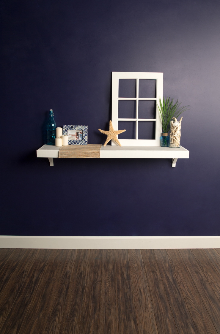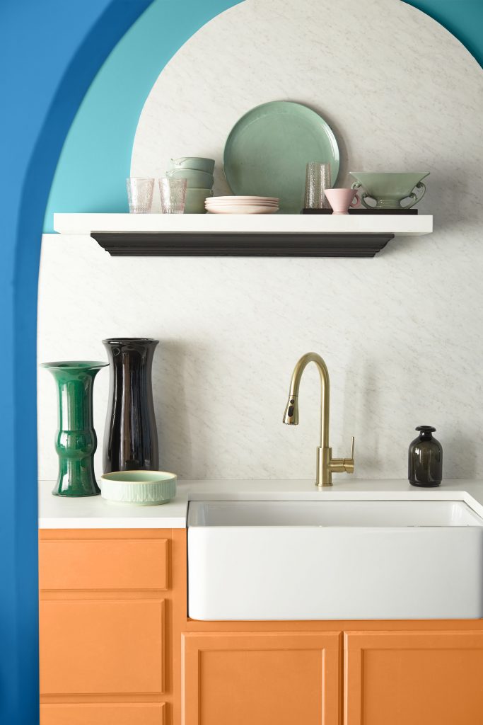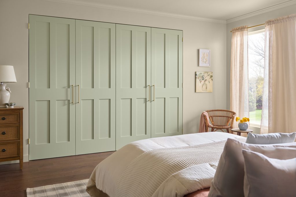
Fall has a way of making us look at home a little differently. A richer wall color, softer lighting or a favorite wood piece can make the rooms we use every day feel more inviting. In a recent interview, designer and lifestyle expert Sabrina Soto shared the fall paint colors she sees carrying into 2027, from earthy reds and muted greens to warm neutral paint colors that work with the things you already love.
In the interview below, Sabrina shares her approach to choosing color, bringing warmth to different rooms and making a few thoughtful updates before holiday guests arrive. Her advice starts with what you have and leaves plenty of room for your own style.
A Look at Sabrina’s Color Picks
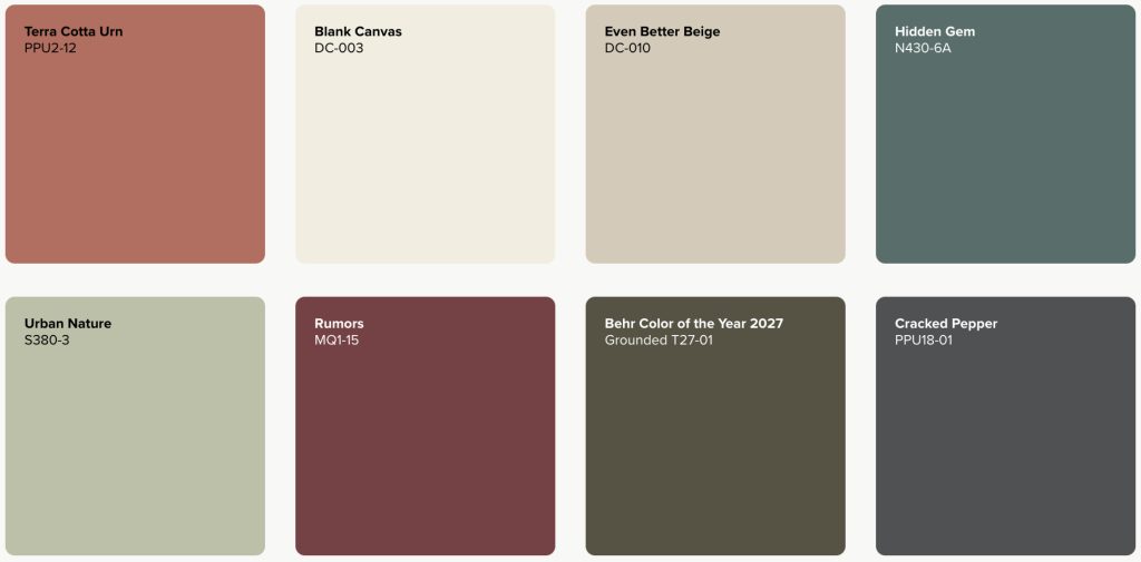
From warm neutrals to earthy greens and richer reds, these BEHR colors reflect the warmth and personality Sabrina highlights in her interview. Explore the palette for inspiration for your own home.
About Sabrina Soto: Sabrina Soto is an interior designer, television host, author and lifestyle expert. She currently hosts The Sabrina Soto Show and will soon be appearing on HGTV’s Totally ’90s House. Her forthcoming book, The Home Within: Design a Life You Love From the Inside Out, explores the connection between our homes and our inner lives, bringing together Sabrina’s two decades of design expertise with her personal perspective on intentional living and reinvention.
Q. What fall color trends are you seeing right now that you expect to carry into 2027? How can homeowners bring these colors into their spaces, and what textures or materials pair especially well with them?
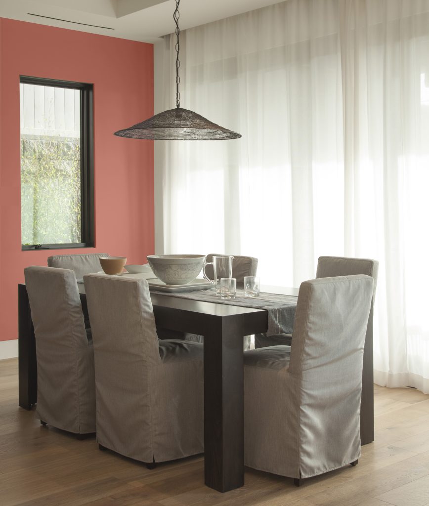
A. I expect the richer fall colors to stay with us, especially earthy reds, browns and muted greens. They’re easy to live with well beyond the holidays. I’d use Terra Cotta Urn PPU2-12in a dining area with linen curtains and wood furniture. If painting the whole room feels like too much, start with one accent wall or a small entryway. Woven baskets, wool rugs and pottery work really well with these colors.
Q. What major color shifts are you seeing emerge for 2027, and what cultural or lifestyle trends are driving these changes?
A. I think we’ll see more people choosing deeper colors for rooms they use every day. There’s so much time spent looking at screens and I think that’s part of the appeal of warmer, softer surroundings. I also think people are getting tired of buying things just to keep up. I just went through my whole house purging and reorganizing. I’ve been surprised by how much I’m enjoying having less stuff. Once you clear things out, you notice the walls and the pieces you kept a lot more. Choosing a paint color that works with the furniture you already own feels more practical and personal.
Q. Are you seeing any changes in the neutrals homeowners are gravitating toward, such as whites and off-whites?
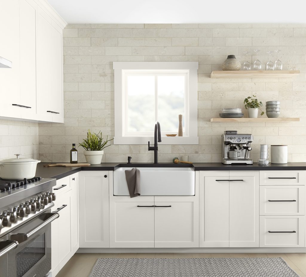
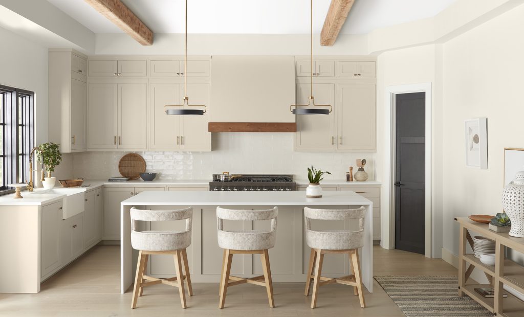
I expect more interest in creamy whites, beige and soft taupe. I like Blank Canvas DC-003 when you want a warm white and Even Better Beige DC-010 when you want a little more color on the wall. The biggest thing is checking that neutral against your floors and countertops. A white that looks beautiful in someone else’s kitchen can look completely different in yours.
Q. Half of Americans say they spend more time choosing the perfect paint color than choosing furniture. Do you have tips to help consumers feel confident experimenting with new paint colors?
A. Start with something in the room you already love, like a rug or a piece of art. Pull a color from that. Narrow it down to two or three samples. Twenty options on the wall will make anyone second-guess themselves! Paint large sample boards and move them around the room. Look at them during the day and again with your lamps on at night. Put them beside the sofa, the flooring and anything else that’s staying. You’ll have a much easier time deciding when you can see everything together.
Q. How do these emerging color trends differ from what we’ve seen in recent years? Are homeowners moving away from particular colors or design styles?
A. I think the all-gray room and the perfectly matching furniture set will feel less appealing as people get more comfortable mixing things. I’d love to see more rooms with an older wood table, a comfortable sofa and art someone bought because they loved it. Warmer paint colors work beautifully with that mix. You also don’t have to replace your gray sofa to participate. A warmer wall color and a patterned rug can change how it looks in the room.
Q. Are these shades replacing any popular 2026 colors? If so, which ones?
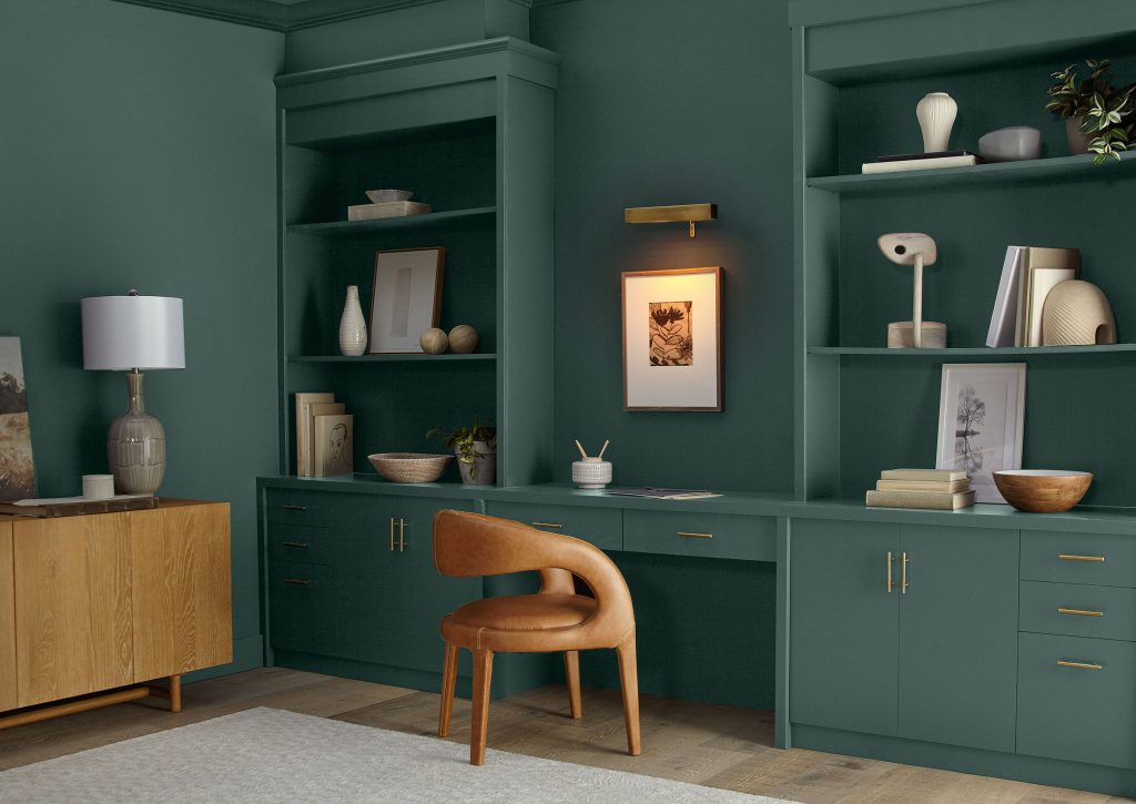
A. I wouldn’t tell someone to paint over a color they love because the calendar changed. I expect greens like BEHR’s 2026 Color of the Year, Hidden Gem N430-6A, to keep working well into 2027. What I’d change is what goes with them. Pairing a green with warmer wood, cream upholstery or a brown patterned fabric can give the room a different feel without repainting.
Q. Are you seeing any trends specific to different rooms, such as bedrooms, bathrooms, living rooms and kitchens?
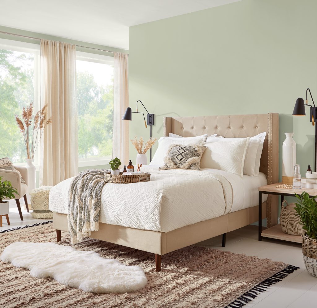
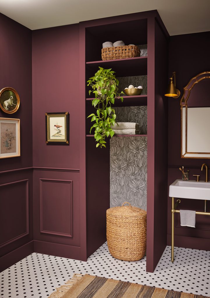
A. For bedrooms, I expect continued interest in softer greens and warm neutrals. Urban Nature S380-3 would be a pretty starting point with simple bedding and wood nightstands. Living rooms can take a warmer beige or a deeper color, depending on the light and how you use the space. In kitchens, I like color on an island with quieter surrounding cabinets. Powder rooms are a good place to try something richer like Rumors MQ1-15, especially if you’ve been nervous about using a deep red elsewhere.
Q. Looking ahead to 2027, is there one color family you’re especially excited to work with? Where would you incorporate it in your own home?
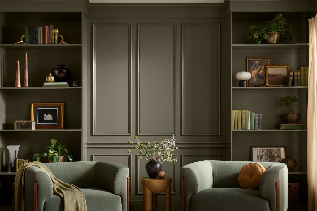
A. Greens would be my pick!! I’m working on a project right now and my contractor keeps laughing that I’m in a green phase. He’s not wrong. I want to put it everywhere! There’s so much range. They work with many of the materials I love, especially wood and woven textures. In my own home, I’d consider an earthy olive like Grounded T27-01, your 2027 Color of the Year, on a bookcase or in a reading corner. I’d pair it with a comfortable chair, a good lamp and somewhere to put my coffee. We’re seeing homeowners gravitate toward spaces that feel lived-in and real.
Q. What design choices and color palettes can help create that feeling going into 2027?
A. Keep the things that mean something to you, even if they don’t all match. A piece of furniture you inherited can sit next to something you just bought. Start with a color from an existing rug or painting and use it to connect the room. Cream, muted green and warm wood are a combination I’d come back to. Leave room for family photos and the things you actually use. You should be comfortable putting your feet up in your own living room.
Q. What are your tips for getting a room ready for holiday hosting? Are there any paint colors or palettes you recommend for creating a warm, welcoming space?
A. Before buying decorations, make room for people. Clear a surface for drinks, check the seating and add lamps where the lighting feels harsh. Warm beige walls with cream linens and greenery make an easy holiday backdrop. A deeper red like Rumors would be beautiful in a dining room with wood furniture and candlelight. If you’re painting before hosting, give yourself enough time for the prep, drying and ventilation recommended on the label.
Q. As people refresh their spaces for 2027, what are some easy paint projects that make a big impact without a full renovation?
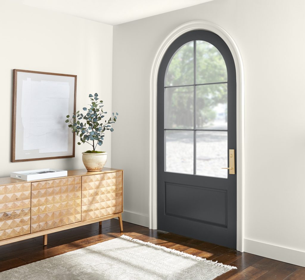
A. The back of a bookcase is a great place to start. You get a little color behind the things you already display. It’s also a manageable project. An interior door or a small entryway can also make a noticeable difference. I’d try Grounded behind shelves or Cracked Pepper PPU18-01 on a door. Choose one area you see every day and finish that before taking on the next project. Cleaning the surface and doing the right prep will make a big difference in the result.
A Home That Feels Like You
What I love about Sabrina’s approach is how much room it leaves for the things that make a home yours. A favorite rug can lead you to a wall color, and a bookcase or door can be a place to try something new. As you explore paint colors for fall and the year ahead, start with a space you enjoy spending time in and see where a little color takes you.
For more paint color inspiration and decorating ideas, explore Colorfully BEHR and Behr.com, including Sabrina’s ideas for decorating with Grounded. To discover more about her design style, projects and inspiration, visit SabrinaSoto.com.
Colorfully yours,
Larayne
BEHR Color Questions
Earthy reds, browns and muted greens can carry a fall-inspired room into everyday living. Try BEHR Terra Cotta Urn PPU2-12 with wood furniture and linen, or use a smaller accent area to introduce color.
Start with BEHR Blank Canvas DC-003 for a creamy white or BEHR Even Better Beige DC-010 for more color on the wall. Compare samples beside your flooring, countertops and upholstery in your own lighting.
BEHR Grounded T27-01, the 2027 Color of the Year, is a mossy olive green with earthy brown undertones. Consider it for a bookcase or reading corner paired with wood and woven textures.
Consider BEHR Urban Nature S380-3 with simple bedding and wood nightstands in a bedroom. For a richer powder-room look, explore BEHR Rumors MQ1-15. Sample each color in the room before deciding.
Narrow your choices to two or three samples. Paint large movable sample boards and compare them beside the furniture and finishes you are keeping. View them in daylight and with your lamps on at night.
Consider painting the back of a bookcase, an interior door or a small entryway. BEHR Grounded T27-01 can add color behind shelves; BEHR Cracked Pepper PPU18-01 offers a soft black option for a door. Choose suitable paint and follow its preparation directions.