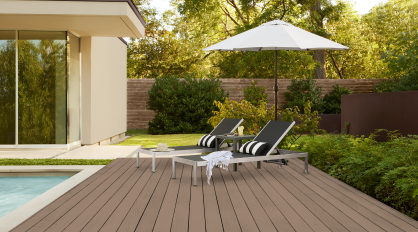
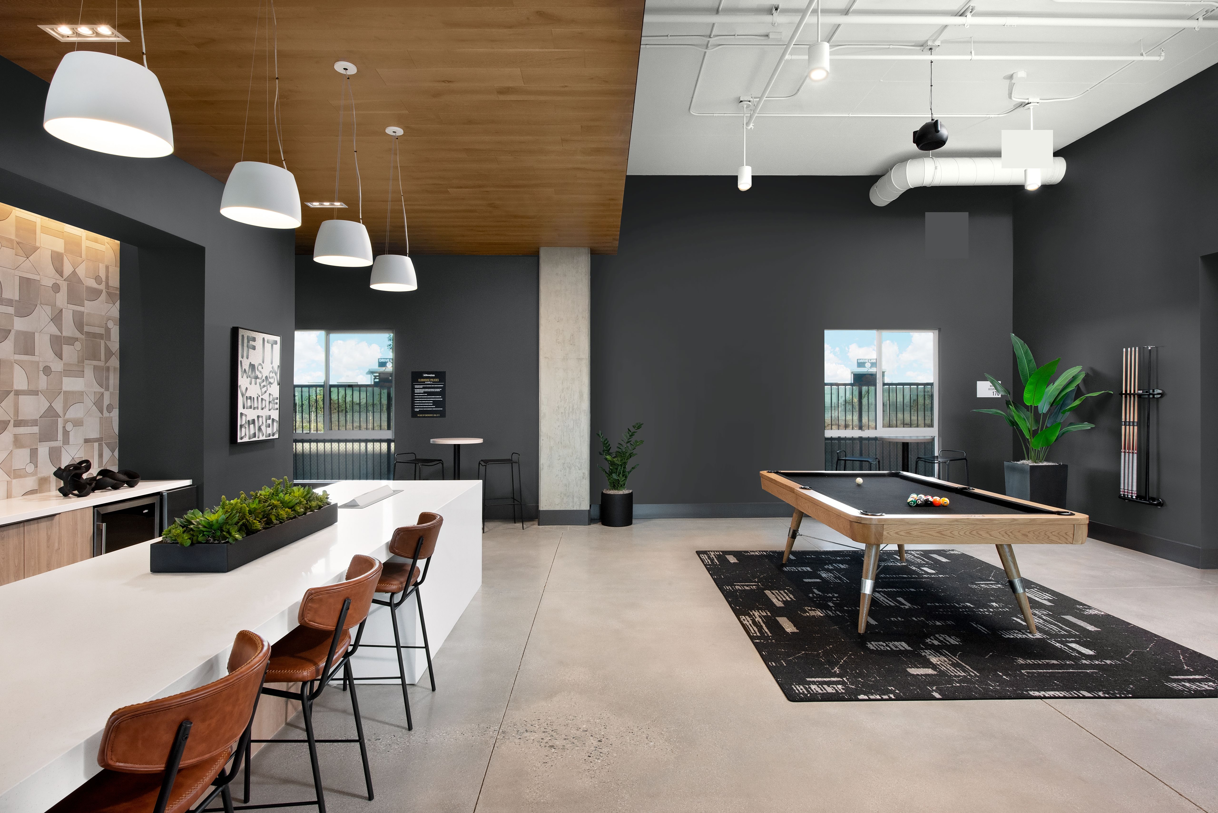
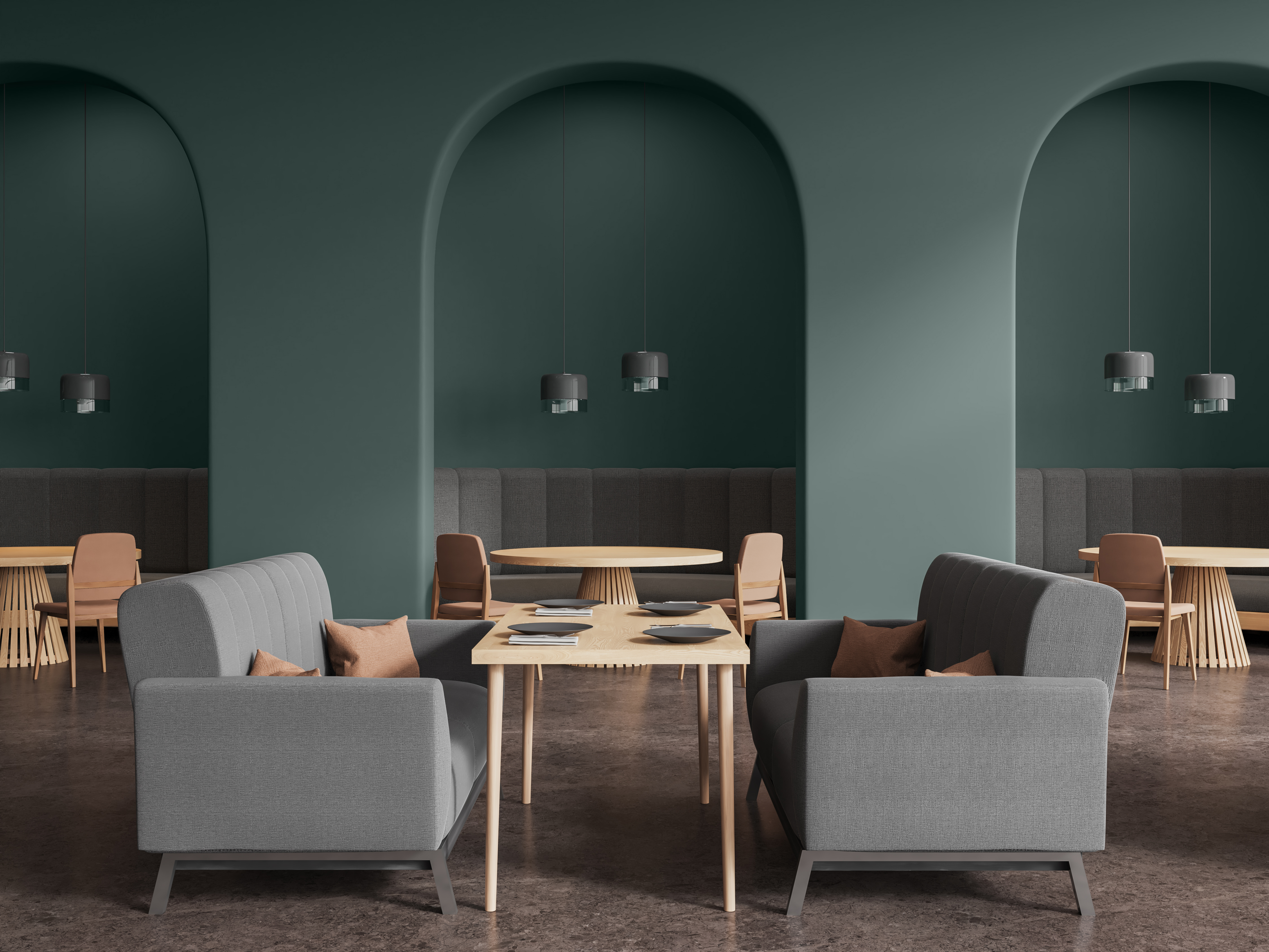
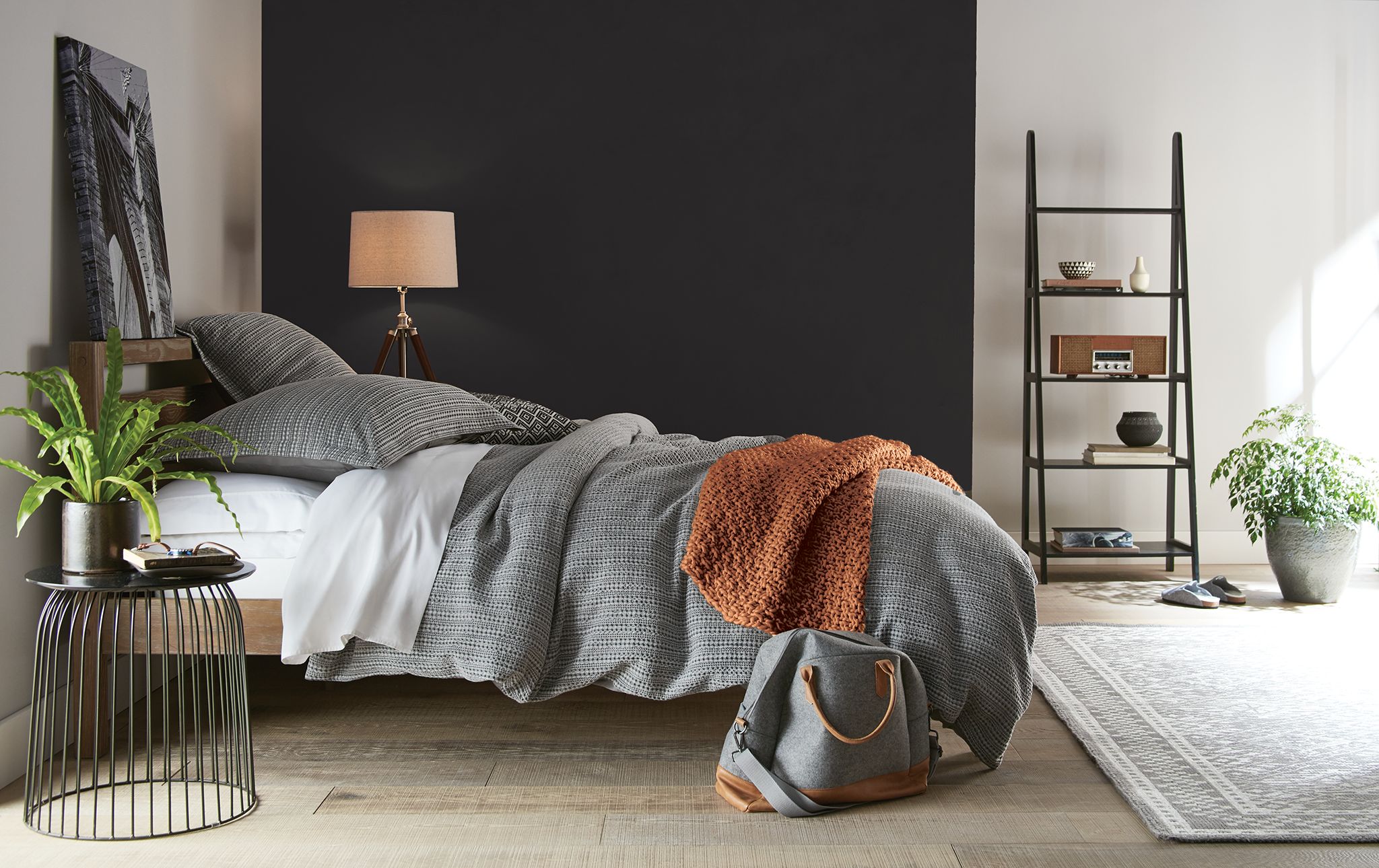
In the world of paint, popularity of colors change and styles come and go — but the use of accent colors remain as popular as ever. The addition of an intriguing color to just one wall of a room draws the eye and establishes a point of focus as well as a feeling of spaciousness. Infusing energy into even the most yawnsome spaces, accent colors provide a bold, budget-friendly way to make a statement.
When designing a colorful space, consider no more than one or two accent colors. They can be bold, vivid, dark, and even neutral and should either complement or contrast the principal hue. Just be sure to use accents sparingly, as their purpose is to enhance, not overshadow, the dominant color. To foster a sense of flow, sprinkle the color throughout the area via artwork, window coverings, and furniture.
A simple rule of thumb when divvying up color in a room is as follows: The main color should cover 60 percent, with 30 percent earmarked for the secondary color. This leaves 10 percent for the accent color(s).
One of the beauties of accent colors is that they provide a great opportunity to incorporate a unique, eye-catching color, pattern or texture without a huge commitment. This makes them particularly attractive to homeowners and property managers experimenting with hues.
And, some property managers now allow, or are considering allowing, residents to choose their paint colors for the interiors of their units with or without an extra deposit or higher rent. Of course, there will be other specifics to work out (e.g., number of walls, which areas). Just make sure that any and all proposed modifications are clearly spelled out in the contract and that all parties understand and approve them.
In the end, accent colors can make a home more alluring and provide a great way to enhance the character and sense of fun in a space — as adding even a little bit of liveliness makes a huge difference. Accent colors also encourage experimentation — inviting you to go big, especially in gathering areas.
When it’s time to choose the perfect shade, here are Behr Paint Company’s top 12 accent colors to brighten and enhance your clients’ living spaces.
Behr Paint Company’s Top 12 Accent Colors
BLACK* — As pure and dark as it gets, this shade from the BEHR® DESIGNER COLLECTION palette is a timeless color that adds a dramatic depth and flow to living spaces.
Greige (PPU24-11)* – This BEHR DESIGNER COLLECTION color combines medium-gray and a warm, sandy beige that is both elegant and welcoming.
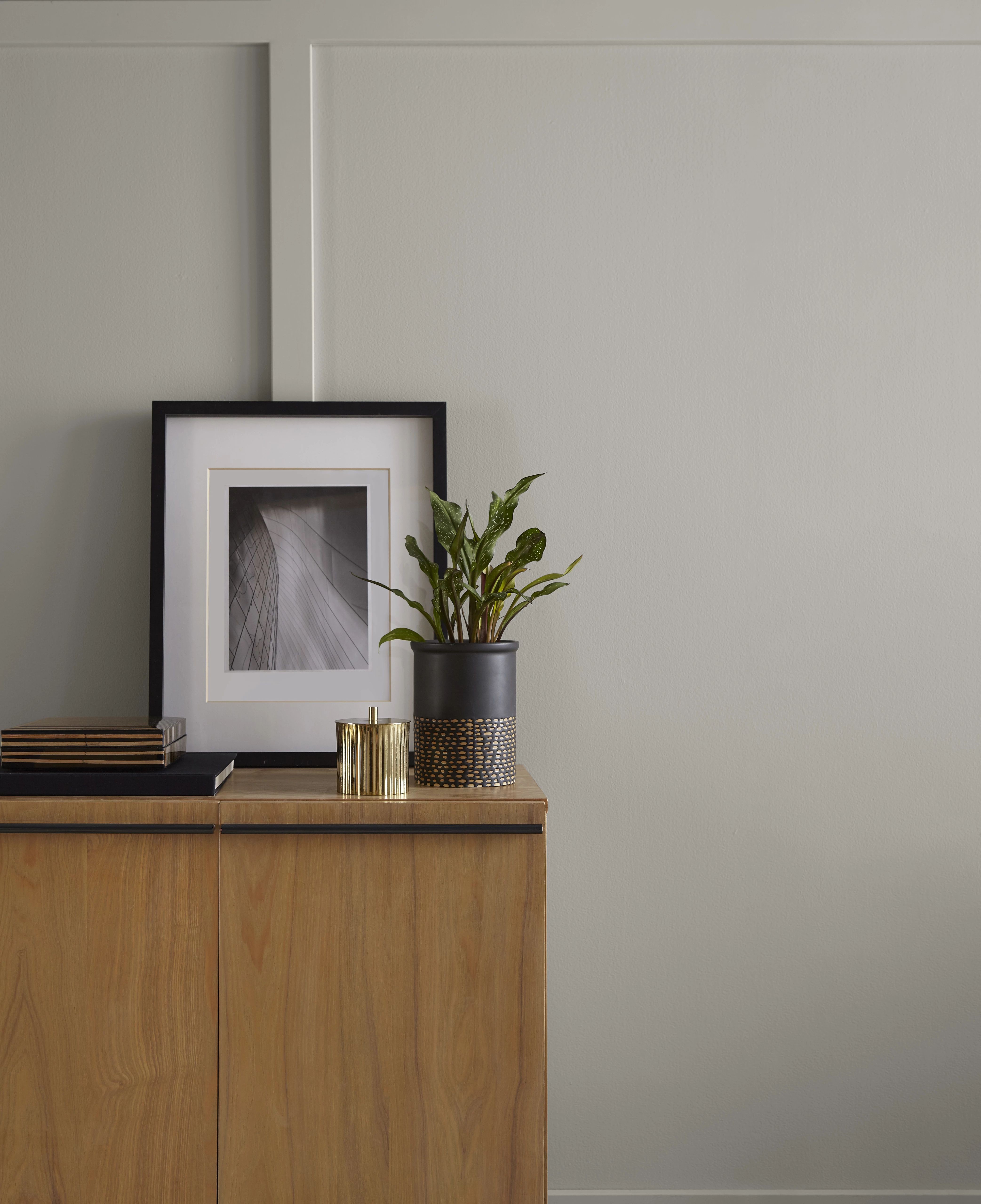
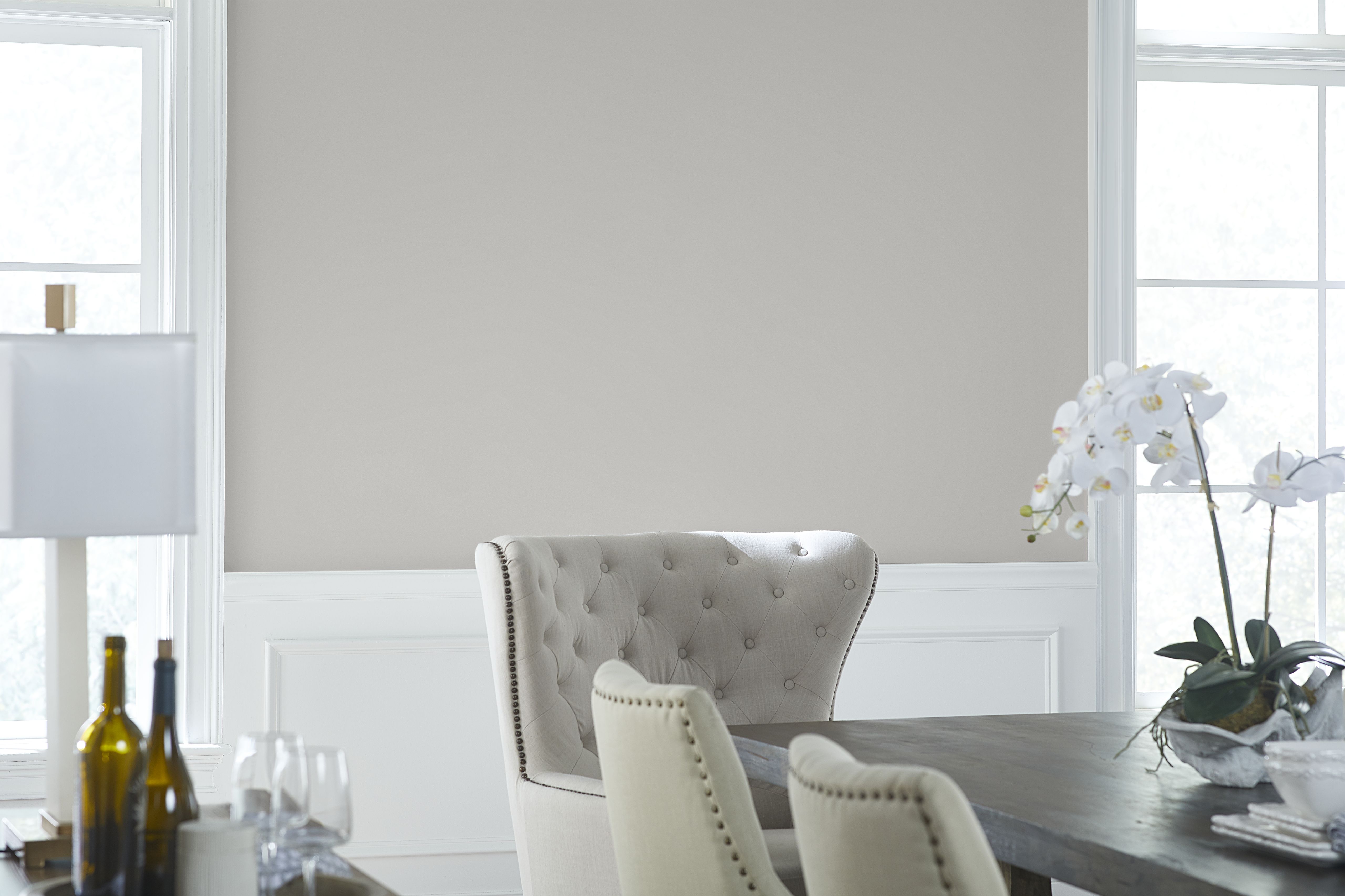
Classic Silver (PPU18-11)** — This popular light gray found in the BEHR DESIGNER COLLECTION palette reflects sophistication and refined simplicity.
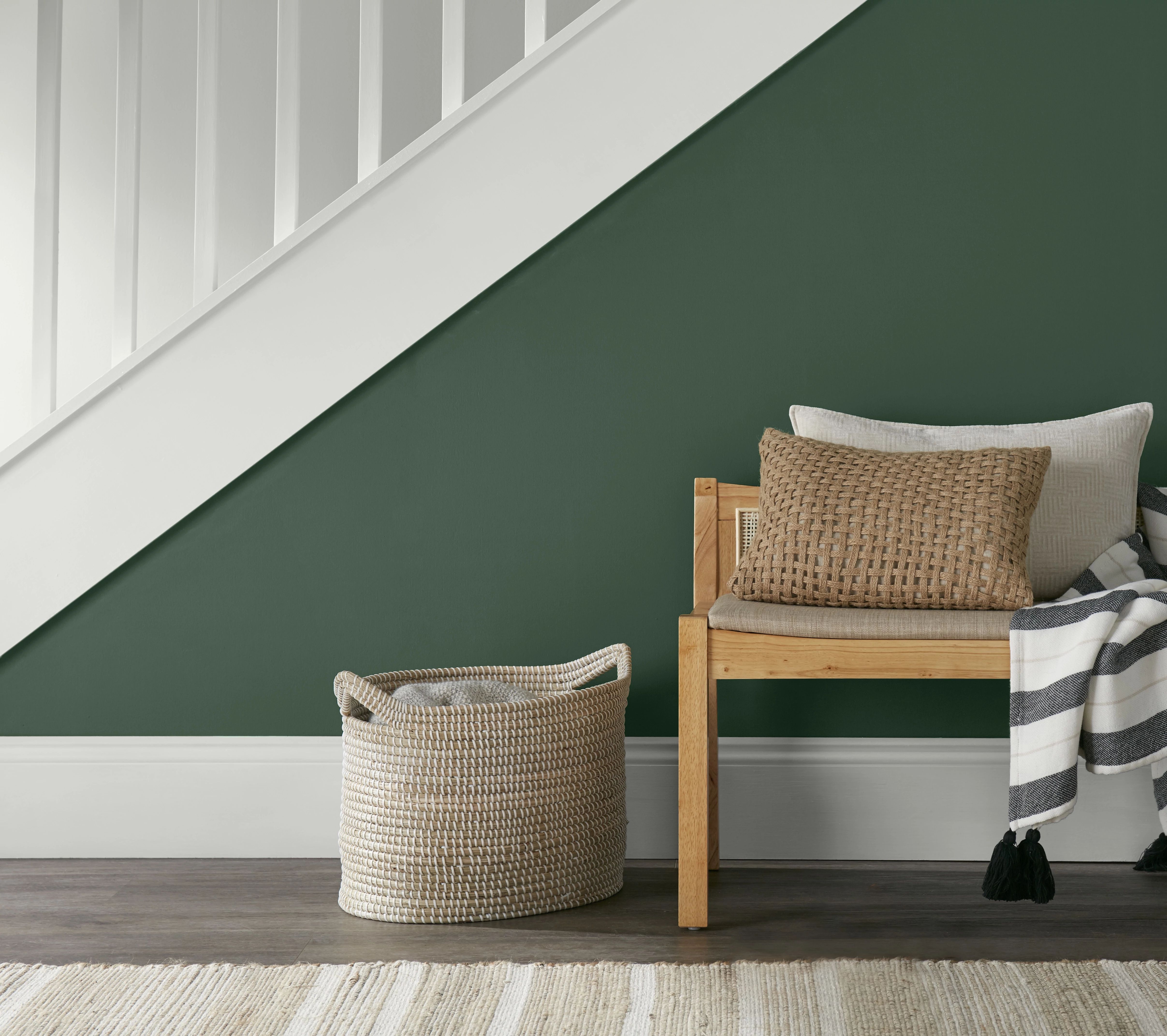
Vine Leaf (N400-7)* — Inspired by the beauty of the deep forest, this green from the BEHR DESIGNER COLLECTION palette is bold and modern.
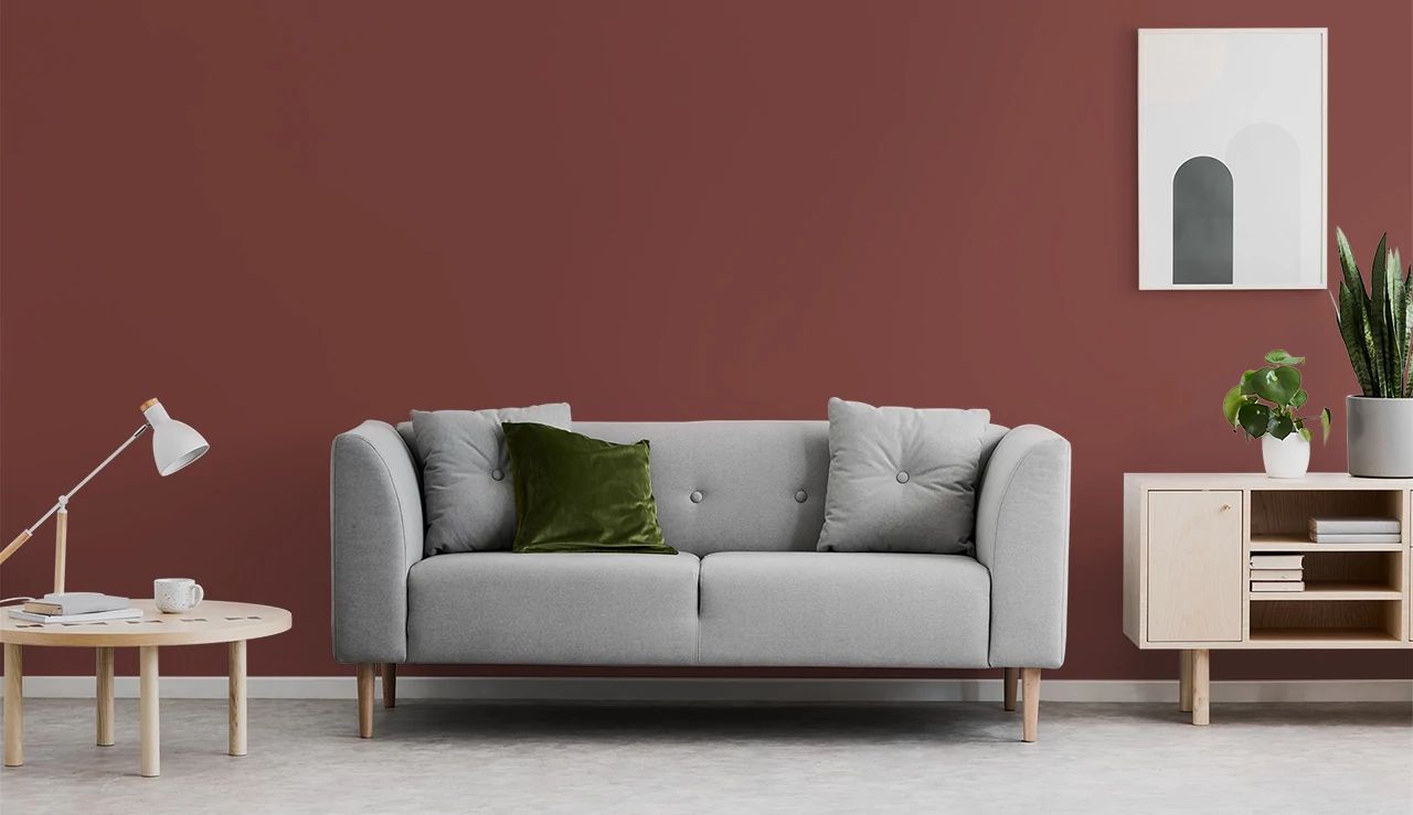
Red Pepper (PPU2-02)* — This self-assured, smoky hue works beautifully in gathering areas, such as living rooms or community common areas.
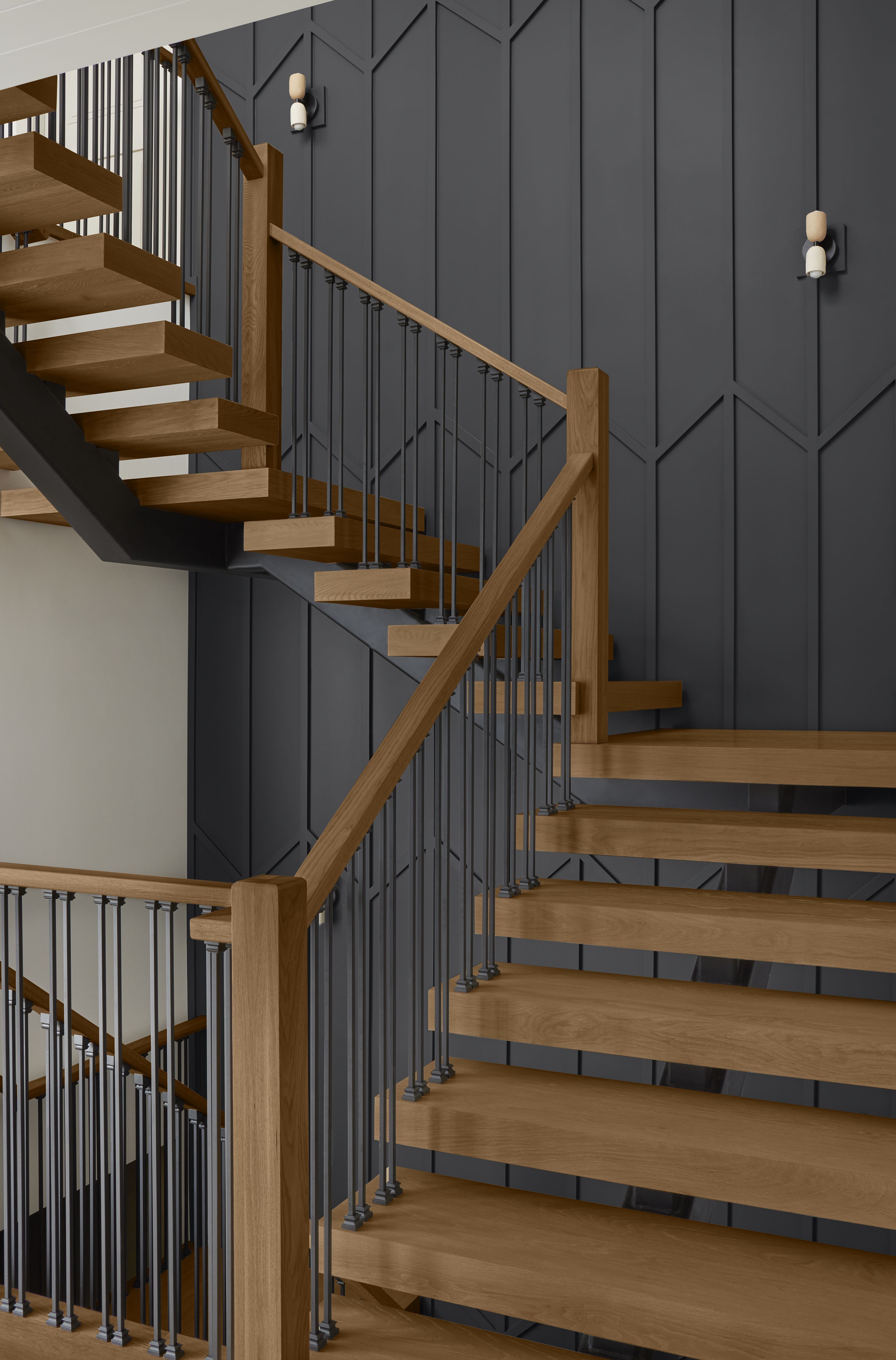
Cracked Pepper (PPU18-01)* – Part of the BEHR DESIGNER COLLECTION palette, Cracked Pepper is a rich, solid gray that makes an instant first impression in areas such as entryways and hallways.
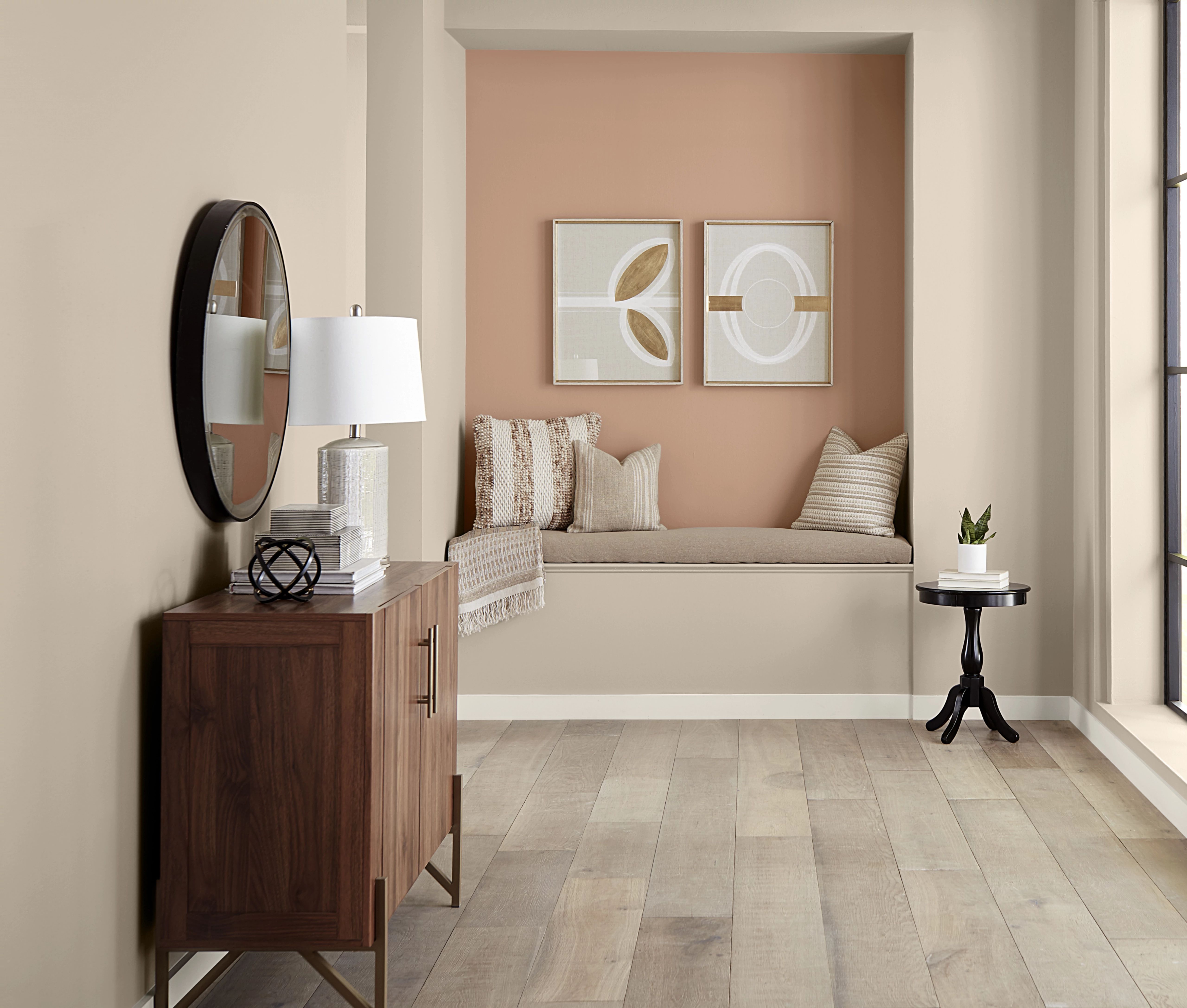
Canyon Dusk (S210-4)** — Behr’s 2021 Color of the Year, Canyon Dusk is a relaxed, terracotta earthtone that establishes a comforting, easy-going vibe.
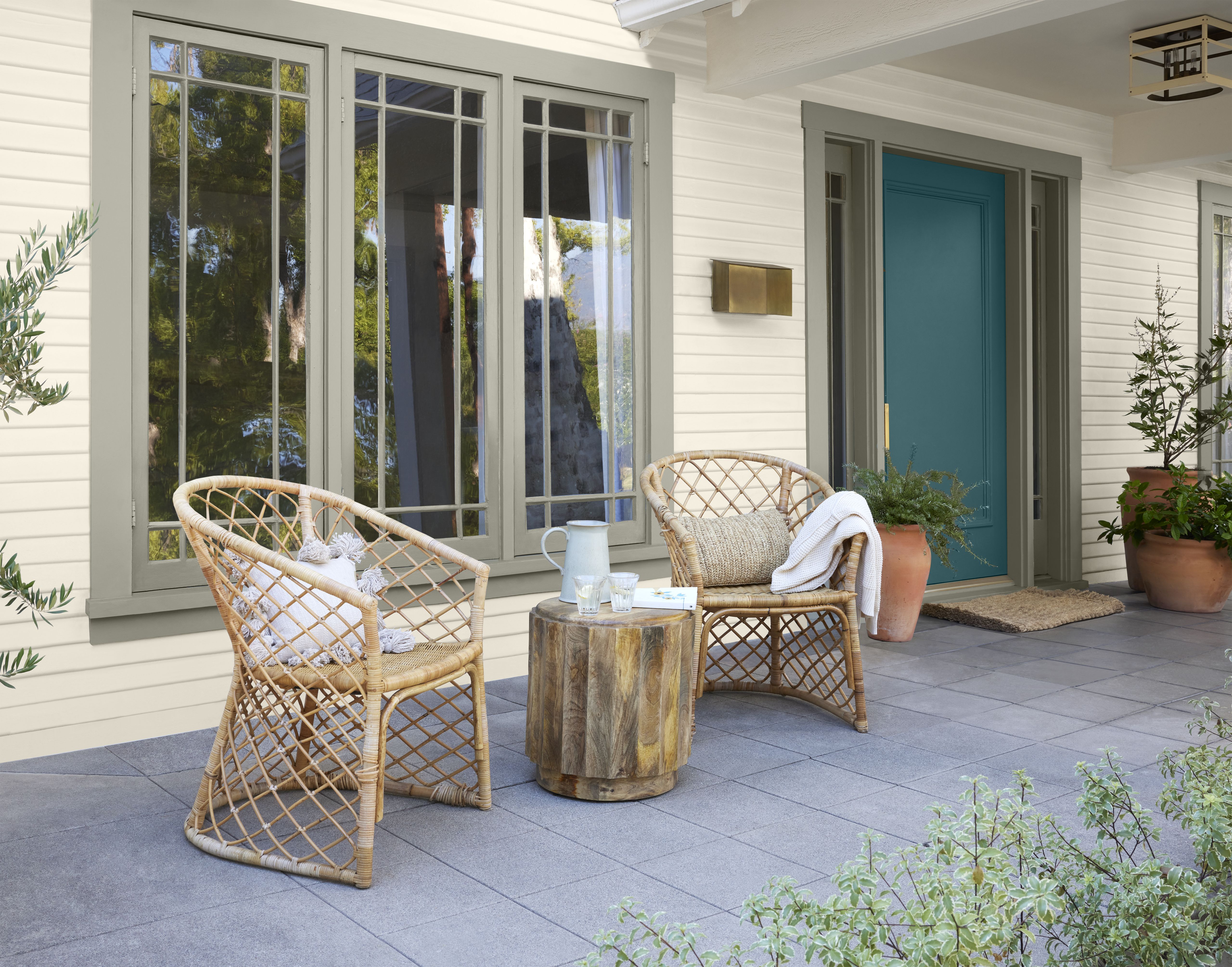
Sophisticated Teal (HDC-CL-22) — A beautifully blended deep blue-green, this Behr 2023 Color Trends color emanates confidence and charisma.
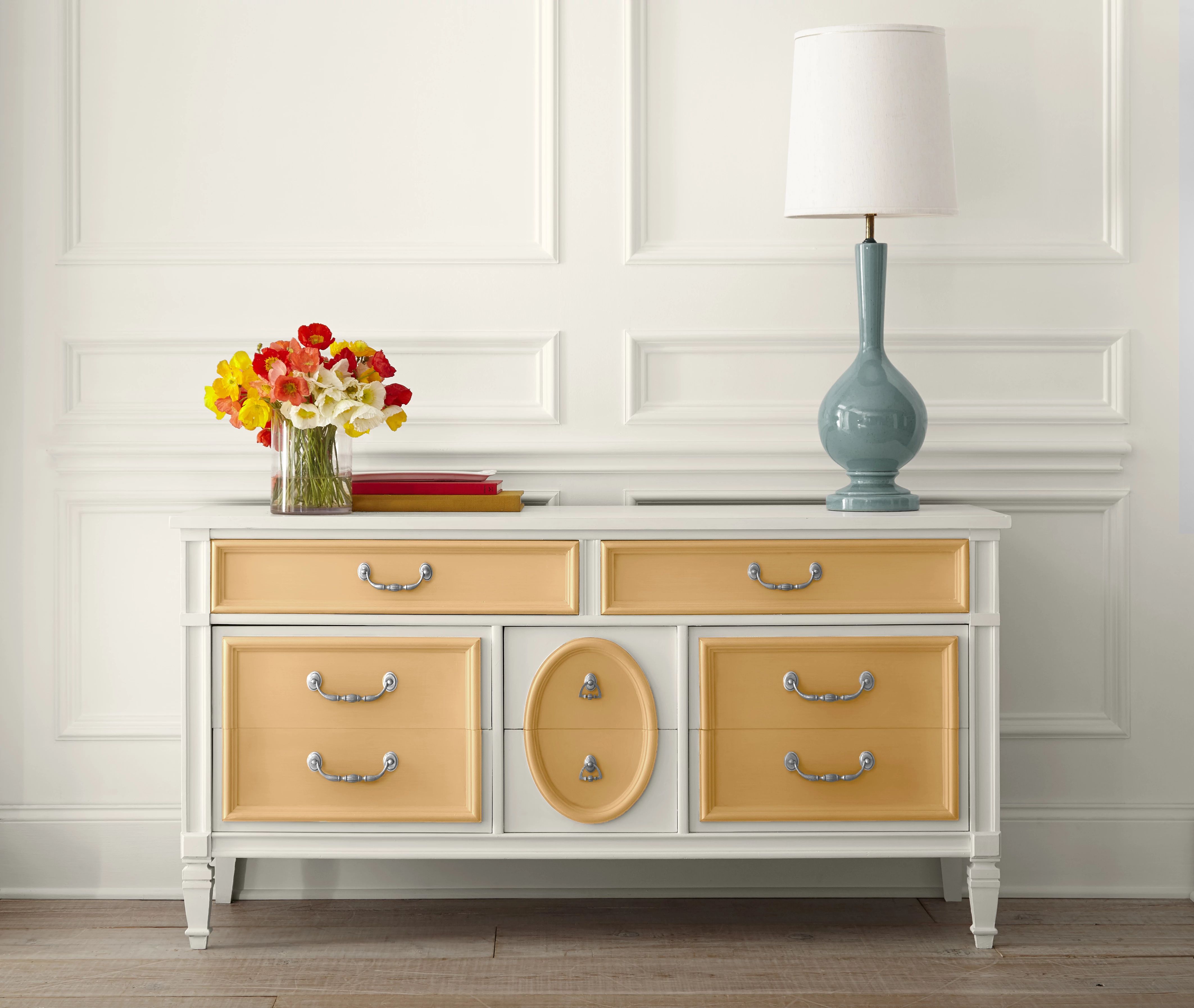
Cellini Gold (HDC-CL-18)** — This color exudes an exquisite, timeless gold tone — a brilliant hue that can make accent furnishings glow.
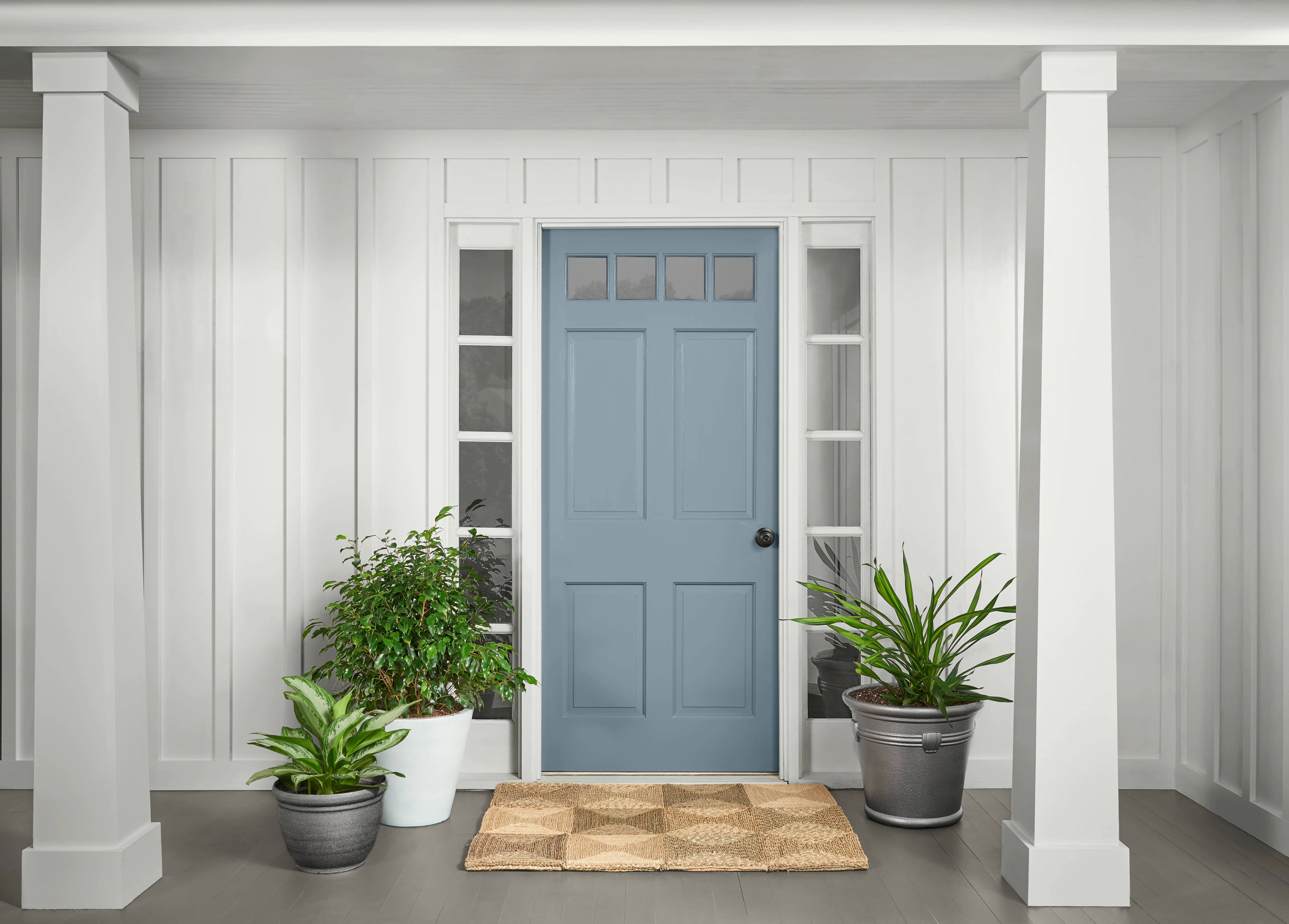
Adirondack Blue (N480-5)** — Naturally reassuring, this slate blue from the BEHR DESIGNER COLLECTION palette echoes the misty peaks of New York’s famous mountain range.
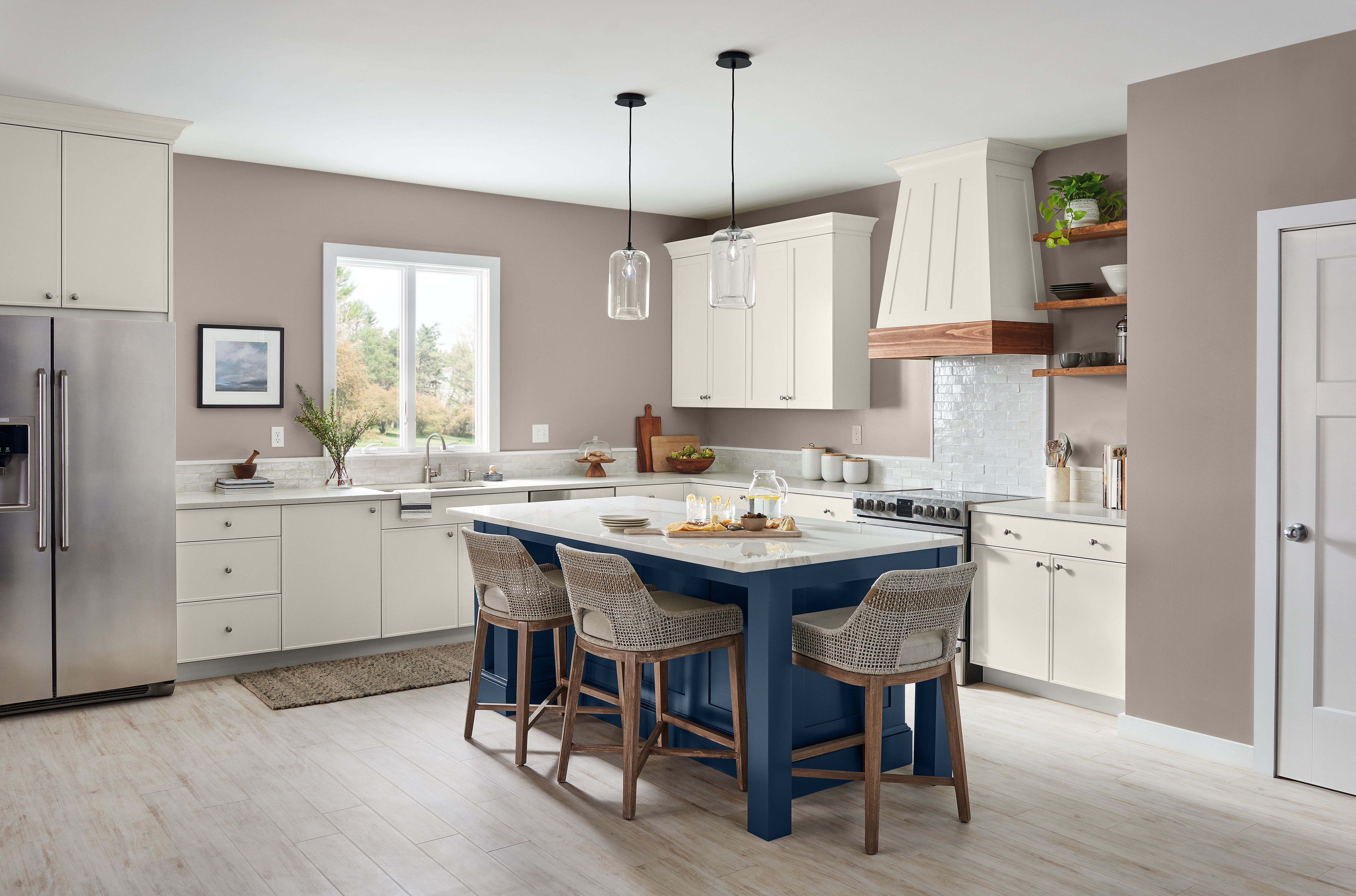
Compass Blue (MQ5-54)* — Bold and harmonious, Compass Blue is an inky navy that embraces the spirit of adventure.
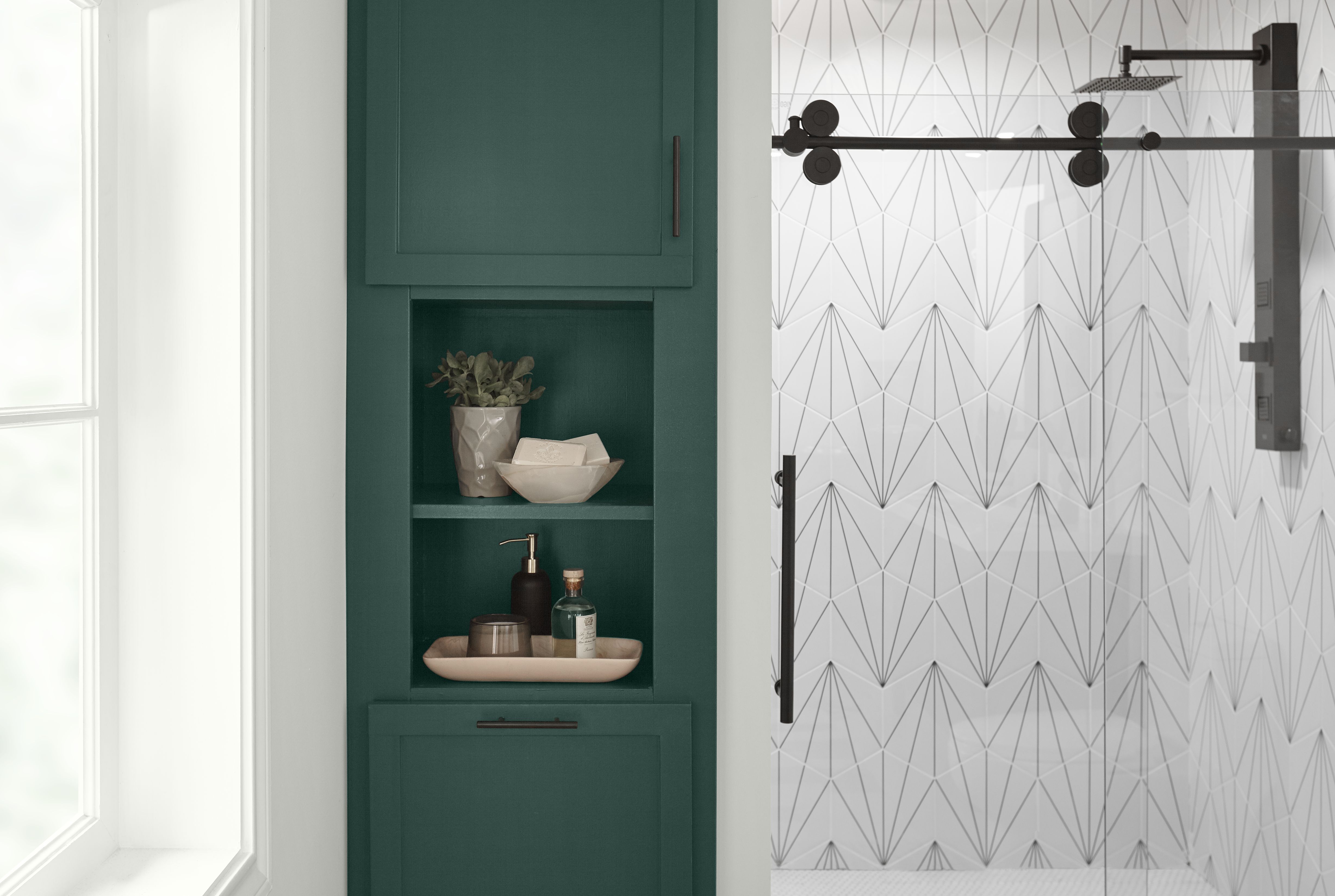
Dark Everglade (HDC-CL-21A) — This deep-green gem from the BEHR DESIGNER COLLECTION palette creates an environment that is both refreshing and grounding.
There’s a plethora of bold, bright and beautiful hues from which to choose — and Behr’s top 12 accent colors are perfect for leaving a lasting impression!
*Guaranteed ONE-COAT HIDE when tinted into BEHR DYNASTY® and MARQUEE® Interior Paint. Limitations apply. For more information, visit the One-Coat Color Guarantee page.
**Guaranteed ONE-COAT HIDE when tinted into BEHR DYNASTY® and MARQUEE® Interior or Exterior paint. Limitations apply. For more information, visit the One-Coat Color Guarantee page.