A Fresh Take on Cabbage-Inspired Color
Rooted in nature and softly unexpected, Garden Layers draws inspiration from the layered beauty of cabbage leaves. This palette brings together earthy greens, petal-like blush, and rich vegetable garden contrast to create rooms that feel grounded, lush, and quietly expressive.
Inspired by the 2026 trend Cabbage Crush, Garden Layers celebrates the depth found in nature; from pale leafy greens to deeper botanical tones and berry-inspired accents.
Layering Earthy Green Paint Colors
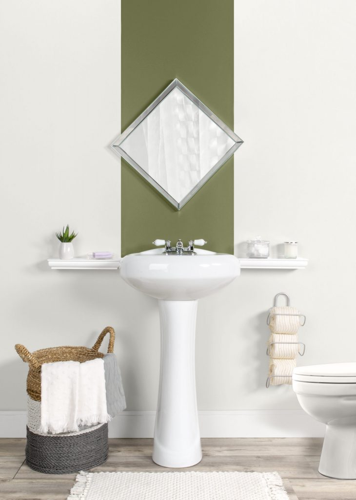
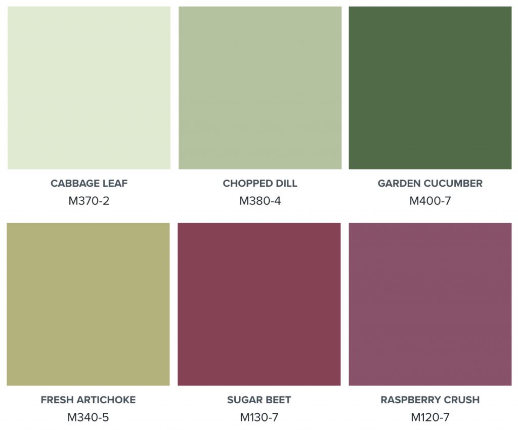
Green is the heart of this palette. Cabbage Leaf M370-2 brings a soft, airy quality, while Chopped Dill M380-4 adds a grounded botanical feel. For deeper contrast, Garden Cucumber M400-7 creates a rich, organic statement.
Together, these green paint colors offer a fresh way to bring the outdoors in especially when paired with warm whites, natural wood, woven textures, stone, and linen.
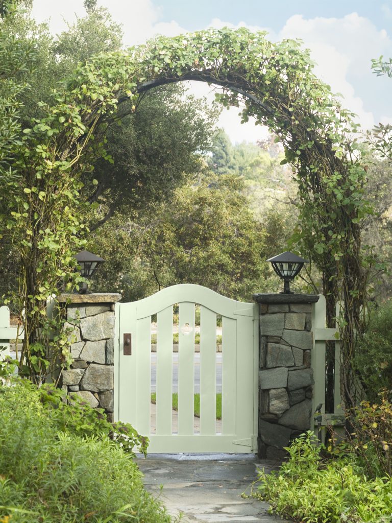
Cabbage Leaf M370-2 shows how a lighter green can feel fresh, welcoming, and quietly polished outdoors. On this garden gate, the soft leafy hue creates a gentle transition between the built environment and surrounding landscape, layering naturally with stone, vines, and greenery while keeping the overall look airy and inviting.
Botanical Color for Dining Spaces
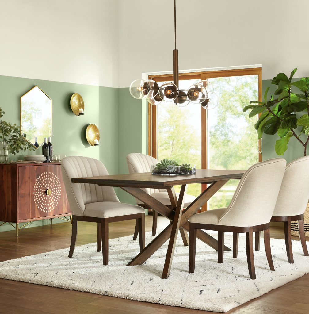
In dining rooms, green can feel both elegant and welcoming. Chopped Dill M380-4 brings a soft, garden-inspired mood that feels fresh without overpowering the space.
Try it with warm wood, brass accents, cream seating, botanical décor, and natural light for a layered dining room color palette.
Deeper Greens for Drama
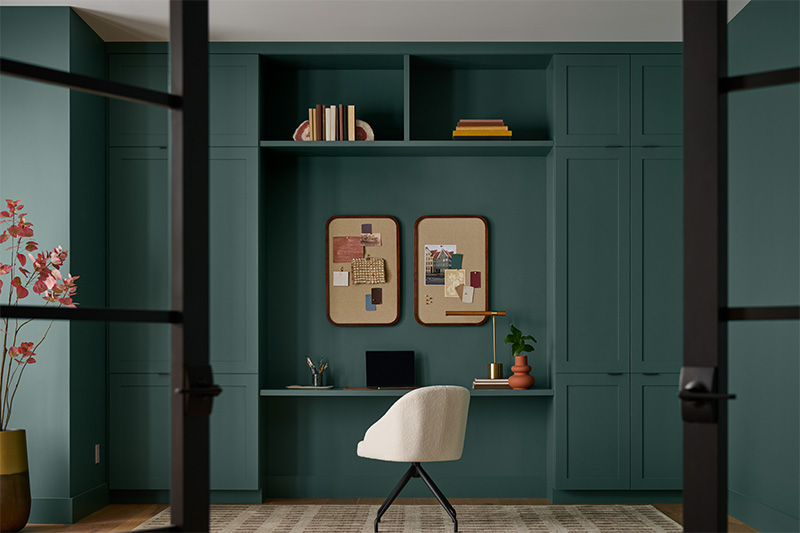
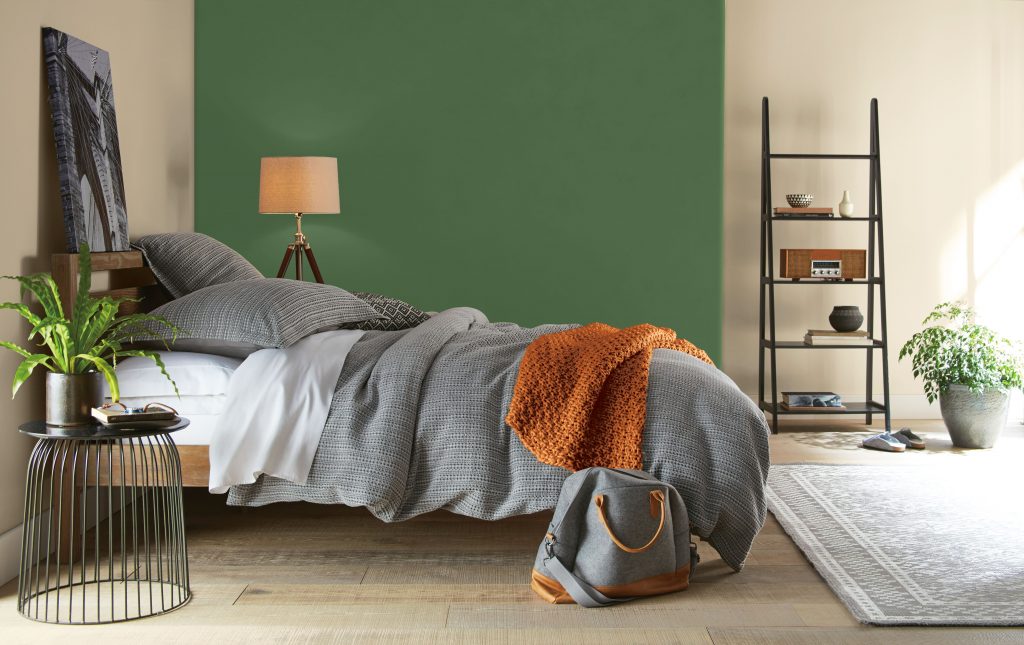
For a bolder look, Garden Cucumber M400-7 offers a deeper green that works well as a focal wall or color-drenched moment. It brings depth and structure to bedrooms, lounge spaces, or any room where you want a more enveloping feel.
Balance deeper greens with warm neutrals, gray textiles, wood tones, and earthy accent colors.
Soft Greens for Restorative Rooms
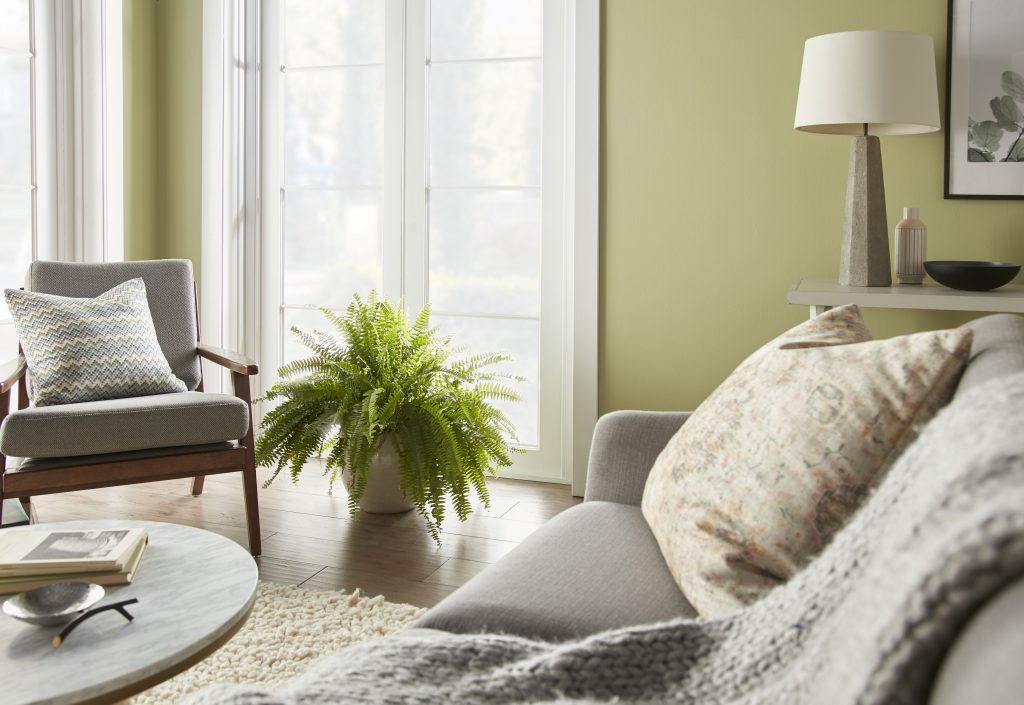
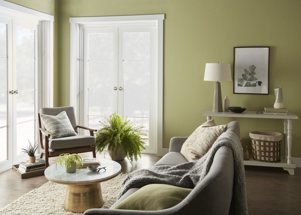
For rooms where comfort and calm are key, softer greens can create a soothing backdrop. Fresh Artichoke M340-5 works beautifully in living areas, adding warmth while still feeling organic and fresh.
This type of green wall paint pairs especially well with wood tones, cozy textiles, creamy neutrals, and plenty of natural light.
Blush and Berry Accents
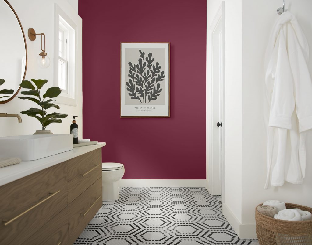
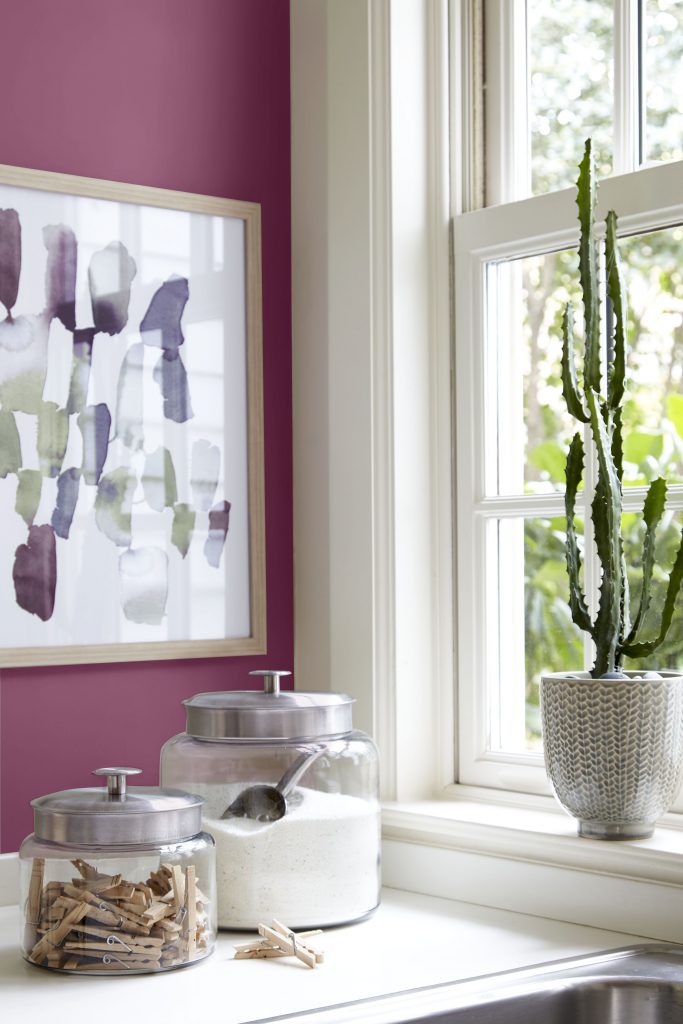
The Garden Layers palette also includes unexpected warmth through Sugar Beet M130-7 and Raspberry Crush M120-7. These berry-inspired hues add contrast and personality, especially in smaller spaces like baths, laundry rooms, or accent walls.
Used thoughtfully, these tones echo the rich colors found at the heart of vegetables like cabbage, radicchio, and beets.
How to Use the Garden Layers Palette
| Color | Description | Best Uses |
|---|---|---|
| Cabbage Leaf M370-2 | Soft, muted light green | Bedrooms, small rooms, garden gates, exterior accents |
| Chopped Dill M380-4 | Organic light gray-green hue | Dining rooms, living rooms, feature walls |
| Garden Cucumber M400-7 | Dark, earthy deep green | Bedrooms, accent walls, color-drenched spaces |
| Fresh Artichoke M340-5 | Warm yellow-green hue | Living rooms, cozy neutral spaces |
| Sugar Beet M130-7 | Moody, muted dark pink | Bathrooms, powder rooms, dramatic focal walls |
| Raspberry Crush M120-7 | Dramatic blush-berry accent | Laundry rooms, art walls, accent moments |
Bringing Garden Layers Home
Garden Layers is all about nature-inspired balance. Soft greens create calm. Deeper greens add grounding. Blush and berry tones bring warmth and contrast.
Whether used indoors or outdoors, this cabbage-inspired color palette offers a fresh way to create spaces that feel layered, botanical, and beautifully lived-in.
Check out behr.com for green paint color inspiration, paint products, sheen guidance and more.
Colorfully yours,
Larayne
Garden Layers centers on cabbage-inspired greens and vegetable garden accents. Core recommendations include Cabbage Leaf M370-2, Kiss Good Night M120-2, Chopped Dill M380-4, and Radicchio 690D-7. Supporting tones include Garden Cucumber M400-7, Raspberry Crush M120-7, Sugar Beet M130-7, and Fresh Artichoke M340-5.
References: Behr paint colors
Use lighter greens where you want an airy, restorative feel, mid-tone greens for living and dining spaces, and deeper greens for focal walls or enveloping rooms. Add blush or berry-toned accents when the space needs warmth and contrast.
References: Color inspiration | Behr paint colors
Pair botanical greens with warm whites, creamy neutrals, natural wood, stone, woven textures, and linen. For a more expressive look, layer blush pink, artichoke yellow-green, or deep radicchio-purple accents.
References: Behr paint colors | Color inspiration
Yes. The palette can translate from interior walls and dining rooms to exterior garden gates, porch details, shutters, and outdoor living moments when the selected product and sheen match the surface.
References: Interior paint | Exterior paint
Choose sheen by surface and traffic level. Lower-sheen finishes can soften bedroom and living room walls, while satin or semi-gloss options are better suited to areas that need added durability, moisture resistance, or easy cleaning.
References: Interior sheen guide