walls: Hidden Gem
A living room rarely serves just one purpose. It can be a place to gather, recharge, entertain, read, watch a favorite movie or simply enjoy the changing light throughout the day. The right living room paint color can help bring all of those moments together while giving the space a distinct mood and personality.
Beyond setting the mood, paint can help define the room itself. It can highlight architectural details, frame a view, give artwork greater presence or help an open living space feel more intentional.
The best paint colors for living rooms depend on the atmosphere you want to create. Light whites and soft neutrals can make a room feel bright and airy; warm beige, brown and earth tones can add comfort; blues and greens can create a calm, restorative feeling; and deeper, saturated hues can bring richness, intimacy and definition.
Whether your style leans classic, contemporary, modern organic, eclectic or somewhere in between, explore these living room paint color ideas across every major color family to find a shade that feels right for your home.
How to Choose the Right Living Room Paint Color
When choosing a living room paint color, start with the elements that are least likely to change—flooring, fireplaces, built-ins, large furniture pieces and architectural details. These fixed features can provide important clues about which colors and undertones will work best.
Next, think about how you want your living room to feel. Lighter colors can create an open, airy atmosphere, while warm neutrals, browns and earthy hues often make a space feel comfortable and inviting. Blues and greens can introduce a calmer, nature-inspired mood, while deeper saturated shades can create intimacy, drama and definition.
Also consider how the living room connects to adjoining spaces. In an open-concept home, a versatile wall color can create visual continuity, while a deeper or contrasting shade can help define the living area within a larger floor plan.
Most importantly, sample paint colors in the room itself. Natural and artificial light can change how a color looks throughout the day. BEHR® paint colors are available through Samplize peel-and-stick samples, making it easy to move colors from wall to wall and see how they interact with your lighting, furnishings and finishes. Compare your samples in morning, afternoon and evening light before making your final choice.
How Does Lighting Affect Living Room Paint Colors?
Lighting can dramatically influence how a paint color appears. A shade may look warmer in afternoon sunlight, cooler in indirect light or deeper after sunset under artificial lighting.
Living rooms with abundant natural light can often support deeper or more saturated colors, while rooms with limited daylight may benefit from lighter or warmer hues that help create a brighter, more inviting feel.
Pay attention to the direction your windows face, the amount of daylight the room receives and the temperature of your light bulbs. Rather than choosing a color based only on a screen or paint chip, test it in the space and observe how it changes throughout the day.
What Are the Best Paint Colors for a Living Room?
There is no single best color for every living room. The right choice depends on the room’s natural light, furnishings, architecture and the mood you want to create.
For a bright and airy living room, consider whites, creams, pale neutrals or soft blues. For a warm and welcoming space, explore beige, tan, brown, clay and muted yellow. Greens and blues can make a room feel calm and restorative, while burgundy, plum, charcoal, deep green and navy can create a cozier, more dramatic atmosphere.
The key is finding a color that complements the elements already in your room while supporting how you want the space to feel.
Red Living Room Paint Colors
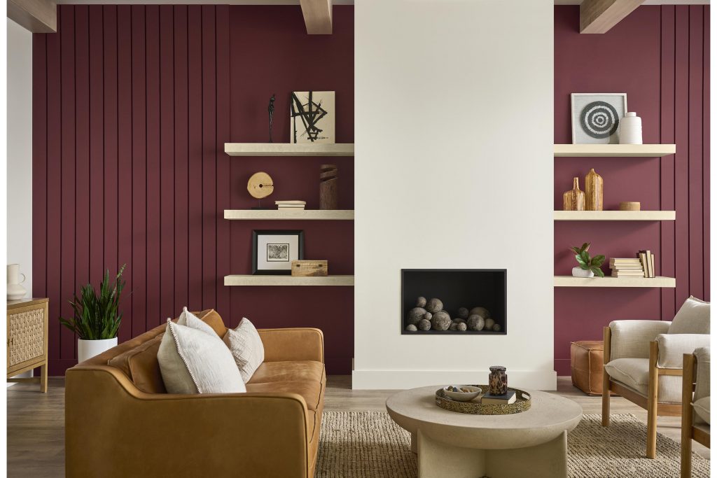
Red can bring energy, warmth and personality to a living room, particularly when the hue has earthy or muted undertones.
Maroon, burgundy, Bordeaux and oxblood shades feel grounded and inviting rather than overly bright. Use them across all four walls for an immersive, cocooning effect, or introduce them on a fireplace wall, built-in shelving or another architectural feature.
Pair deep red paint colors with warm neutrals, dark woods and tactile materials for a collected, lived-in look.
Pink Living Room Paint Colors
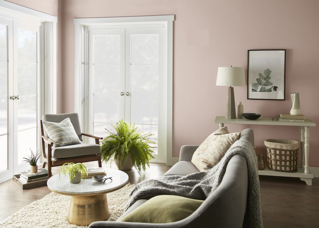
Today’s pink paint colors extend far beyond pastel.
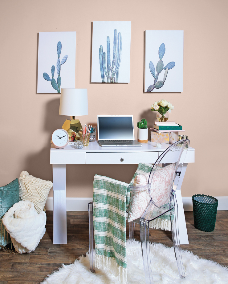
Dusty rose, blush, clay pink and muted terracotta-inspired shades bring warmth to a living room while still behaving much like a neutral. Their earthy undertones make them especially easy to pair with cream, brown, green, burgundy and natural wood.
A softer pink can brighten a living room without the starkness of white, while a deeper, browned pink adds warmth, depth and character.
Orange Paint Colors for Living Rooms
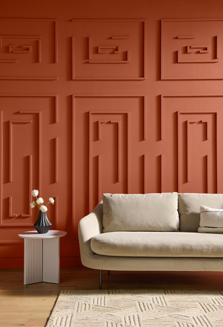
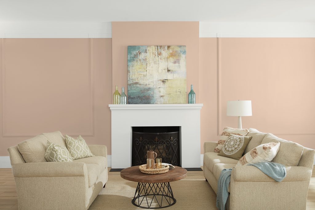
Orange paint colors can range from subtle and earthy to energetic and expressive.
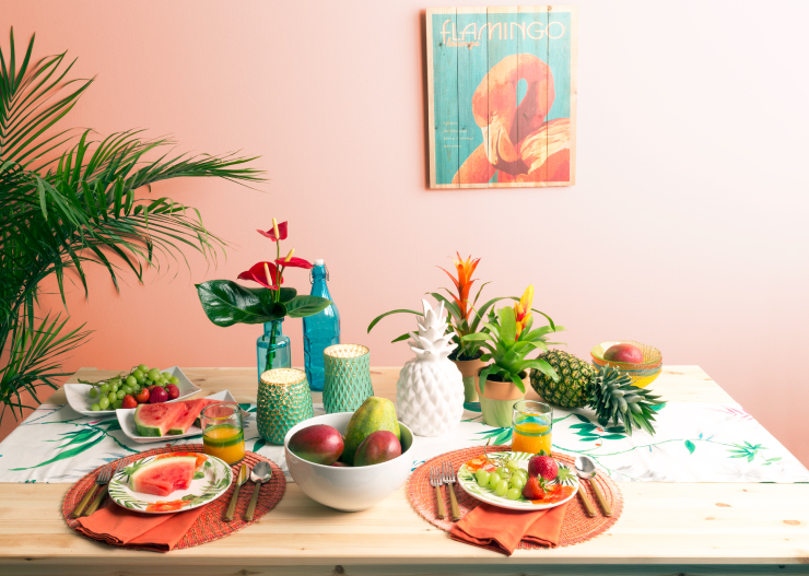
Soft apricot and sun-baked clay bring warmth without overwhelming a space, while rust and burnt orange create greater depth and richness. These shades work particularly well in mid-century, eclectic and globally inspired living rooms.
Balance orange with cream, beige and brown for a harmonious color scheme.
Yellow and Gold Living Room Paint Colors
Yellow brings warmth and optimism to a living room, but it does not need to be bright or highly saturated.
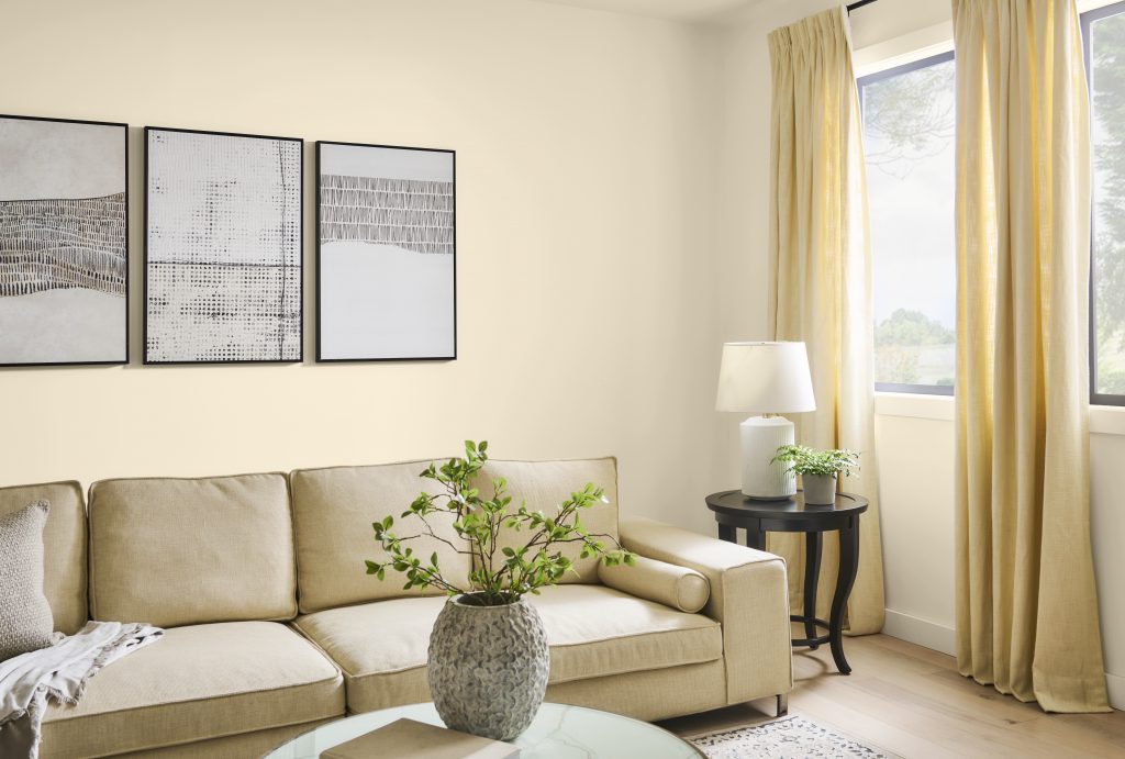
Soft buttercream, straw, ochre and muted gold shades can create a warm glow that shifts beautifully throughout the day. They pair naturally with warm woods, cream upholstery and earthy green or brown accents.
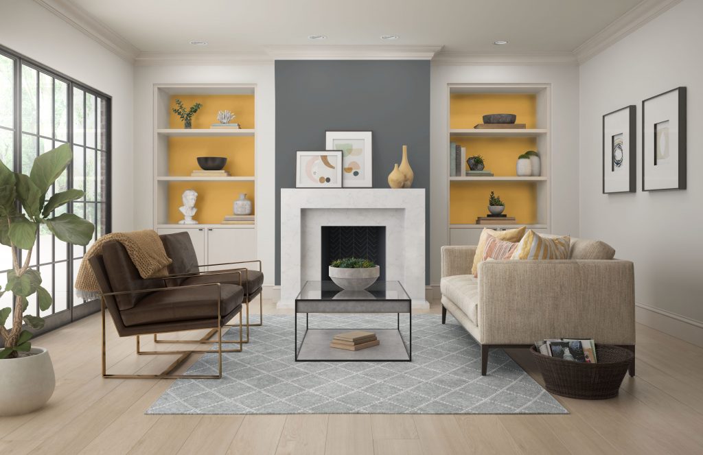
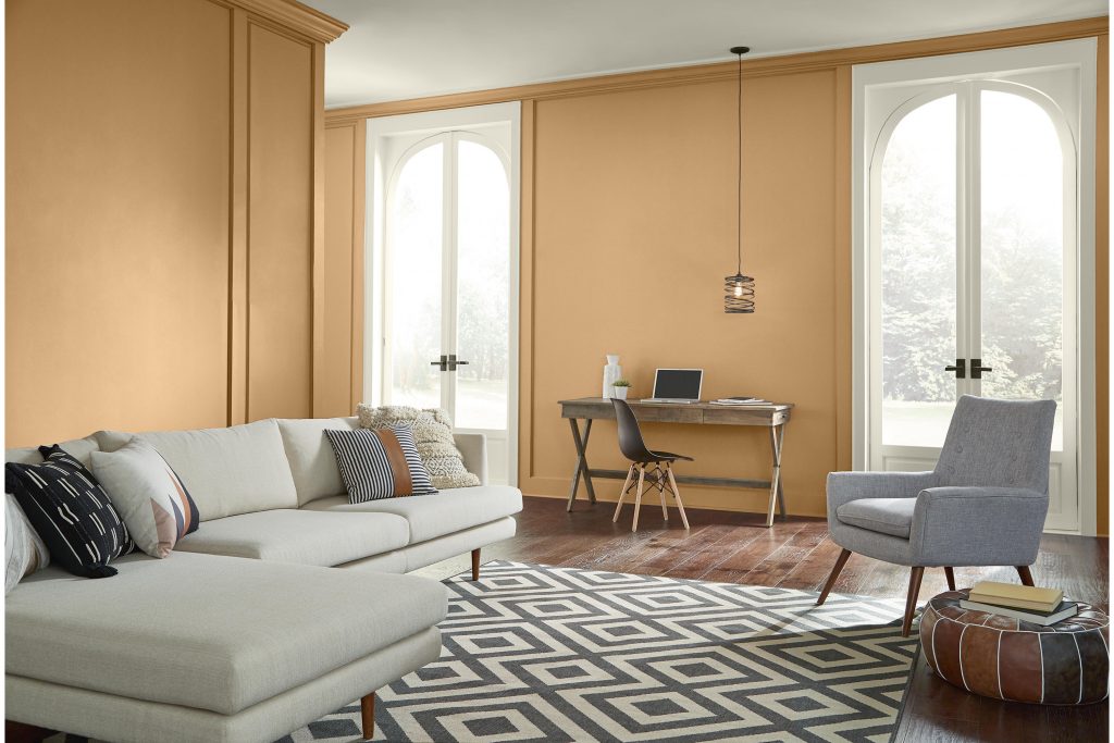
Soft yellow paint colors can help a living room feel brighter, warmer and more open, making them a great choice for creating an airy, welcoming atmosphere.
Green Paint Colors for Living Rooms
Green is one of the most versatile living room paint colors because of its strong connection to the natural world.
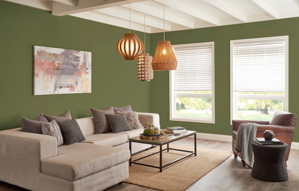
Soft sage and gray-green shades can create a relaxed backdrop, while olive, mossy and browned greens offer more depth and character. Deep forest-inspired greens can transform a living room into an enveloping, restorative retreat.
Green also works particularly well with materials commonly found in living spaces, including wood, stone, leather, linen and warm metals, making it easy to create a layered, natural look.
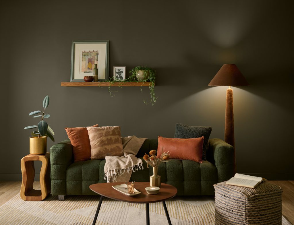
Whether used as a soft backdrop or an immersive all-over color, green living room paint colors can bring a grounded, restorative quality to a space while pairing naturally with a wide range of colors and materials.
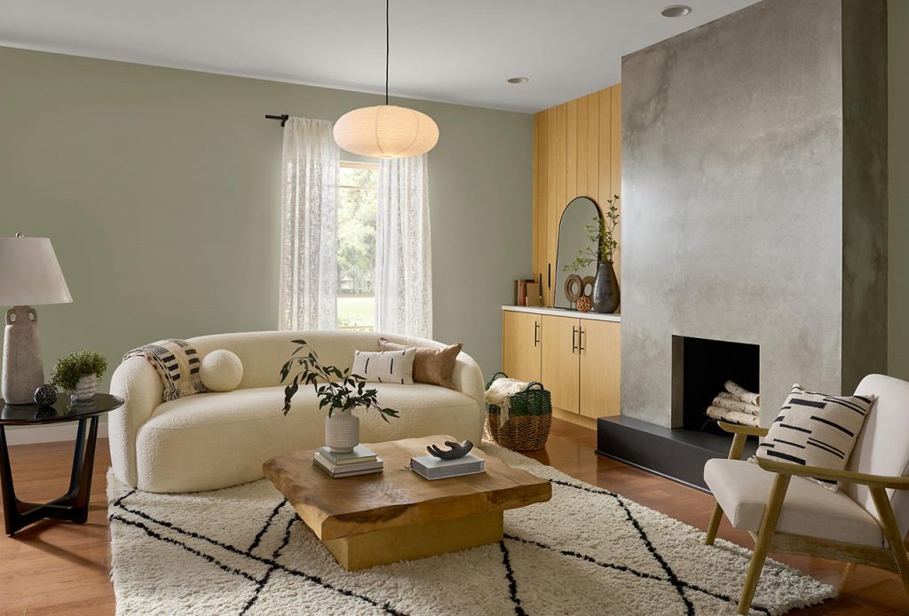
Blue-Green Paint Colors for Living Rooms
Blue-green paint colors bring together the calming qualities of blue with the natural freshness of green, making them an inviting choice for living rooms. These versatile hues can create a space that feels relaxed, refreshing and connected to nature, while still adding enough color to give the room personality.
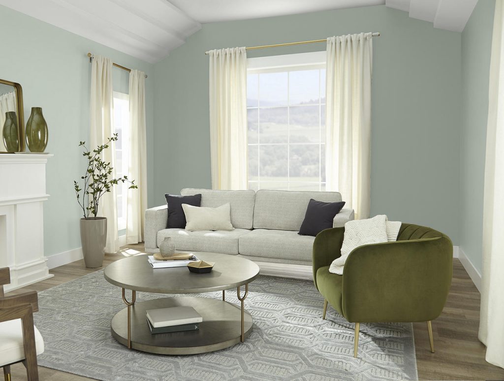
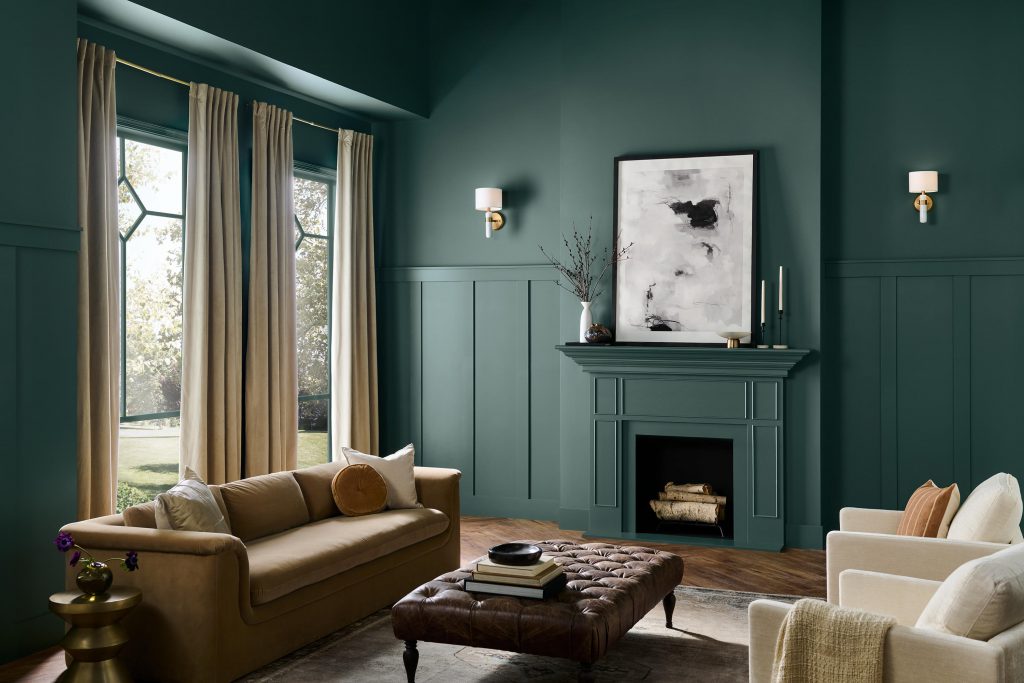
A blue-green living room creates a calm, refreshing atmosphere with just the right amount of color. Crisp white trim and light furnishings brighten the palette and provide clean contrast, allowing the blue-green walls to feel fresh, airy and inviting.
Blue Paint Colors for Living Rooms
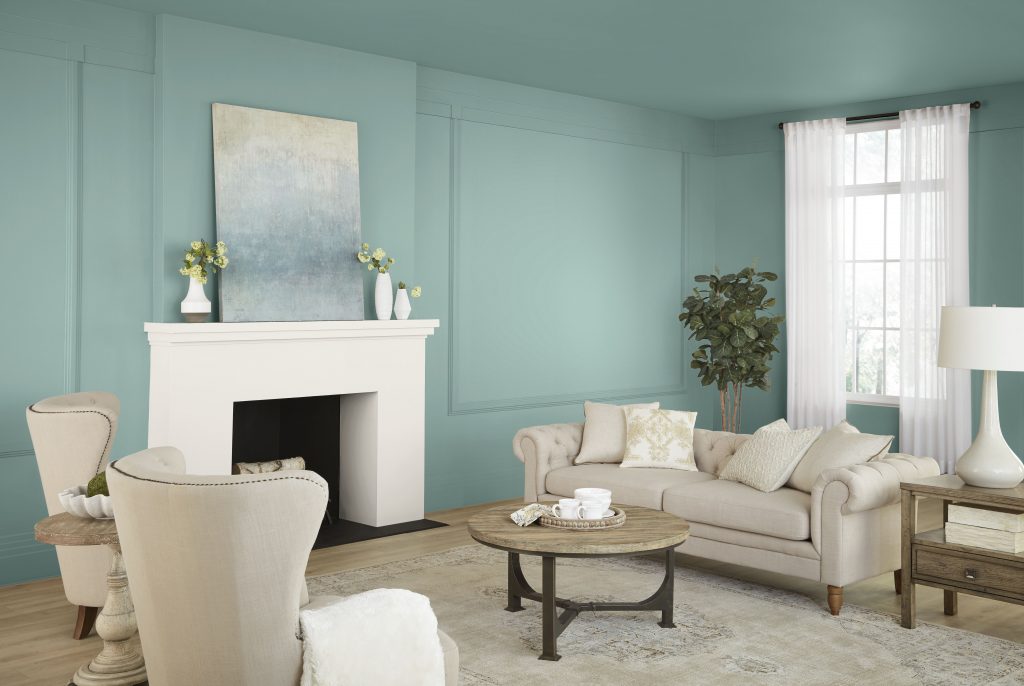
Blue can take on an entirely different character depending on its depth and undertone.
Pale, atmospheric blues can make a living room feel light and refreshing, while blue-grays introduce a quieter, more sophisticated mood. Mid-tone denim and mineral blues bring more presence without overwhelming a space, while navy and inky blues can add dramatic depth.
Blue living room paint colors pair naturally with warm whites, beige, camel and wood tones. The contrast between cool color and warm materials can make a space feel both relaxed and layered.
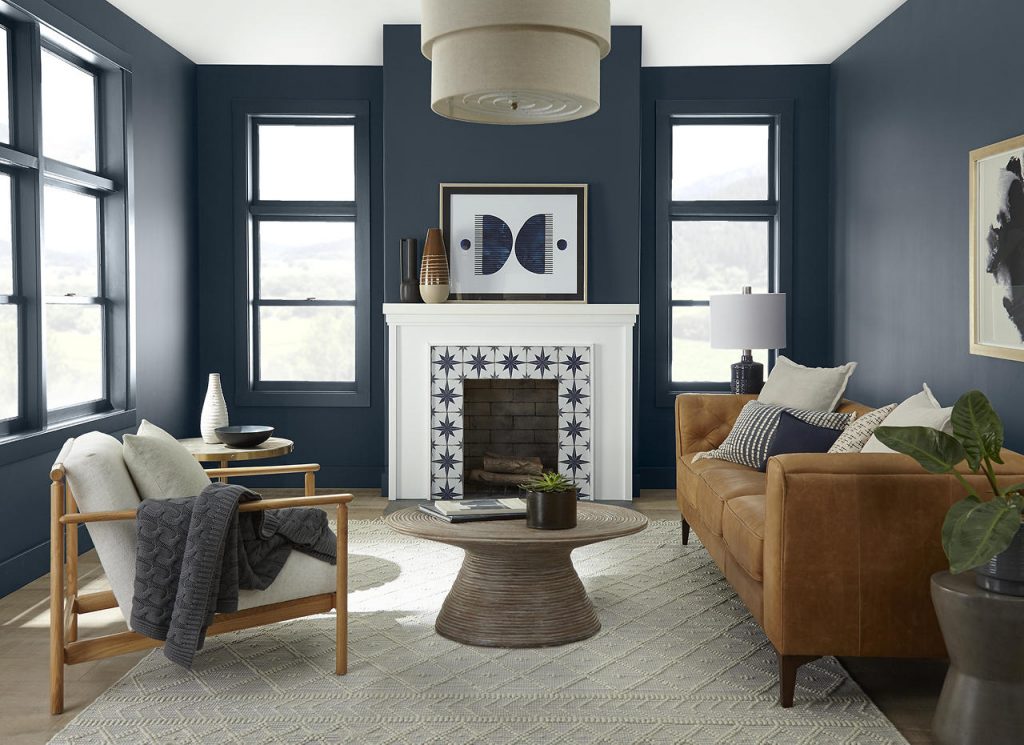
If you are looking for a relaxing living room paint color, blue is an especially versatile choice because it can shift from fresh and airy to sophisticated and enveloping depending on the shade.

Purple and Plum Living Room Paint Colors
Purple can be surprisingly versatile when softened, muted or deepened.
Muted mauve, dusty violet and gray-purple shades introduce subtle color without feeling overly sweet, while plum and eggplant tones can create a richer, more intimate effect.
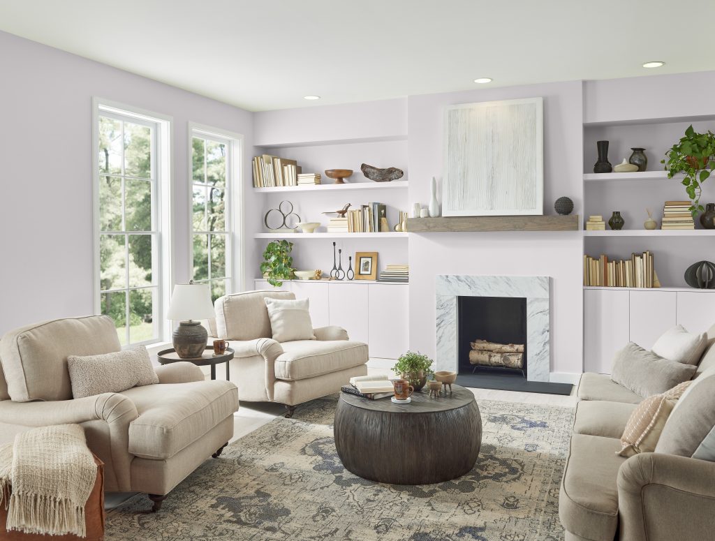
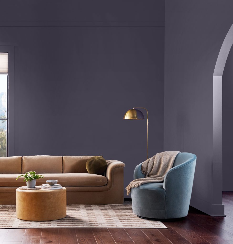
Pair a deeper purple paint color with layered neutrals, warm browns and metallic finishes. For a more contemporary palette, combine muted blue with taupe or earthy green.
White Paint Colors for Living Rooms
White living room paint colors create a fresh, flexible foundation and can help a space feel open and airy—but not all whites feel the same.
Warm whites with creamy, beige or subtle yellow undertones can soften a living room and pair naturally with wood, woven materials and warm-toned furnishings. Cleaner or cooler whites create a crisp backdrop for contemporary spaces, colorful artwork and stronger graphic contrast.
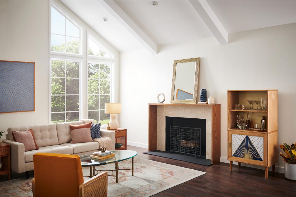
Beige, Cream and Tan Living Room Paint Colors
Beige, cream and tan living room paint colors offer the versatility of a neutral while bringing more warmth than a crisp white or cool gray.
These warm neutrals work especially well with natural materials such as oak, walnut, stone, linen and leather. Their understated warmth also makes them a versatile choice for open-concept homes, where one color may need to connect several adjoining spaces.
For a more modern approach, pair beige, cream or tan walls with deeper brown, green or black accents to create definition without losing the room’s relaxed quality.
Greige and Taupe Living Room Paint Colors
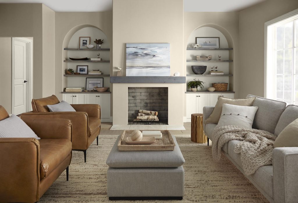
Somewhere between warm beige and cool gray are greige and taupe—complex neutrals that can shift subtly depending on light and surrounding materials.
Greige offers the softness of beige with the tailored quality of gray, while taupe may introduce brown, mushroom or violet undertones that give a room added depth.
These nuanced neutrals are especially useful when a living room contains a mix of warm and cool finishes because they can help bridge wood tones, stone, metals and upholstered pieces into one cohesive palette.
That versatility makes greige and taupe especially useful when choosing a living room wall color that needs to work with existing furniture, flooring and finishes.
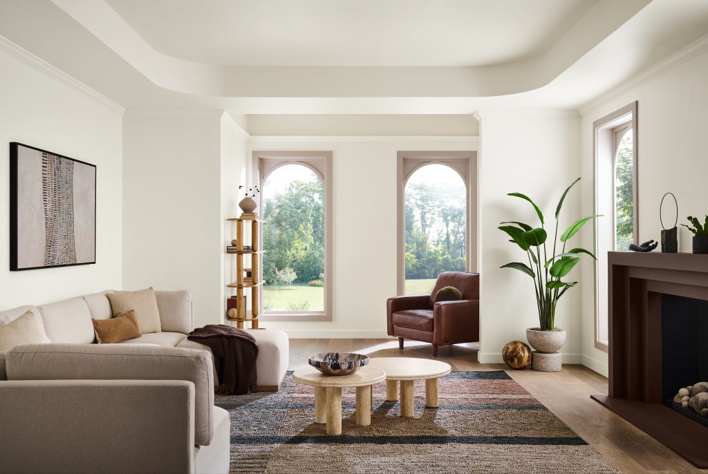
These nuanced neutrals are especially useful when a living room contains a mix of warm and cool finishes because they can help bridge wood tones, stone, metals and upholstered pieces into one cohesive palette.
That versatility makes greige and taupe especially useful when choosing a living room wall color that needs to work with existing furniture, flooring and finishes.
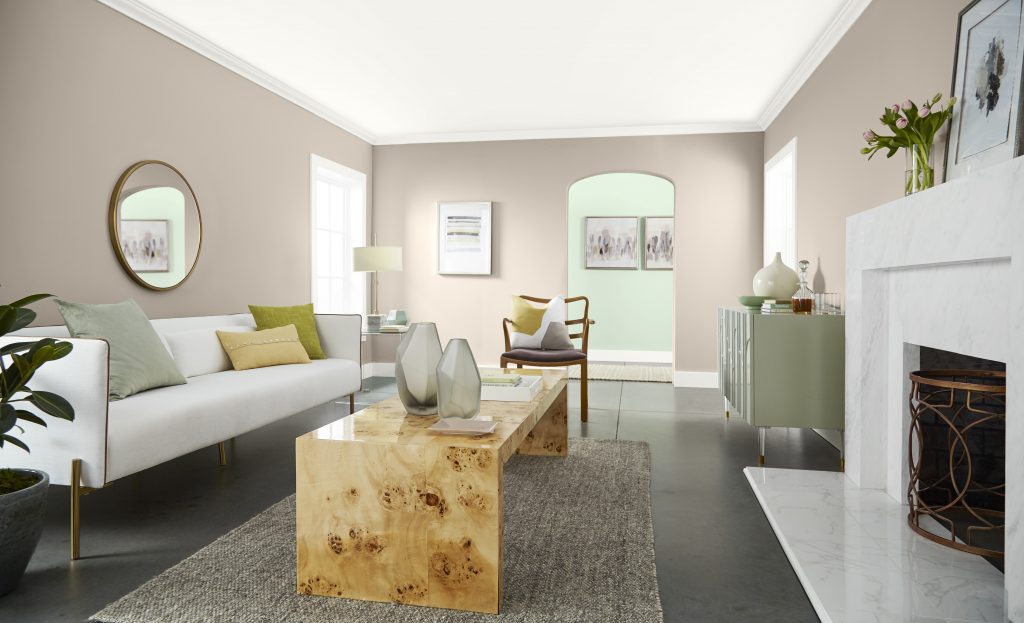
A bright, contemporary living room with walls painted Wheat Bread and the hallway painted a soft pastel green color called Glass Tile. Warm taupe walls, a soft green hallway, white seating, sculptural wood furniture, a marble fireplace, and natural light create a fresh, balanced palette with subtle contrast.
Brown Living Room Paint Colors
Brown living room paint colors are returning in richer, more dimensional ways. Rather than basic brown, think cocoa, clay-brown, mushroom, umber and deep espresso.
These colors have an inherently grounding quality and can make larger living rooms feel warmer and more intimate. Brown also connects beautifully with wood, stone, metallic finishes and other nature-inspired materials.
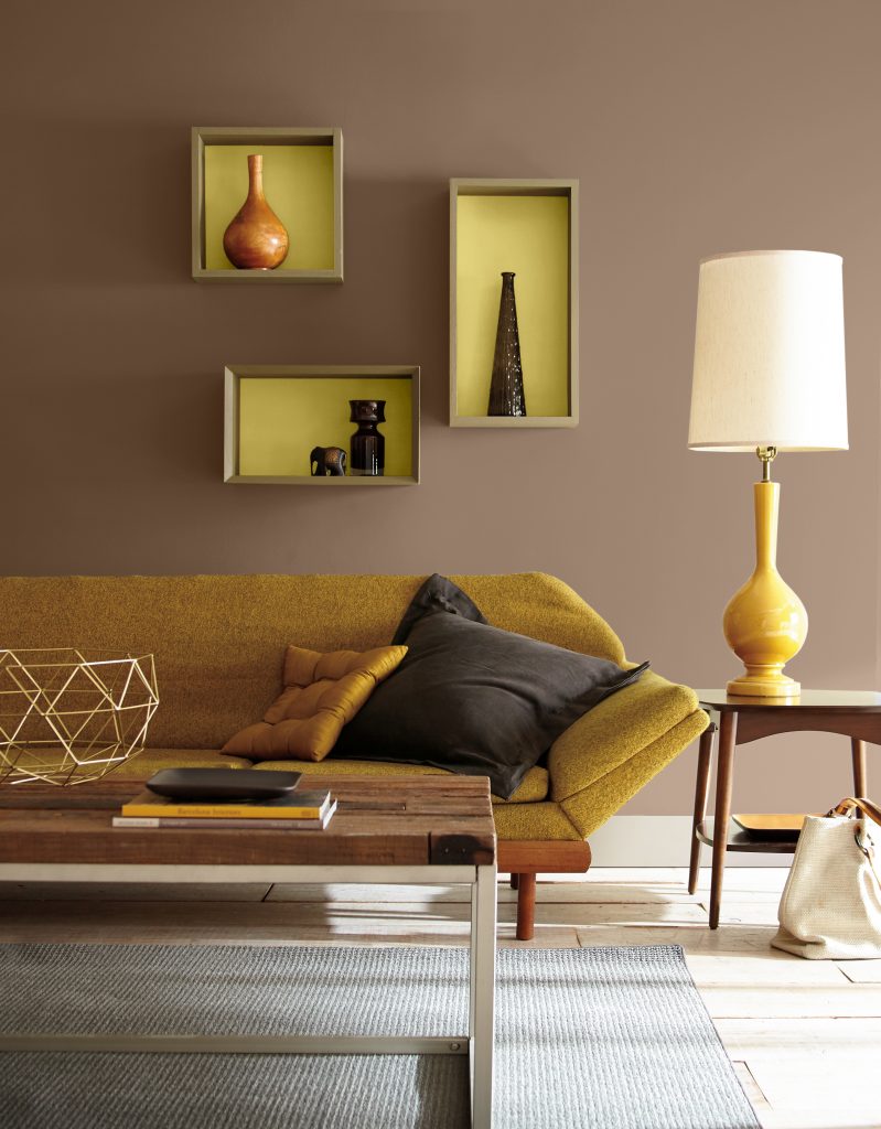
For a tonal living room, layer brown walls with camel, cognac, cream and lighter natural textures. For more contrast, introduce soft blue, muted green or warm white.
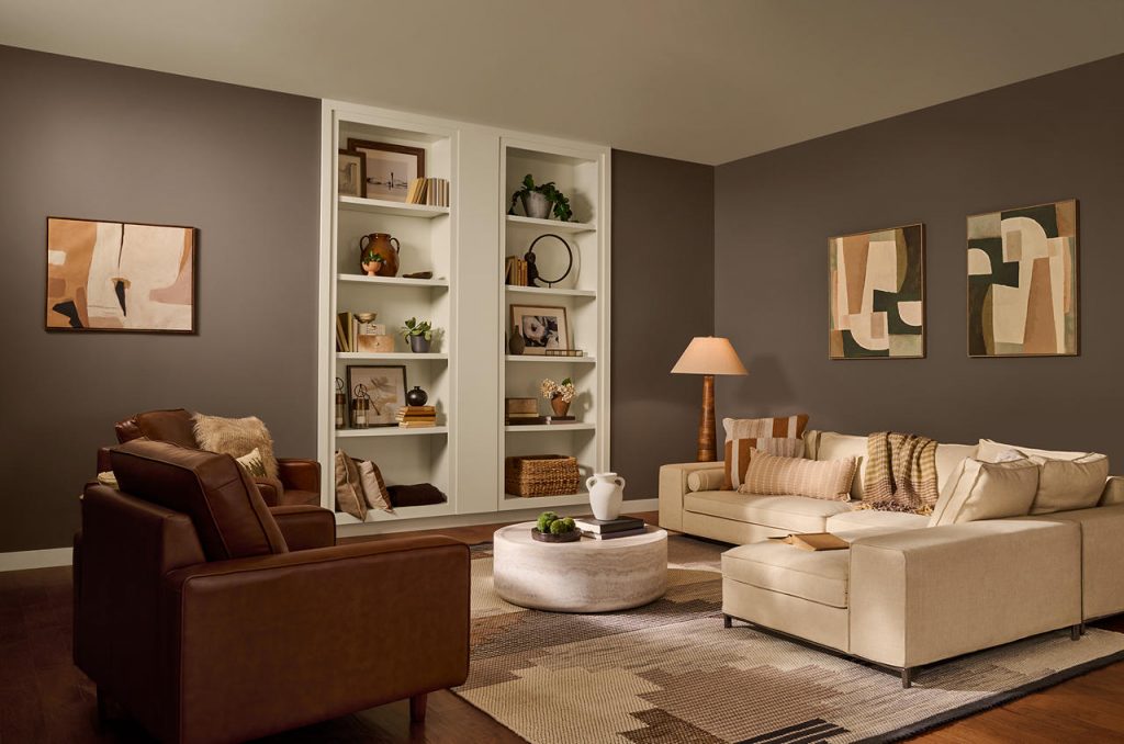
Gray & Black Paint Colors for Living Rooms
Gray remains a versatile living room paint color when its undertone is chosen intentionally.
Warm grays can feel soft and sophisticated alongside natural wood and creamy upholstery, while cooler blue- or green-based grays create an airy, more contemporary effect.
Instead of automatically reaching for a mid-tone gray, consider the mood you want to create. Pale gray can provide a quiet backdrop, while charcoal adds depth and can make artwork, furniture and architectural details stand out.
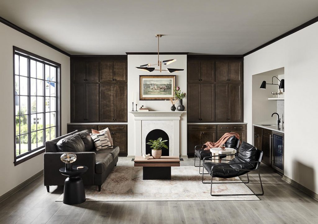
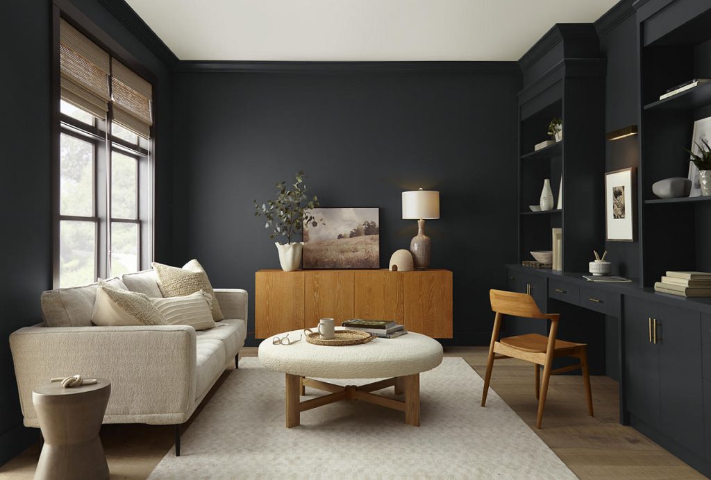
Black and near-black paint colors can create an even more enveloping look. Used on walls, cabinetry, built-ins or trim, deep shades add definition and sophistication while allowing lighter furnishings, natural wood and artwork to create contrast.
Should You Paint an Accent Wall or the Entire Living Room?
Both approaches can work—it depends on the effect you want to create.
Painting all four walls can make color feel more intentional and immersive, particularly with earthy neutrals, greens, blues, burgundies and other nuanced shades. Extending color onto trim, built-ins or even the ceiling can create an even more enveloping, tonal effect.
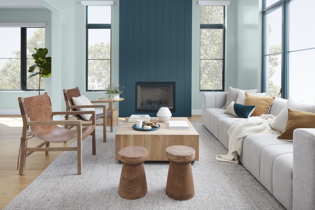
An accent wall can be useful when you want to highlight a fireplace, built-in shelving, architectural detail or focal point without changing the entire room.
In open living spaces, paint color can also be used strategically to define one zone from another while maintaining a cohesive palette throughout the home.
Find a Living Room Color That Feels Like Home
The best living room paint color is ultimately one that supports the way you want to experience the space. Whether that means the quiet versatility of a warm neutral, the restorative quality of green or blue, the warmth of an earth tone or the personality of a deeper, more expressive hue, color can transform how a living room looks and feels.
Start with the elements already in your room, consider the natural light and decide on the mood you want to create. Then explore different color families and sample your favorites in a space.
A living room serves many purposes. The right color can help make all of them feel connected.
Find the color that brings your living room to life. Explore BEHR® paint colors, discover coordinating color ideas and sample your favorites at home to see how each shade looks in your space and lighting.
Colorfully yours,
Diana
The best living room paint color depends on the room’s natural light, furniture, fixed finishes and the atmosphere you want to create. Whites and light neutrals can feel open and airy, earthy neutrals can add warmth, blues and greens can feel calm and restorative, and deeper colors can create intimacy and drama.
Whites, creams, pale neutrals and softly tinted colors can help a living room feel more open and airy. Using lower contrast between the walls and trim can also create a more continuous visual effect.
Warm beige, brown, clay, muted yellow, earthy green, burgundy, plum and other deeper hues can bring warmth and intimacy to a living room. Layering these paint colors with natural wood, soft textiles and warm lighting can enhance the cozy effect.
A living room does not need to be lighter or darker than adjoining spaces. In open layouts, similar tones can create continuity, while a lighter or deeper living room color can help visually define the space. The most important consideration is that the undertones and overall palette feel connected.
Sample paint colors directly in the living room and view them on multiple walls at different times of day. Natural light, artificial lighting, flooring, furniture and surrounding colors can all affect how a paint color appears.