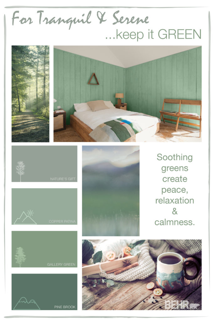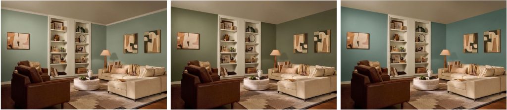
Sage green, olive green, and forest green can all bring a nature-inspired feel to your home, but they create very different effects. Sage is typically the softer, more muted direction, olive feels warmer and earthier, and forest green brings the most depth and contrast.
The right shade depends on more than the color name. Your room’s light, flooring, cabinetry, furniture, trim, and the amount of wall space you plan to paint can all change how a green feels. Comparing the three side by side can help you narrow the direction before you sample your favorites.
Sage green vs. olive green vs. forest green at a glance
If you want a softer green that can sit comfortably with light neutrals and natural materials, start with sage. If you want a warmer, grounded green with an earthy presence, explore olive. If you want a deeper green that adds visual weight, forest green may be the direction to test first.
| Consideration | Sage green | Olive green | Forest green |
| Overall character | Muted, softened green | Earthy, grounded green | Deep, saturated-looking green direction |
| Depth | Often soft to mid-depth | Can range from muted mid-tone to deep | Usually chosen for stronger depth and contrast |
| Temperature | Varies by shade and light | Often warmer when yellow or brown is present | Can lean cool, blue-green, or neutral depending on shade |
| Best for | Airy or relaxed rooms | Warm, organic spaces | Moody or high-contrast spaces |
| Behr example | Bitter Sage N390-4 | Mountain Olive N350-7A | Forest Edge S430-6 |
These are useful starting points, not fixed rules. Individual paint colors can shift warmer, cooler, lighter, or darker than the category name suggests, so compare the actual colors in your space.
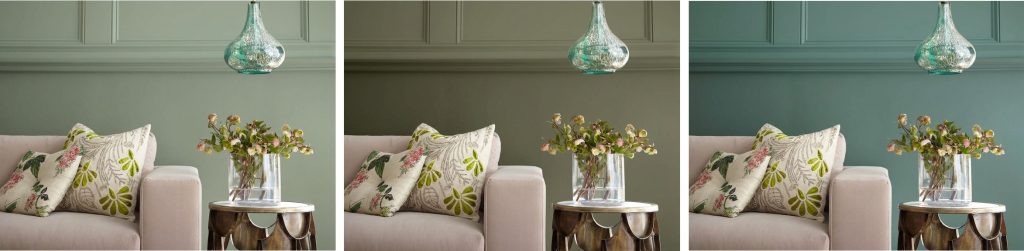
What is sage green?
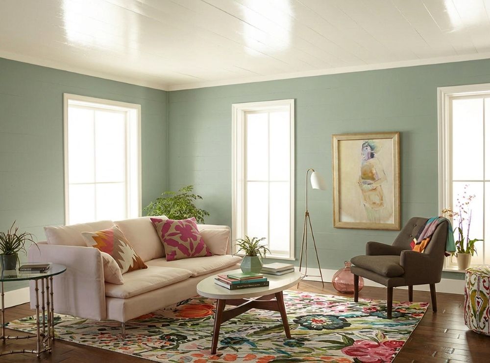
Sage green is a muted green direction that usually feels softer and quieter than olive or forest green. Behr Bitter Sage N390-4 is a soft, muted sage with earthy undertones, giving you a grounded green that still feels approachable.
Sage can work especially well when you want green to support the room rather than dominate it. In a living room, pair it with warm off-white, natural wood, linen, or a deeper accent such as navy. In a bedroom, softer textiles and lower-contrast neutrals can keep the palette relaxed. Earthy red, dusty blush, and other muted greens can also add contrast or layering without pulling the room away from its nature-inspired feel.
What is olive green?
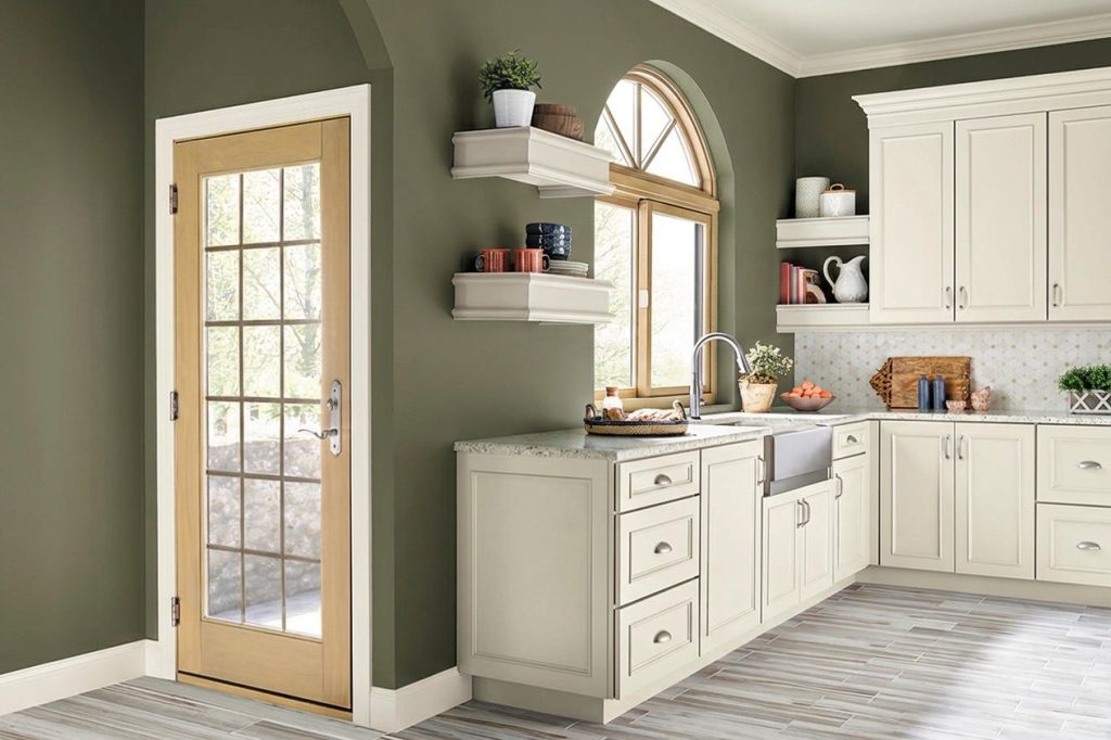
Olive green brings a warmer, earthier character to the green family. It often picks up yellow or brown influence, which can help it connect naturally with wood, cream, tan, clay, leather, and warm metal finishes. The exact balance still varies by shade.
Mountain Olive N350-7A is a dark Behr green with a warm undertone. That makes it a useful example when you want an olive direction with noticeable depth. Try it in a living room, dining room, kitchen, or on cabinetry where warm wood, creamy neutrals, or stone can help build a grounded palette around it.
What is forest green?
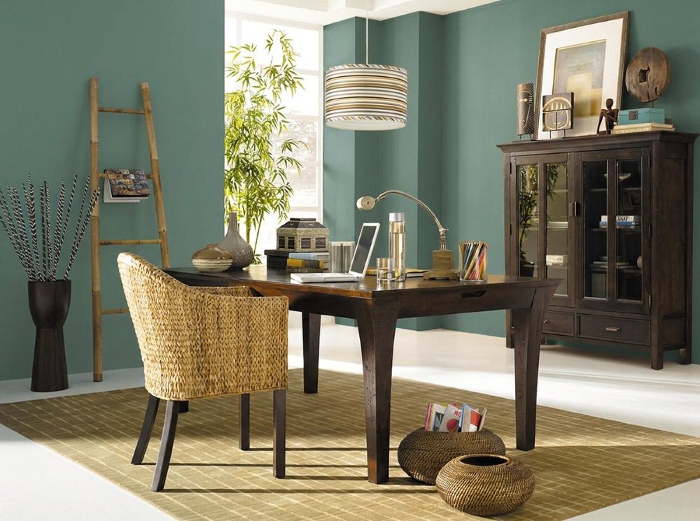
Forest green is the deepest of these three directions, making it a strong choice when you want more visual weight or an enveloping effect. Depending on the specific color, forest greens may lean blue-green, neutral, or warmer, so the sample matters more than the label alone.
Forest Edge S430-6 is a dark, veiled blue-green that can bring depth to a dining room, home office, built-in, door, or accent wall. Pair a deeper green with lighter neutrals when you want crisp contrast, or add natural wood and warm metals to soften the transition between dark walls and the rest of the room.
How to choose between sage, olive, and forest green
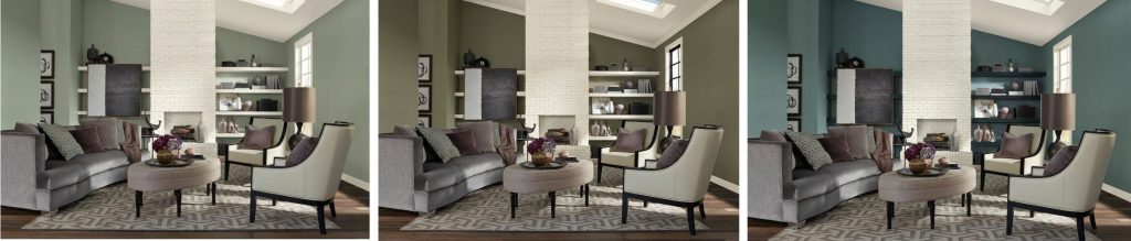
Start with the amount of depth you want. Sage is a natural place to begin for a softer, lower-contrast look. Olive can add more warmth and earthiness, while forest green creates a stronger, deeper statement. Then compare that direction with the materials that are staying in the room.
Look at your fixed finishes
Flooring, tile, countertops, cabinetry, upholstery, and trim can pull a green warmer or cooler by comparison. Warm woods and creamy finishes may connect easily with an earthy olive, while cooler stone or gray-blue elements may change how a sage or forest green reads. Instead of choosing by color name, place the actual samples next to the finishes you need to keep.
Think about light and surface area
Natural and artificial light can change the depth and undertone you notice in any green. A color used on four walls can also feel more immersive than the same color on a cabinet, door, or accent wall. Check your samples in morning, afternoon, and evening light, and consider how much of the room will carry the color.
Choose the mood, then choose the shade
For a living room, sage can keep the palette soft and relaxed, olive can make the room feel warmer and more grounded, and forest green can create a deeper, more dramatic backdrop. Let your light, existing materials, and preferred level of contrast guide the final decision.
Find the green that fits your space
The easiest way to choose between sage, olive, and forest green is to compare real colors in the room where you plan to use them. Explore Behr green paint colors to find a few directions you like, then visualize and sample your favorites alongside the finishes that are already part of the space.
You can also preview colors with the Color Visualizer before bringing samples into your space.
Colorfully yours,
Diana
Sage green is generally the softer, more muted direction, while olive green often has more yellow, brown, or warm earthy character. Because individual shades vary, compare the actual paint colors rather than assuming every sage is cool or every olive is warm.
Forest green is typically deeper and creates more contrast, while sage green is usually more muted and understated. Forest can work well when you want a stronger backdrop or accent, while sage can be easier to use across larger surfaces when you prefer a softer effect.
All three can work in a living room. Sage supports a softer palette, olive brings earthy warmth, and forest green adds depth. Compare each option with your flooring, upholstery, wood tones, trim, and daylight before deciding.
Yes. Using related greens at different depths can create continuity from room to room. Keep a few connecting materials or neutrals consistent, and sample the greens near each other so their undertones feel intentional across adjoining spaces.
Cooler or lower light can make some greens appear grayer, bluer, or deeper, while warmer light can bring forward yellow or earthy notes. Artificial light can shift the balance again after sunset, so view samples at different times of day before making the final choice.