Cobalt & Royal Blue Paint: Bold Blue Ideas for Walls and Accents
Cobalt and royal blue bring strong color to a room, whether you use them across the walls or concentrate them on a built-in, cabinet, door, or other accent. Start with the amount of visual impact you want, then compare saturated blues in your actual light, so the final choice feels bold but still connected to the rest of the space.
What do cobalt and royal blue look like in a room?
Cobalt blue typically reads as vivid and saturated, giving a room an energetic point of focus. Royal blue is a broader design term for a strong, clear blue, so its exact appearance can vary from brighter to deeper interpretations.
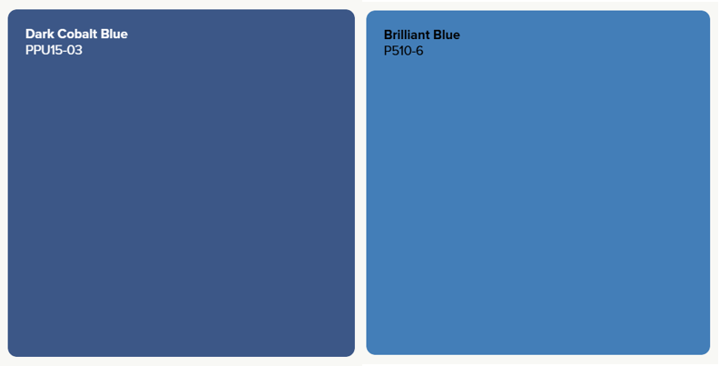
In practice, the shade matters more than the label. Dark Cobalt Blue PPU15-03 brings a dramatic, intense blue presence, while Cosmic Cobalt P500-7 offers a clearer mid-tone cobalt direction. For a brighter, vivid blue look that can lean toward a royal-blue, consider Brilliant Blue P510-6 or the deeper Beacon Blue P510-7. Compare each shade in your room to see which level of depth and saturation fits the space.
Cobalt and royal-blue paint colors for interior walls
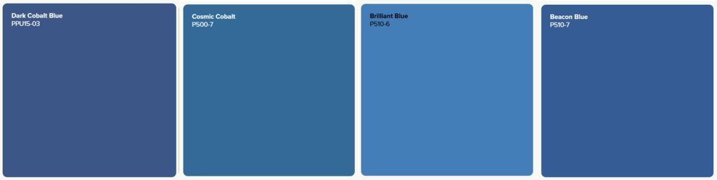
For a deeper cobalt statement, Dark Cobalt Blue PPU15-03 can bring strong color and definition to a feature wall, alcove, or larger wall area. Cosmic Cobalt P500-7 leans more mid-tone, for when you want saturated blue with a little less visual weight.
If you are drawn to the vivid character associated with royal blue, Brilliant Blue P510-6 offers a brighter saturated direction, while Beacon Blue P510-7 brings more depth. Because royal blue describes a broader color rather than one exact Behr shade, sampling these colors in your actual light can help you find the interpretation that feels right for the room.
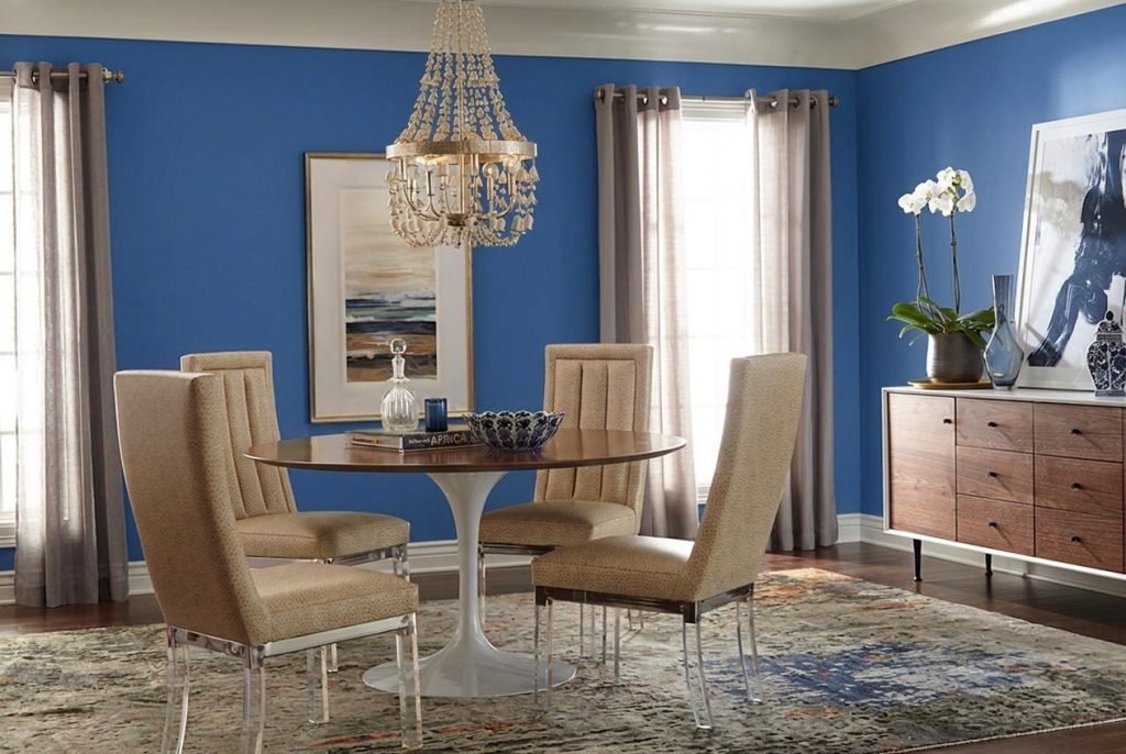
Should you use bold blue on every wall or as an accent?
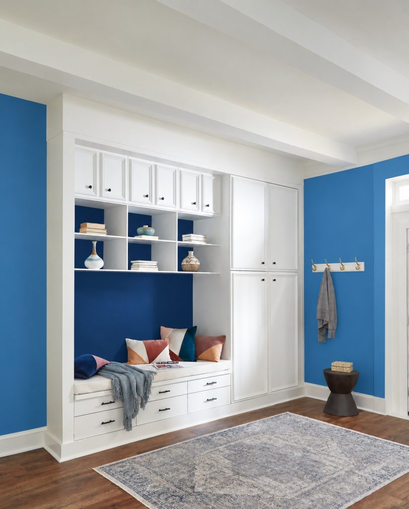
Use cobalt or royal-blue color across more wall area when you want an immersive room and the space has enough light and visual breathing room to support the saturation. A deeper cobalt can create a more enveloping effect, while a brighter royal blue can bring a clearer, more energetic presence. In either case, trim, flooring, and larger furnishings can provide useful contrast.
If you want the color to feel more concentrated, start with an accent wall, built-in, cabinet, door, or architectural feature. This gives either cobalt or a vivid royal blue a defined role and can make it easier to coordinate the stronger color with existing finishes.
Bold blue accent ideas beyond the walls
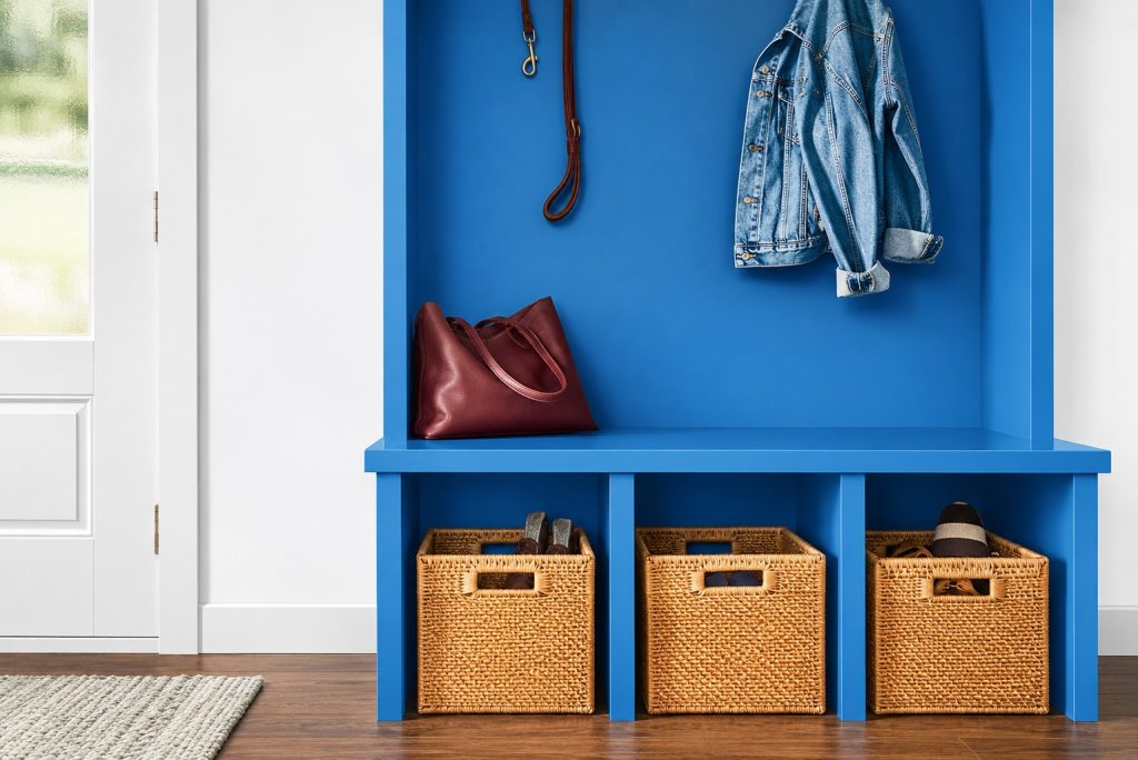
Cobalt and royal blue do not have to cover the walls to make an impact. Try a saturated blue such as Dark Cobalt Blue PPU15-03 or Brilliant Blue P510-6 on built-ins, the back of shelving, a kitchen island, interior door, desk, vanity, or painted furniture to create a defined focal point against a quieter backdrop.
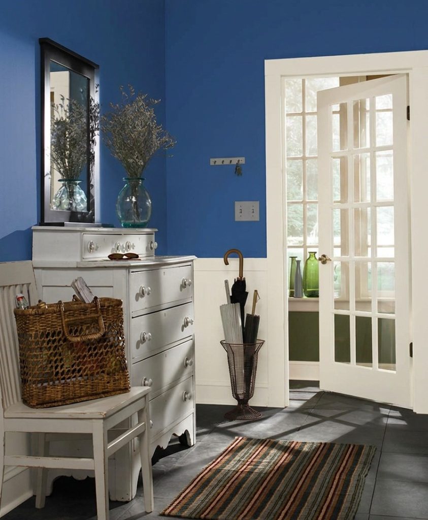
To help a bold blue feature feel connected to the rest of the room, echo the color in smaller details or balance it with surrounding materials and finishes. Warm wood can add natural contrast, while white and other light neutrals can give vivid cobalt and royal-blue tones more visual space to stand out.
What colors go with cobalt and royal blue?
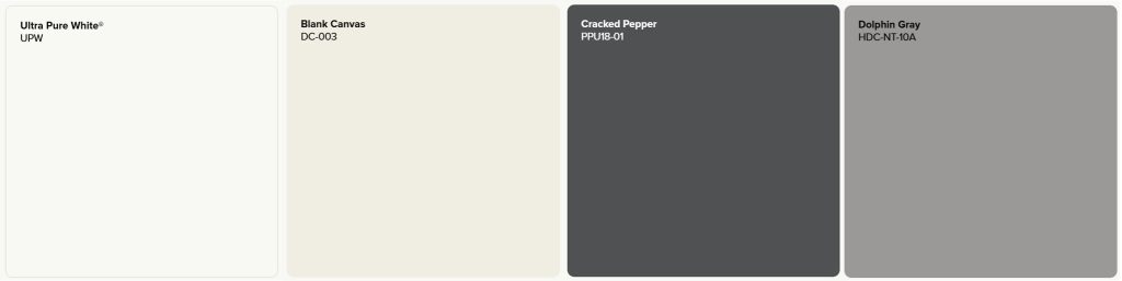
Whether you choose the deeper intensity of cobalt or the vivid character of a royal-blue direction, light neutrals can provide clean contrast. ULTRA PURE WHITE® UPW creates a crisp backdrop, while Blank Canvas DC-003 offers a softer neutral option. Either can give saturated blues more visual space when used on trim, adjoining walls, cabinetry, or other larger surfaces.
For greater contrast, consider Cracked Pepper PPU18-01 or Dolphin Fin 790C-3. Cracked Pepper can add deeper definition alongside brighter royal-blue tones, while Dolphin Fin provides a quieter gray counterpoint to saturated cobalt. Warm wood and natural textures can also soften the overall palette, while brushed gold and other warm-metal finishes can introduce warmth against either blue direction.
How lighting changes bold blue paint
Cobalt and royal blue can shift noticeably as the light changes. Daylight may make a vivid royal-blue shade feel clearer and more energetic, while a deeper cobalt may show more of its depth. Lower or warmer artificial light can make either blue appear richer or more subdued.
Test your finalists on more than one wall and look at them during the times you use the room most. Compare the samples directly with flooring, cabinetry, countertops, trim, upholstery, and other fixed finishes before deciding how much blue to use.
Find your bold blue
Start by deciding whether you prefer the deeper intensity of cobalt, the vivid character of a royal-blue direction, or a combination of both. Explore Behr’s blue paint colors, visualize your favorites, and compare samples beside the finishes that will stay in the space before making the final choice.
Colorfully yours,
Diana
Dark Cobalt Blue PPU15-03 and Cosmic Cobalt P500-7 offer two distinct cobalt directions, from deeper and more dramatic to clearer and mid-tone. Compare samples in your room to see how the saturation responds to your lighting and surrounding finishes.
Royal blue can describe a range of strong, vivid blues rather than one exact paint color. Brilliant Blue P510-6 and Beacon Blue P510-7 are Behr shades to consider when you want a bright or deeper royal blue. Compare them in your space to see which interpretation gives you the depth and intensity you want.
Not necessarily. The result depends on the specific shade, room size, available light, and surrounding finishes. If a full-room application feels too intense, use cobalt on one wall, built-ins, cabinetry, or another focal feature instead.
ULTRA PURE WHITE® UPW and Blank Canvas DC-003 can create light contrast, while Dolphin Fin 790C-3 offers a softer gray counterpoint and Cracked Pepper PPU18-01 adds deeper definition. Warm wood and warm-metal details can also balance saturated cobalt and royal blue. Compare the materials beside your paint sample before deciding.
Try a vivid blue such as Brilliant Blue P510-6 on an accent wall, built-in, shelving, kitchen island, vanity, interior door, desk, or painted furniture. Keeping the surrounding palette simpler can help a royal-blue direction read as an intentional focal point.
A smooth-looking finish starts with careful surface preparation and the right paint, sheen, tools, and application technique for the project. Because darker saturated colors can make surface variation more noticeable, follow current Behr preparation and application guidance and evaluate the sheen you choose in the room’s actual light.