
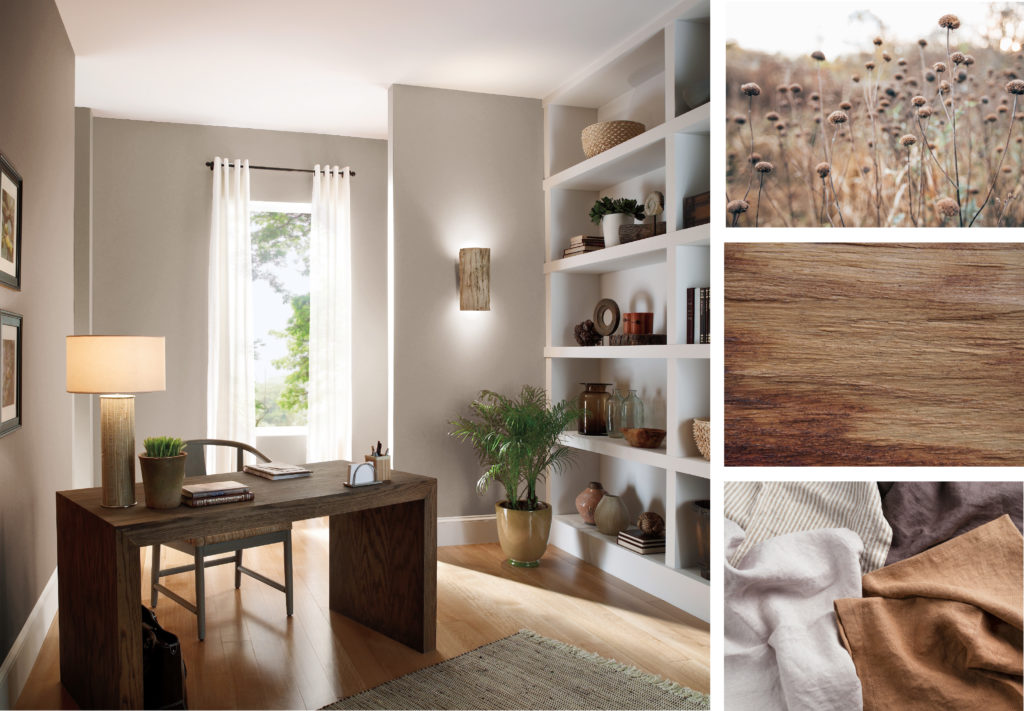
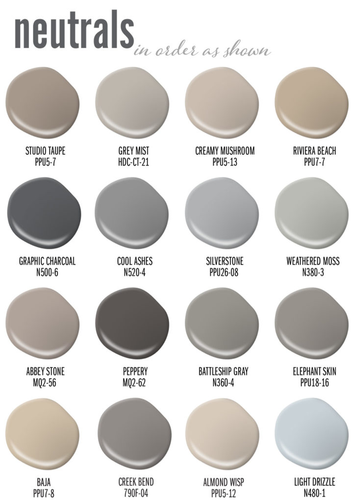
Office – wall: Studio Taupe PPU5-07
Once I heard neutrals described as “People, countries and colors that mind their own business.” It’s a true statement. Neutrals hold their ground and do not waver. To me neutral colors are masters of subtlety, stable as time, aligned with nature and easy to use. I’ve never met a neutral I didn’t like.
So, what defines a neutral color as it relates to home décor?
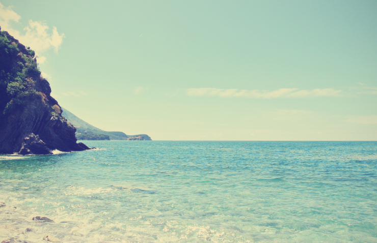
Neutrals come from the natural world. They range in a variety of white, gray, black, brown, beige, and taupe hues. Words like earth-tone, stony, smoky, foggy, misted, shaded, or wood-toned are often applied to such colors. It often looks like a bit of dust has settled over them, or they’ve weathered storms that have washed vivid color intensity away.
Living Room – wall: Grey Mist HDC-CT-21
Divided into two camps, neutrals can be considered either warm (brown families) or cool (gray families). Everything that falls between are wonderful nuances: driftwood, mushroom, taupe, mist, charcoal, fawn, tan, and sand.
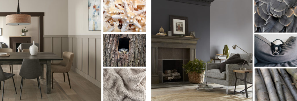
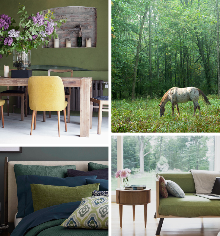
Dining Room – upper wall: Creamy Mushroom PPU5-13, lower wall: Riviera Beach PPU7-07
Living Room – fireplace wall: Graphic Charcoal N500-6, back wall: Cool Ashes N520-4
Neutrals are known to have complex compositions, meaning they often hold an undercurrent of another color. For example, a gray married to blue becomes a cool stone gray. Gray carrying a hint of green becomes lichen. A dark brown might be tinged with red to create a rich mahogany tone.
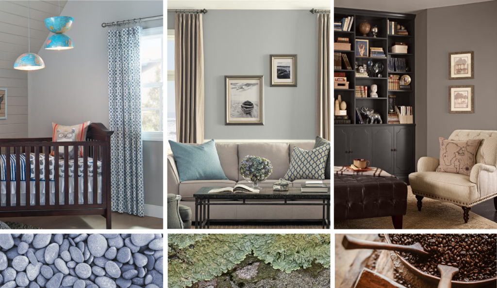
Nursey – wall: Silverstone PPU26-08
Living Room – wall: Weathered Moss N380-3
Library – wall: Abbey Stone MQ2-56, cabinets: Peppery MQ2-62
Their quiet, unassuming nature makes neutrals perfect for all four walls, and they can be successfully used in any room. They make easy background colors because they don’t fight for attention with furniture, artwork, cabinetry or other materials that may be brighter in color.
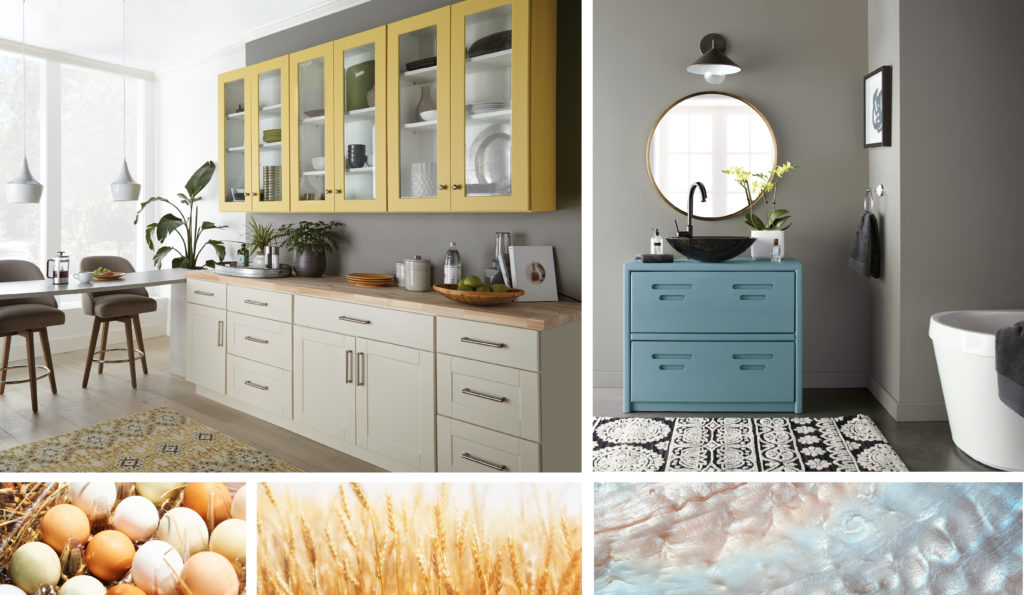
Kitchen & Bathroom – walls: Battleship Gray N360-4
Favored for their versatility, neutrals pair well with almost any other color. Gray or tan walls live perfectly well with white trim around windows, doorways and baseboards. They harmonize with bright, bold colors used for accents, window treatments and upholstery. Tone on tone neutrals sets the mood for serene and tranquil places of relaxation. Make a statement with dark and dramatic colors like charcoal, black or chocolate brown.
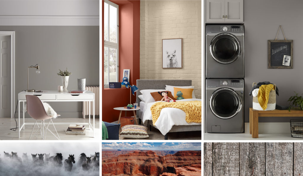
Office – wall: Elephant Skin PPU18-16
Bedroom – brick wall: Baja PPU7-08
Laundry – wall: Creek Bend 790F-4, cabinets: Grey Mist HDC-CT-21
Neutrals are ideal for large open spaces and for connecting one room to another. Use neutrals in traffic areas like hallways, stairway landings to move from public to private areas of the home. They also help transition people from outdoor surroundings to indoor settings.
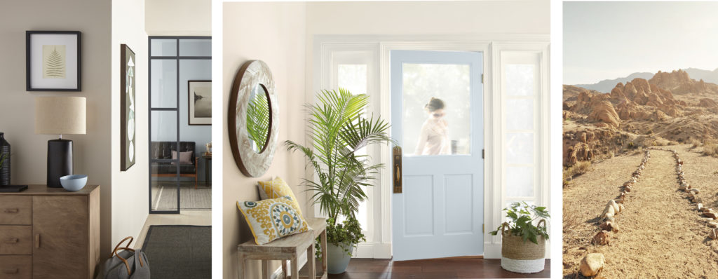
Hallway & Entry – walls: Almond Wisp PPU5-12, back wall & door: Light Drizzle N480-1
Neutral colors can enhance your home in many positive ways. To find out more about these colors and more visit our Gray Color Family Page or the Gray and Neutral color sections in the Color Solution Center at The Home Depot.
Colorfully Yours,
Erika

Great information and color samples for Neutrals! Thank you. I am a designer and a painter and probably one of the biggest supporters and consumers of Behr neutral, natural paint colors. It is all I use. (outside of customer personal requests for another color). I was looking for ways to ..describe the abilities of beautification and the look of luxury created with layering neutral tones to my clients, and contractors. And the attractive ,descriptive ways each color and color scheme is displayed and explained was exactly what I needed.
Hello Jakolia, thank you so much for your feedback and we appreciate you visiting our blog! 🙂
Colorfully Yours,
Deanna
Hello I have a color emergency. The painter is here. We have an open floor plan and I need to paint the walls and I need a color to work with everything. Our kitchen opens to vaulted room with windows floor to ceiling, reading loft and family room. The kitchen is beige with warm exotic new persia granite counter tops. our floors are yellow red oak. I have a red sofa, yellow chairs, black leather bar chairs and a black credenza to hold china. I need a color to work with all this. All the trim is a bright white( newly painted). Lots of large windows but only moderate light in the north, east facing room. What can I use on these walls in this open floor plan. (I had on it sw ivoire which is which “worked” Please recommend a wall color for as the lv, dr, foyer, kitchen, etc are all on the one floor. Thanks so much!
Hello Sandra, thank you for visiting our blog!
A great backdrop color for your furnishings/decor that I recommend is Cotton Knit PPU7-11.
Colorfully Yours,
Deanna
Hi! We currently have beige cabinets in our kitchen and a maroon color on the wall…..yuck!
I am looking for a paint color that will complement the cabinets. Our dining room is a light gray so I would like to stay away from that color. Any suggestions?!
Hi. I am redoing my small shower bathroom. I have selected shower wall tile and floor tile. I am looking for a complementary paint. The closest and most pleasing is called Moss Mist. I am hoping to find something a little lighter and maybe a bit less grey (or a bit greener). Any suggestions? Thanks.
Hi Shane – thanks for contacting us with your question.
Check out the two following light green options.
Sounds of Nature S390-1 and At Ease S400-1, these two colors are slightly lighter and less gray than Moss Mist.
Diana O.
Hello,
I have a mix of turquoise and white kitchen cabinets with taj mahal quartzite countertops. Is there a neutral color you could recommend for the walls.
Thanks!
Hello DJ, thank you for reaching out!
A neutral that will coordinate is Baja PPU7-08, Gravelstone MQ2-50 or Roman Plaster PPU7-10.
Hope this helps!
Colorfully Yours,
Deanna
I have a medium gray vanity and cabinet. White shiny trim and white tub, shower and counter.
What colors would go on walls in the bathroom?
Hello Carol, thank you for visiting our blog we recommend the following colors for your walls.
Watery HDC-CT-26, Riverdale N410-3, or Zen PPU11-14.
Hope this helps!
Colorfully Yours,
Deanna
I am an Interior Designer and often use Behr paints in my projects. I absolutely love Creamy Mushroom and Riviera Beach. Those have become my go-to colors.
Now that the grey fad is finally over, many clients are wanting shades of green.
Weathered Moss is becoming another favorite. LOVE Behr paints!
I thought the color was called calming maybe 10-13 years ago
Hi Vivian,
Thank you for visiting our blog!
Sorry I am not locating a old color by the name of Calming. Do you still have the color number to it?
Colorfully Yours,
Deanna
I want to paint my kitchen cabinets a neutral light color that will go with the muslin color rock around my stove. I don’t want a color that will have a pink undertone. I painted them in a kiltz color called starched linen but, it looks has a pink undertone so im going to have to paint them over. Can you please help me with a color that will go with a muslin colored off white rock that doesnt look pink. thanks you.
Hello Pam,
Thank you for your interest in BEHR paint!
I will recommend the following lighter neutral tones minus a pink tone.
Swiss Coffee 12, Sail Cloth N300-1 or Silky White PPU7-12.
Colorfully Yours,
Deanna
I am painting my kitchen cabinets. The walls are Mesa Taupe (ppu5-14) and the bottom cabinets are dark antique red. I have black countertops. I am trying to find a color to match the top cabinets to the Mesa taupe walls. I also have stone colored backsplash so I didn’t know if I should lean toward the brown/grays or just match the Mesa taupe. Any suggestions would be very helpful. Thank you!
I will recommend painting the upper cabinets in a different tone than the walls so the cabinets do not get lost with the wall color. For the upper cabinets I will recommend the following hues – Swiss Coffee 12, Almond Wisp PPU5-12, Ashen Tan N220-2, Doeskin Gray N200-2 and Cappuccino Froth N210-2.
I’m looking to paint my entry hallway and wall going up the stairs and the landing at the top of the stairs..the color i’m thinking on is mauve melody..is this a neutral color…just don’t want it to stand out too strong…oh and i’m painting over flex rock would that work out ok..any info would be appreciated..thanks..:)
Thank you Carol for your interest in BEHR Products! 🙂 Mauve Melody is a darker gray neutral with a tint of mauve/purple. If you would like more of a tan neutral color then we will suggest neutrals such as Baja PPU7-8, Roman Plaster PPU7-10, Casual Khaki N300-3. All our pleasure to help!