Blue vs. Green for Home Offices: Which Color Actually Boosts Focus?
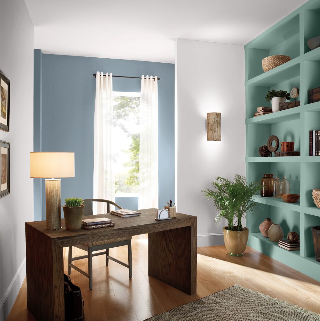
Blue and green can both work beautifully in a home office, but neither is a guaranteed productivity switch. Blue can create a composed, structured backdrop, while green can feel softer and more connected to nature. If you want something between the two, a blue-green can balance both directions.
Blue vs. green for focus: the short answer
Choose blue when you want the room to feel crisp, organized, and visually anchored. Choose green when you want a gentler, nature-inspired backdrop that feels less formal. For a flexible middle ground, consider a blue-green. The best choice depends on the work you do, the amount of light in the room, and how much color you want around you throughout the day.
| Color direction | Room feel | Useful starting point | Behr example |
| Blue | Composed, structured | Writing, planning, analytical work, client calls | Blueprint S470-5 |
| Green | Soft, nature-connected | Reading, creative work, multipurpose offices | Back to Nature S340-4 |
| Blue-green | Balanced, adaptable | Mixed workdays, shared or flexible offices | Green Meets Blue S430-4 |
What color psychology can and cannot tell you
Color can influence how a room is perceived, but research does not support a simple rule that painting an office blue or green will reliably improve focus for every person or task. Findings vary by setting, task, comparison color, and individual response, so color psychology is most useful as context rather than a promise of performance.
For your home office, pay attention to whether the color supports the atmosphere you want without becoming distracting. Then test the actual shade with your room light, desk, flooring, trim, and other fixed finishes before making the final decision.
When blue works best in a home office
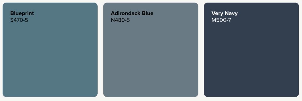
Blue is a strong direction when you want the office to feel organized and composed. Blueprint S470-5 gives the room a mid-tone, steel-blue presence that can feel polished without the visual weight of a deep navy. Warm wood, pale neutrals, and light trim can keep the workspace balanced.
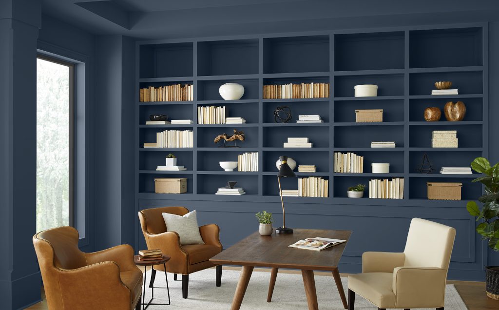
For a quieter slate-blue look, Adirondack Blue N480-5 adds more depth while staying versatile. Very Navy M500-7 creates a stronger executive-office backdrop on a focal wall, built-ins, or cabinetry. In a smaller or dimmer office, consider using deep blue selectively and balancing it with lighter surfaces and layered task lighting.
When green works best in a home office
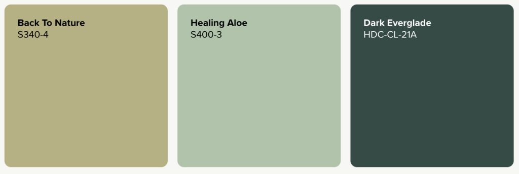
Green is a natural fit when you want the office to feel less formal and more connected to the outdoors. Back to Nature S340-4 brings a muted green direction that can work across all four walls without the intensity of a brighter green.
Healing Aloe S400-3 offers a lighter option for a smaller office or a room where you want a softer backdrop. For a moodier, library-like workspace, Dark Everglade HDC-CL-21A can add depth to built-ins or a feature wall. Green may feel comfortable and nature-connected, but the paint itself should not be treated as a guarantee of better concentration or reduced eye fatigue.
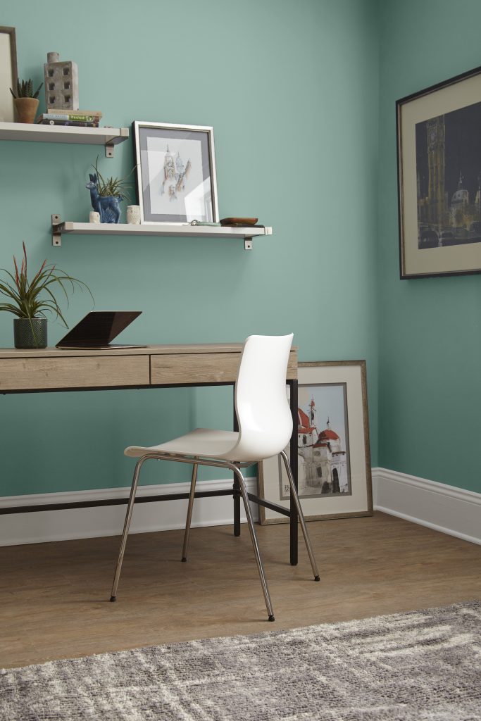
Blue-green is the middle ground
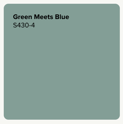
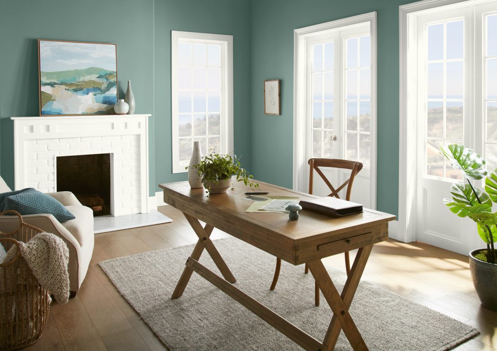
If you like blue’s cool character but want some of the natural quality associated with green, a blue-green shade can bridge the two. Green Meets Blue S430-4 offers a more noticeable balance of both color families, bringing color and definition to a home office without committing fully to either blue or green.
The surrounding finishes can influence which side of the color stands out. Warm woods and natural materials can emphasize its greener character, while crisp white, charcoal, and black accents can bring its cooler blue qualities forward.
Choose by the work you do
Writing, planning, and analytical work
Start with Blueprint S470-5 or Adirondack Blue N480-5 if you want the room to feel structured and professional. These blue directions can create a clear visual backdrop for focused desk work without requiring an especially dark palette.
Reading, creative work, and long work sessions
Back to Nature S340-4 or Healing Aloe S400-3 can create a softer, nature-inspired setting. Keep the rest of the palette simple so the room feels intentional rather than visually busy.
Mixed workdays and shared offices
Green Meets Blue S430-4 can be a versatile choice when a home office needs to shift between meetings, focused tasks, and creative work. Its blue-green character offers enough color to define the workspace while maintaining a balanced feel that can suit a shared office or multipurpose room. The goal is not to match a job title to a color, but to choose a visual environment that feels comfortable through the different kinds of work you actually do.
How light changes blue and green office paint
Natural and artificial light can change both color families throughout the day. Cooler or north-facing light may make blues feel crisper and can mute some greens, while warmer afternoon light may soften blue and bring forward yellow or olive notes in green. Flooring, trim, furniture, and bulb temperature can shift the effect too.
Test your finalists where you will see them most: at desk height, behind your chair if the wall appears on video calls, and on the wall that receives the least natural light. Check the samples during your normal working hours and again after your task lighting is on.
Best Behr blue and green paint colors for a home office
Blue paint colors
Try Blueprint S470-5 for a mid-tone office, Adirondack Blue N480-5 for slate-blue depth, or Very Navy M500-7 when you want a darker focal wall or built-in. Each option changes with room light, so compare the shade against your desk, flooring, and trim before committing.
Green paint colors
Back to Nature S340-4 offers a muted whole-room direction, Healing Aloe S400-3 keeps the palette lighter, and Dark Everglade HDC-CL-21A creates a deeper statement. If you want a shade that bridges the blue and green families, Green Meets Blue S430-4 offers a more balanced blue-green direction.
Find your home office color
Start with the atmosphere you want around your desk, then narrow the choice with your room’s light and fixed finishes. Explore Behr’s blue and green paint colors, compare finalists in the Color Visualizer, and sample the shades in your office before you commit.
Colorfully yours,
Larayne
Neither is universally better. Blue can create a steady, structured office feel, while green can create a more natural, relaxed backdrop. Choose based on your room light, the work you do, and which color stays comfortable for you over time.
Blue is often used in workspaces because it can feel calm, crisp, and composed. Research on color and task performance is context-dependent, so that association should not be treated as proof that blue paint automatically improves concentration.
Green can be a comfortable design choice for a long workday when you prefer a softer, nature-connected room. Muted shades such as Back to Nature S340-4 or Healing Aloe S400-3 are easier to use across a full room than a highly saturated green.
Green Meets Blue S430-4 is a balanced blue-green option that can bring color and definition to a workspace without leaning fully blue or green. Pair it with warm wood and natural materials to emphasize its greener character, or crisp white, gray, and black accents to bring its cooler qualities forward.
Very Navy M500-7 creates a deep backdrop, while Adirondack Blue N480-5 offers slate-blue depth with less visual weight. Compare both in the room to see how much depth the available light can support.
Use the room’s size, light, and fixed finishes as the guide. A bright office may support dark blue across more wall area, while a smaller or dimmer room may benefit from using navy on a focal wall, door, or built-ins.
Light can shift both color families throughout the day. Compare samples during your normal working hours and with your task lighting on, so you can see how the color behaves where you will actually work.