A Romantic Interior Paint Color Palette with Timeless Charm
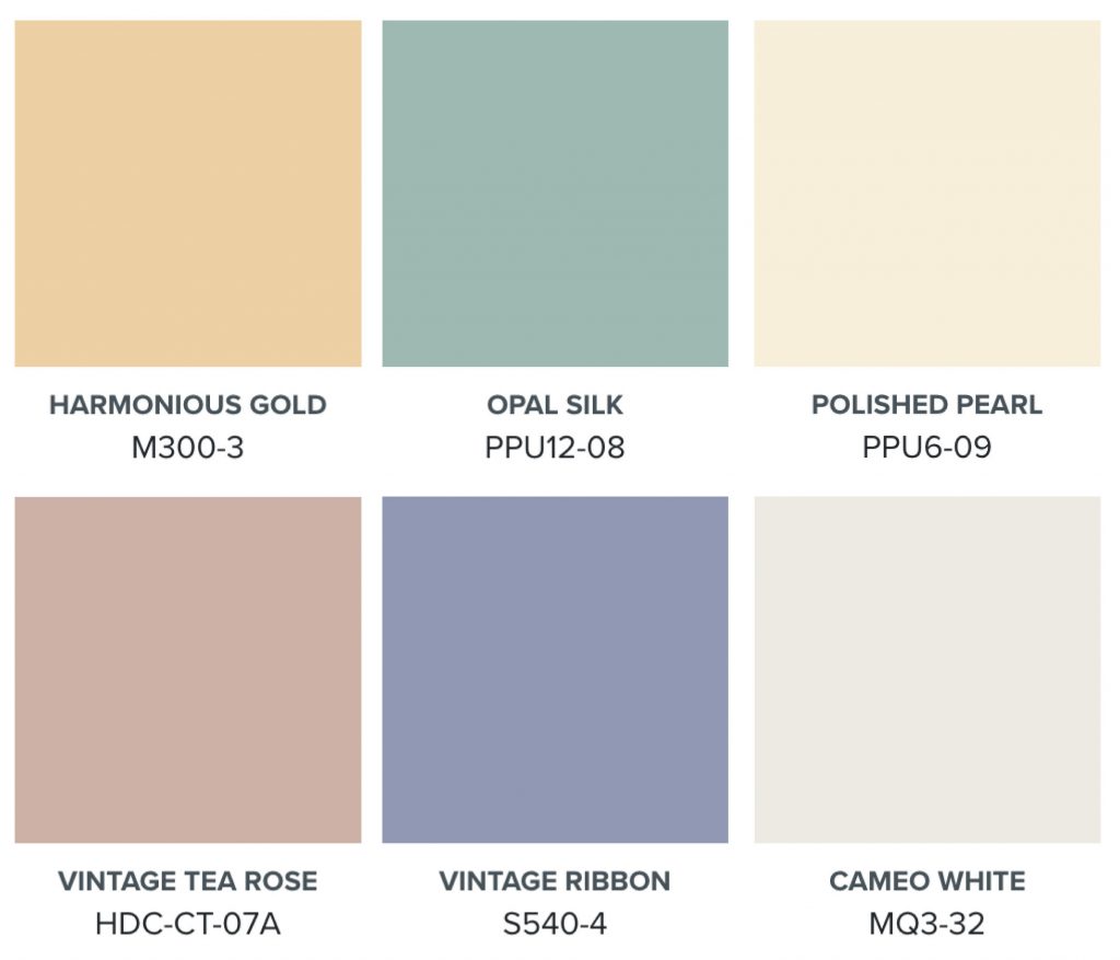
Regency Romance is a soft, elegant BEHR paint color palette inspired by the timeless charm of Regency Revival and English Country style. This romantic interior color palette brings together warm gold, misty blue-green, creamy white, vintage rose, powdery blue-violet, and a warm white neutral anchor to create rooms that feel refined, luminous, and gracefully layered.
The colors are nostalgic without feeling dated, romantic without feeling too sweet, and polished enough to work throughout the home, from bedrooms and dining rooms to living rooms, bathrooms, trim, furniture accents, and even exterior details.
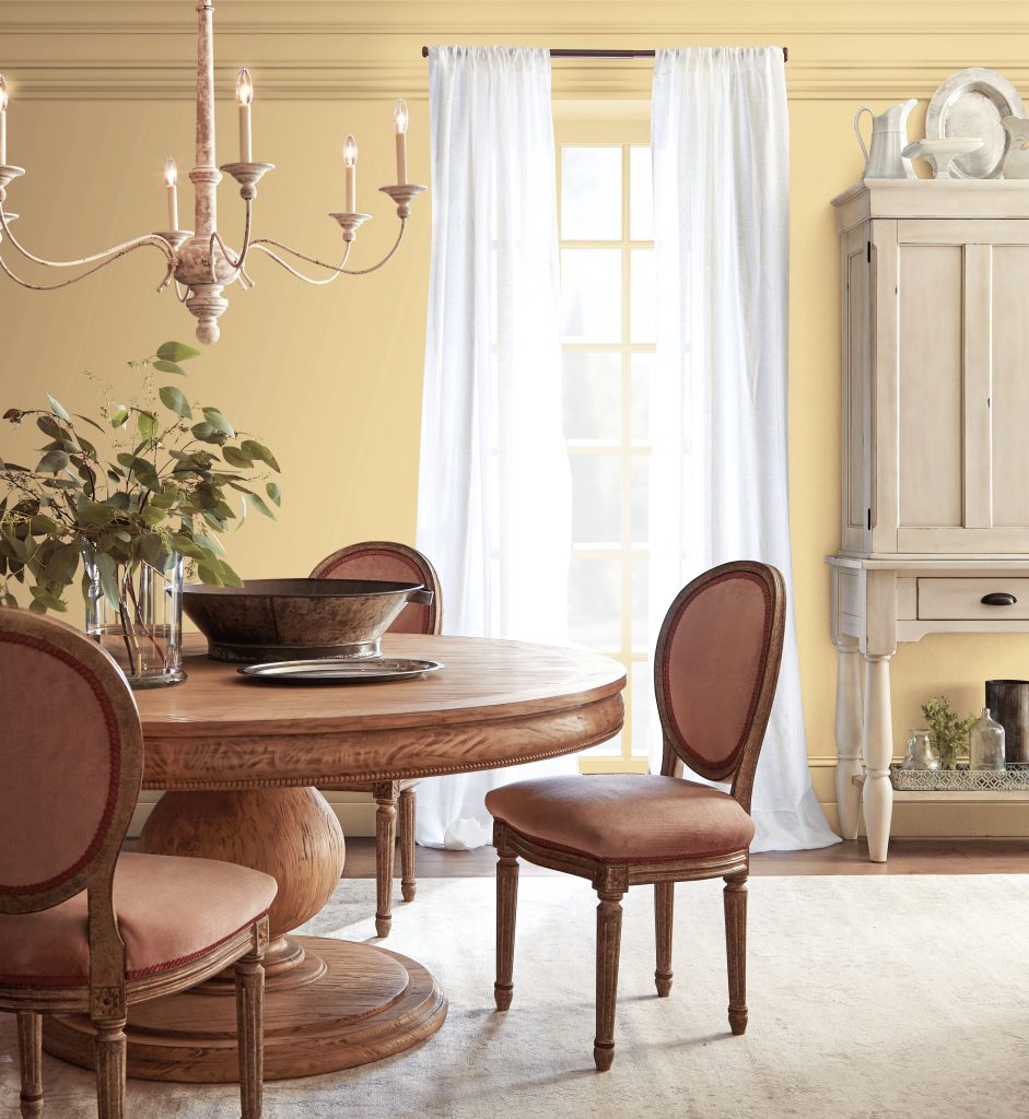
A Heritage-Gold Dining Room That Feels Warm and Welcoming
A touch of heritage warmth helps define this Regency-inspired interior paint color palette, creating rooms that feel welcoming, elegant, and timeless. Harmonious Gold M300-3 delivers a warm gold with soft almond-honey undertones, while maintaining a refined, graceful character.
Use Harmonious Gold on dining room walls, living room accent walls, or traditional spaces that need a little glow. In a dining room, it creates a luminous backdrop for classic wood furniture, upholstered seating, soft white drapery, and traditional metallic accents; warm, romantic, and welcoming without overpowering the room.
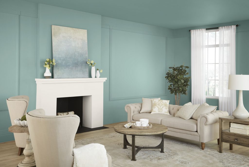
A Soft Blue-Green Living Room with Romantic Polish
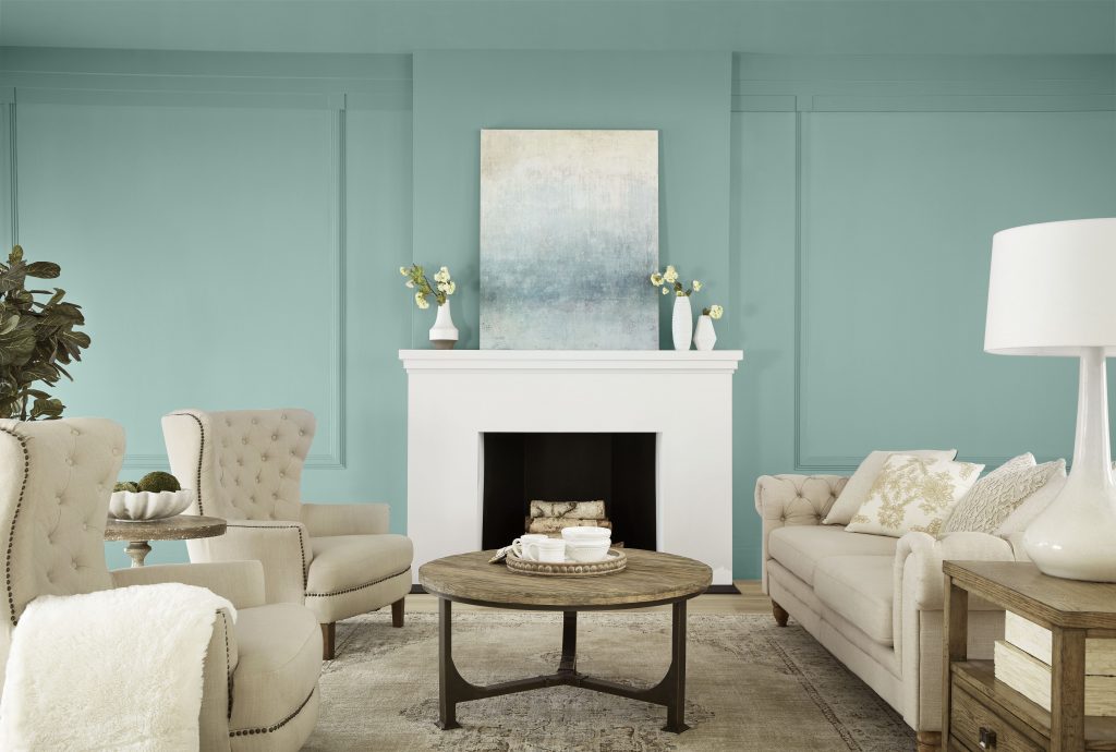
Soft blue-green tones bring calm sophistication to a romantic color palette. Opal Silk PPU12-08 captures that balance beautifully, adding a wall color that feels polished, airy, and gently refreshing.
In the living room, Opal Silk brings a misty blue-green quality to paneled walls and gives the space a serene, romantic feel. Pair it with creamy upholstery, a white fireplace surround, natural textures, and warm wood accents for a balanced room color palette that feels graceful, relaxed, and softly elegant.
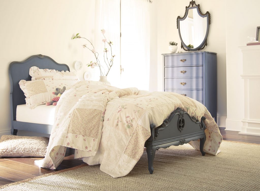
A Creamy Bedroom Foundation for Soft, Layered Color
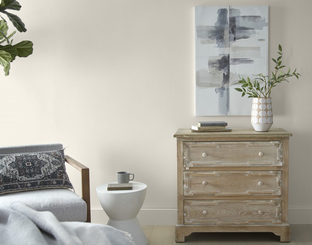
Every romantic palette benefits from a luminous neutral that helps the surrounding colors shine. Polished Pearl PPU6-09 provides that cream paint color foundation with softness that feels warm, elegant, and versatile for bedrooms, walls, and trim pairings.
In a bedroom, Polished Pearl creates a warm, luminous backdrop for vintage-inspired furniture, soft bedding, and muted blue accents. This cream paint color keeps the room feeling romantic and restful while still giving the overall look a refined, pulled-together finish.
A Muted Rose Exterior with Vintage-Inspired Character
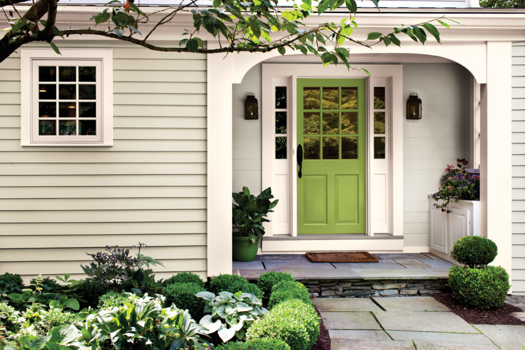
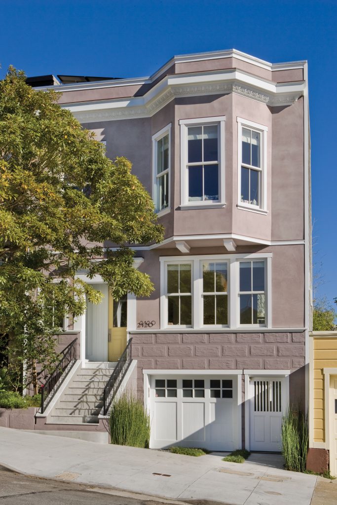
Vintage Tea Rose HDC-CT-07A brings a muted pink paint color into the palette, adding warmth, softness, and a romantic touch. It has a vintage quality that feels charming without becoming too sweet, especially when balanced with creamy whites, warm neutrals, and tailored architectural details.
On an exterior, Vintage Tea Rose gives the home a graceful, romantic character while Cameo White trim keeps the look crisp and classic. The soft rose color feels elegant against white windows and traditional details, making it a beautiful example of how a romantic color palette can extend beyond interiors.
A Powdery blue-violet Wall Color for Studies, Reading Nooks, and Small Spaces
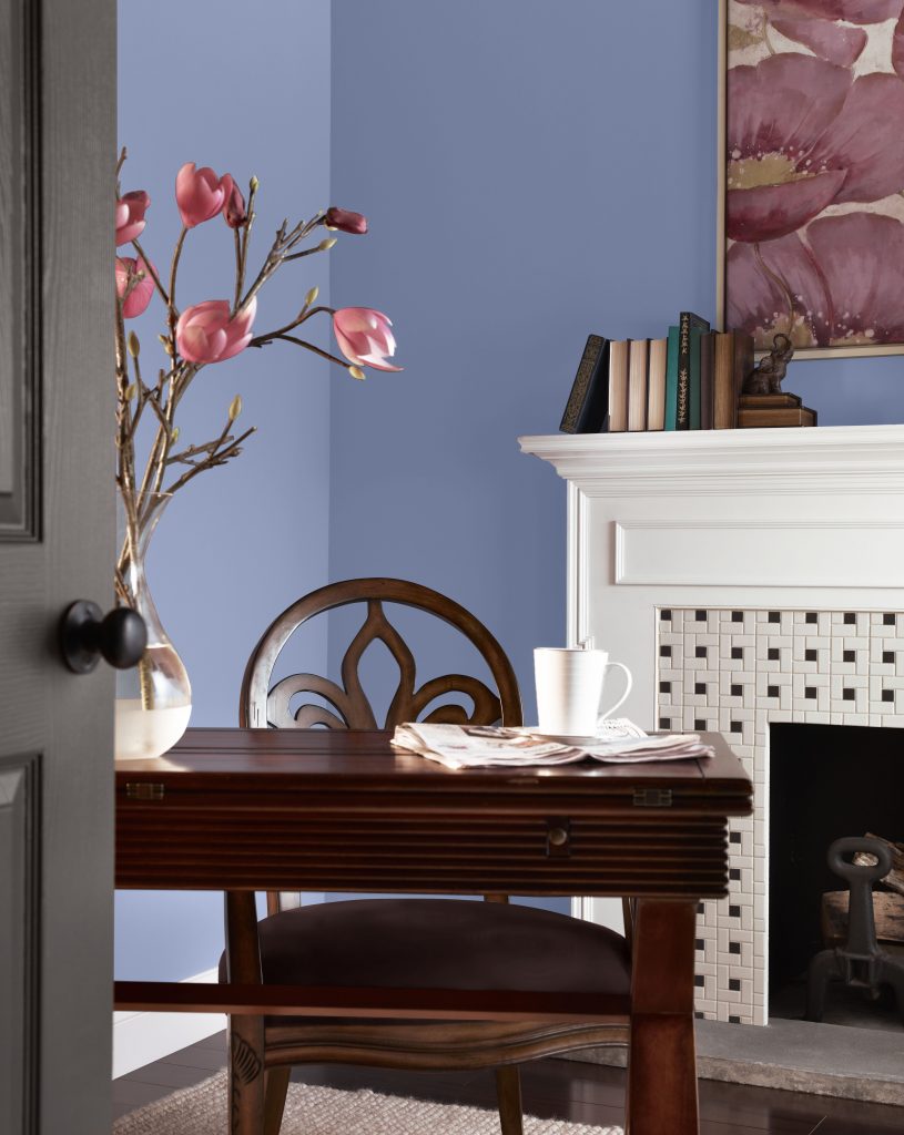
A powdery blue-violet paint accent adds depth and polish while keeping the room color palette soft and approachable. Vintage Ribbon S540-4 introduces that classic touch, creating contrast that feels elegant rather than dramatic.
Used in a small space for a thoughtful and elevated feel, Vintage Ribbon gives the room a refined sense of color without overpowering the space. It pairs beautifully with crisp white trim, warm wood furniture, vintage artwork, and soft rose accents for a look that feels tailored, romantic, and quietly inspiring. This powdery blue-violet paint color is also a lovely choice for reading nooks, bathrooms, vanities, or furniture pieces.
A Warm White Anchor for Trim, Ceilings, and Whole-Home Flow
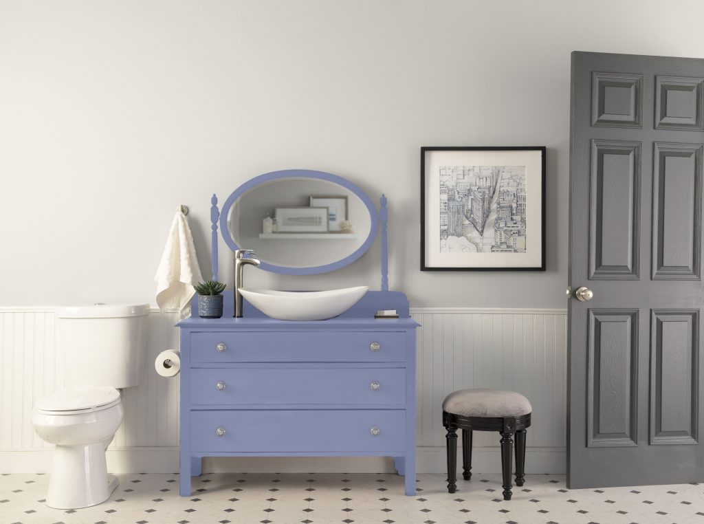
Every well-balanced paint color palette needs a versatile neutral to tie everything together. Cameo White MQ3-32 fills that role beautifully, connecting the palette’s gold, rose, blue-green, and powdery blue-violet tones while maintaining a soft, classic look. Use Cameo White on trim, doors, ceilings, walls, and whole-home pairings when you want a soft, classic finish.
Cameo White keeps this bathroom feeling soft, clean, and timeless on the walls, creating a warm white backdrop that complements the Regency Romance paint color palette. As a secondary accent, Vintage Ribbon adds a refined powdery blue-violet paint detail on the vanity, bringing tailored Regency-inspired character to the space. Paired with white wainscoting, a gray door, patterned floor tile, and simple vintage details, this bathroom paint color idea feels balanced, elegant, and updated.
How to Use the Regency Romance Color Palette by Room
| Color | Palette role | Best rooms and surfaces | Mood outcome |
| Harmonious Gold M300-3 | Heritage warm accent | Dining rooms, living rooms, accent walls, traditional spaces | Warm, welcoming, refined |
| Opal Silk PPU12-08 | Soft blue-green wall color | Living rooms, bedrooms, paneled walls, calm interiors | Airy, serene, polished |
| Polished Pearl PPU6-09 | Creamy foundation color | Bedrooms, walls, trim pairings, soft neutral spaces | Luminous, restful, graceful |
| Vintage Tea Rose HDC-CT-07A | Muted romantic pink | Exteriors, bedrooms, accent walls, vintage-inspired rooms | Romantic, charming, softly elegant |
| Vintage Ribbon S540-4 | Powdery blue-violet accent | Vanities, furniture, bathrooms, studies, reading nooks | Tailored, classic, fresh |
| Cameo White MQ3-32 | Warm white neutral anchor | Trim, doors, ceilings, walls, and whole-home pairings | Clean, timeless, connecting |
Pairing Ideas for a Romantic Room Color Palette
For a soft, low-contrast look, pair Behr Cameo White with Polished Pearl and Vintage Tea Rose. The combination creates a warm, romantic bedroom color story that feels gentle, layered, and easy to live with.
For a more tailored look, pair Vintage Ribbon with Cameo White, warm wood, brass, and soft white trim. The powdery blue-violet note gives the palette polish while still preserving the romantic feel.
For rooms that need extra warmth, Harmonious Gold pairs beautifully with antique wood furniture, cream fabrics, traditional lighting, and vintage-style artwork. For a calmer room, let Opal Silk lead on the walls and keep the remaining finishes soft and natural.
Bringing Regency Romance Home
Regency Romance is all about soft elegance, timeless charm, and color that feels collected over time. Warm creams bring luminosity, rose tones add romance, blue-green and powdery blue-violet notes bring polish, and gold adds a sense of heritage warmth.
Whether you use this romantic paint color palette in a dining room, bedroom, bathroom, living room, exterior accent, or small furniture moment, it offers a graceful way to bring Regency-inspired style into the home.
Explore more on behr.com for paint color palette inspiration, paint products, sheen guidance, room inspiration, and more.
Colorfully yours,
Larayne
The palette should clearly list Rococo Beige HDC-NT-15, Foxglove M550-3, Radiant Rose S140-1, Cameo White MQ3-32, Harmonious Gold M300-3, Opal Silk PPU12-08, Polished Pearl PPU6-09, Vintage Tea Rose HDC-CT-07A, and Vintage Ribbon S540-4, with Cameo White identified as the repeated neutral anchor.
References: Behr colors
Use the palette across bedrooms, dining rooms, living rooms, bathrooms, exterior accents, reading nooks, and laundry or utility spaces. The strongest content opportunity is to map each room photo to a primary wall color, trim color, accent color, and mood outcome.
References: Bedroom inspiration | Living room inspiration | Bathroom inspiration | Dining room inspiration
Balance Radiant Rose or Vintage Tea Rose with structured neutrals such as Cameo White, Polished Pearl, and Rococo Beige. Add deeper blue, green, or ribbon-inspired accents to make the palette feel tailored rather than overly delicate.
References: Behr colors | Behr inspiration
Use Foxglove or Vintage Ribbon as a contrast color in dining rooms, studies, bathrooms, built-ins, or accent walls. Pairing blue with warm creams, muted rose, brass, wood, and soft white trim helps the look feel fresh while preserving the romantic theme.
References: Behr colors | Interior paint
The palette communicates soft elegance, timeless charm, and refined romance. Content should explain the mood by color family: creams create luminosity, blush tones add warmth, blue notes add polish, gold adds heritage warmth, and deeper greens or blues add depth.
References: Behr inspiration
Add sheen guidance by surface and traffic level. Walls can use lower-sheen or mid-sheen finishes depending on room needs, while trim, doors, cabinetry, and furniture-style accents should be routed to more durable product and sheen guidance.
References: Interior sheen guide | Compare interior sheens | Interior paint