Color is one of the most enduring ways we connect past and present. It reflects how people lived, the materials they had access to, and the moods they wanted to create within a space. While palettes naturally evolve over time, they never truly disappear. Instead, each era leaves behind a distinct point of view that continues to influence how we live and use color today.
The colors we gravitate toward now are not random. They are influenced by decades, even centuries, of design history. From quiet, nature inspired hues to bold, expressive tones, each era continues to shape the way we think about color in the home.
Here is how these palettes show up today and how to make them your own. They are shaped by a layering of design history, where the muted practicality of Colonial palettes, the richness of the Gilded Age, the bold contrast of Art Deco, and the optimism of Midcentury Modern all subtly inform today’s choices. From quiet, nature-inspired hues to more expressive, saturated tones, these influences come together to create palettes that feel both familiar and new.
Here is how these eras continue to show up today and how to make them your own.
Classic Revival: Colonial Influence
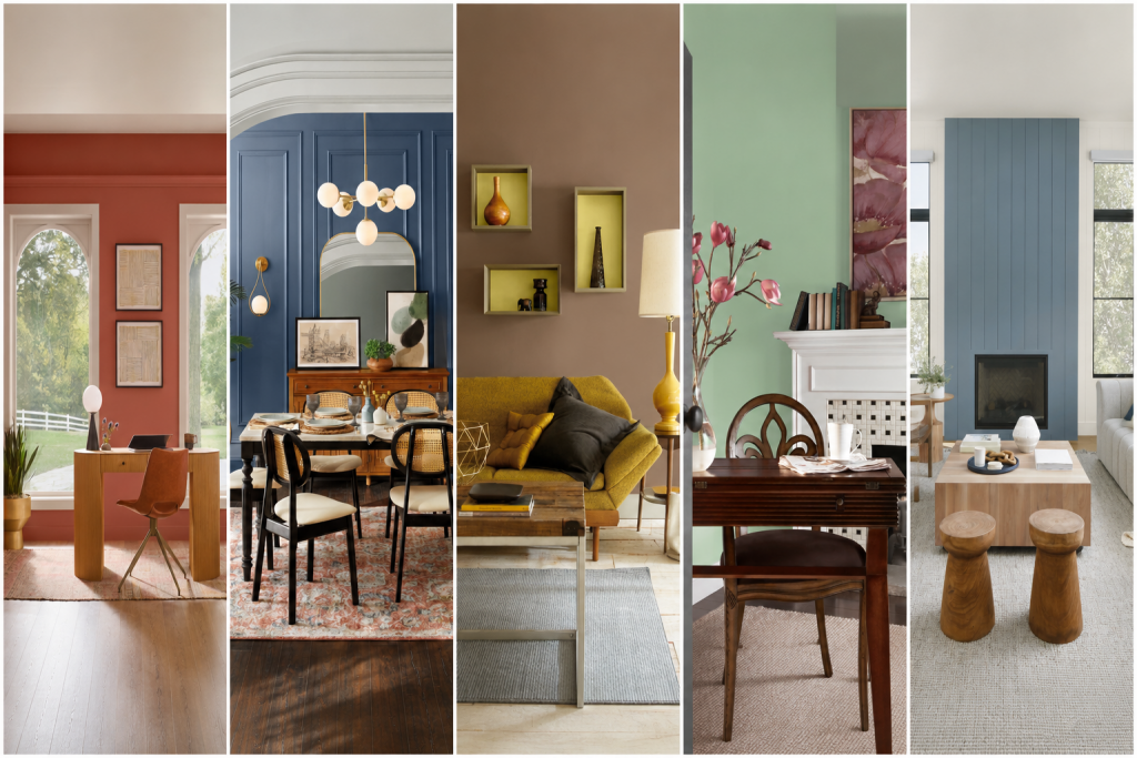
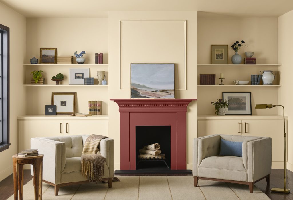
Colonial color palettes were shaped by necessity, resourcefulness, and the materials available at the time. Early American interiors reflected this practicality, with pigments sourced from the surrounding environment, mostly derived from natural earth minerals and stones resulting in warm, muted hues that felt both functional and enduring. Earth tones such as Spanish Brown and Ochres were the most common and affordable. As craftsmanship evolved, deeper green blues and red were introduced, adding richness while maintaining a sense of simplicity.
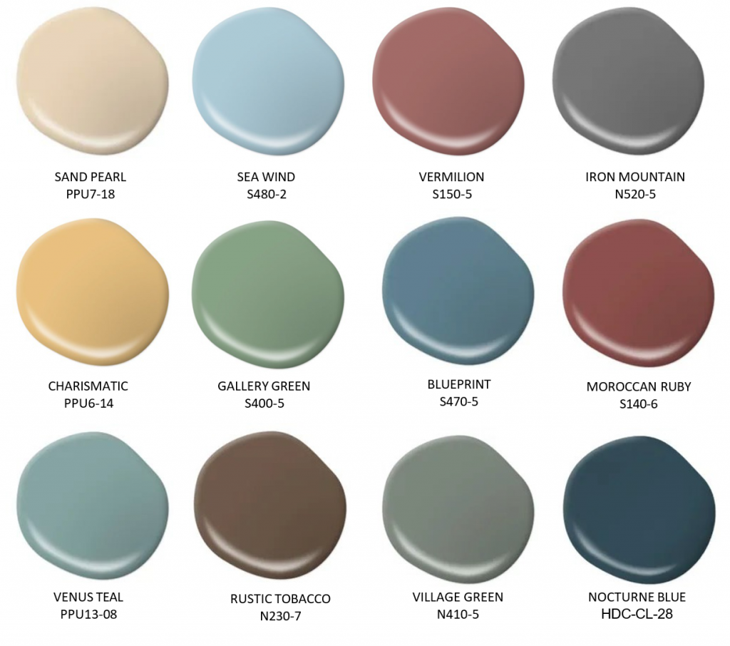
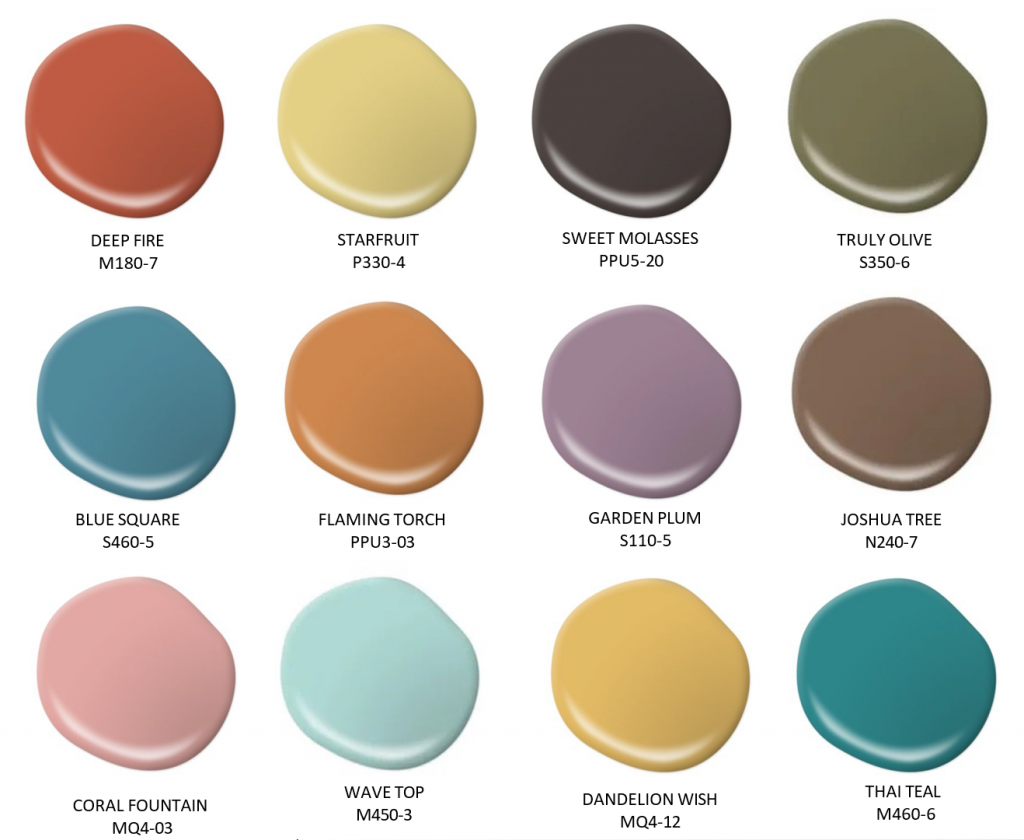
Colors like Village Green N410-5, Blueprint S470-5, Sand Pearl PPU7-18 and Rustic Tobacco N230-7 continue to evoke that familiar, timeless appeal in today’s homes.
How to use it today:
- Build a layered foundation with warm tones and soft contrast. Start with warm, natural hues as your base, then introduce deeper shades through trim, cabinetry, or accents to add definition without overpowering the space.
- Balance tradition with modern simplicity by pairing classic colonial colors with updated furnishings and cleaner silhouettes to create a look that feels timeless yet relevant.
- Soften the palette with light, airy accents by incorporating lighter elements through textiles, finishes, or décor to bring brightness and ease, keeping the overall look fresh and inviting.
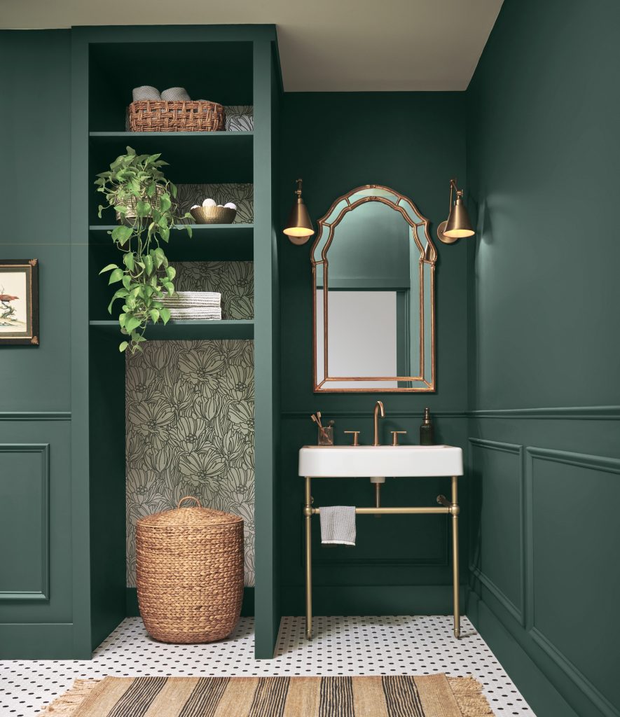
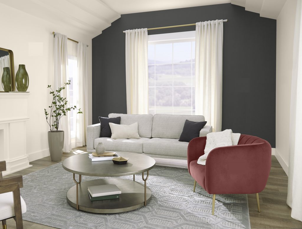
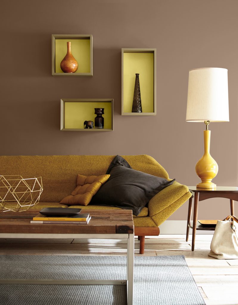
Gilded Grandeur: Depth and Drama
During the Gilded Age, color became a true expression of status and sophistication. Interiors embraced richness and opulence in every sense, with layered, saturated hues that created an immersive and ornate atmosphere. Advances in color technology made it possible to achieve deeper, more intense shades, often paired with intricate detailing and luxurious finishes that highlighted craftsmanship and grandeur.
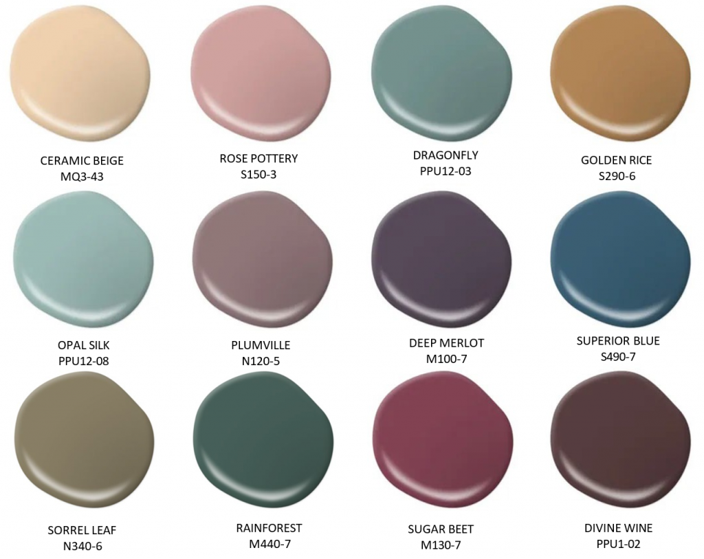
Jewel tone paint colors like Deep Merlot M100-7, Rainforest M440-7, Divine Wine PPU1-12 and Superior Blue S490-7 bring that same sense of depth and presence into today’s spaces.
How to use it today:
- Create a sense of drama and refinement with rich tones, balanced by lighter contrasts. Use deep, saturated colors to add mood and depth, then layer in lighter elements like upholstery or trim to keep the space feeling refined rather than heavy.
- Focus bold color in intentional moments. Apply Gilded-inspired hues to statement areas such as dining rooms, living rooms, libraries, powder rooms, or accent walls to capture drama without overwhelming the entire home.
- Elevate the palette with subtle metallic accents. Introduce touches of gold or brass through lighting, hardware, or décor to enhance dimension and echo the era’s sense of luxury in a more understated way.
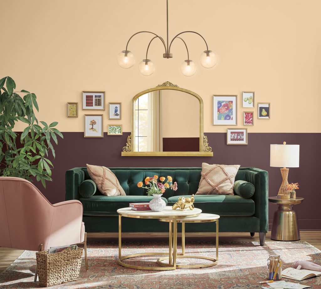
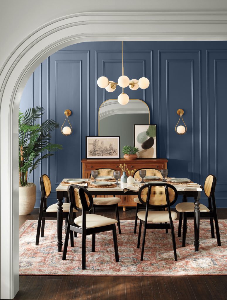
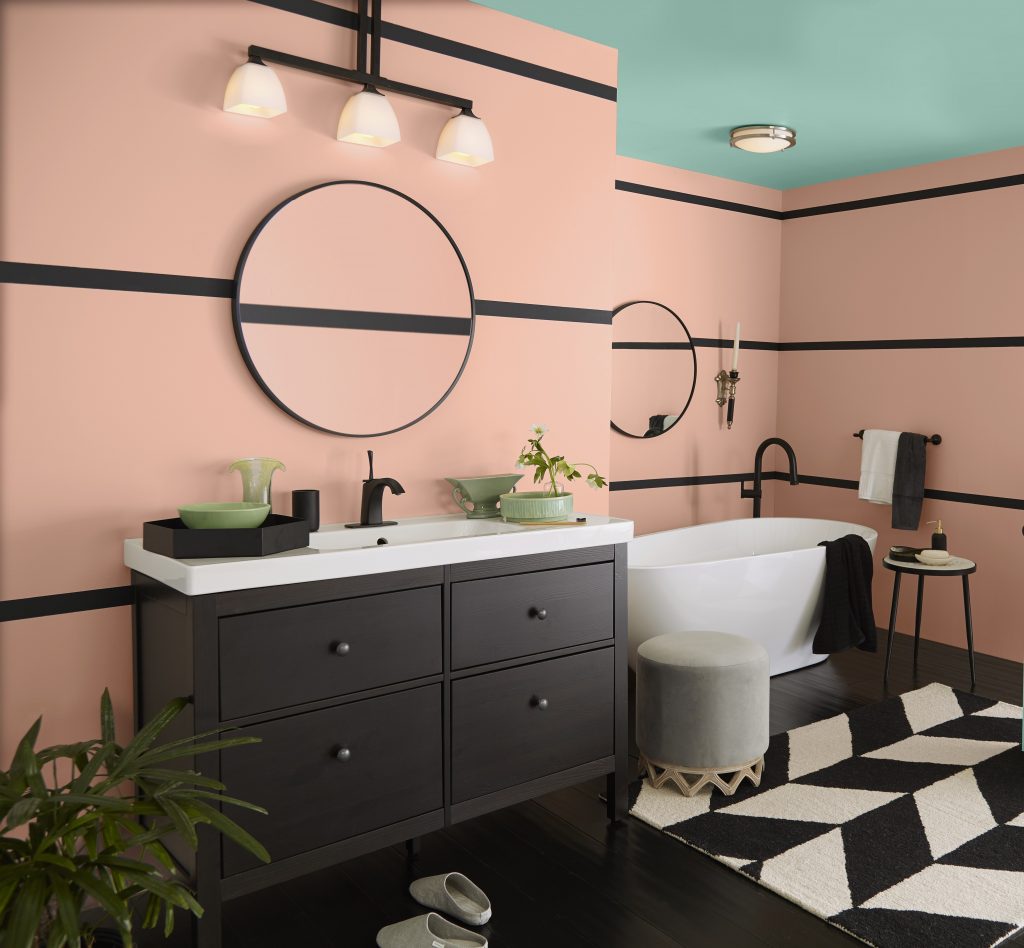
Metropolitan Glamour: Art Deco Influence
Art Deco colors were driven by a fascination with progress, global influence, and the desire to make a lasting impression. Designers drew inspiration from travel, architecture, and luxury goods, creating palettes that felt bold, polished, and intentionally eye-catching. Hight-contrast pairings, rich jewel tones, and reflective finishes defined the look, bringing a sense of drama and sophistication to interiors.
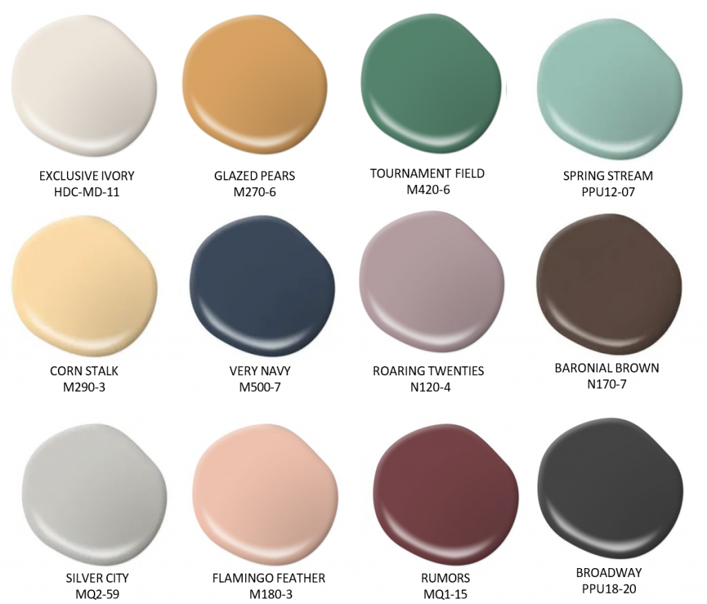
Colors like Very Navy M500-7, Cherry Cola S130-7, Broadway PPU18-20, and Exclusive Ivory HDC-MD-11 capture that bold yet refined elegance while still feeling approachable for today’s spaces.
How to use it today:
- Create contrast with deep tones, crisp neutrals, and black accents. Try pairing rich, saturated colors with light hues, and use black as a defining element to sharpen lines and add structure.
- Incorporate color through architectural details with intentional repetition. Highlight arches, paneling, or inset walls, and repeat color or shapes to echo the symmetry that defines Art Deco design.
- Layer in metallic finishes through thoughtful details. Introduce gold, brass, or chrome through lighting, hardware, or décor to enhance color and bring a subtle sense of glamour.
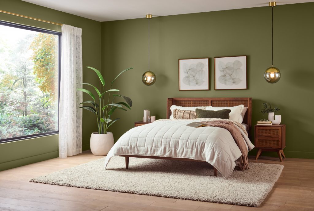
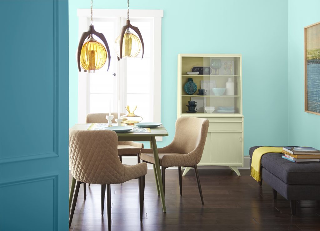
Retro Chic: Midcentury Modern, Reimagined
Midcentury Modern design embraced a sense of optimism, and its palette reflects that forward-looking mindset. Drawing from both nature and innovation, these interiors balanced organic tones with bold moments of color. Olive greens, golden yellows, warm browns, and vivid teals became defining hues of the era, influenced in part by post-war advancements in synthetic pigments that made brighter, more durable colors widely accessible.
Mid-century modern inspired paint colors like Starfruit P330-4, Truly Olive S350-6, Joshua Tree N240-7, Flaming Torch PPU3-03, and Thai Teal M460-6 capture that distinctive blend of earthy warmth and vibrant energy.
How to use it today:
- Use color to highlight architectural features like built-ins, room dividers, statement walls to draw attention to structure without overwhelming the space.
- Blend vintage-inspired color with modern materials. Try pairings classic Midcentury tones like olive or burnt orange with contemporary finishes such as matte black, glass, or polished stone for a more current look.
- Create contrast through color blocking. Instead of spreading color evenly, define zones with distinct hues to give open-concept spaces a sense of purpose and visual rhythm.
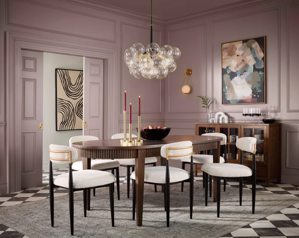
Current Edit: Designed for the Way We Live Now
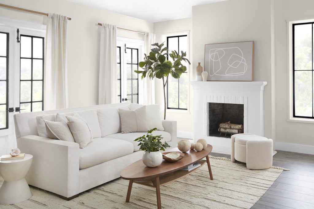
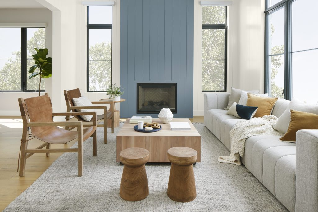
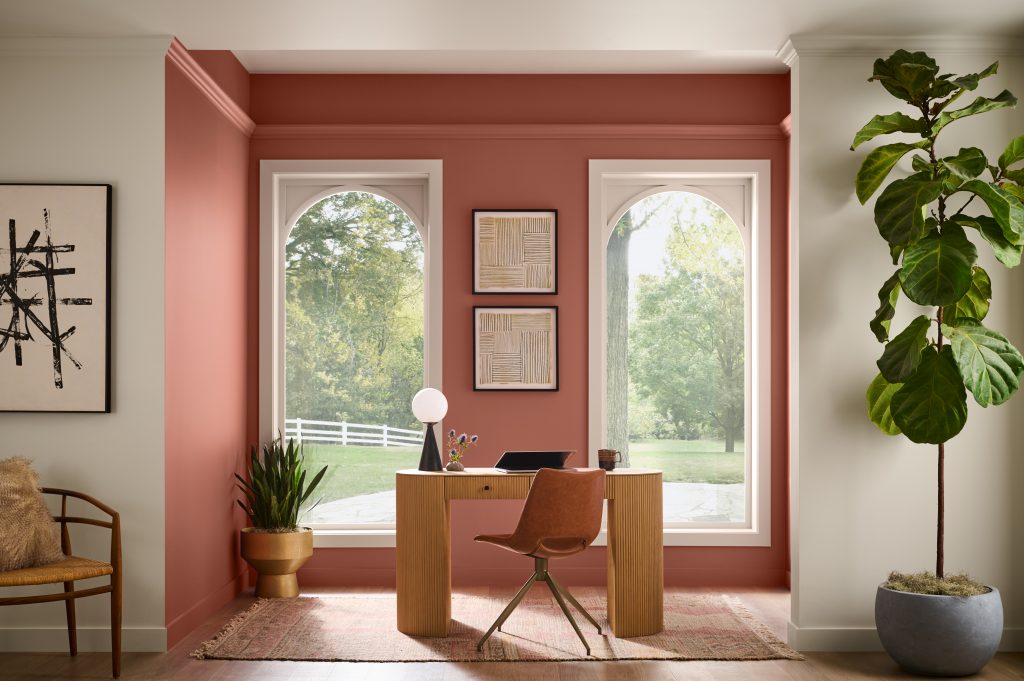
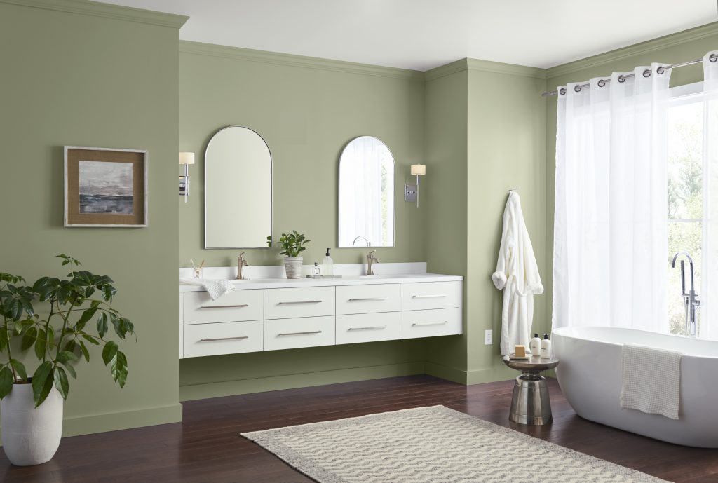
Today’s palette leans into comfort, balance, and flexibility, reflecting how our homes have evolved into spaces that do more than ever before. As living, working, and gathering increasingly happen under one roof, color has shifted to support a sense of ease and adaptability. Soft whites, warm neutrals, and gentle earth tones resonate because they create a calming foundation that feels both grounding and versatile across changing light, functions, and moods throughout the day.
These warmer hues also reflect a broader return to natural influence, echoing materials like wood, clay, and stone that bring a sense of authenticity and connection to the outdoors. They also offer visual warmth and softness, helping spaces feel more inviting and lived-in rather than stark or formal. Deeper paint colors can then be layered in to add dimension and contrast, introducing visual interest while maintaining an overall sense of calm.
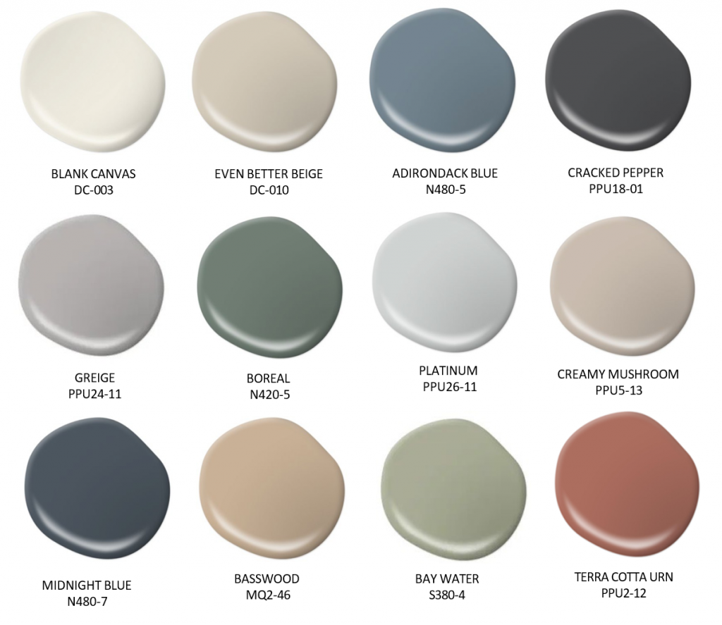
Neutral paint colors like Blank Canvas DC-003, Even Better Beige DC-010, and Creamy Mushroom PPU5-13 feel effortless and adaptable, while Adirondack Blue N480-5, Midnight Blue N480-7 and Terra Cotta Urn PPU2-12 introduce richness and contrast.
How to use it today:
- Experiment with paint finishes to create interest, pairing matte walls with satin cabinetry or textured surfaces to subtly shift how color is experienced.
- Define a cozy zone by painting an alcove or nook in an earthy, inviting hue, creating a moment that feels both purposeful and welcoming within the larger space.
- Let natural light guide your color placement by using lighter tones where light hits and slightly deeper tones in shadowed areas to create a soft, dimensional effect.
- Incorporate tone-on-tone layering through textiles and décor, such as pillows, rugs, and art, to reinforce the palette without introducing visual noise.
Each of these palettes tells a different story, yet they all share one thing in common. They continue to inspire how we design today. By pulling from the past and adapting it to current lifestyles, color becomes more than a design choice. It becomes a way to create spaces that feel meaningful, personal, and lasting. For more color inspiration, visit Behr.com.
Colorfully yours,
Diana
Note – The colors featured in this article draw inspiration from historical palettes and design eras, offering a modern interpretation for today’s homes.
A: Start with a comfortable base—soft whites, warm neutrals, and gentle earth tones—then add deeper hues in controlled moments to create dimension without overwhelming the space. Use finish variation and tone-on-tone layering to reinforce the palette through light, texture, and décor rather than adding more colors.
References: Choose an interior sheen | Compare interior paint sheens
A: The Current Edit palette is a modern, flexible mix built around soft whites and warm neutrals, with deeper accents for contrast and dimension. The colors included are Blank Canvas (DC-003), Even Better Beige (DC-010), Creamy Mushroom (PPU5-13), Midnight Blue (N480-7), and Terra Cotta Urn (PPU2-12).
References: Blank Canvas DC-003 | Even Better Beige DC-010 | Creamy Mushroom PPU5-13 | Midnight Blue N480-7 | Terra Cotta Urn PPU2-12
A: Sheen changes how paint reflects light and how the finish reads across different surfaces. That makes it one of the simplest ways to add depth while keeping the same color story. Use a lower-sheen finish to keep large wall areas soft and uniform, then use a higher-sheen finish on cabinetry, trim, or architectural details to add definition and subtle contrast.
References: Choose an interior sheen | Compare interior paint sheens
A: Use Midcentury-inspired color to highlight architectural features—built-ins, room dividers, or a statement wall—then keep the rest of the room clean and modern. Pair bold Midcentury tones with modern materials like matte black, glass, or polished stone, and use color blocking to define zones in open-concept spaces.
References: Starfruit P330-4 | Truly Olive S350-6 | Joshua Tree N240-7 | Flaming Torch PPU3-03 | Thai Teal M460-6
A: Build high contrast using deep tones with crisp neutrals, then sharpen lines with black accents for structure. Repeat shapes and color moments to echo symmetry (arches, paneling, inset walls), and add metallic finishes through lighting, hardware, or décor.
References: Very Navy M500-7 | Cherry Cola S130-7 | Broadway PPU18-20 | Exclusive Ivory HDC-MD-11
A: Concentrate deep, saturated hues in intentional statement areas—like a dining room, library, powder room, or an accent wall—rather than covering the entire home. Balance rich tones with lighter contrasts and use subtle metallic accents to keep the overall look refined.
References: Deep Merlot M100-7 | Rainforest M440-7 | Divine Wine PPU1-12 | Superior Blue S490-7
A: Start with warm, muted base hues, then add definition with deeper shades through trim, cabinetry, or accents—keeping the overall feel grounded and calm. Modernize the palette with updated furnishings and cleaner silhouettes, and soften the look with light, airy accents through textiles and finishes.
References: Village Green N410-5 | Blueprint S470-5 | Rustic Tobacco N230-7