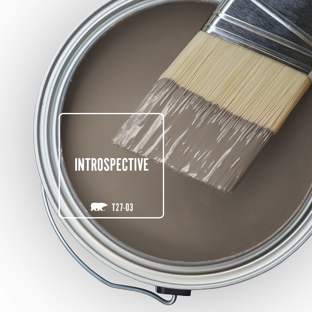
Some colors have a way of changing the feeling of a room without demanding all the attention. Introspective T27-03 brings depth, warmth and a grounded quality to interiors, making it a versatile choice for spaces designed for relaxing, gathering, working and everything in between.
Part of the BEHR® 2027 Color Trends Palette, Introspective is also featured within BEHR’s neutral color family, giving it the versatility to work as a foundational hue or alongside a broader range of colors.
Whether used across an entire room, on cabinetry or as an accent, Introspective adds dimension while creating a comfortable backdrop for furniture, finishes and personal style.
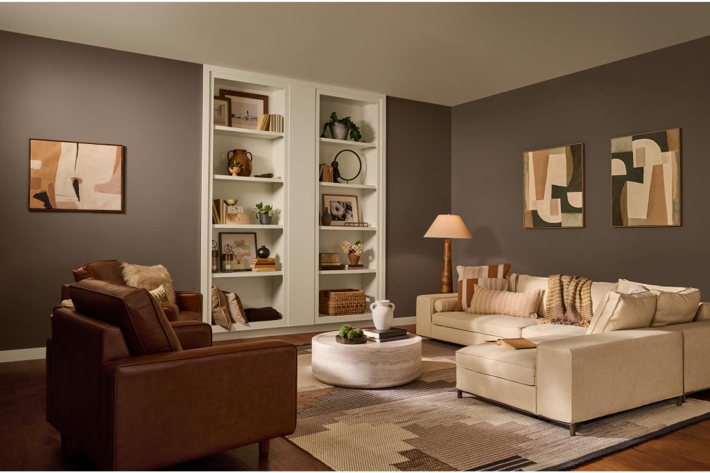
In a living room, Introspective creates an enveloping backdrop that feels polished yet relaxed. Covering the walls in this deeper neutral helps anchor lighter upholstery and décor while complementing natural wood tones and layered textures.
The result is a space that feels collected and comfortable, a reminder that neutrals can have plenty of personality and depth.
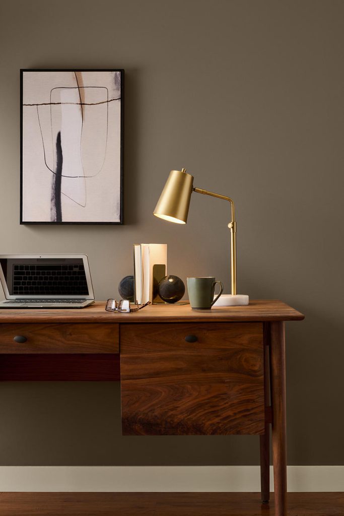
A home office is an ideal place to experiment with a richer neutral. Introspective creates definition behind a desk while letting warm wood furniture, artwork and metallic accents stand out.
Its grounded character can also help visually separate a workspace from the rest of the home, making even a simple desk area feel more intentional.
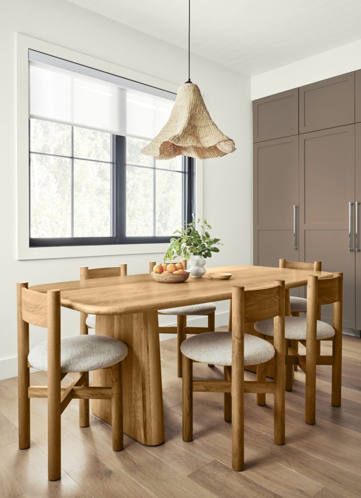
Paint color doesn’t have to stop at the walls. Bringing Introspective onto cabinetry offers another way to introduce color while highlighting architectural details.
Against a lighter surrounding palette, Introspective cabinetry can provide contrast and dimension without overpowering the room. Natural wood furniture and woven materials reinforce its warm, approachable character.
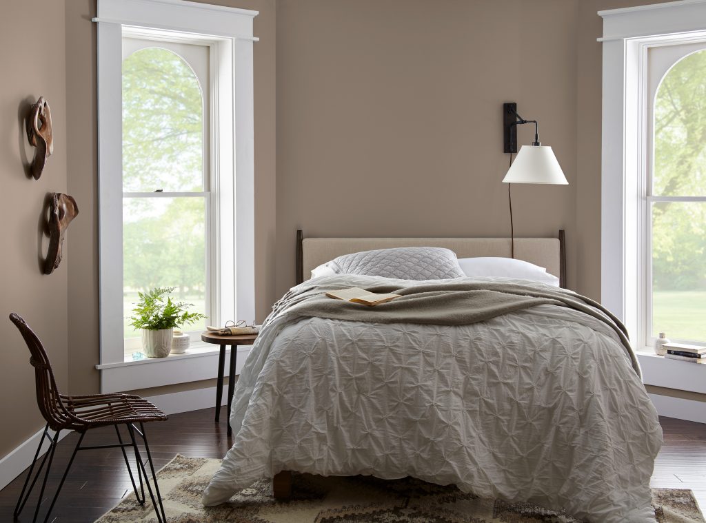
Deeper colors can transform bedrooms into more intimate retreats. Used across the walls, Introspective surrounds the room with color and creates a strong backdrop for crisp whites, soft neutrals and natural materials.
The contrast between the deeper walls and lighter bedding and trim gives the space definition while maintaining a calm, uncomplicated look.
Highlight Architectural Details
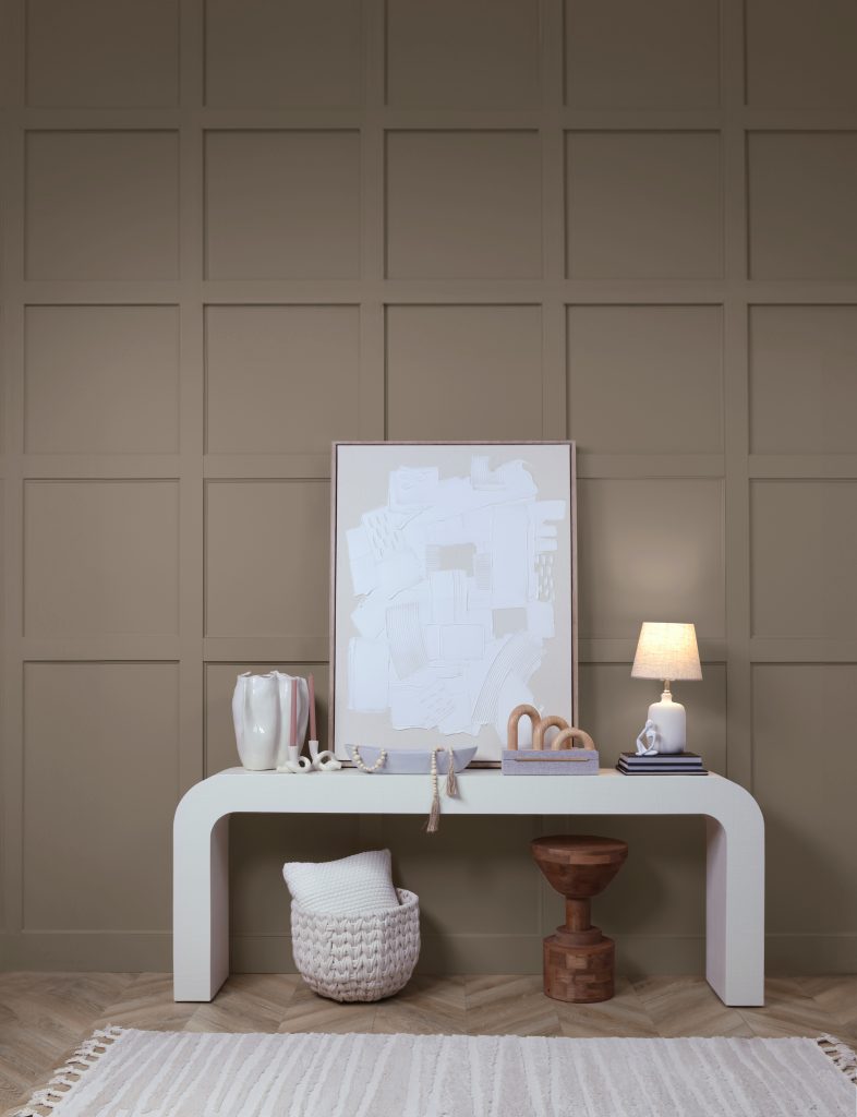
Introspective can also be used to emphasize architectural features. Paneling, molding and dimensional wall treatments become more noticeable when unified with a single paint color.
This approach gives the wall texture and visual interest while allowing furniture and accessories to remain simple.
Colors That Pair with BEHR Introspective
While Introspective can easily stand on its own, its versatility becomes especially apparent when it is paired with other colors. From soft greens and warm earth tones to deeper reds and approachable neutrals, these combinations show how Introspective can become part of a layered, whole-home palette.
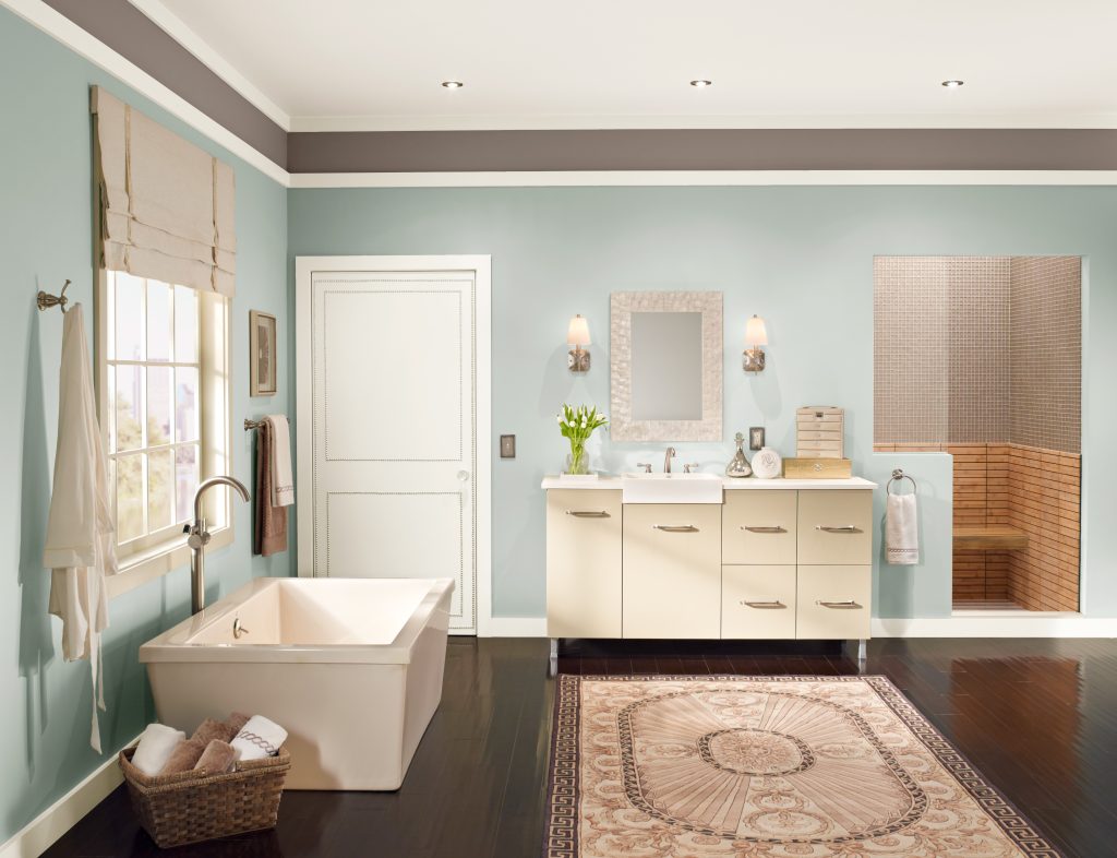
Introspective + Brook Green + Shoelace + Blank Canvas
A soft green-and-neutral combination gives this bathroom a fresh, restorative quality. Brook Green establishes a gentle wash of color across the walls, while Introspective adds greater depth as an accent. Shoelace overhead and Blank Canvas on the trim introduce lighter notes that keep the palette balanced. Together, the colors create subtle contrast while maintaining a cohesive, nature-inspired look.
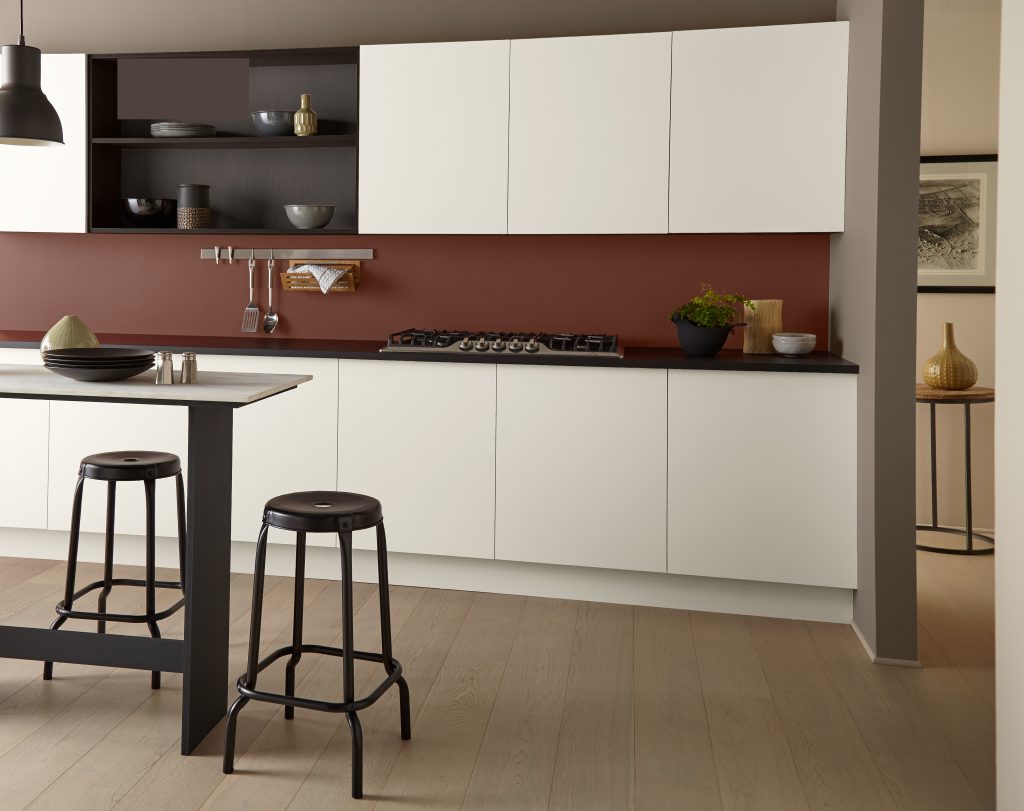
Introspective + Tuscan Terra + Hayloft + Blank Canvas + Espresso Beans
For a more layered approach, combine Introspective with warm, earthy colors.
Tuscan Terra introduces a rich clay-inspired note, while Hayloft brings in a softer golden quality. Introspective acts as a grounding neutral between them, helping connect the warmer hues.
On the cabinetry, Blank Canvas provides a light counterpoint while Espresso Beans adds deeper contrast. The combination demonstrates how several colors can coexist in one kitchen when they share an earthy, connected character.
Introspective + Rumors + Blank Canvas
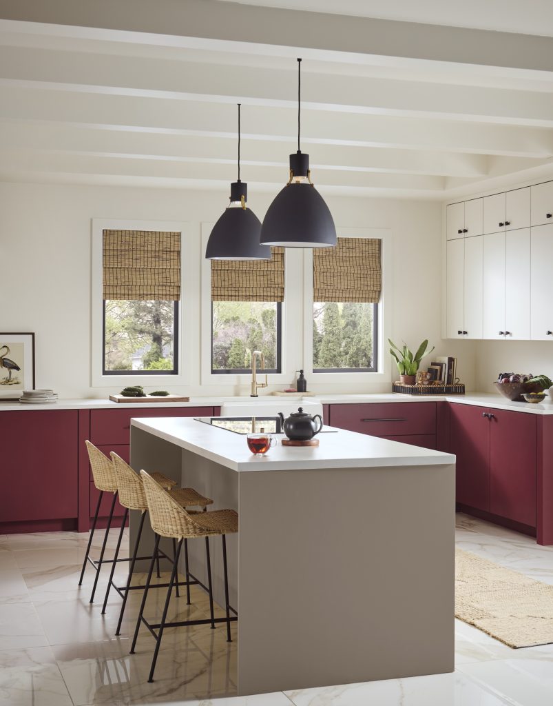
A kitchen island is a natural place to introduce Introspective when you want color without carrying one hue across the entire space.
Here, Introspective grounds the center of the kitchen while Rumors brings rich color to the surrounding cabinetry. A light backdrop keeps both hues distinct, turning the cabinetry and island into intentional design features. The mix of a grounded neutral and a deeper red creates a look that feels expressive but still balanced.
Introspective + Even Better Beige + Hidden Gem
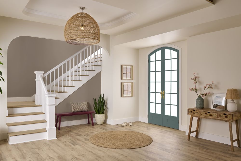
Entryways and staircases provide opportunities to build a color story that introduces the personality of the rest of the home.
Even Better Beige creates a warm, approachable foundation, while an Introspective staircase accent wall brings depth and draws attention to the architecture. Hidden Gem on the door adds a distinctive green note, creating another layer of color without overwhelming the space. Together, the three colors show how neutrals and richer hues can work together to guide the eye from one area of the home to another.
Make Introspective Your Own
From full-room applications to cabinetry, accents and coordinated color palettes, Introspective T27-03 offers plenty of ways to bring depth into an interior.
Use it alone for an immersive look, introduce it on a feature such as cabinetry or an accent wall, or build a palette around it with warm neutrals, greens, reds and earthy shades. The result can feel distinctly different from room to room while still creating a thoughtful sense of connection throughout the home.
Before committing to a color, see how Introspective and its coordinating shades respond to your room’s lighting, furnishings and finishes. Explore BEHR color tools and try Samplize to sample colors in your own space to find the combination that feels right for your home.
Colorfully yours,
Diana
BEHR Introspective T27-03 is a deeper neutral with a warm, grounded character. Part of the BEHR® 2027 Color Trends Palette, it brings depth to interiors and works as both a foundational wall color and an accent on cabinetry or architectural details.
Introspective pairs with warm neutrals, soft greens, earthy shades and richer accent colors. Try Brook Green for a gentle, nature-inspired combination or Tuscan Terra and Hayloft for an earthy palette. Rumors introduces rich red contrast, while Even Better Beige and Blank Canvas create a warm, neutral foundation.
Blank Canvas, Whipped Cream and Polar Bear provide a lighter counterpoint to Introspective. Use them on trim, cabinetry or surrounding walls to give the deeper color definition. Compare samples alongside your flooring, countertops and furnishings to find the white that works best in your space.
Yes. Introspective adds depth to cabinetry and can make a kitchen island a focal point. Pair it with lighter walls and natural wood finishes for a balanced look, or combine an Introspective island with Rumors cabinetry and Blank Canvas walls for a more expressive palette.
Introspective can create an enveloping backdrop in both bedrooms and living rooms. In a bedroom, pair it with white bedding, light trim and natural materials for a comfortable retreat. In a living room, lighter upholstery, warm wood furniture and layered textures help balance the deeper walls.
Warm wood, woven materials, soft textiles and metallic accents complement Introspective’s grounded character. Try natural wood furniture, a woven pendant light or brass accents to add texture and interest. Cream upholstery and lighter accessories provide contrast against the deeper neutral.
Repeat Introspective in different ways throughout your home, such as on living room walls, kitchen cabinetry or a staircase accent wall. Use coordinating colors like Even Better Beige, Blank Canvas and Brook Green in nearby spaces to create a sense of connection. This approach lets each room have its own character while maintaining a cohesive palette.
View a sample in the room where you plan to use it, alongside your flooring, furniture and other finishes. Check it at different times of day and under the lighting you use in the evening. Sample coordinating colors together so you can see how the full palette works in your space.