What Colors Go with Sage Green? Complete Paint Palettes for Every Room.
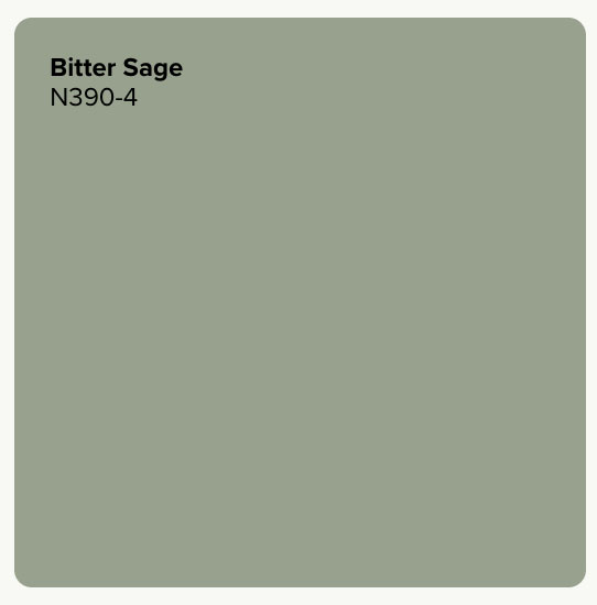
A sage green hue like Behr’s Bitter Sage N390-4 pairs naturally with warm neutrals, earthy terracotta, soft blush, deep navy, plum, and other muted greens. The combination can make sage feel fresh and airy, warm and organic, or rich and sophisticated, giving you plenty of ways to shape the mood of your space.
What colors go with sage green?
Part of sage green’s versatility comes from its muted character. Its balance of green and softened neutral tones allows it to sit comfortably alongside natural materials and understated colors, while deeper or warmer accents can create more contrast. Lighting, surrounding finishes, and the particular sage you choose can influence how those relationships appear in your room.
Whether you’re planning a living room, bedroom, kitchen, or home office, a thoughtful palette can help bring the whole space together. You can explore color combinations below that are built around Bitter Sage N390-4 with ideas for coordinating paint colors, furnishings, finishes, and materials you can adapt to your home.
Warm and natural: sage green + off-white + earthy red
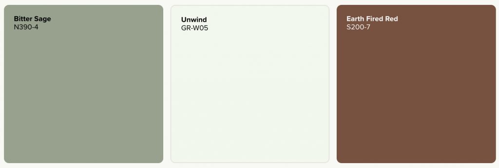
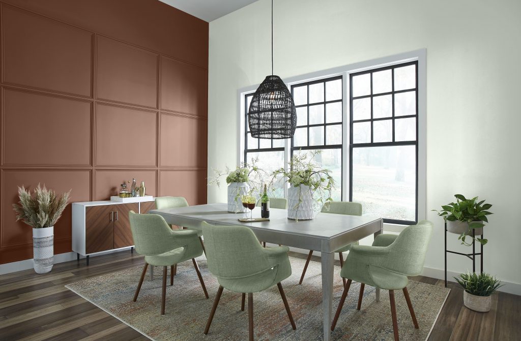
For a warm, organic palette, pair Bitter Sage N390-4 with Unwind GR-W05 and Earth Fired Red S200-7. This soft, mint-white gives sage room to breathe, while the earthy red introduces contrast without pulling the palette away from its nature-inspired feel. This combination works especially well in living and dining spaces with woven textures, warm woods, clay-toned accessories, or aged brass.
Soft and relaxed: sage green + blush pink
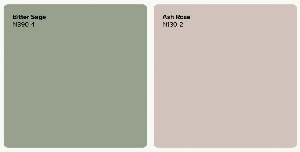
Sage and dusty blush create a gentle color story that feels layered rather than sweet. Ash Rose N130-2 is a light, dusty pink that can soften the green while adding a warm counterpoint. Try sage on the walls and bring blush into a painted furniture piece, a small accent area, or textiles. Natural oak, linen, and creamy neutrals can help connect the two colors.
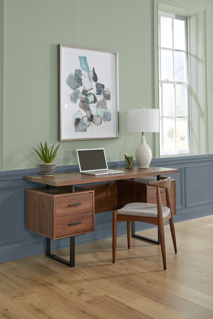
Tailored contrast: sage green + navy blue
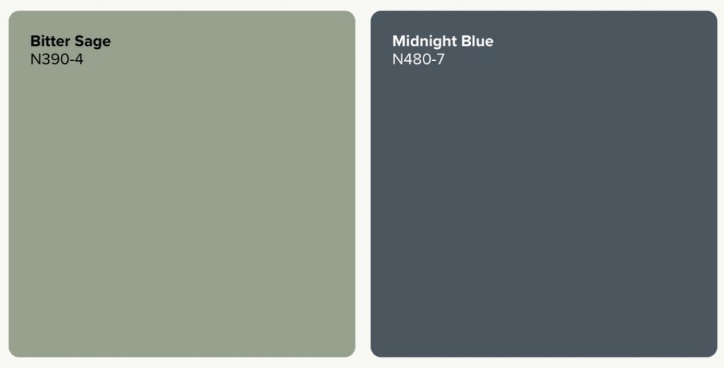
If you want more depth, pair sage with navy. Midnight Blue N480-7 is a deep blue-gray with a hint of black, giving the palette a strong anchor while letting sage stay calm and approachable. Use navy on cabinetry, built-ins, doors, or a smaller painted surface, then add a warm white or natural wood to keep the room balanced.
Rich and expressive: sage green + plum

Plum brings a richer complementary note to sage green. Medieval Wine S100-7 is a deep vintage plum that can add drama in smaller doses, such as a painted cabinet, door, furniture piece, or decorative accent. Keeping sage as the larger field of color helps the room stay grounded while plum adds depth and personality.
Quiet and layered: sage green + tonal greens + soft neutral
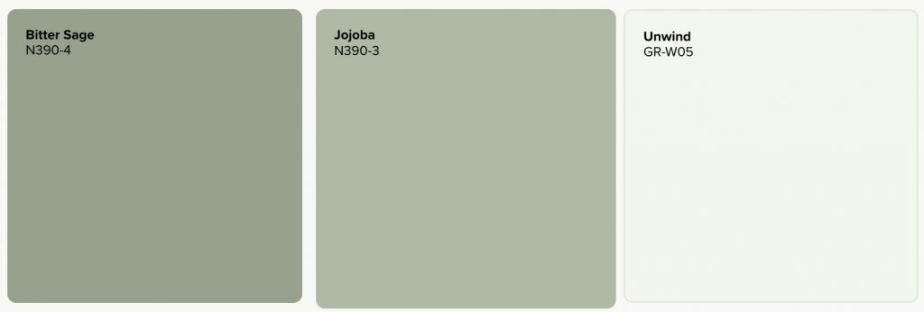
For a lower-contrast look, stay within the green family. Pair Bitter Sage N390-4, with Jojoba N390-3, then add Unwind GR-W05 to create visual breathing room. The shift in green depth adds dimension without changing the mood of the room, making this palette a natural fit for restful bedrooms, relaxed living rooms, and connected spaces.
What colors go with sage green in a living room?
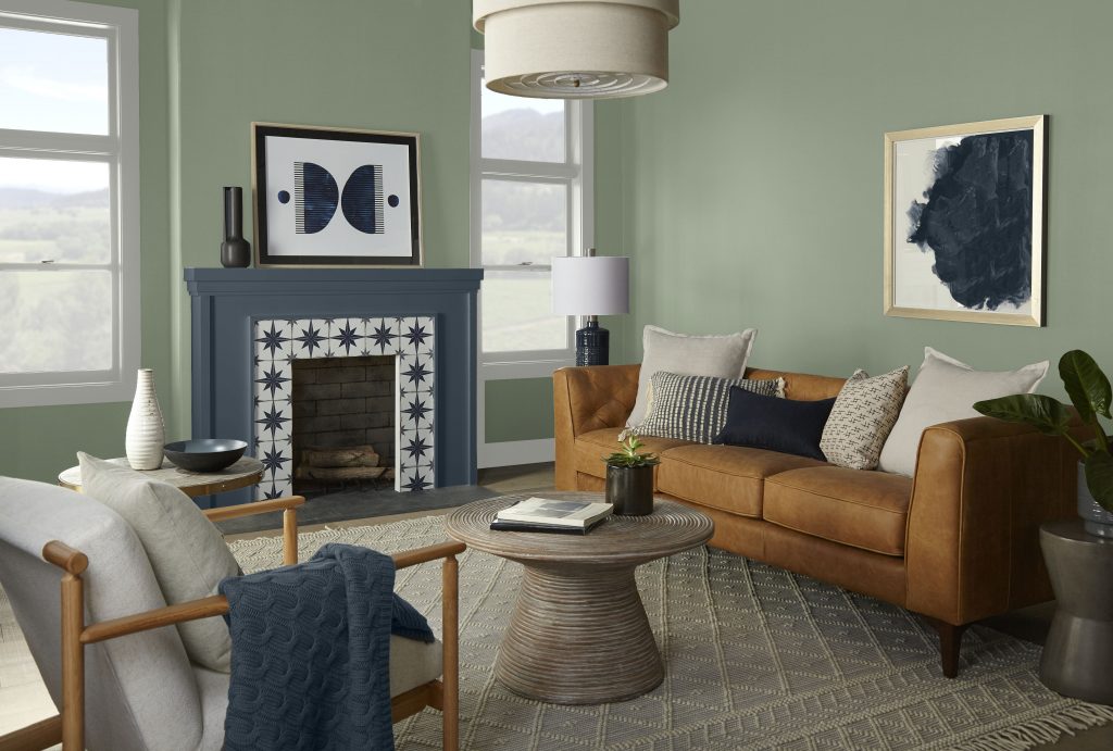
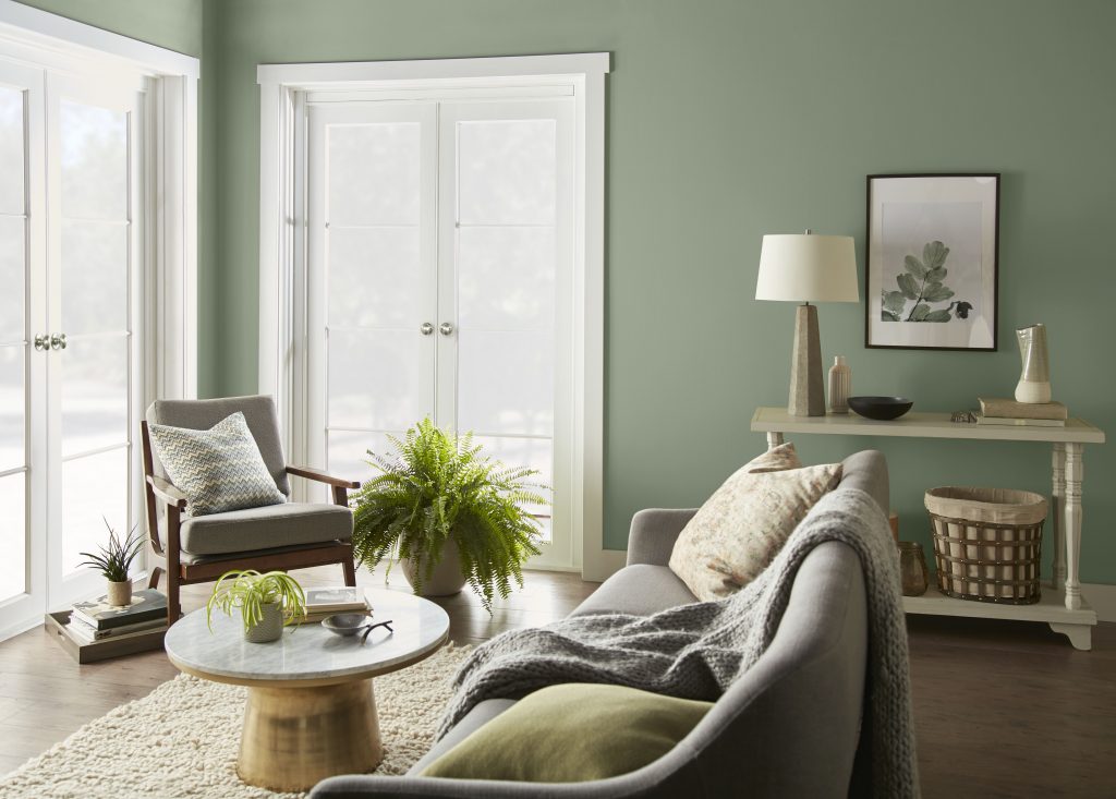
In a living room, sage green works well with warm off-white, beige, terracotta, dusty blush, navy, charcoal gray, cream, and natural wood tones. For a warm, organic modern scheme, combine Bitter Sage N390-4 with a warm beige or soft cream, then layer in light oak, linen, and brushed or aged brass. For a more tailored room, keep sage on the walls and add Midnight Blue N480-7 through built-ins, a door, or a smaller painted feature. Charcoal gray and cream can create another higher-contrast direction, especially when natural wood keeps the room from feeling too cool.
Sage green palettes by room
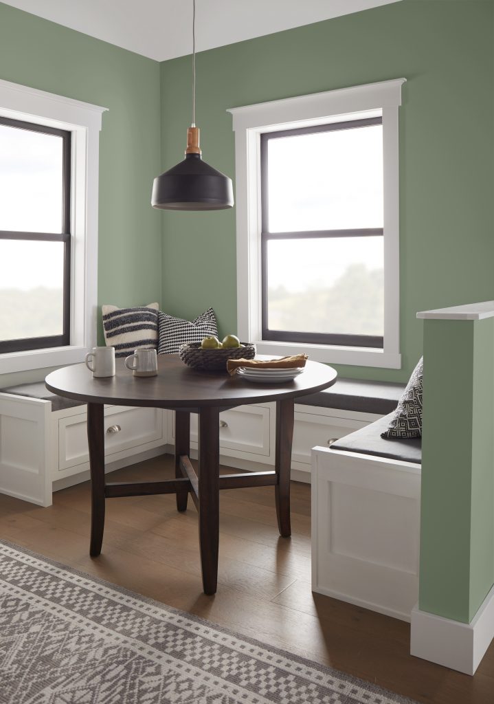
Living room
For an easy DIY living room palette, pair sage with warm beige or cream, natural wood, and brass, then choose one deeper accent such as navy or charcoal gray. Linen, woven textures, and matte black details can add definition without competing with the wall color.
Bedroom
Keep the palette softer with dusty blush, warm white, natural linen, and wood. A small amount of plum can add depth without overwhelming the room. In a low-light or north-facing bedroom, sage may appear grayer or cooler, so compare it with warmer companions in the actual room before choosing.
Kitchen
Sage can sit comfortably beside warm white or cream, natural oak, brass, and navy. If your countertops or backsplash are staying, compare samples directly against those fixed finishes before choosing the final shade.
Dining room
Deeper accents such as plum, navy, or earthy red can make sage feel more enveloping and give the room a stronger evening presence.
Home office
Pair sage with navy or a deeper green for focus and definition, then use a pale neutral to keep the overall palette balanced.
Sage green also works naturally with materials that echo its nature-inspired character. Light oak, walnut, linen, stone or marble, and warm metals can reinforce an earthy palette, while matte black and charcoal can sharpen the contrast. These material pairings are one reason sage works so well in nature-inspired and organic modern spaces.
Is sage green warm or cool, and how does light change it?
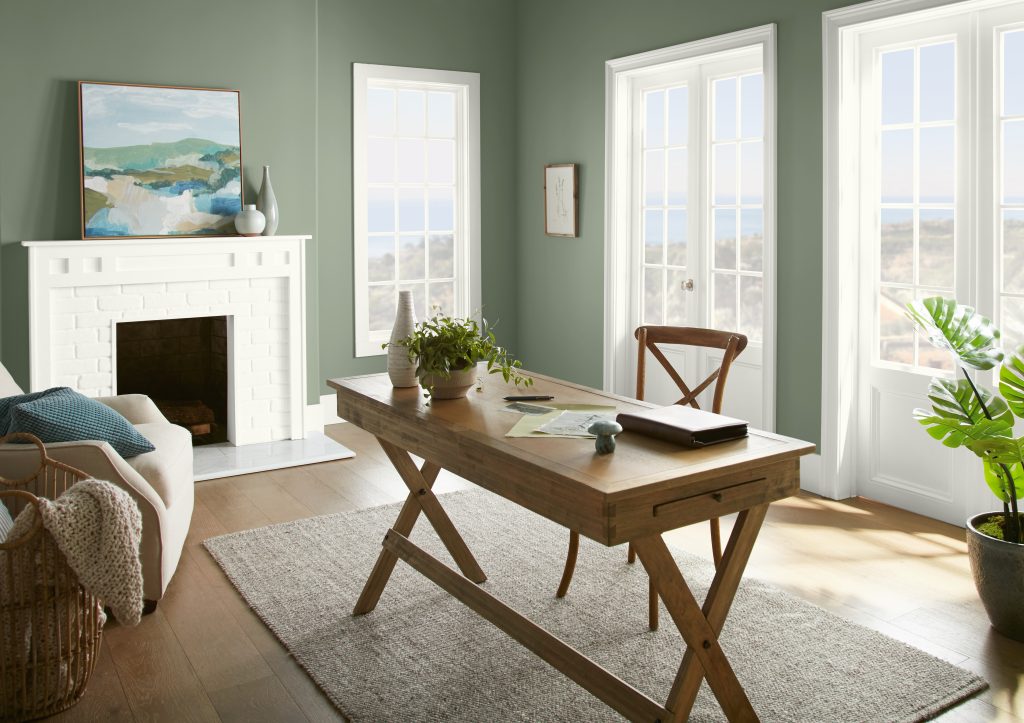
Sage green can act like a muted, nature-inspired neutral, but it is not automatically warm or cool. The undertones of the specific shade and the light in your room influence how it reads. Cooler or north-facing light may bring forward a grayer or cooler side, while warmer southern or western light can emphasize earthy character. Artificial light matters too, so look at your samples during the day and after the lamps come on. Place companion colors beside the sage sample, along with flooring, cabinetry, countertops, upholstery, and trim to see the palette as a whole.
Find your sage green palette
The right sage green palette should feel connected to the light, finishes, and mood of your room. Explore Behr’s full range of green paint colors for more shade ideas, then use the Green Inspiration gallery to see how green can work across different spaces. Bring your favorite combinations into your room with samples before making the final choice.
Colorfully yours,
Larayne
On a color wheel, green sits opposite the red family, but an interior palette usually benefits from softer versions of that contrast. Earthy red, terracotta, dusty pink, and plum can all complement sage without feeling overly bright.
Yes. Deep navy can give muted sage more definition and a tailored feel. Use navy where you want visual weight, then add a lighter neutral or natural wood to balance the contrast
Yes. Dusty, muted blush tones echo sage green’s softness and can create a calm, welcoming palette, especially in bedrooms and living spaces.
Warm white, cream, beige, greige, and some soft grays can all coordinate with sage green. Compare undertones in your room so the neutral supports the green rather than making it look unexpectedly cool or yellow.
Natural oak and walnut are easy places to start. Warm-to-neutral woods reinforce sage green’s earthy character, but your existing flooring and furniture should guide the final combination.
Sage green can behave like a colored neutral because its muted quality makes it easy to coordinate with many finishes and accent colors. Its temperature depends on the specific shade, surrounding colors, and light, so compare samples in your room rather than treating every sage as universally warm or cool.
Natural and artificial light can change how sage green appears. North-facing or cooler light may make it look grayer or cooler, while warmer southern or western light can bring forward its earthy side. Test sage alongside the colors and materials you plan to use and check the combination at different times of day.