

From soft dusty blue-grays to deeper stormy shades, this versatile color family brings depth, softness, and a calming sense of balance to interiors and exteriors alike.
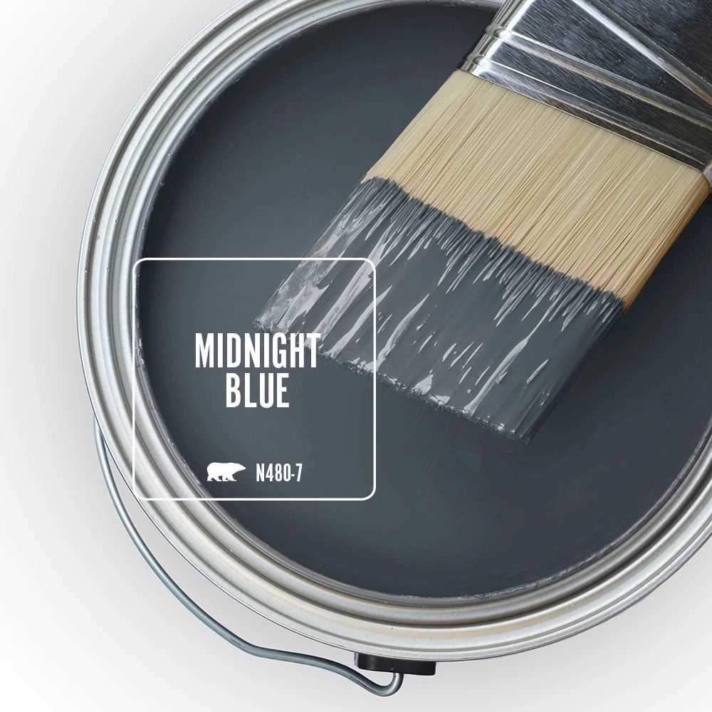
Blue-gray paint colors bring together the calm of blue and the softness of gray. Some feel light and airy, while others lean darker and moodier. Midnight Blue N480-7 sits at the dramatic end of the family, giving this palette a grounded, sophisticated feel without losing the versatility that makes blue-gray so easy to live with.
If you are drawn to a softer look, dusty blue-grays can make a bedroom or bathroom feel restful and serene. If you want more depth, stormier blue-grays can create a richer statement on cabinets, accent walls, or exterior details. The key is understanding how undertones shape the mood.
Featured Shade: Midnight Blue
Midnight Blue gives it presence, but the gray influence keeps it feeling more livable than a pure navy. In brighter rooms, it can feel velvety and dimensional. In lower-light spaces, it reads richer, moodier, and more cocooning.
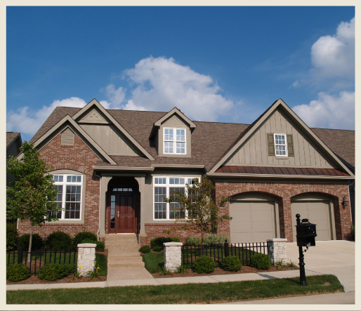
Use Midnight Blue when you want a blue-gray that can hold its own on a full wall, built-in cabinetry, a front door, or exterior siding. It pairs especially well with warm whites, natural wood, brass accents, and stone surfaces that soften its darker edge.
Soft Dusty Blue-Grays
Soft dusty blue-grays are often the easiest entry point into the family. They feel gentle, relaxed, and a little muted, which makes them a natural fit for bedrooms, bathrooms, and other spaces where a calm backdrop matters most.
Shades such as Dusted Blue N470-2A and Peaceful Blue S470-3 are ideal when you want the softness of gray with just enough blue to keep the room feeling fresh instead of flat.
Deeper Stormy Blue-Grays
Deeper stormy blue-grays bring more drama and contrast. These shades work especially well when you want color to act as a design feature rather than just a backdrop.
Midnight Blue N480-7 and Charcoal Blue N490-5 are strong choices for accent walls, dining rooms, cabinetry, and exterior accents where a richer look feels intentional and refined.
Where Blue-Gray Works Best
Bedrooms: Blue-gray helps create a restful, settled mood. Lighter dusty tones feel airy and quiet, while Midnight Blue can add depth as a feature wall behind the bed.
Bathrooms: Blue-gray feels clean, calm, and polished. It works beautifully on walls, vanities, and built-ins, especially when paired with crisp white or warm white finishes.
Living Rooms: In shared spaces, blue-gray can feel both classic and current. Medium to deeper shades bring depth without feeling as heavy as charcoal or black.

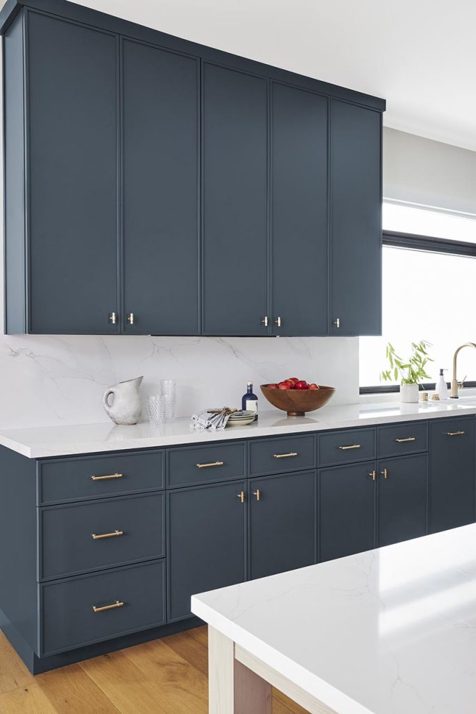
Cabinets: Blue-gray cabinetry offers contrast while still reading as timeless. Darker shades like Midnight Blue create a bold statement that pairs well with white counters, brass hardware, and warm wood accents.
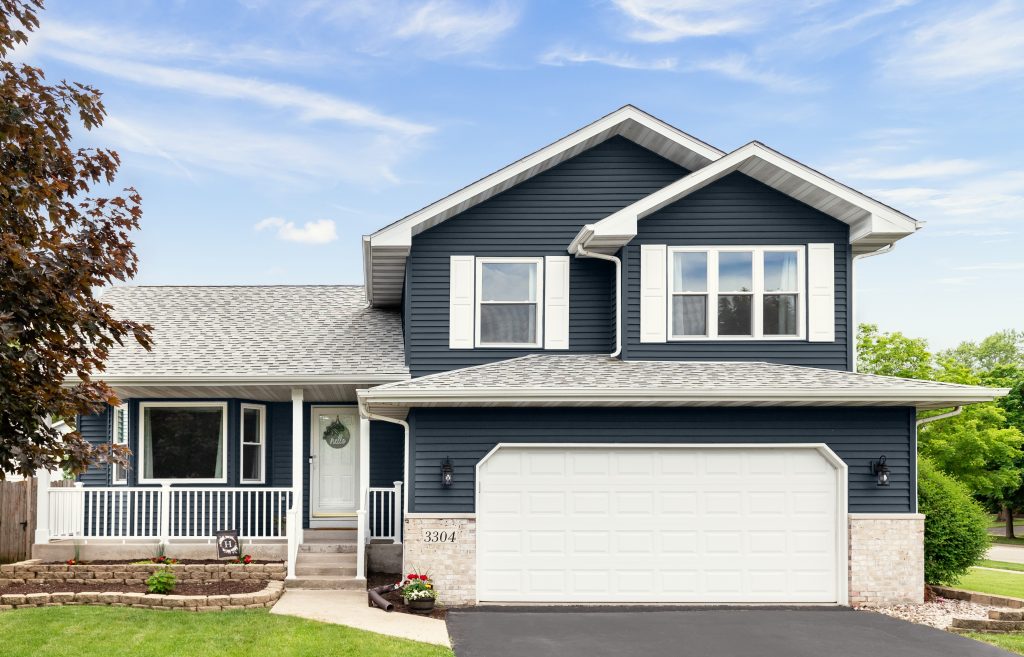
Exterior Accents: On front doors, shutters, or siding details, blue-gray feels elevated and versatile. It can read traditional, modern, or coastal depending on the trim and material pairings around it.
Understanding Blue-Gray Undertones
Black influence: When a blue-gray carries more black, it reads deeper, moodier, and more dramatic. Midnight Blue is a great example of this direction.
Gray influence: A stronger gray influence softens the color and makes it easier to layer across larger surfaces. These shades tend to feel balanced, subtle, and highly versatile.
Green influence: Some blue-grays carry a slight green cast, which can make them feel more coastal, earthy, or atmospheric. This is why sampling in your own light is so important.

Blue-Gray vs. Gray-Blue
These terms are close, but they do not always read the same on the wall. Blue-gray usually feels a little more colorful and obviously blue. Gray-blue tends to feel quieter, more muted, and a bit more neutral overall.
If you want the room to feel softer and more restrained, lean toward gray-blue. If you want the color family to show up with a little more personality, blue-gray is often the better choice.
Coordinating with Warm Whites and Natural Oak
Warm whites help keep blue-gray from feeling stark. They soften the palette and let deeper shades like Midnight Blue feel inviting rather than severe. This pairing works especially well in bedrooms, living rooms, and exteriors where you want contrast with a little warmth.
Natural oak brings out the grounded side of blue-gray. Together, they create a look that feels layered and approachable, balancing cool color with organic warmth. Add brass or soft stone finishes to complete the palette.

To learn more about the versatility of blue gray paint colors and find more color inspiration, visit behr.com.
Colorfully yours,
Diana
Blue-gray paint colors blend blue with enough gray to soften the overall look. Depending on the undertones, they can feel airy and muted or deep and dramatic.
Blue-gray works especially well in bedrooms, bathrooms, living rooms, cabinets, and exterior accents because it feels calm, versatile, and easy to coordinate.
Balance it with warm whites, natural wood, light stone, or metallic accents. Sampling the color in morning, afternoon, and evening light will also help you understand how much depth it will bring to the room.
Start by deciding whether you want the room to read more colorful or more neutral. Blue-gray will feel more obviously blue, while gray-blue usually feels quieter and more subdued.
After living with paint swatches on the exterior of my house for two years, I came across this color and fell in love with it. Immediately purchased a quart, in satin and layer out swatches on every side of the house to see how it looked in different lights. Love it. Will be doing all doors, porch columns and porch ceiling s in special walnut and repainting lights and gutters in a hammered copper. Cannot wait. It will completely transform the look of our rural farmhouse.
Hello Karyn, thank you for visiting our blog and sharing your feedback!
Happy Painting!
Colorfully Yours,
Deanna
Beautiful color.
Love the Midnight Blue.
What is added to create the sparkle in the paint?
Hello there, thank you for visiting our blog!
This paint does not have any sparkles.
Colorfully Yours,
Deanna
We just painted one of our bathrooms with Midnight Blue. It’s beautiful!
I think it would be great on cabinets too!
Hello Lorene! This color would absolutely be great on cabinets.
Colorfully Yours,
Deanna
Gorgeous Midnight Blue !! Wish I was able to repaint my entire house with this new color. Also love the deep grey which was featured previously… also one of my favorites.
Hello Diane, thank you so much for your feedback! 🙂
Doesn’t have the sparkles?