A few weeks back I was asked if I could help coordinate a community outreach program for the “Painting for Good” program our Pro team was sponsoring. Painting for Good is a national community service initiative from BEHR Paints in which we partner with paint professionals to give back to communities in need.
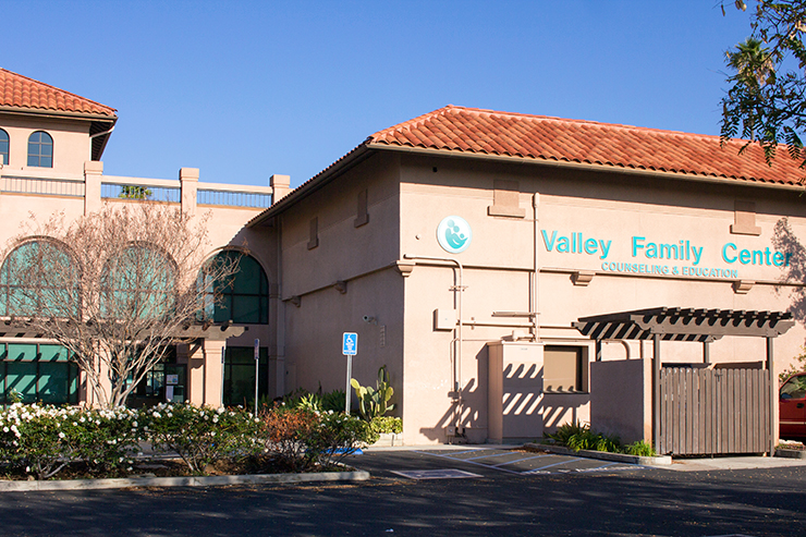
To find places that could benefit from a fresh coat of paint, our fans on Facebook were invited to nominate a deserving building in their city, such as a worn-down school or an aging community center. The Valley Family Center, in San Fernando CA, was selected from hundreds of compelling entries to receive a paint refresh at no product or labor costs to the non profit.
Pairing with a local professional painter, I was tasked with selecting a new color palette’s for the center’s interior and designing some fun and engaging concepts for the youth activities rooms. The four rooms we selected to tackle were the: therapy play room, art room, study center, and art gallery room.
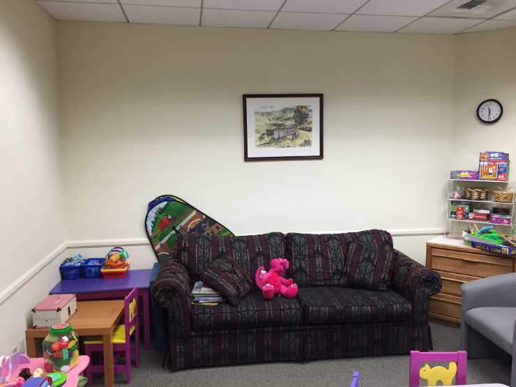
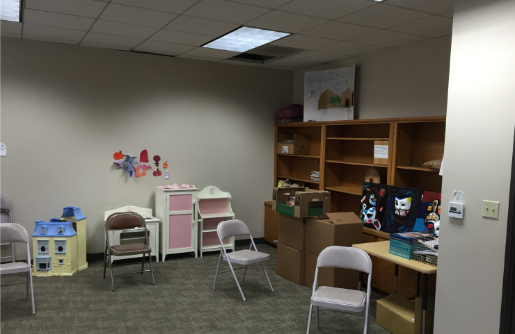
The Family Valley Center hadn’t been painted since the facility was built in the 1990’s. The entire building was the go to industrial color of the time- putty. Versatile? Yes! Dim and dingy feeling? Also, yes. For the center itself we freshened up the palette with a warm, bright, white and a soft, neutral tan.
The youth rooms were where we could have a bit more fun- incorporating color with some installations. My ideas were ambitious, the rooms were many, but we had a great turn out of hardworking team members that turned vision into a reality.
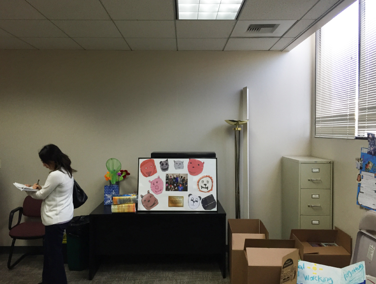
The Art Gallery Room
This room was the smallest of the four spaces. The idea for this space was to give it a gallery feel, and provide a means where art work could be displayed. Most art galleries paint their walls an achromatic color. This is mainly done because the art displayed is always changing and if the walls were a vivid color they may detract, or, obscure the intended color harmonies of the art.
The art gallery before
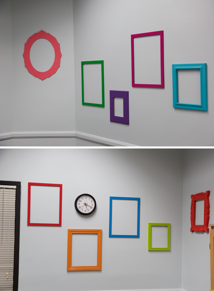
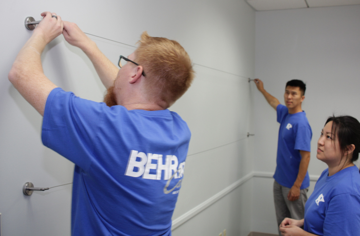
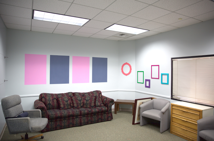
In the spirit of gallery colors, we selected a light, gray with a warm blue undertone for the wall color. To keep the room from feeling dull, we hung brightly colored frames on the walls where the kids could pin their art. We installed a suspension line with clips to hang artwork, and painted four frames where they could post artwork within.
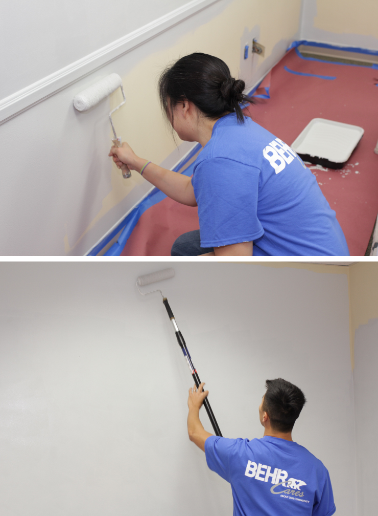
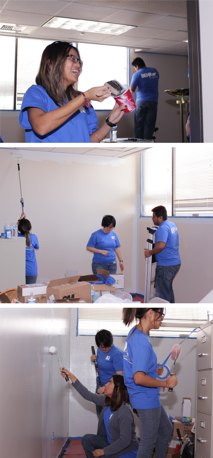
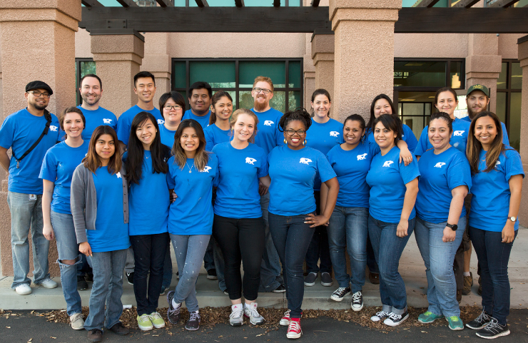
Victoria Ip and Tri Hoang paint the gallery walls in Salt Glaze PPU12-11
The gallery team: Eric Martin, Victoria Ip and Tri Hoang
The art gallery after
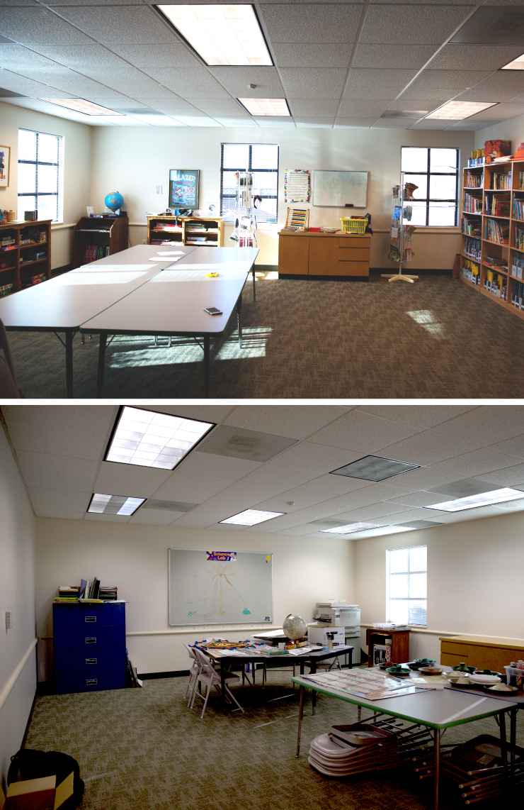
The Study Center
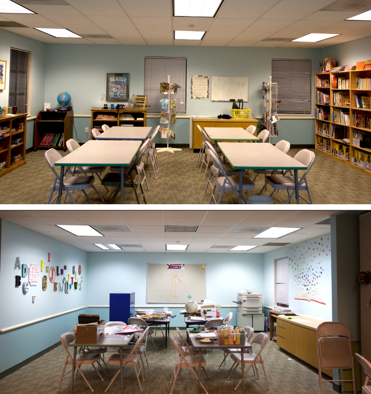
The largest room by far was the study center. This room serves as a multipurpose space, for tutoring, projects and reading.
The study room before
This room had a chair rail running around the room, and some open space on the walls. I decided on a two tone look in soothing, concentration inducing, but also fun, colors. The volunteers from our amazing customer care team handled all the heavy lifting for this room. They were very careful to prep properly and read all the label instructions before beginning- this team knows their stuff!
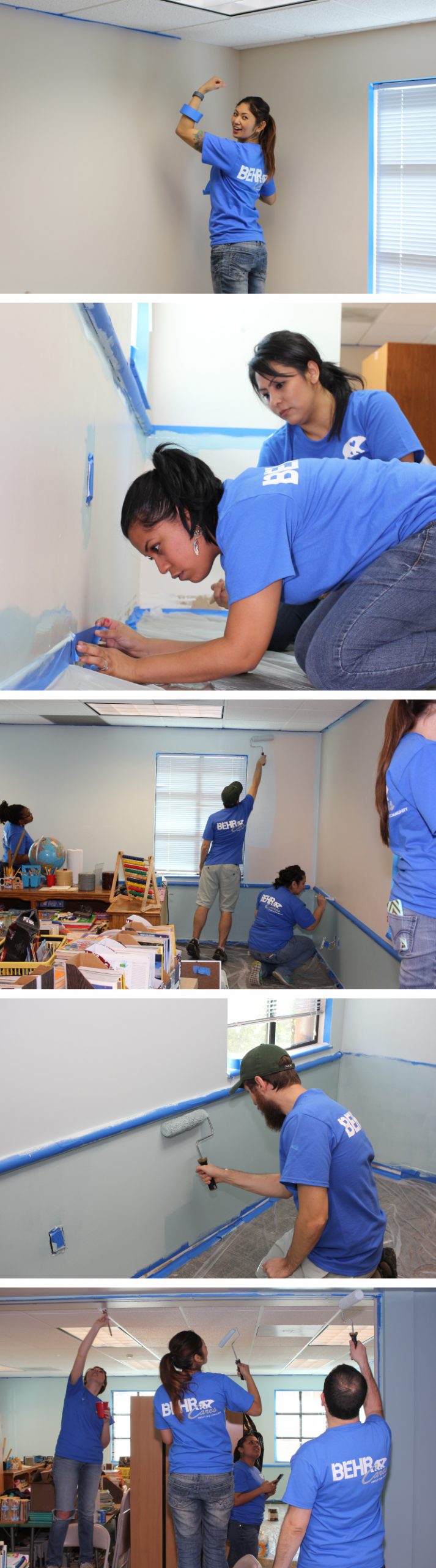
The study room team painting the walls in Sunken Pool S440-1 and Aspiring Blue S440-3: Cecille Siebert, Kristina G, Steven Pestana, Amy Martinez, Edith Roman, Rocio Delgado Mejia and Demetrias Sessions, Kelsey Mullings.
For the empty spaces on the wall, I planned some wall art installations that tied to learning to read, and the wonder of books. I found an 3D wall mural online of a book portrait with butterflies emerging, that I thought would be a perfect colorful addition to this room.
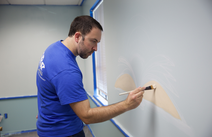
Artist Alex Fitch hand paints an open book on the wall.
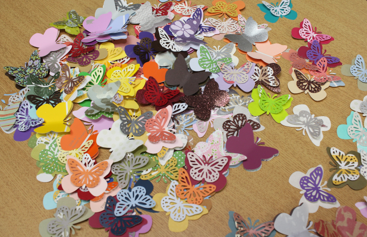
In preparation for the Behr cares day the Color Marketing team cut out and assembled paper butterflies from color chips and decorative paper.
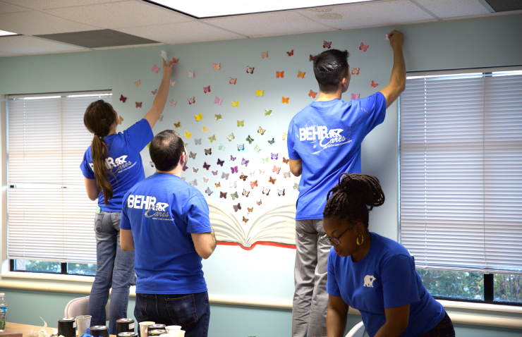
Our tallest team members handled the top.
The final results were amazing.

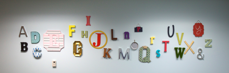
The second installation we did for this room was an alphabet mural with letters in different shapes, sizes and colors.
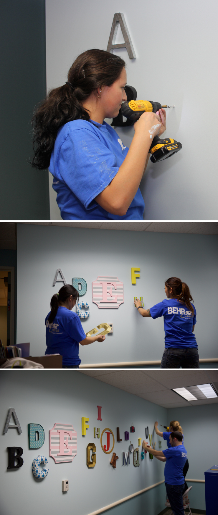
It took power tools and multiple teams of people to complete, but they did it!
The study room after
The Art and Therapy Play Room
This was actually one room that could be divided in two. One half of the room was going to be an art room and the other half a therapy play room. For each half I chose a different direction.
The Therapy Room
The Valley family Center is a community resource for women, children and families who need help, guidance and support. For this space my goal was for those entering to step into an environment that made them feel more at ease.
On my way home one evening, pondering what I could do to achieve this, I took notice of how beautiful the setting sun was. I thought that this was an especially tranquil time of day, the light and colors being very soothing and harmonious. Then it struck me! I had found my inspiration.

This is the inspiration picture I snapped out of my car window on my drive home
This beautiful sunset scene could be accomplished with a ombre painting technique and similar colors. I opted for a woodland scene created with decals, to give it a whimsical- other worldly feel. Our PR and Color Marketing teams stepped up for this challenge. You can watch how it came together below:
The therapy room team painting in Lunchbox M260-4 and Spring Storm S450-3: Nicole Davis, Rachel Caudillo, Alex Fitch, Quinn Larson
The therapy play room after

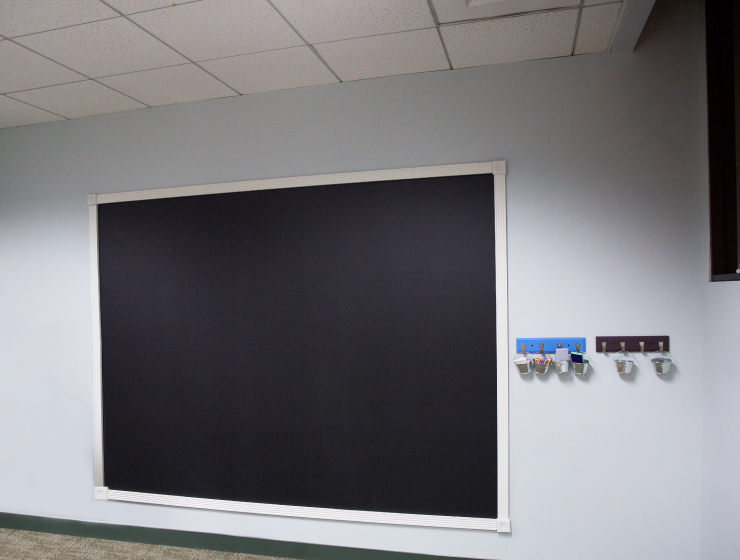
The Art Room
The second half of the room was designated for art projects. Because this room had the least available wall space, our embellishments were limited to building chalkboard and installing suspension lines for hanging art to dry.
The art room before
I wanted the art room to tie to the gallery room, so the same neutral gray colors was used on the walls. Our R&D team handled the repainting and construction of the chalkboard here. They also lent a much needed hand in putting up decals in the adjoining room.
The art room team painting the wall in Salt Glaze PPU12-11: Muya Wang, Stephanie Huynh, Zamanta Mondragon, Juvy Hali and Thanh Thach.
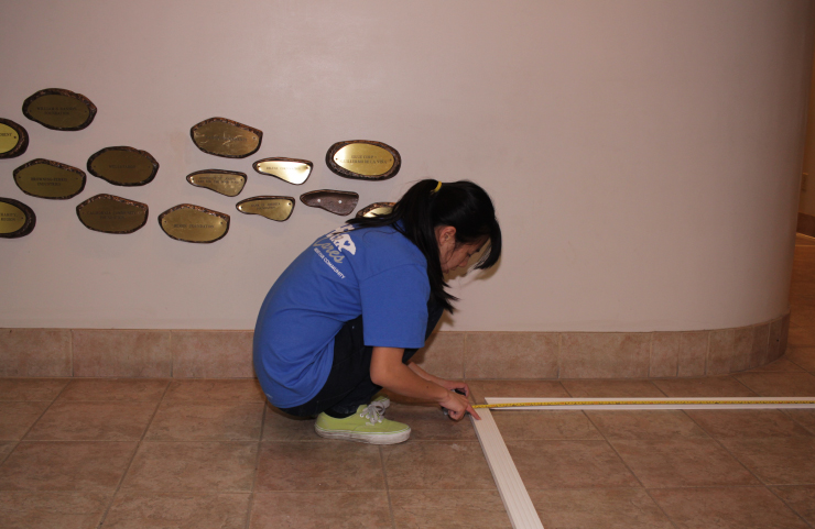
The age range of center participants ranges from as young as 5 all the way to the late teens. Because of this, I wanted to create a chalkboard that reached, almost, to the floor. I was very lucky to have the members of our R&D team to helping me- they were the perfect team to take care of the tough measurments.
The art room after
My sincerest thanks to the all the Behr team members who participated. We could never have done such an amazing job with out your hardwork and dedication.
If you’d like read more about this project click here and here.
Colorfully yours,
-Quinn