

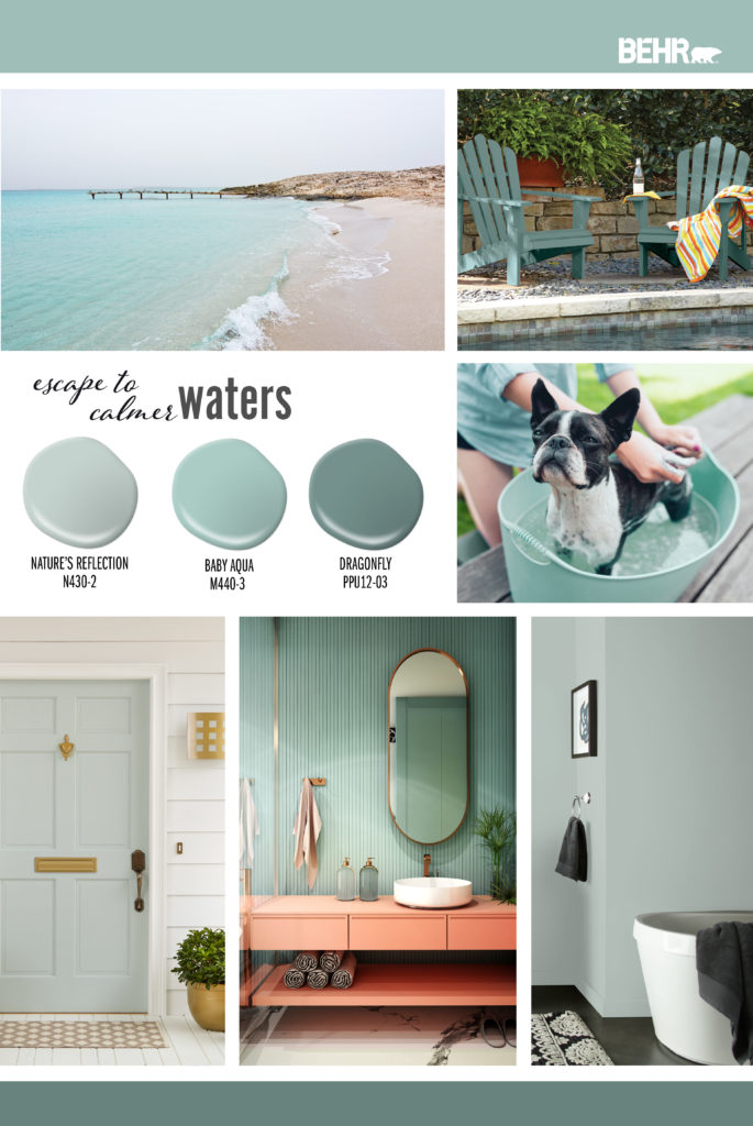
Choosing the perfect paint color can be fun and exciting. Whether you’re refreshing your living room or giving your kitchen a new look, BEHR® has the perfect neutral shades to make your project shine. In fact, creating a whole house palette using only neutrals is a timeless approach that brings cohesion, flexibility, and effortless flow from room to room.
Neutrals like beiges and taupes are a popular choice for home interiors due to their versatility. If you’re wondering what are the best neutral paint colors, these timeless hues consistently rise to the top. They provide a backdrop that complements a wide range of furniture styles, décor, and accent colors, making it easier to elevate your space. They create a cozy and inviting atmosphere, helping rooms feel more welcoming and comfortable, and adapt well to different lighting conditions, maintaining their warmth and appeal in both natural and artificial light.
If you’ve ever wondered about the difference between beige, taupe, and greige, it comes down to undertones. Beige is typically a warm neutral with soft yellow or golden notes, while taupe leans more toward a beige-brown or gray-brown blend that feels slightly deeper and earthier. Greige, as the name suggests, is a mix of gray and beige, offering a modern neutral that balances warmth with a subtle coolness. Choosing between them helps set the overall mood of your space, from cozy and classic to fresh and contemporary.
When comparing warm beige vs. cool beige, the easiest way to tell the difference is by looking at the undertone and how the color reacts to light. Warm beiges have yellow, cream, or soft golden undertones and tend to feel cozy and inviting, especially in north-facing rooms or spaces with limited natural light. Cool beiges lean toward gray or subtle green undertones, giving them a cleaner, more muted appearance that works well in bright rooms or modern interiors. Testing samples next to white trim or flooring can help reveal whether a beige reads warm or cool in your space.
You may also be wondering about warm neutral paint colors vs. cool neutral paint colors, and which you should choose for your home. The key distinction is the subtle color cast within the shade: warm neutrals have hints of yellow, red, or beige that create a cozy, inviting feel, while cool neutrals lean toward blue, green, or violet tones for a crisper, more modern look. Cool neutrals work beautifully in bright rooms or contemporary interiors where you want a clean, airy effect while warm neutrals are especially popular because they can make spaces feel brighter, softer, and more expansive. This is why many designers recommend them for small rooms, open layouts, and cozy gathering areas.
Let’s explore these beautiful hues together!
Antique White 23

Soft and timeless, Antique White brings a nostalgic feel to any room. It’s perfect for kitchens and dining rooms.
If you’re wondering which warm neutrals make a small room feel larger, shades like Antique White are a great choice. Light warm whites reflect natural light beautifully, helping tight spaces feel more open without looking stark or cold.
Off White 73

With hints of yellow, Off White is a versatile shade that works well with grays, browns, and subdued accent colors. It can tie together various décor elements throughout your home.
To tell if a neutral paint has a warm or cool undertone, look at how it leans in different lighting. Warm neutrals tend to show hints of yellow, beige, or soft red, while cool neutrals reveal blue, green, or violet undertones.
Dove HDC-MD-21

This warm greige creates a peaceful and gentle mood. When comparing gray vs. greige for a bedroom, greige is often a favorite because it blends the softness of beige with the modern touch of gray, creating a warmer and more relaxing atmosphere.
Dove is also an excellent warm neutral for rooms with dark wood floors. Its beige-gray balance helps soften the richness of deeper stains like walnut or espresso, creating a lighter, more open feel while still keeping the space grounded and cozy.
Many homeowners ask about the difference between “greige” and “warm gray.” Greige is a blend of gray and beige, giving it a softer, warmer feel. Warm gray is primarily gray with subtle beige or brown undertones. Dove is a perfect example of greige because it balances warmth with modern neutrality.
Even Better Beige DC-010

Understanding the difference between beige and tan paint helps explain why this versatile neutral imparts such a warm, distinctive feeling. Beige typically has softer, creamier undertones, while tan leans warmer and deeper with more brown influence. Even Better Beige works well with other neutrals and a range of colors, making it a flawless backdrop for many room types, including living rooms, bedrooms, kitchens, and dining rooms.
Spanish Sand OR-W07
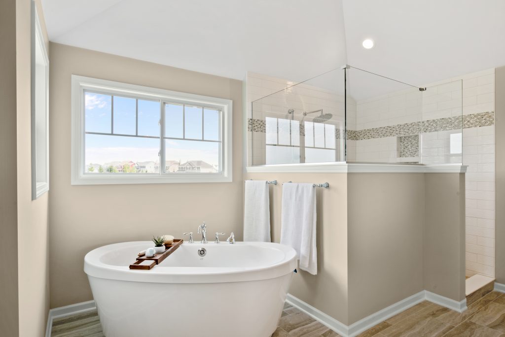
A rich beige with warm undertones, Spanish Sand is perfect for transforming your home’s exterior or adding a soft greige touch to your kitchen cabinets and bathroom walls.
Creamy Mushroom PPU5-13

Calming and earthy, Creamy Mushroom relaxes and invites you to unwind with its coziness.
White Mocha OR-W11

White Mocha has an orange undertone that adds freshness to any space.
If your home has lighter wood floors, such as oak or a soft natural finish, warm neutrals like White Mocha help keep the space feeling bright while adding gentle contrast and coziness. This shade works especially well in hallways and sitting nooks where you want warmth without heaviness.
Roman Plaster PPU7-10
Roman Plaster is a light, creamy beige reminiscent of ancient sculptures with their graceful, wistful curves.
Smokestack N220-3

A highly versatile shade, Smokestack is a warm taupe-gray that works beautifully either as a background or accent color.
Dainty Lace MQ3-11

Dainty Lace is a gentle creamy color that brings a sense of nostalgic charm to any space.
Dainty Lace also pairs beautifully with natural textures like raw wood shelving, woven baskets, and linen towels. These elements enhance the spa-like warmth of the palet
Basswood MQ2-46

Basswood is medium golden beige that evokes joy and relaxation.
Ashen Tan N220-2

Ashen Tan is a light gray neutral with a warm undertone that creates the perfect amount of coziness.
Transform your space by exploring these 12 sophisticated neutral whites, each offering its own subtle character and warmth. From warm Creamy Mushroom to crisp Off White, these versatile hues create the perfect foundation for any room, bringing harmony and elegance to your space. To discover what paint sheen pairs best with neutrals, be sure to explore our guide to paint sheens.
Visit behr.com to see all of BEHR’s neutral paint colors.
Colorfully yours,
Diana

Finally someone has gotten the pink out of these colors!
Preparing to paint kitchen cabinets walls
Preparing for sale ashen tan bottom cabinets I whipped cream walls need a whiteish color top cabinets or should top and bottom in ashen up and down ,?
Hello Elizabeth, thank you for reaching out!
You can do Ashen Tan on the bottom cabinets and upper cabinets in Polar Bear 75.
Colorfully Yours,
Deanna