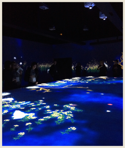
If you’re into the home trends, there is no better show to view them than the Maison & Objet in Paris, France. It is an event held for six days every January and September. Attendees will come from all over the world to feast their eyes on the latest home fashions. Eight huge exhibition halls showcase an international array of high end furniture, lighting, accessories, textiles, bedding, table top pieces, kitchen wares and so much more.
I was lucky enough to attend the show last week to discover the newest colors popping up on the trend radar. Pastels were everywhere, especially in bedding and accessories. Navy blue had a strong presence in textiles and paint, and strong colors could be found on furniture pieces. Gray had greatly diminished from where it had been a few years back. Here’s a few more colorful highlights:
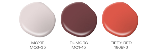
Pink, burgundy and hotrod orange-red defined the latest variations for the red color family.
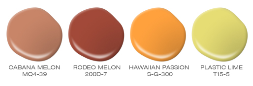
Orange felt earthy on one end of the spectrum; while yellow went towards mango or vibrant citron.
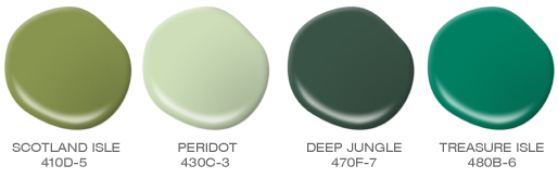
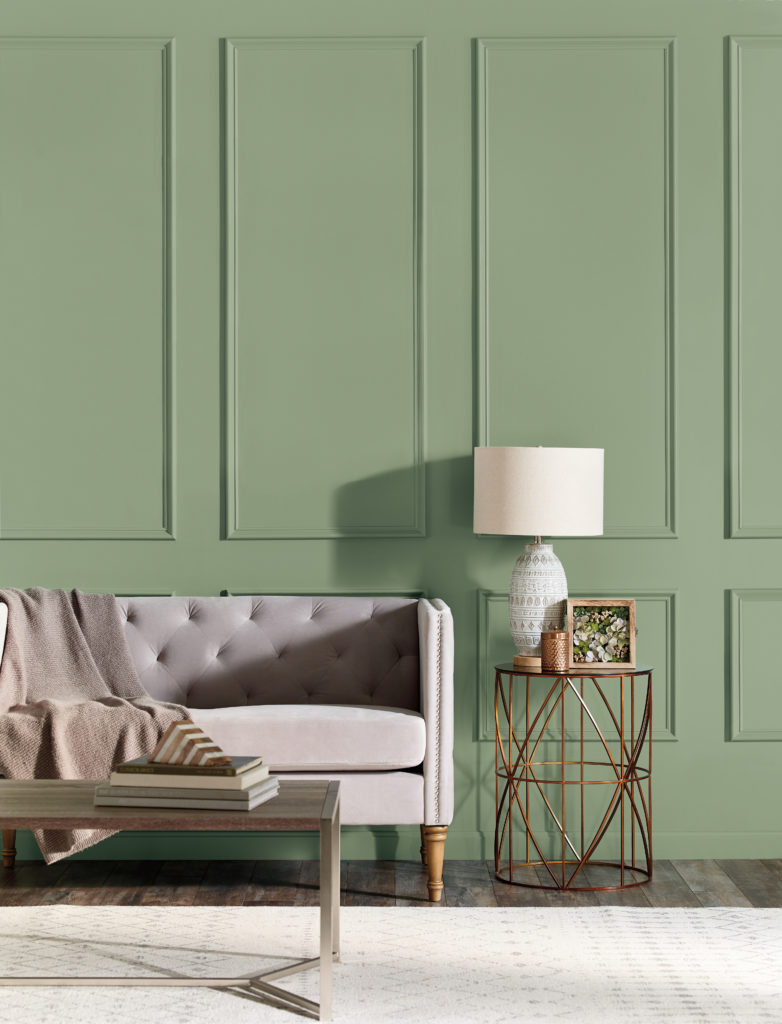
Green is an expanding color family, edging out turquoise and aqua.
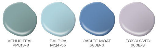
Navy blue prevailed, but light and clear true blues felt newer. Purple will be more important by 2016, for now it still falls into the pastel category.
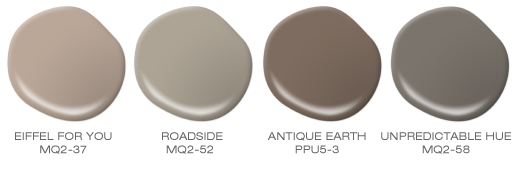
Neutrals favored brown, taupe and mushroom instead of gray.
Colorfully yours,
Erika