Colorfully, Behr fans are invited to submit questions via the Ask Erika portal on the blog site. All questions will be answered!
An inquiry came in recently from a reader named Chelsea regarding a color and lighting issue. Read on for advice from our team of experts:
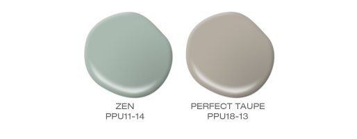
Question: I have one room painted Behr Perfect Taupe, and another Behr Zen. I love both of these colors! In between these two rooms is a living room that goes into a foyer and up the stairs into the hallway. What is a neutral color that could complement the other two and be used in this space?
Chelsea,
Thank you for your interest in BEHR Paint products!
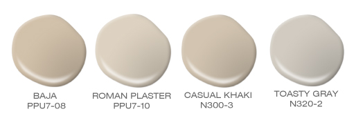
Zen PPU11-14 is a beautiful blue green and Perfect Taupe PPU18-13 is considered a neutral gray. So based on the information that you have provided to us, we have found four additional neutrals that you may want to consider to coordinate with Zen and Perfect Taupe. They are Baja PPU7-8, Roman Plaster PPU7-10, Casual Khaki N300-3 and Toasty Gray N320-2 which is also a neutral gray.
Due to differences in monitors and technical factors, the colors here cannot be represented with their true qualities. These color samples should only be considered a guide. Please refer to actual swatches for true color. We strongly recommend beginning with an 8 oz. sample container of the color you choose and apply it to a small area on your wall to ensure your satisfaction with the color choice. It is always a good idea to see how the light and ambient conditions affect the color at different points in the day.
Thank you for taking the time to email us and we wish you well in all your future paint projects.
Sincerely,
Rob H.