
Selecting color in decor is fairly easy once you get the hang of it. Where it gets more challenging is layering in pattern and texture. You don’t have to play it safe by using one pattern with a bunch of solid fabrics. Here are a few quick tips if you’re interested in coordinating multiple patterns.
- Odd numbers work best. Three patterns is the minimum. Plaids, paisleys, stripes, florals, geometrics – it is possible to make them work together. The trick is to vary the scale of the patterns and choose similar colors.
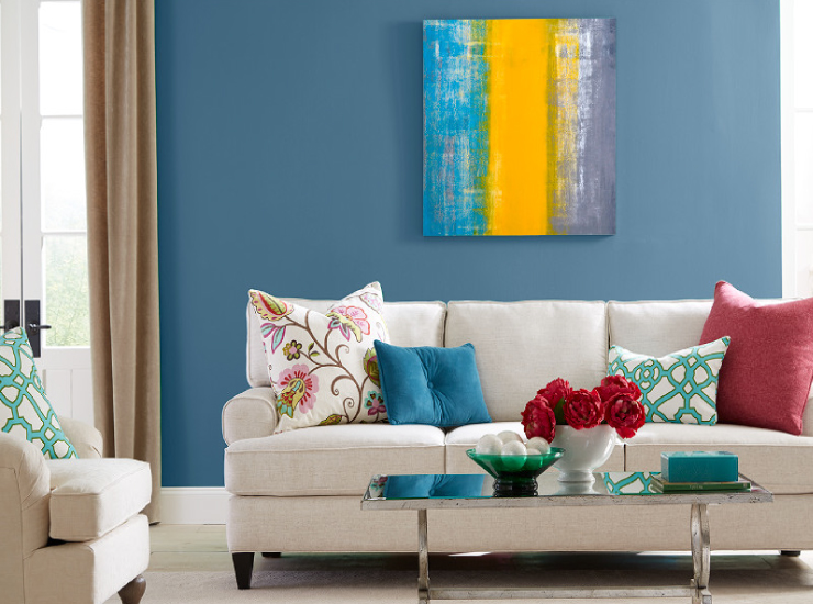
- Use pattern to create a focal point. Highlight a sofa with an assortment of throw pillows, or draw attention to a coffee table with a collection of patterned vases and jars.
- Choose the main fabric pattern first. Maybe you fell head over heels for an over-sized geometric pattern (that’s what happens to me every time I visit a Marimekko store). Then select a medium sized pattern with a different style and one similar color, like an abstract floral. The third pattern to balance it all out could be a small scale geometric pattern with several of the same colors in the design.
- All kinds of patterns work together if the colors are related and share the same intensity. Pastels harmonize with other pastels. Vibrant brights work well with other brights. Toned neutrals work well with other neutrals in the same saturation range.
- Busy patterns in bright colors give a room more energy.
- Subtle patterns in light or muted colors will calm a space down.
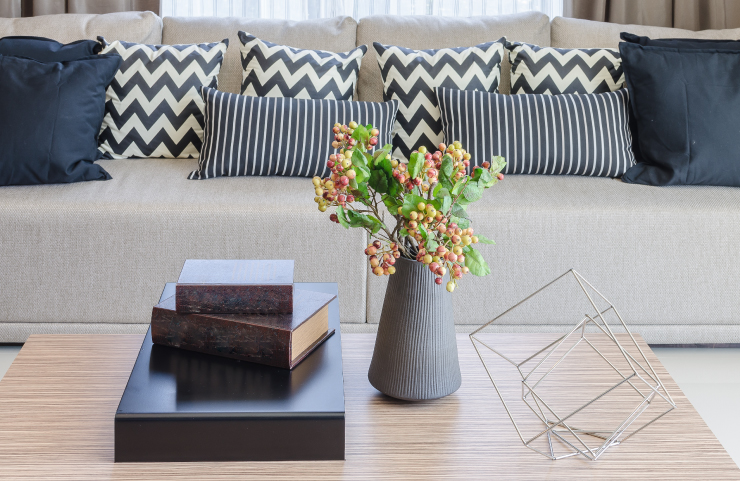
Go simple: Navy blue is the feature color in this mix and match of zig zags and stripes.
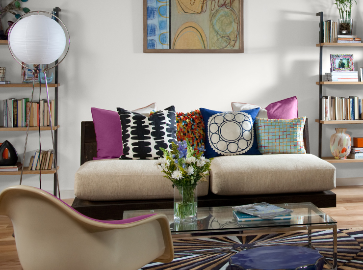
It’s OK if its busy! Patterns make a room more exciting. A combination of geometric patterns and bright colors draw the eye to the throw pillows on the sofa. White walls and streamlined furniture keep the entire room in balance.
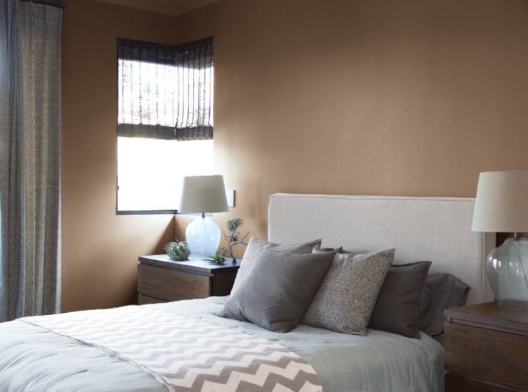
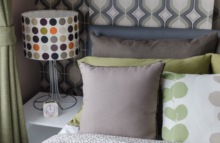
Neutral colors and a minimal layering of pattern creates a relaxing atmosphere in this bedroom.
Scale and proportion makes a difference. The balance here comes by combining a large floral, a medium sized geometric and a tiny floral pattern on the pink pillow. All colors have a similar level of intensity – in this case, bright!
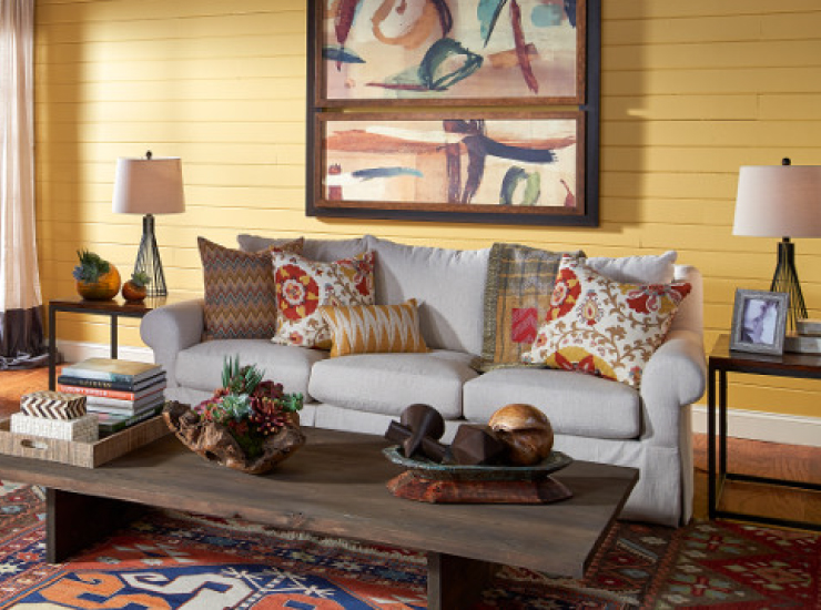
Make vastly different patterns work together by using colors from the same hue families. In this space yellow, orange and blue carry through the area rug, pillows and artwork.
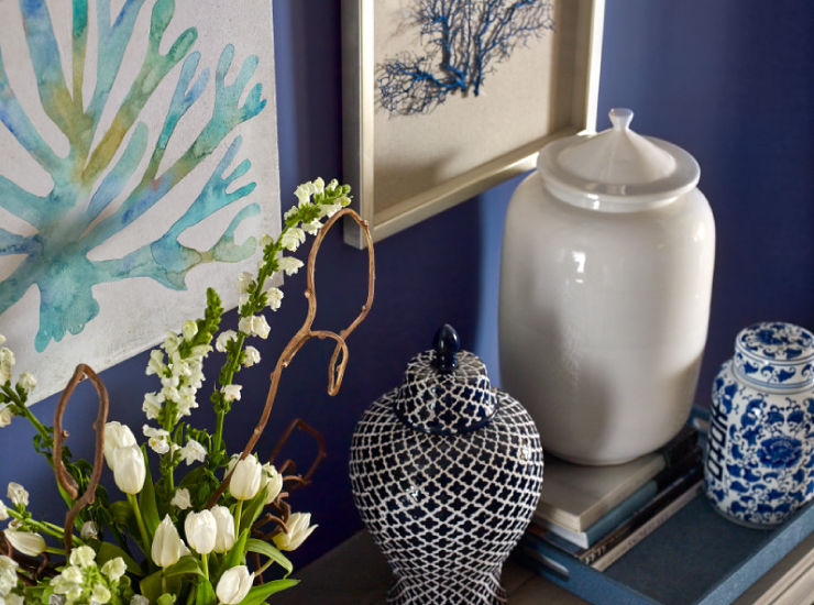
Ceramic collections add another dimension of color and pattern on table tops and shelving displays.
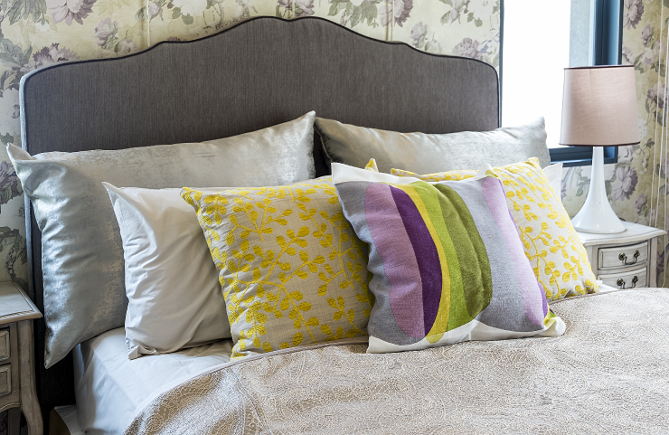
There’s no such thing as going overboard with the pattern when applying the simple principle: Similar colors, a variety of pattern sizes. Solid fabrics balance four areas of pattern in this detail.
Colorfully yours,
Erika

Thanks for this post, Erika. I appreciate specific direction because decorating is not a natural thing for me. I am a DEDICATE to Behr paints, though, and that’s how I found you and this blog.