
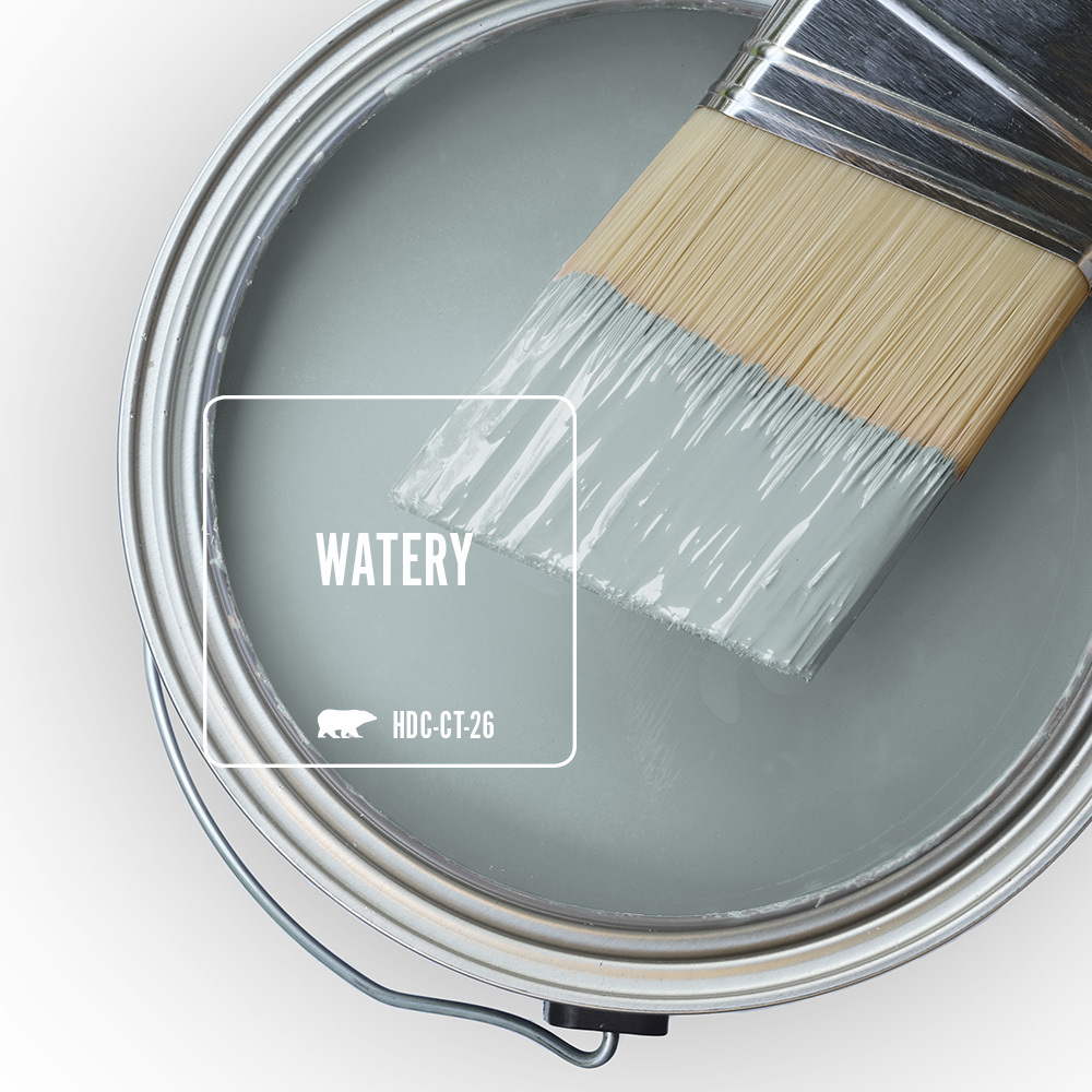
Watery brings a calm blue-green point of view to interiors, making it an easy choice when you want a room to feel fresh, airy, and quietly colorful.
As we step into a new year, many of us are looking for small ways to make home feel lighter, calmer, and more renewed. Watery HDC-CT-26 is a soft blue-green that brings that feeling into a space right away. It feels easy and uplifting, with enough color to add personality while still reading soft and livable from room to room.
The beauty of Watery is how naturally it works with the finishes many of us already love: crisp whites, warm woods, woven textures, matte black accents, and layered neutrals. It can brighten a space without feeling stark, soften a room without washing it out, and create a serene backdrop that still feels fresh and modern.
When to Choose a Blue-Green Like Watery
Choose a blue-green like Watery when you want something softer and more natural than a true blue, but fresher and more colorful than a blue-gray. Blue-green sits in a sweet spot: it carries the light, open feeling people often love in blue, while the green influence keeps it from feeling too icy or too formal.
If a room needs a gentle lift, Watery can bring in color without turning overly cool. It is a great fit for spaces that benefit from a clean, airy look with a little more life to it, especially when paired with white trim, warm woods, and easy natural textures. For a lighter take on blue, link to the Light Blue page. For a moodier, more muted direction, link to the Blue-Gray page.
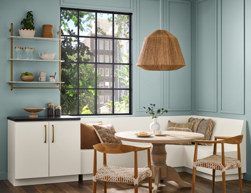
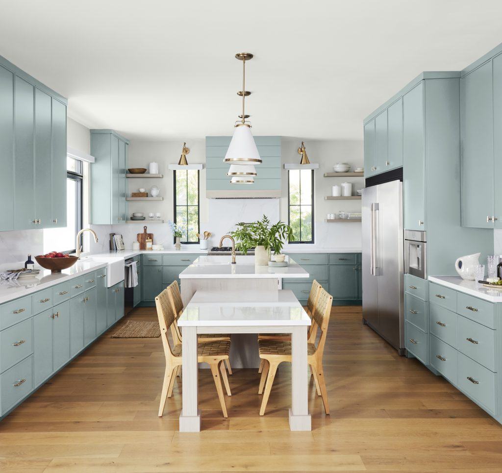
Fresh Kitchens and Dining Spaces
In kitchens and dining areas, Watery adds a refreshing hit of color while still keeping the overall look relaxed. On cabinetry, it feels clean and current, especially when balanced by white walls, white countertops, and warm wood flooring or dining furniture. The result is a room that feels bright and welcoming without losing warmth.
In more casual eating spaces, Watery also works beautifully on walls. It brings in just enough color to make the room feel intentional, while still leaving plenty of room for natural materials, woven lighting, and neutral upholstery to shine.
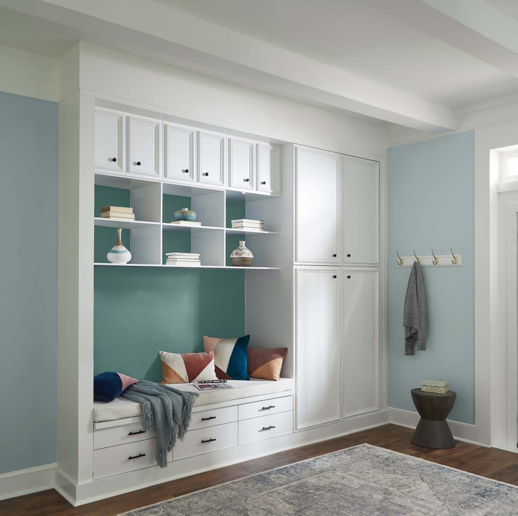
Soft Contrast in Hallways and Transition Spaces
Watery is especially effective in the spaces that connect a home. In hallways, entry moments, and built-in nooks, it adds color in a way that feels calm rather than busy. It can stand on its own for an easy all-over look, or it can be paired with a deeper accent, like Dragonfly, to create subtle contrast that still feels cohesive.
This is one of the reasons blue-green can be such a useful category. It gives you more color than a neutral, but it stays versatile enough to move through adjoining rooms without creating a hard visual stop.
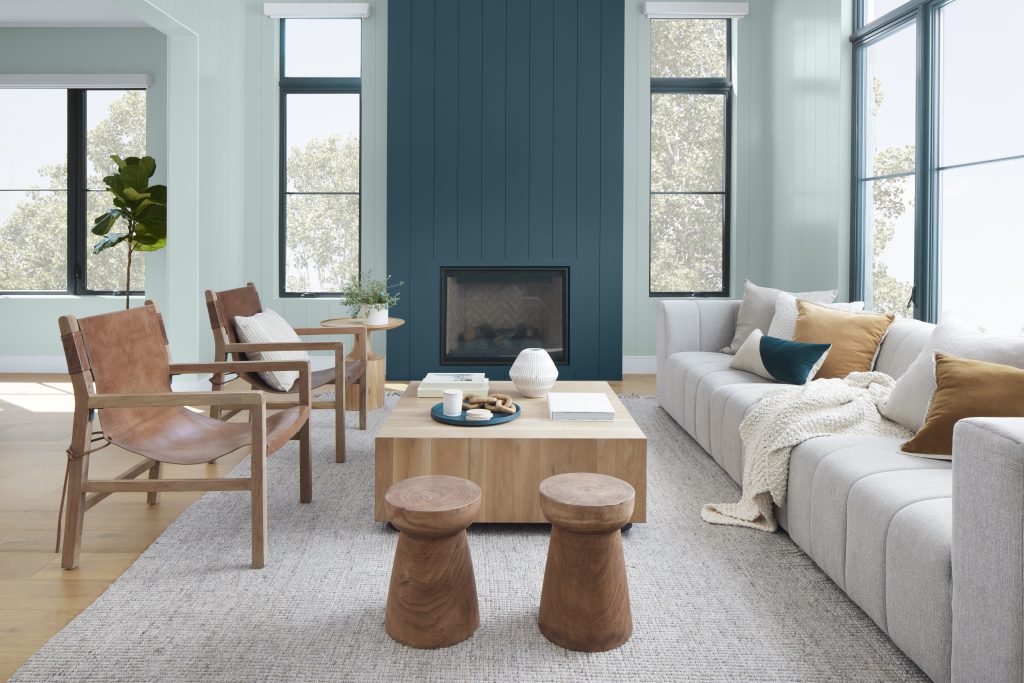
Living Rooms and Bedrooms That Feel Calm but Not Flat
In living rooms, Watery creates a light, collected backdrop that works especially well with sunlight, layered neutrals, and natural wood accents. It also pairs nicely with deeper blues, making it easy to introduce a stronger focal point, like a painted fireplace or accent wall, while keeping the rest of the room feeling open and easy to live in.
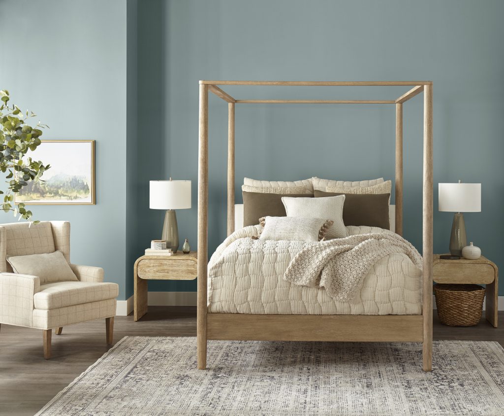
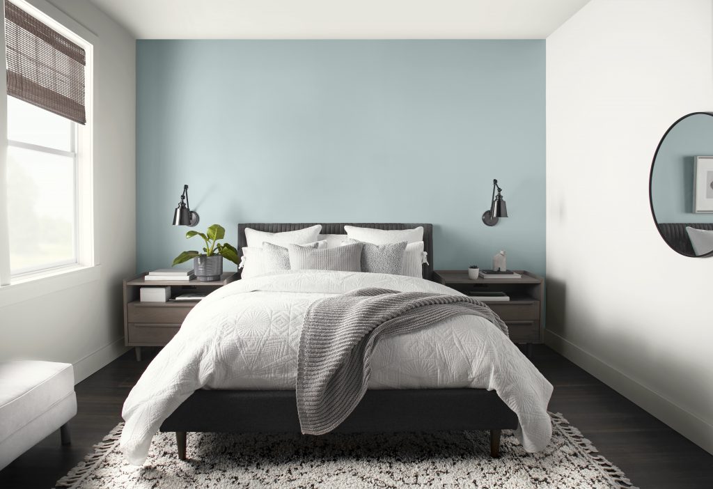
In bedrooms, Watery leans restful and restorative. It has enough softness for a retreat-like feel, but it still reads more colorful than an off-white or pale gray. Paired with warm wood furniture, soft beige textiles, and muted green accents, it helps create a bedroom that feels relaxed, layered, and inviting.
Bathrooms, Laundry Rooms, and Other Hardworking Spaces
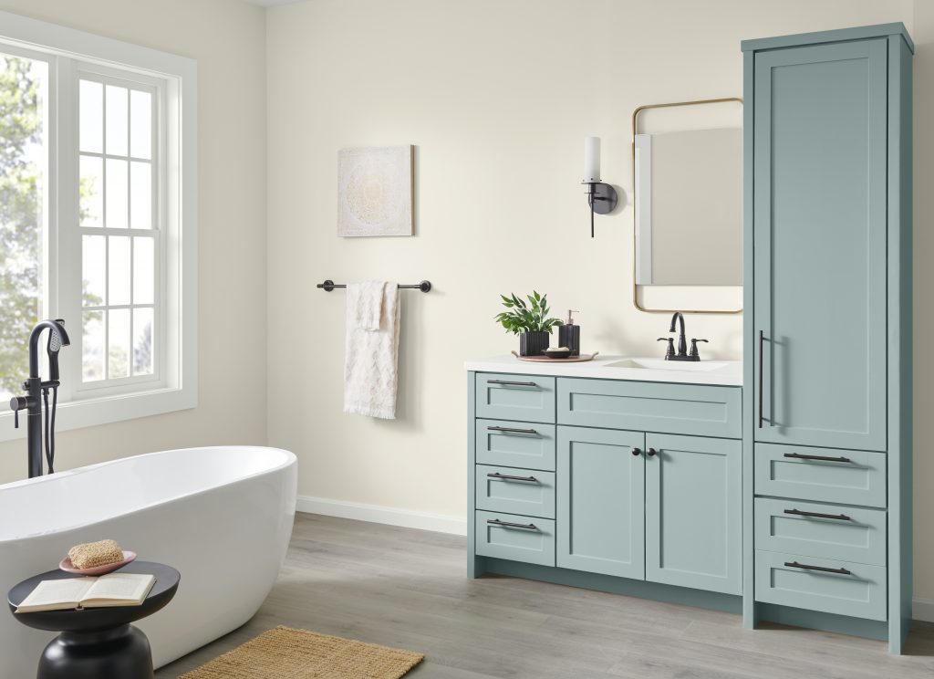
If you are after a spa-like bathroom, Watery is a natural fit. Its clean blue-green tone brings freshness to vanities and cabinetry, and it works beautifully with white tubs, light neutral walls, polished tile, and black or brass fixtures. It adds color, but the overall feel still stays clean and calming.
That same quality makes Watery a smart option for laundry rooms, too. In a space that is often compact and utility driven, a soft blue-green can make the room feel brighter, more cheerful, and more finished. It is especially strong on cabinets, lower storage, or even a single wall when paired with white appliances, pale stone, and simple natural baskets or wood accents.
Playful Accent Spaces That Still Feel Polished
Watery also works well in the smaller moments that bring personality into a home. Think built-in desks, reading nooks, entry benches, kids’ study corners, or painted alcoves. In these spots, it feels playful and fresh without leaning overly sweet, and it is easy to layer with a deeper accent color for added shape and contrast.
If you want a color that feels happy and airy while still looking polished, Watery is an easy choice. It adds visual interest in accent spaces without pulling too far away from the calm, cohesive feel of the rest of the home.
A Serene Blue-Green to Build Around
Watery is more than just a color, it’s an invitation to create spaces that feel calm, balanced, and full of life. It is truly an uplifting hue that pairs beautifully with neutrals, natural textures, and even bold accents, making it the perfect choice for those looking to refresh their home with a touch of tranquility and optimism.
Ready to bring Watery into your home? Order samples or visit your nearest Home Depot to start your transformation today. Let Watery set the tone for a fresh, inspiring year ahead!
Colorfully yours,
Diana
We painted our 3rd bedroom office and it is perfect.
Hi Kathy – Thank you for sharing! We’re thrilled to hear Watery worked perfectly for your bedroom project. Enjoy your beautiful new space!
I love that color! I think I’m going to repaint my living room/kitchen!
Hi Kathleen – That sounds lovely! Watery can bring a light and refreshing look to both the living room and kitchen. We’d love to see how it turns out!
Watery color – Behr
This is lovely, we have been contemplating on paint colors for our nautical themed home. I love every room and think we will use these as our inspiration!
Cool
I love Watery Blue!