
Colorfully, Behr fans are invited to submit questions via the Ask Erika portal on the blog site. All questions will be answered! An inquiry came in recently from a reader named Christine regarding a color and lighting issue. Read on for advice from our team of experts:
Hello,
I recently painted a room in Behr’s Old Map. I love the colour at night, but in the day with sunlight it looks pink. I was wondering if there is a similar colour that doesn’t look pink/purple during the day. Thanks.

Christine
_________________________________________________________________
Our expert replied:
Hi Christine,
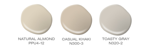
Based on the information that you have provided, light browns can be a problem because the lighter the brown the more pink it will look. Like many other colors, especially grays, lighting and ambient conditions can make a color appear totally different depending on the time of day. Below are three different paint colors which are similar in tone but may not change as dramatically for you to consider. They are Natural Almond PPU4-12, Casual Khaki N300-3 and Toasty Gray N320-2.
Due to differences in monitors and technical factors, the colors here cannot be represented with their true qualities. These color samples should only be considered a guide. Please refer to actual swatches for true color. We strongly recommend beginning with an 8 oz. sample container of the color you choose and apply it to a small area on your wall to ensure your satisfaction with the color choice. It is always a good idea to see how the light and ambient conditions affect the color at different points in the day.
Thank you for taking the time to email us and we wish you well in all your future paint projects.
Sincerely,
Rob
Hi,
Thanks for looking into this. The glass bead paint we are sampling on our wall looks too lavender. We want a subtle bluish gray. Any suggestions?
Hello Trish, thank you for visiting our blog!
Here are a few blue-gray tones that you can take a look at.
Intercoastal Gray MQ5-23, French Silver PPU18-05, Classic Silver PPU18-11 or Galactic Tint N510-2.
Colorfully Yours,
Deanna
My kitchen cabinets are parchment…looks like French vanilla ice cream to me as it gets darker outside. They have a strong yellow hue. They do get plenty of light due to the west facing French doors. I’m looking for a great geige color to help tone down the yellow in the cabinets. Any thoughts? PS my floor are rectified porcelain tile that have alot of warm golden tones. And the counter tops are basically very dark browns, golds and creams.
Hello Holly, thank you for reaching out!
We have a perfect gray/beige tone for you.
Please take a look at Greige PPU24-11.
Colorfully Yours,
Deanna