Contact a Pro Rep
BEHR® 2026 Color of the Year: Hidden Gem
Discover Hidden Gem, a rich blue-green paint color that blends elegance and depth with a lasting, professional finish.
Explore Hidden Gem
Designing with Color
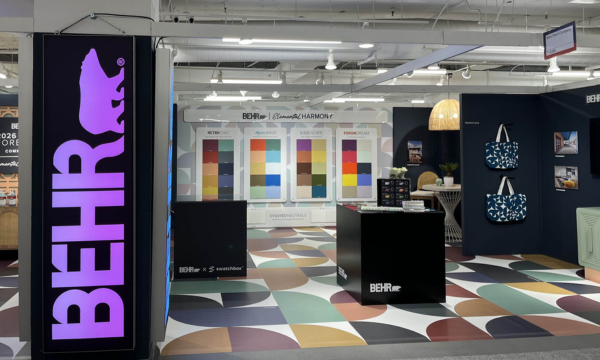
See how Behr brought creativity and color to life at NeoCon, from the iconic Behr bear to the 2026 Color Forecast.
Discover the Design Journey
To Prime or Not to Prime
Learn when to prime and when to skip it. BEHR PRO experts explain how to choose the right products to save time and ensure a professional-grade finish.
Get expert tips
Dark Paint Color Trends
Explore trending dark paint colors and find expert tips for using them to transform residential and commercial spaces.
Discover More
Insider Tips From Behr Pro Reps
Get insider tips from Behr Pro Reps and learn how they support pros with prep, product selection, and opportunities to grow your business.
Learn More
BEHR® 2026 Commercial Color Forecast
A curated collection of 50 colors rooted in elemental harmony.
Explore Collection
Paint Sheen Differences
Learn how paint sheen differences affect the durability and design of a space.
Learn More
Paint Tips From a Chemist
Discover painting tips from one of our own paint formulators and gain insight into proper application to achieve lasting results.
Learn More
BEHR® BioNature Collection
50 colors to infuse harmony and wellbeing into built environments to elevate the human experience.
Explore Palette
Featured Content:
       Behr Contributing Writer: Stephanie Lindsey, Principal and Co-Founder of Etch Design Group   Imagine painting a bear… a BEHR bear. At NeoCon, Behr Paint typically has this life-sized bear for guests to paint, and each year is a new design on the bear. It’s a creative approach to showcasing their brand. In the middle of the booth, this 3D bear is sectioned off into small squares, each about three inches wide, and it was the talk of the show. I loved seeing how the bear changed with each visitor! This collaborative art piece became an unexpected emotional moment for many of us.   Each painted square added to the story of the bear, which in turn, told the story of those who had passed through the space.   There was something special about watching people discover the Behr bear, take time to think about what they wanted to paint – and which spot – and then invest time in something tactile and creative during such a busy conference. It made me think about the design industry as a whole and how we all contribute to the larger community as a team. Which then leads me to think about the Behr Designer Council for this year…     Earlier this year, I had the privilege of joining Behr’s inaugural Designer Council. We met for the first time in California at the Behr headquarters, and that trip set the tone for everything that followed. We dove deep into product knowledge, toured their facilities, and met the Behr team. We had open conversations about design trends and where the industry is heading. The Behr team had done so much research on past, current, and future trends, and it was eye-opening to see what those looked like visually. What stood out the most was how much Behr truly listens.   They want to know what matters to designers. And when you feel heard, you naturally become an advocate for that brand.   As a group, we were tasked with creating initial concepts for the 2026 Commercial Color Forecast, and it was such a blast! It’s not every day that we as designers get to be involved in something like that. I have a personal love for Fusion Dream because it ties into my love for technology and AI. Glamorous (P130-7) and Inferno (P190-7) are my two top favorites within that collection. At NeoCon, we revealed the 2026 Color Forecast, and I felt honored to represent the council at the Behr booth.   People were so curious, not just about the colors, but about how they were chosen, what they represent, and how they’ll be used in commercial spaces.     Oh, and the tote bags? Did you hear about the tote bags? Behr created the cutest teal totes for the event, and they became hot commodities. We literally had to space out their distribution to make sure we didn’t run out by day two. I saw people walking the show with five different totes, but you better believe the Behr bag was always on top.     Seeing the buzz at NeoCon reminded me of our own projects where Behr has played a role. At Acton Academy, we designed and executed three murals using Behr colors. One featured a bold logo wall that greets students every morning, another was a geometric patterned mural, and the last was a quote wall that inspires curiosity and learning. These murals were brought to life by local muralist Tiffany Dewitt from Color Brush Co, and her artistry paired perfectly with Behr’s vibrant and durable paint selections.         As a co-founder of Etch Design Group, I’m always looking for ways to blend innovation and authenticity. And as the co-creator of AI for Interiors, it’s exciting to be part of conversations that span from color trends to cutting-edge technology.   If you’re curious about where commercial color is headed or want to see how Behr is pushing the boundaries, check out the full 2026 Color Forecast. And if you ever get the chance to paint a piece of a Behr bear, don’t hesitate… because trust me, your little square might just inspire the next big thing.  
Designing in Color
Paint and primer in one formulas have long been a hot topic of conversation among pro painters. While fewer steps can benefit busy contractors, you should never compromise quality.   Ultimately, superior finishes require proper product selection and prep. “Using a primer is widely regarded as best practice in the professional painting world,” says Ed Edrosa, Senior Product Owner – Pro at Behr Paint Company.   While skipping important steps is not the right path to a professional finish, it’s worth knowing when to prime and when a paint and primer in one product can save time and produce a beautiful, flawless finish.     Paint with a Primer, vs Paint and Primer in one “Paint is a coating made to be decorative and to protect. It enhances the beauty and seals the surface,” says Stephanie Glick, Research Fellow at Behr Paint Company. “Primer, on the other hand, is a little bit more complex. Primers are much softer and gummier. They’re made for adhesion, and it’s much easier for them to do the one thing they’ve been formulated for.”   Because many primers are formulated for specific scenarios, a thorough understanding of where products perform best is crucial. “Primers can create adhesion to surfaces that are harder to stick to, seal porous substrates, lock in stains and odors, prevent cracking, block tannins, prevent grain raise, and lock in efflorescence, to name a few,” stated Glick.   Paint and primer products are designed to do a bit of both and are also designed for specific scenarios. “You are still going to get a really good primer, but not a primer built for specific challenges,” says Glick. The key to choosing the right product for your job comes down to the substrate and your goal.   A few of the questions you should ask yourself before choosing a paint, a primer, or a paint and primer product include:   What is your substrate? Has it been previously coated? With what? Are there imperfections? (Stains, holes, etc.) Do you need scuff resistance? Do you want one-coat hide? Do you want 10-year color fade protection? Is easy touch-up and spray sheen uniformity important to you? What’s your budget? To Prime   Generally speaking, you need to prime before painting when working with raw or imperfect surfaces that need a bit of extra attention to get them smooth, sound, and ready for a topcoat.   For example, new or unsealed surfaces require primer.  “With drywall, you’ll see sheen differences at the joint line if you don’t prime,” says Glick. Additionally, porous surfaces, like stucco, will soak up too much paint, making priming the most efficient and economical choice. “A blocking primer is best for wood, especially redwood, cedar, teak, and mahogany, to avoid tannin bleed,” says Glick.   There are primers specifically formulated for metal and concrete. “For instance, BEHR® Metal Primer is formulated to help protect new metal surfaces from corrosion and can even be applied over sound, rusty metal,” said Edrosa. BEHR® Multi-Surface Stain-Blocking & Sealer ensures better adhesion and long-term durability on concrete or masonry surfaces with high alkalinity.     While some situations require a full prime, others only require spot priming.  Glick points to tilt-ups, a construction method commonly used in many commercial buildings  as a great example. Tilt-up construction is a building technique where large concrete panels are made flat on the ground then tilted upright after they dry.    “If you use BEHR PRO® e600 Exterior Paints, you can do all the broad surfaces without a primer because it’s great at sealing the surface. However, on tilt-ups, you have sealant between the joints, and because the sealant is  so flexible, you have to add a primer coat to help the coating flex with the natural movement of that joint.”       Or Not to Prime   Not all paint jobs are fraught with challenges. This is where a paint and primer in one product can save time and money. “Paint and primer products are generally most effective when refreshing previously painted surfaces that are in good condition, particularly for interior spaces. They offer convenience and solid coverage in these scenarios,” says Edrosa.   “Even if you have a stain on the wall, like lipstick, some of our higher lines, like BEHR Dynasty®, are designed to block those very well. However, if you want to buy a more economical product, you might want to spot prime those stains,” says Glick.     Every paint job is unique, but with the proper knowledge, you can choose the right product to solve problems and save time.   If you have product selection questions, contact your local BEHR Pro Rep.  

To Prime or Not to Prime

While neutral paint colors like beiges and grays have dominated for decades, darker colors have been trending as people look to incorporate more personality and depth in their spaces that are bold, elegant, and full of possibility. Darker neutrals are also becoming increasingly prominent as the industry shifts to an overall dark and warmer aesthetic across colors, finishes, and materials.   Walls: Dark Everglade HDC-CL-21A Darker colors can make a statement in residential and commercial color schemes in a multitude of ways, ranging from small, dramatic accents to full color-drenched spaces. BEHR® Paint is available in several curated collections like the Designer Collection and 2026 Color Trends Palette with dark hues your clients are craving this year. Hear from Behr Paint Company’s VP of Color and Creative Services, Erika Woelfel, on how to play with bolder color in interesting and unique ways.   A New Era of Elegance The BEHR Designer Collection is designed to highlight the go-to colors that can be used anywhere,” says Woelfel.   It includes many classic, light neutrals that your clients know and love, but it also features some darker, deeper colors to elevate and personalize your clients’ spaces.   Some of the notable colors in the designer collection include Dark Everglade, a shady blackened green that exudes luxury, while Rumors, our 2025 Color of the Year, brings deep, ruby red allure. Dark browns are also trending, including Espresso Beans, which packs a bold and beautiful punch.   Cracked Pepper, our 2024 Color of the Year, remains in the spotlight for both interiors and exteriors as a soft black with timeless and modern appeal.   There’s just amazing versatility with that color,” says Woelfel.   Walls: Cracked Pepper PPU18-01; Ceiling: Winter White DC-004   She also calls out Midnight Blue, “which is the darkest a blue can be before it turns to black. It’s just beautiful. It has this nice saturation to it, and you can use it with camel-colored neutrals or caramel-colored leather tones.”   Right Building: Midnight Blue N480-7; Left Building: Dove HDC-MD-21   Using Dark Colors Darker colors naturally create cozier and more intimate spaces than lighter colors.   People are often afraid or nervous that a darker color will make their room feel smaller,” says Woelfel.   If your client is concerned about this, Woelfel recommends two strategies. The first is color-drenching, which can create a more expansive feeling.   Woelfel explains, “When the walls and the ceiling are the same color, it becomes a cohesive whole. Done well, it actually pushes the boundaries out to make a space appear larger.”   Walls & Ceiling: Rumors MQ1-15   If color-drenching doesn’t fit your client’s style, another option is to skillfully balance the darker colors with light/neutral colors.   “This avoids the feeling of heaviness that can come with darker colors.”   A wall split with a chair rail or wainscoting can have a darker color below and a lighter color on top (or vice versa). This approach allows for two different sheens to create dimension and depth, for example a matte finish on upper wall and a satin sheen on wainscoting—as seen in our Paint Sheen Differences blog.   Upper Wall: Perfect Taupe PPU18-13; Lower Wall: Aubergine N100-7; Trim & Ceiling: Blank Canvas DC-003   As always, architectural features of a room are a great opportunity to create a splash of drama.   Painting the kitchen island or a bathroom vanity with a dark color is a small way to make a big statement for your client’s space.”   A Note on Dark Colors Often times, darker colors can be more challenging to apply than lighter colors. It’s important to remember that an experienced painting contractor and high-quality paint are essential to achieving a flawless finish for your client’s space. Choosing a top-quality paint like BEHR® MARQUEE Interior Paint or BEHR® DYNASTY Interior Paint can ultimately result in a more vivid finish and keep the surfaces of your projects looking newer longer—all with one-coat hide guaranteed in over 1,000 colors.*   In addition, stunning, dark colors can be a major commitment for residential and commercial spaces. Done poorly, they can sometimes be overwhelming and distracting in an environment.   Sometimes it’s a good idea to start with a big, bold color in a smaller room before using it in a big room,” says Woelfel.     Finally, Woelfel doesn’t recommend darker colors in rooms that don’t have enough natural light.   She says, “The best way to use these colors is if you’re getting plenty of natural light during the daytime and terrific lighting at night that really plays up the color.”   She also says it’s important to balance darker colors out with lighter furniture, flooring, and/or artwork.   Take the risk. It can be amazing.”   To learn more about the beautiful, bold colors Behr offers, contact your local Behr Architectural & Design Rep.   *Limitations apply. One-coat hide in 1,000+ colors. One-coat hide excludes untinted bases, colors outside of the Interior One-Coat Color Collection and all other colors that have not been selected as one-coat hide from other BEHR® palettes. Not valid when painting over uncoated, porous or repaired interior surfaces; over woods that contain tannins such as redwood or cedar; or when painting over heavy stains, which may require spot-priming, multiple coats, and/or longer dry time.  
Dark Paint Color Trends
Keeping jobs running on schedule, failure-free, and under budget is the goal of any paint professional, so it’s vital to use every available resource. One valuable ally you should never overlook is your Pro Rep, who can help you with anything from troubleshooting coating issues and product selection, to getting discounts and finding prospective customers.     Behr Pro Reps spend years mastering the BEHR® product portfolio, including application methods and proper selection. They also dedicate themselves to understanding end users, many of whom are (or could be) your customers too. Behr Pro Reps understand the needs and challenges of our customers across our audience segments, including pro painters, architects, designers, property managers, and facility managers. Hear from three Behr Pro Reps who share their top tips for pros on the job.   1. Proper Prep is Critical. Erik Miranda has been with Behr for five years, including three years in the field working directly with pro painters. Most of the problems I see stem from improper prep or product selection,” says Miranda.   It’s painting 101, but it always bears repeating (pun intended): Fully and properly prep the surface. If you find that you have a coating failure, reach out to your Behr Pro Rep. Together, you can review each step in the process to see how the problem originated and create  a plan to fix it.   2. Know When You Can/Can’t Use Paint-and-Primer-in-One. Another issue that Miranda noted is improper use of paint-and-primer-in-one products.   Always keep in mind that the paint-and-primer-in-one products are for specific circumstances,” said Miranda. “With a brand-new surface, a primer is still needed to seal that surface before applying a topcoat.”   Paint-and-primer-in-one is a great choice for a surface that is properly prepared, like an interior repaint. The increased solids mean better coverage without the use of a separate primer.     However, if you are dealing with a surface like new drywall, wood, metal, or areas you’ve patched, take the extra step of priming to ensure that the surface is ready for the topcoat.   It takes a little bit longer, but at the end of the day, it’s going to provide the customer with a more foolproof job,” says Miranda.   3. Working With Your Rep Could Mean More Business. Nicole Higgins is an Architectural and Design Rep for Behr in Atlanta, GA. She spends her days meeting with designers and architects to educate them on the perfect BEHR products for their projects.     You might wonder what that has to do with pro painters.   My biggest role with pro painters is to funnel them opportunities,” says Higgins.   This makes her an excellent and valuable resource for painting contractors with whom she works,   Once a project is specified with Behr, I help bridge the gap between the design side and the execution side by identifying professional painters and contractors who are qualified to bid on the work. This gives painters access to high-value commercial opportunities they might not otherwise be aware of.”       Because of this symbiotic relationship, Higgins generates new opportunities for pros while Miranda ensures those same pros are using the right products leading to on-time job completion.   We really work together as a team to present a complete portfolio of what Behr can offer. We don’t just help with paint orders, we generate and create projects,” says Higgins.   4. Take the Behr Pro Challenge. If you haven’t tried BEHR® Paint before, you might qualify to give it a test run.   If you have a painter who only wants to use one of our competitor’s products, we can provide an equivalent BEHR product to test in an adjacent room. This way they can paint one room with the competitor’s product and then one room with the equivalent BEHR product and then form a judgment,” says Higgins. “This challenge is very successful in persuading customers to choose BEHR Paint because they see our product quality firsthand.”       The Behr Pro Challenge not only allows painters to test out a new product, but it also allows you to better understand the true value of the products you select.   The Behr Pro Challenge was introduced to show the value of BEHR Paint, but you have to measure the true cost,” says Mario Garita, National Account Manager for Property Management. Contact your local Behr Pro Rep for more information.   5. A Higher-Grade Paint Can Save Time and Money. Garita has worked for Behr for 26 years, and today he works closely with multi-family property managers—both existing and new construction.   Garita points out the importance of measuring the true job cost and not just cost-per-gallon.   A lot of times we end up proving that a higher quality product is actually cheaper,” says Garita.   For instance, if you paint two rooms and the first is painted with an entry-level product that costs $10 per gallon, and it takes seven gallons to get a good finish, that would be $70. But if you painted the second room with a mid-level paint that costs $15 per gallon, but got full coverage using four gallons, the cost is only $60. In addition, you have a lower labor cost when applying four gallons compared to seven.   That’s where we have to educate our customers. You may pay more for the product, but you’ll use less product, representing an overall savings,” says Garita.       Working hand-in-hand with your Behr Pro Rep grants you access to a valuable resource that can save you time, money, and even help you get more business.   Learn more about what your Rep can do for you and your business here.  
Insider Tips From Behr Pro Reps
Have you uncovered the BEHR® 2026 Color of the Year? Hidden Gem is a smoky jade that’s redefining design in both residential and commercial spaces.      With its elegant balance of blue and green, Hidden Gem delivers a rich and dynamic shade that resonates across interiors—from multifamily living rooms to boutique hotel lobbies and modern office suites. This subtle yet captivating hue offers professionals a sophisticated option that’s as timeless as it is trend-forward, making it the perfect choice to elevate any environment with ease and intention.      Crafted by BEHR® Color Experts to reflect growing demand for grounded, nature-inspired tones; Hidden Gem shows how subtle color choices can redefine commercial interiors.       In high-touch environments like this modern washroom, Hidden Gem transforms an everyday utility space into an intentional design statement.          Designed to bring a quiet confidence to open layouts, this shade offers visual interest without overwhelming the space. The result is an elegant, polished look that works across a wide range of modern workplaces.          Pair with muted neutrals and grounded accents to bring calm sophistication and create a welcoming first impression in healthcare spaces.         Now’s the time to show your clients how subtle color can make a stunning statement with BEHR® Hidden Gem.    To explore more of the 2026 Color of the Year, visit behr.com/2026coty.  
2026 Color of the Year: Hidden Gem
Today’s commercial and residential design landscape is ever-evolving. Rising movements such as technology, nature, travel and more continue to influence the built environment. With current macro design trends blending futurism and nostalgia, traditional color boundaries are dissolving to create spaces that feel balanced and connected to both our heritage and our future.   The desire to achieve this harmonious design in commercial environments is the foundation of Behr Paint Company’s second annual BEHR® 2026 Commercial Color Forecast. The curated collection centers around elemental harmony – which includes 50 colors that balance nature, nostalgia, and technology.   We’re thrilled to introduce our second annual Commercial Color Forecast. These colors honor traditional color elements while embracing contemporary aesthetics that reflect forward-thinking design trends in the commercial space,” says Erika Woelfel, Head of Color & Creative at Behr.     The collection is organized into five distinctive themes, each designed to create harmonious spaces across a diverse range of commercial settings such as workplaces, healthcare facilities, hospitality suites, multifamily spaces, and more.   EVOLVEDNeutrals Credit: Original photography and design by Bethany Nauert and Michelle Sprauer. Paint color by Behr Paint Company.Walls: Sculptor Clay PPU5-08; Roof Trim: Shoelace OR-W13   Designed to be a foundational element, these dynamic neutrals range from “pure” to “toned” to anchor spaces that exude balance and harmony. Sculptor Clay (PPU5-08) and Shoelace (OR-W13) help create a balanced exterior for this modern multi-family home.   SOULScape Credit: Original photography and design by Bethany Nauert and Stina Funch at Atwater Inc. Paint color by Behr Paint Company.Walls: Eastern Bamboo PPU9-25; Trim/Ceiling: Nano White HDC-MD-06   Inspired by the Mediterranean, these soulful and moody hues create an inviting environment with a warm, coastal feel. This hotel room features Eastern Bamboo (PPU9-25) for a fresh pop of color that brings dimension and visual appeal to the space.   MYSTICWave Credit: Original photography by John Sutton. Paint color by Behr Paint Company.Siding Walls: Coral Cloud M200-4; Ceiling Accent: Mayan Treasure P490-7; Side Building Walls: Beach Foam S450-1; Window Accent: Coral Cloud M200-4; Skinny Window Trim: Deep Fire M180-7   Drawing off the tranquil nature of aquatic hues, these soothing colors help promote well-being and comfort within a space. Coral Cloud (M200-4) and Mayan Treasure (P490-7) give this elementary school a vibrant, playful aesthetic that inspires creativity and joy.   METROChic Credit: Original photography and design by Bethany Nauert and Allie Bell. Paint color by Behr Paint Company.Walls: Nano White HDC-MD-06; Accent: Extreme S530-6   This selection of colors combines Parisian charm with New York City’s energy that can add both classic elegance and a modern flair to interiors. Create subtle beauty in a patient room by opting for a grayed blue like Extreme (S539-6) for a refined aesthetic.   FUSIONDream Credit: Original photography by John Sutton. Paint color by Behr Paint Company.Back Wall: Eon N370-2; Outer Wrap-Around Walls: Sultana P100-7; Inner Accent: Coveted Gem N560-2   Featuring a blend of frosted pastels and edgy bright tones, these hues create a striking blend of allure and mystique. This workspace features Sultana (P100-7), a bold purple hue for eye-catching impact.   Behr Designer Council The colors in this forecast palette were inspired by the expertise and insights from our first-ever Behr Designer Council. The Council includes eight designers whose expertise spans across commercial and residential markets.     We gathered feedback from our Council to ensure we were providing a collection that could be a go-to resource for designers to leverage for their projects,” says Woelfel. “By uniting a curated collective of visionary talent, we are better positioned to understand the desires of the designer community and shape the future of color and design together.”     To learn more about the 2026 Commercial Forecast Palette, click here. To learn more about the Designer Council, click here.  
BEHR® 2026 Commercial Color Forecast
Stucco is a beautiful architectural element for both residential and commercial buildings. With a rich history dating back to 1,400 BCE in Greece, it’s a substrate that has stood the test of time. Today, it remains as popular as ever thanks to its natural look and timeless appeal.   Like most substrates, stucco is best protected and most beautiful when it is coated with high-quality paint. As a pro painter, it’s worth the time to understand the best techniques and products for coating this substrate in order to estimate properly and create a beautiful, long-lasting finish for your customers.   ​Stucco: Perfect Taupe PPU18-13​ | Trim: Spanish Sand OR-W07​ | Shutters: Rumors MQ1-15​ | Garage Door: Cordovan Brown ST   Challenges With Stucco A blend of sand, cement, and lime, stucco is a textured and porous surface, and while this earthy look adds to its appeal, it also requires an experienced painter’s hand for even, durable coverage.     Like all professional paint jobs, the first requirement for success is to properly and thoroughly prep the surface. While surface prep steps are always dependent on the unique situation, here are some things to look for and steps to consider:   When new stucco is applied, it holds a lot of moisture. To properly cure, allow a full 30 days before coating. When fully dry and cured, pressure wash to remove dirt and chalk (allow 24 hours to dry). Once clean and dry, thoroughly inspect the surface. Keep an eye out for stubborn stains, mildew, cracks, and areas where the previous coating is flaking, bubbling, peeling, or cracking. To remove any remaining dirt or grease, use a concrete and masonry degreaser and cleaner. To remove mildew stains, use mildew stain remover. Spot scrape where there is poor adhesion of the previous coating and prime. If there are any glossy surfaces, scuff sand and prime.   Reminder: Even if you are using a self-priming coating, a primer like BEHR® Multi-Surface Stain-Blocking Primer & Sealer should be used on uncoated, patched, or chalky surfaces.   Cracks! Because temperatures can cause stucco to expand and contract, it’s not uncommon to find small cracks. Be sure to inspect the surface and note the size and shape of each crack. Cracks less than a 1/16” are considered hairline cracks, which means an elastomeric coating will often bridge the gap.   If the crack is larger than 1/16”, route out the center of the crack, apply a high-quality stucco patch or caulk, and prime.   For cracks that are larger than ¼” or in a diagonal or stairstep pattern, note that it could be a sign of structural damage. If you suspect structural damage, get in touch with a structural professional to assess the situation.     Choosing a Product When choosing your topcoat, ensure that the coating is specially formulated for the substrate. It’s important that the coating is:   Breathable: Moisture trapped inside can cause the topcoat to bubble. Flexible: This allows for the natural expansion and contraction of the stucco. Durable: The coating should be able to endure the local weather.   For instance, in mild climates, BEHR® Masonry, Stucco and Brick Paint in Flat or Satin sheen are two great choices depending on the sheen your customer desires. Both are mildew resistant, alkali resistant, and are self-priming under the appropriate conditions.However, if your customer is in an area that experiences frequent freezing, thawing, or wind-driven rain, BEHR PREMIUM® Elastomeric Masonry, Stucco and Brick Paint is a better choice since this high-build coating is waterproof and can withstand 98 mph wind-driven rain. This 100% acrylic latex formula expands and contracts up to 600% with the substrate. Painting Stucco: Riviera Beach PPU7-07​ | Trim: Polar Bear 75 | Deck: Cedar ST-146   When painting stucco, a little extra effort can go a long way to get every nook and cranny. If you are spraying stucco, be sure to back roll by using a roller that has a minimum of a 1-inch nap.   Follow the manufacturer instructions for temperature and color uniformity. Apply as many coats as needed to build to the desired mil thickness.   Proper prep, product, and planning will ensure a beautiful result for your customers and can help position your company as a go-to painting company for stucco.   To learn more about Behr Paint Company’s products that are ideal for stucco, as well as warranty information, contact your BEHR Pro Rep.  
Exterior with Stucco_Thumbnail asset
Prepping and Painting Stucco
Understanding the difference between paint sheens and how each can create various moods and dimensions in a space is an excellent way to impress your customers. Imagine wowing your customers by describing each sheen, their functional and aesthetic qualities, and the many possibilities for mixing and matching to create a truly unique space.   Selecting the best paint sheen for your client’s space requires understanding how sheen level affects light, color, and texture and keeping up with the latest trends and technology. We caught up with Behr’s Erika Woelfel, Vice President of Color & Creative, and Sid Maxey, Senior Director of Research & Development for the latest and greatest in paint sheens.     Sheen Technology Sheen determines how much light reflects off the coating. Lower sheens absorb light, giving a matte finish, and higher sheens reflect light, giving a glossier finish.     Traditionally, a lower sheen has been achieved by adding more extender pigmentation like calcium carbonate, talcs, micas, etc.   If you looked at it under magnification, it would kind of look like the surface of the moon or like a mountain range,” said Maxey. This surface texture absorbs the light, creating a matte finish.   To create a higher sheen, the ratio of binder to extender pigmentation increases, giving you that smooth, reflective look.   The benefit of a more matte sheen is that the texture not only absorbs light, but also hides imperfections in the wall; however, it’s not as scuff-resistant.   Because the rough material sticks out like mountain ranges, when your shoulder rubs against them on a wall, you break the peaks off of those mountains, creating scuffing, marring, and a sheen differential,” said Maxey.   That breakage is why lower-sheen paint has not historically been considered as durable or cleanable as higher-sheen paint.   Luckily, as the world of paint evolves to meet the needs of professional painters and end users, chemists like Maxey get the opportunity to be creative and build new technologies. In this instance, it’s creating a lower-sheen paint without using a high concentration of extender pigments, giving both high hide and durability.   If you can get rid of those pigments, then you don’t have anything to break, which means that your products are more resistant to scuffing and marring,” says Maxey.   Today, BEHR ULTRA® Interior Paint is a great example of a paint specifically designed to offer that high hide of an ultralow sheen and durability.   And that was achieved through advanced technology,” said Maxey. This durability can be especially important when dealing with darker colors. “If you have a very flat sheen in a navy blue, sometimes marring can happen just by touching it. With BEHR ULTRA Interior Paint, you can get really vivid colors without the risk of sheen change.”   Walls: Dark Secret PPU26-23A   2025 Sheen Design Trends Of course, if you only talk to your clients about the functionality of a sheen, you are missing half its appeal.   Sheen can have a big impact on the mood and atmosphere of a space if you know how to use it,” said Woelfel. “It can bounce light around in really interesting ways.”   One area where sheen can play a big role is in color drenching. Color drenching is when you use a single color for everything in the room (ceiling, walls, trim, baseboard, door, etc.).   There are a couple of approaches that I think have been really interesting from a design-and-paint-application perspective,” said Woelfel.   Single sheen: “You can create a very sophisticated and cohesive look if you’re just using all one sheen, like matte for example, in an entire room,” said Woelfel. Walls: Cracked Pepper PPU18-01; Ceiling: Weathered White HDC-NT-21 Different sheens on different substrates: This follows the more traditional use of sheens, but it creates dimensionality in a color-drenched room. “You can use sheen to highlight architectural features. For example, flat on the walls and semi-gloss on the ceiling can capture the light in an interesting way and create a dynamic atmosphere,” said Woelfel. Walls & Ceiling: Rumors MQ1-15 Sheens can help create architectural features: A chair rail is one way to create architectural interest in a room, but you can take it a step further by doing it with paint. “It is an effective look when the upper wall above the chair rail is painted a matte finish and the lower wall is a higher sheen,” said Woelfel. Upper Wall: Perfect Taupe PPU18-13; Lower Wall: Aubergine N100-7; Trim & Ceiling: Blank Canvas DC-003 Dual-sheen feature: In addition to texture and light reflection, sheen also affects the appearance of color. As the sheen goes up, the color appears darker. Because of this, layering different sheens on the wall in the same color can create shifts of color and dimensionality. One idea is to paint the wall in a matte sheen and then overlay a design in the same color with a glossier sheen. Walls & Graphic Overlay: Weathered White HDC-NT-21; Trim: Whipped Cream DC-001 Sheens are something that I think contractors should explore as they’re doing different projects. It just adds another layer of professionalism. Plus, you can create some really dynamic décors and appealing aesthetics when you get the sheen right,” said Woelfel.   Regardless of whether you are working to create a design that is traditional or modern, or you’re looking to deliver durability in a heavily trafficked space, sheens are an exciting talking point when communicating with a customer.   If you have paint sheen questions or want to learn more, contact your local BEHR® Pro Rep.  
RESIDENTIAL SPACE WITH UPPER WALL ABOVE CHAIR RAIL PAINTED A MATTE FINISH AND THE LOWER WALL IS A HIGHER SHEEN
Paint Sheen Differences
Painters are no strangers to ladders, and since safe ladder usage protects your crews and your bottom line, it’s imperative that everyone on the job site is well-trained in ladder safety.    March, recognized as National Ladder Safety Month by the American Ladder Institute* (ALI), is the perfect time to renew your commitment to a safe job site.   Treat Ladder Safety Month as a reminder to prioritize ladder safety every day and continuously improve a safe work environment,” says Joe Zgrabik**, account executive for ALI.       ALI is not alone in this initiative. In 2025, nearly 25 organizations have committed to sponsoring Ladder Safety Month including longtime sponsor and leader in the climbing industry, Werner Ladder.   Ladder Safety Month is an ideal time to revisit ladder safety practices, encourage communication and behaviors on job sites, and provide education to ensure the job is finished safely. While Werner Ladder focuses on safety year-round, we also offer unique national training events, webinars, and programs during March and May,” says Michael Cameron**, QSSP, technical service – fall protection at Werner Ladder. “During March, the Werner Jobsite Safety and Security (JSS) team conducts onsite safety training and hosts free webinars. Safety topics include ‘Ladder Safety and Setup’ and ‘Fall Protection Best Practices’.”   With more than 15 years of experience in the use, design, manufacture, testing, and qualification of fall protection products and systems, Cameron is well-versed in ladder safety. He shared some of the most common mistakes along with some important safety tips to keep yourself and your crew safe on the job.      Ladder Safety Tips    The first step in ladder selection is choosing the right style of ladder for the job,” says Cameron. “Secondly, it’s important to choose the appropriate ladder based on the maximum height of the project. For example, the ladder should extend three feet beyond the top of the property when painting soffits or eaves.”   After selecting the appropriate ladder, inspect the ladder to ensure that it’s safe to use. Some things to look for include:      Ladder rungs are secure and free from damage.  There are no bends or cracks in the side rails.   Ladder feet are intact and provide proper grab.  Ladder safety labels and load capacity are visible and intact.    Ladder load capacity supports the user’s weight, plus any tools or materials needed.      Note: If you do find yourself with an unsafe ladder, be a good friend to your community and properly dispose of it.   One idea is to cut it vertically down the middle so it can’t be used by someone else,” says Zgrabik.   Once you’ve selected and inspected your ladder, proper use is critical to safety. Cameron noted these important safety precautions:    Maintain 3 points of contact. That’s two feet and one hand or two hands and one foot.  Keep from overreaching: Stay centered on the ladder. Leaning too far in any direction can cause falls.   Take tools and paint safely up and down the ladder: Remember three points of contact. Werner offers a LOCK-IN Ladder Top with LOCK-IN Accessories that allows painters to safely and conveniently hold tools, painting supplies, and of course BEHR Paint on the top of the ladder.   Stay level: If you must put a ladder on an uneven surface, there are multiple tools available to ensure the ladder is level. Werner recently released the Werner LevelSafe Pro which automatically levels your ladder on uneven terrain up to 8 1/2”.      In addition to these important tips, certified training in ladder safety is the best way to be prepared. Here are some ideas to get the most out of Ladder Safety Month this year:    Ladder Safety Certification: ALI offers a free online ladder safety course and one-year certification. ALI’s Ladder Safety Training Program consists of four modules: Stepladder Safety, Single and Extension Ladder Safety, Articulated Ladder Safety, and Mobile Ladder Safety,” says Zgrabik.   Recertify annually: If your job involves frequent ladder use, it’s tempting to think you already know all there is to know about safety. However, don’t let complacency set in. Taking an annual refresher course is a great way to renew your safety IQ.   Consider in-person training: In addition to online courses, there are plenty of options for on-site training. Werner Ladder offers a variety of on-site opportunities that are tailored to specific job and application needs.   Foster a culture of safety: Participating in training events and enforcement of safe practices keeps everyone safer on the job site. It’s important to raise safety awareness and encourage others to report any safety concerns.    We can all have a hand in making sure that job sites are safe and efficient.       For more ladder safety tips, visit laddersafetymonth.com/safety-resources/flyers.  For more information on Werner Ladder, visit wernerco.com.      *The American Ladder Institute does not approve or endorse any product. **There is no affiliation/partnership between Behr Paint Company and the individuals quoted. 
Werner Ladder_Thumbnail asset
Stay on Top of Ladder Safety
Load More
Shop Behr Products
Explore more on homedepot.com
BS_THD_Logo_Exclusive_RGB (1)