Contact a Pro Rep
BEHR® 2026 Color of the Year: Hidden Gem
Discover Hidden Gem, a rich blue-green paint color that blends elegance and depth with a lasting, professional finish.
Explore Hidden Gem
Designing with Color
See how Behr brought creativity and color to life at NeoCon, from the iconic Behr bear to the 2026 Color Forecast.
Discover the Design Journey
To Prime or Not to Prime
Learn when to prime and when to skip it. BEHR PRO experts explain how to choose the right products to save time and ensure a professional-grade finish.
Get expert tips
Dark Paint Color Trends
Explore trending dark paint colors and find expert tips for using them to transform residential and commercial spaces.
Discover More
Insider Tips From Behr Pro Reps
Get insider tips from Behr Pro Reps and learn how they support pros with prep, product selection, and opportunities to grow your business.
Learn More
BEHR® 2026 Commercial Color Forecast
A curated collection of 50 colors rooted in elemental harmony.
Explore Collection
Paint Sheen Differences
Learn how paint sheen differences affect the durability and design of a space.
Learn More
Paint Tips From a Chemist
Discover painting tips from one of our own paint formulators and gain insight into proper application to achieve lasting results.
Learn More
BEHR® BioNature Collection
50 colors to infuse harmony and wellbeing into built environments to elevate the human experience.
Explore Palette
Featured Content:
       Behr Contributing Writer: Stephanie Lindsey, Principal and Co-Founder of Etch Design Group   Imagine painting a bear… a BEHR bear. At NeoCon, Behr Paint typically has this life-sized bear for guests to paint, and each year is a new design on the bear. It’s a creative approach to showcasing their brand. In the middle of the booth, this 3D bear is sectioned off into small squares, each about three inches wide, and it was the talk of the show. I loved seeing how the bear changed with each visitor! This collaborative art piece became an unexpected emotional moment for many of us.   Each painted square added to the story of the bear, which in turn, told the story of those who had passed through the space.   There was something special about watching people discover the Behr bear, take time to think about what they wanted to paint – and which spot – and then invest time in something tactile and creative during such a busy conference. It made me think about the design industry as a whole and how we all contribute to the larger community as a team. Which then leads me to think about the Behr Designer Council for this year…     Earlier this year, I had the privilege of joining Behr’s inaugural Designer Council. We met for the first time in California at the Behr headquarters, and that trip set the tone for everything that followed. We dove deep into product knowledge, toured their facilities, and met the Behr team. We had open conversations about design trends and where the industry is heading. The Behr team had done so much research on past, current, and future trends, and it was eye-opening to see what those looked like visually. What stood out the most was how much Behr truly listens.   They want to know what matters to designers. And when you feel heard, you naturally become an advocate for that brand.   As a group, we were tasked with creating initial concepts for the 2026 Commercial Color Forecast, and it was such a blast! It’s not every day that we as designers get to be involved in something like that. I have a personal love for Fusion Dream because it ties into my love for technology and AI. Glamorous (P130-7) and Inferno (P190-7) are my two top favorites within that collection. At NeoCon, we revealed the 2026 Color Forecast, and I felt honored to represent the council at the Behr booth.   People were so curious, not just about the colors, but about how they were chosen, what they represent, and how they’ll be used in commercial spaces.     Oh, and the tote bags? Did you hear about the tote bags? Behr created the cutest teal totes for the event, and they became hot commodities. We literally had to space out their distribution to make sure we didn’t run out by day two. I saw people walking the show with five different totes, but you better believe the Behr bag was always on top.     Seeing the buzz at NeoCon reminded me of our own projects where Behr has played a role. At Acton Academy, we designed and executed three murals using Behr colors. One featured a bold logo wall that greets students every morning, another was a geometric patterned mural, and the last was a quote wall that inspires curiosity and learning. These murals were brought to life by local muralist Tiffany Dewitt from Color Brush Co, and her artistry paired perfectly with Behr’s vibrant and durable paint selections.         As a co-founder of Etch Design Group, I’m always looking for ways to blend innovation and authenticity. And as the co-creator of AI for Interiors, it’s exciting to be part of conversations that span from color trends to cutting-edge technology.   If you’re curious about where commercial color is headed or want to see how Behr is pushing the boundaries, check out the full 2026 Color Forecast. And if you ever get the chance to paint a piece of a Behr bear, don’t hesitate… because trust me, your little square might just inspire the next big thing.  
Designing in Color
While neutral paint colors like beiges and grays have dominated for decades, darker colors have been trending as people look to incorporate more personality and depth in their spaces that are bold, elegant, and full of possibility. Darker neutrals are also becoming increasingly prominent as the industry shifts to an overall dark and warmer aesthetic across colors, finishes, and materials.   Walls: Dark Everglade HDC-CL-21A Darker colors can make a statement in residential and commercial color schemes in a multitude of ways, ranging from small, dramatic accents to full color-drenched spaces. BEHR® Paint is available in several curated collections like the Designer Collection and 2026 Color Trends Palette with dark hues your clients are craving this year. Hear from Behr Paint Company’s VP of Color and Creative Services, Erika Woelfel, on how to play with bolder color in interesting and unique ways.   A New Era of Elegance The BEHR Designer Collection is designed to highlight the go-to colors that can be used anywhere,” says Woelfel.   It includes many classic, light neutrals that your clients know and love, but it also features some darker, deeper colors to elevate and personalize your clients’ spaces.   Some of the notable colors in the designer collection include Dark Everglade, a shady blackened green that exudes luxury, while Rumors, our 2025 Color of the Year, brings deep, ruby red allure. Dark browns are also trending, including Espresso Beans, which packs a bold and beautiful punch.   Cracked Pepper, our 2024 Color of the Year, remains in the spotlight for both interiors and exteriors as a soft black with timeless and modern appeal.   There’s just amazing versatility with that color,” says Woelfel.   Walls: Cracked Pepper PPU18-01; Ceiling: Winter White DC-004   She also calls out Midnight Blue, “which is the darkest a blue can be before it turns to black. It’s just beautiful. It has this nice saturation to it, and you can use it with camel-colored neutrals or caramel-colored leather tones.”   Right Building: Midnight Blue N480-7; Left Building: Dove HDC-MD-21   Using Dark Colors Darker colors naturally create cozier and more intimate spaces than lighter colors.   People are often afraid or nervous that a darker color will make their room feel smaller,” says Woelfel.   If your client is concerned about this, Woelfel recommends two strategies. The first is color-drenching, which can create a more expansive feeling.   Woelfel explains, “When the walls and the ceiling are the same color, it becomes a cohesive whole. Done well, it actually pushes the boundaries out to make a space appear larger.”   Walls & Ceiling: Rumors MQ1-15   If color-drenching doesn’t fit your client’s style, another option is to skillfully balance the darker colors with light/neutral colors.   “This avoids the feeling of heaviness that can come with darker colors.”   A wall split with a chair rail or wainscoting can have a darker color below and a lighter color on top (or vice versa). This approach allows for two different sheens to create dimension and depth, for example a matte finish on upper wall and a satin sheen on wainscoting—as seen in our Paint Sheen Differences blog.   Upper Wall: Perfect Taupe PPU18-13; Lower Wall: Aubergine N100-7; Trim & Ceiling: Blank Canvas DC-003   As always, architectural features of a room are a great opportunity to create a splash of drama.   Painting the kitchen island or a bathroom vanity with a dark color is a small way to make a big statement for your client’s space.”   A Note on Dark Colors Often times, darker colors can be more challenging to apply than lighter colors. It’s important to remember that an experienced painting contractor and high-quality paint are essential to achieving a flawless finish for your client’s space. Choosing a top-quality paint like BEHR® MARQUEE Interior Paint or BEHR® DYNASTY Interior Paint can ultimately result in a more vivid finish and keep the surfaces of your projects looking newer longer—all with one-coat hide guaranteed in over 1,000 colors.*   In addition, stunning, dark colors can be a major commitment for residential and commercial spaces. Done poorly, they can sometimes be overwhelming and distracting in an environment.   Sometimes it’s a good idea to start with a big, bold color in a smaller room before using it in a big room,” says Woelfel.     Finally, Woelfel doesn’t recommend darker colors in rooms that don’t have enough natural light.   She says, “The best way to use these colors is if you’re getting plenty of natural light during the daytime and terrific lighting at night that really plays up the color.”   She also says it’s important to balance darker colors out with lighter furniture, flooring, and/or artwork.   Take the risk. It can be amazing.”   To learn more about the beautiful, bold colors Behr offers, contact your local Behr Architectural & Design Rep.   *Limitations apply. One-coat hide in 1,000+ colors. One-coat hide excludes untinted bases, colors outside of the Interior One-Coat Color Collection and all other colors that have not been selected as one-coat hide from other BEHR® palettes. Not valid when painting over uncoated, porous or repaired interior surfaces; over woods that contain tannins such as redwood or cedar; or when painting over heavy stains, which may require spot-priming, multiple coats, and/or longer dry time.  
Dark Paint Color Trends
Keeping jobs running on schedule, failure-free, and under budget is the goal of any paint professional, so it’s vital to use every available resource. One valuable ally you should never overlook is your Pro Rep, who can help you with anything from troubleshooting coating issues and product selection, to getting discounts and finding prospective customers.     Behr Pro Reps spend years mastering the BEHR® product portfolio, including application methods and proper selection. They also dedicate themselves to understanding end users, many of whom are (or could be) your customers too. Behr Pro Reps understand the needs and challenges of our customers across our audience segments, including pro painters, architects, designers, property managers, and facility managers. Hear from three Behr Pro Reps who share their top tips for pros on the job.   1. Proper Prep is Critical. Erik Miranda has been with Behr for five years, including three years in the field working directly with pro painters. Most of the problems I see stem from improper prep or product selection,” says Miranda.   It’s painting 101, but it always bears repeating (pun intended): Fully and properly prep the surface. If you find that you have a coating failure, reach out to your Behr Pro Rep. Together, you can review each step in the process to see how the problem originated and create  a plan to fix it.   2. Know When You Can/Can’t Use Paint-and-Primer-in-One. Another issue that Miranda noted is improper use of paint-and-primer-in-one products.   Always keep in mind that the paint-and-primer-in-one products are for specific circumstances,” said Miranda. “With a brand-new surface, a primer is still needed to seal that surface before applying a topcoat.”   Paint-and-primer-in-one is a great choice for a surface that is properly prepared, like an interior repaint. The increased solids mean better coverage without the use of a separate primer.     However, if you are dealing with a surface like new drywall, wood, metal, or areas you’ve patched, take the extra step of priming to ensure that the surface is ready for the topcoat.   It takes a little bit longer, but at the end of the day, it’s going to provide the customer with a more foolproof job,” says Miranda.   3. Working With Your Rep Could Mean More Business. Nicole Higgins is an Architectural and Design Rep for Behr in Atlanta, GA. She spends her days meeting with designers and architects to educate them on the perfect BEHR products for their projects.     You might wonder what that has to do with pro painters.   My biggest role with pro painters is to funnel them opportunities,” says Higgins.   This makes her an excellent and valuable resource for painting contractors with whom she works,   Once a project is specified with Behr, I help bridge the gap between the design side and the execution side by identifying professional painters and contractors who are qualified to bid on the work. This gives painters access to high-value commercial opportunities they might not otherwise be aware of.”       Because of this symbiotic relationship, Higgins generates new opportunities for pros while Miranda ensures those same pros are using the right products leading to on-time job completion.   We really work together as a team to present a complete portfolio of what Behr can offer. We don’t just help with paint orders, we generate and create projects,” says Higgins.   4. Take the Behr Pro Challenge. If you haven’t tried BEHR® Paint before, you might qualify to give it a test run.   If you have a painter who only wants to use one of our competitor’s products, we can provide an equivalent BEHR product to test in an adjacent room. This way they can paint one room with the competitor’s product and then one room with the equivalent BEHR product and then form a judgment,” says Higgins. “This challenge is very successful in persuading customers to choose BEHR Paint because they see our product quality firsthand.”       The Behr Pro Challenge not only allows painters to test out a new product, but it also allows you to better understand the true value of the products you select.   The Behr Pro Challenge was introduced to show the value of BEHR Paint, but you have to measure the true cost,” says Mario Garita, National Account Manager for Property Management. Contact your local Behr Pro Rep for more information.   5. A Higher-Grade Paint Can Save Time and Money. Garita has worked for Behr for 26 years, and today he works closely with multi-family property managers—both existing and new construction.   Garita points out the importance of measuring the true job cost and not just cost-per-gallon.   A lot of times we end up proving that a higher quality product is actually cheaper,” says Garita.   For instance, if you paint two rooms and the first is painted with an entry-level product that costs $10 per gallon, and it takes seven gallons to get a good finish, that would be $70. But if you painted the second room with a mid-level paint that costs $15 per gallon, but got full coverage using four gallons, the cost is only $60. In addition, you have a lower labor cost when applying four gallons compared to seven.   That’s where we have to educate our customers. You may pay more for the product, but you’ll use less product, representing an overall savings,” says Garita.       Working hand-in-hand with your Behr Pro Rep grants you access to a valuable resource that can save you time, money, and even help you get more business.   Learn more about what your Rep can do for you and your business here.  
Insider Tips From Behr Pro Reps
Have you uncovered the BEHR® 2026 Color of the Year? Hidden Gem is a smoky jade that’s redefining design in both residential and commercial spaces.      With its elegant balance of blue and green, Hidden Gem delivers a rich and dynamic shade that resonates across interiors—from multifamily living rooms to boutique hotel lobbies and modern office suites. This subtle yet captivating hue offers professionals a sophisticated option that’s as timeless as it is trend-forward, making it the perfect choice to elevate any environment with ease and intention.      Crafted by BEHR® Color Experts to reflect growing demand for grounded, nature-inspired tones; Hidden Gem shows how subtle color choices can redefine commercial interiors.       In high-touch environments like this modern washroom, Hidden Gem transforms an everyday utility space into an intentional design statement.          Designed to bring a quiet confidence to open layouts, this shade offers visual interest without overwhelming the space. The result is an elegant, polished look that works across a wide range of modern workplaces.          Pair with muted neutrals and grounded accents to bring calm sophistication and create a welcoming first impression in healthcare spaces.         Now’s the time to show your clients how subtle color can make a stunning statement with BEHR® Hidden Gem.    To explore more of the 2026 Color of the Year, visit behr.com/2026coty.  
2026 Color of the Year: Hidden Gem
Today’s commercial and residential design landscape is ever-evolving. Rising movements such as technology, nature, travel and more continue to influence the built environment. With current macro design trends blending futurism and nostalgia, traditional color boundaries are dissolving to create spaces that feel balanced and connected to both our heritage and our future.   The desire to achieve this harmonious design in commercial environments is the foundation of Behr Paint Company’s second annual BEHR® 2026 Commercial Color Forecast. The curated collection centers around elemental harmony – which includes 50 colors that balance nature, nostalgia, and technology.   We’re thrilled to introduce our second annual Commercial Color Forecast. These colors honor traditional color elements while embracing contemporary aesthetics that reflect forward-thinking design trends in the commercial space,” says Erika Woelfel, Head of Color & Creative at Behr.     The collection is organized into five distinctive themes, each designed to create harmonious spaces across a diverse range of commercial settings such as workplaces, healthcare facilities, hospitality suites, multifamily spaces, and more.   EVOLVEDNeutrals Credit: Original photography and design by Bethany Nauert and Michelle Sprauer. Paint color by Behr Paint Company.Walls: Sculptor Clay PPU5-08; Roof Trim: Shoelace OR-W13   Designed to be a foundational element, these dynamic neutrals range from “pure” to “toned” to anchor spaces that exude balance and harmony. Sculptor Clay (PPU5-08) and Shoelace (OR-W13) help create a balanced exterior for this modern multi-family home.   SOULScape Credit: Original photography and design by Bethany Nauert and Stina Funch at Atwater Inc. Paint color by Behr Paint Company.Walls: Eastern Bamboo PPU9-25; Trim/Ceiling: Nano White HDC-MD-06   Inspired by the Mediterranean, these soulful and moody hues create an inviting environment with a warm, coastal feel. This hotel room features Eastern Bamboo (PPU9-25) for a fresh pop of color that brings dimension and visual appeal to the space.   MYSTICWave Credit: Original photography by John Sutton. Paint color by Behr Paint Company.Siding Walls: Coral Cloud M200-4; Ceiling Accent: Mayan Treasure P490-7; Side Building Walls: Beach Foam S450-1; Window Accent: Coral Cloud M200-4; Skinny Window Trim: Deep Fire M180-7   Drawing off the tranquil nature of aquatic hues, these soothing colors help promote well-being and comfort within a space. Coral Cloud (M200-4) and Mayan Treasure (P490-7) give this elementary school a vibrant, playful aesthetic that inspires creativity and joy.   METROChic Credit: Original photography and design by Bethany Nauert and Allie Bell. Paint color by Behr Paint Company.Walls: Nano White HDC-MD-06; Accent: Extreme S530-6   This selection of colors combines Parisian charm with New York City’s energy that can add both classic elegance and a modern flair to interiors. Create subtle beauty in a patient room by opting for a grayed blue like Extreme (S539-6) for a refined aesthetic.   FUSIONDream Credit: Original photography by John Sutton. Paint color by Behr Paint Company.Back Wall: Eon N370-2; Outer Wrap-Around Walls: Sultana P100-7; Inner Accent: Coveted Gem N560-2   Featuring a blend of frosted pastels and edgy bright tones, these hues create a striking blend of allure and mystique. This workspace features Sultana (P100-7), a bold purple hue for eye-catching impact.   Behr Designer Council The colors in this forecast palette were inspired by the expertise and insights from our first-ever Behr Designer Council. The Council includes eight designers whose expertise spans across commercial and residential markets.     We gathered feedback from our Council to ensure we were providing a collection that could be a go-to resource for designers to leverage for their projects,” says Woelfel. “By uniting a curated collective of visionary talent, we are better positioned to understand the desires of the designer community and shape the future of color and design together.”     To learn more about the 2026 Commercial Forecast Palette, click here. To learn more about the Designer Council, click here.  
BEHR® 2026 Commercial Color Forecast
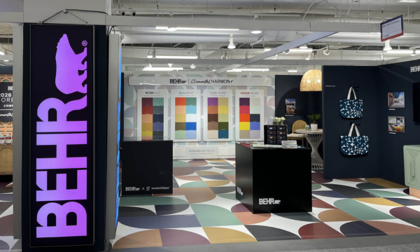
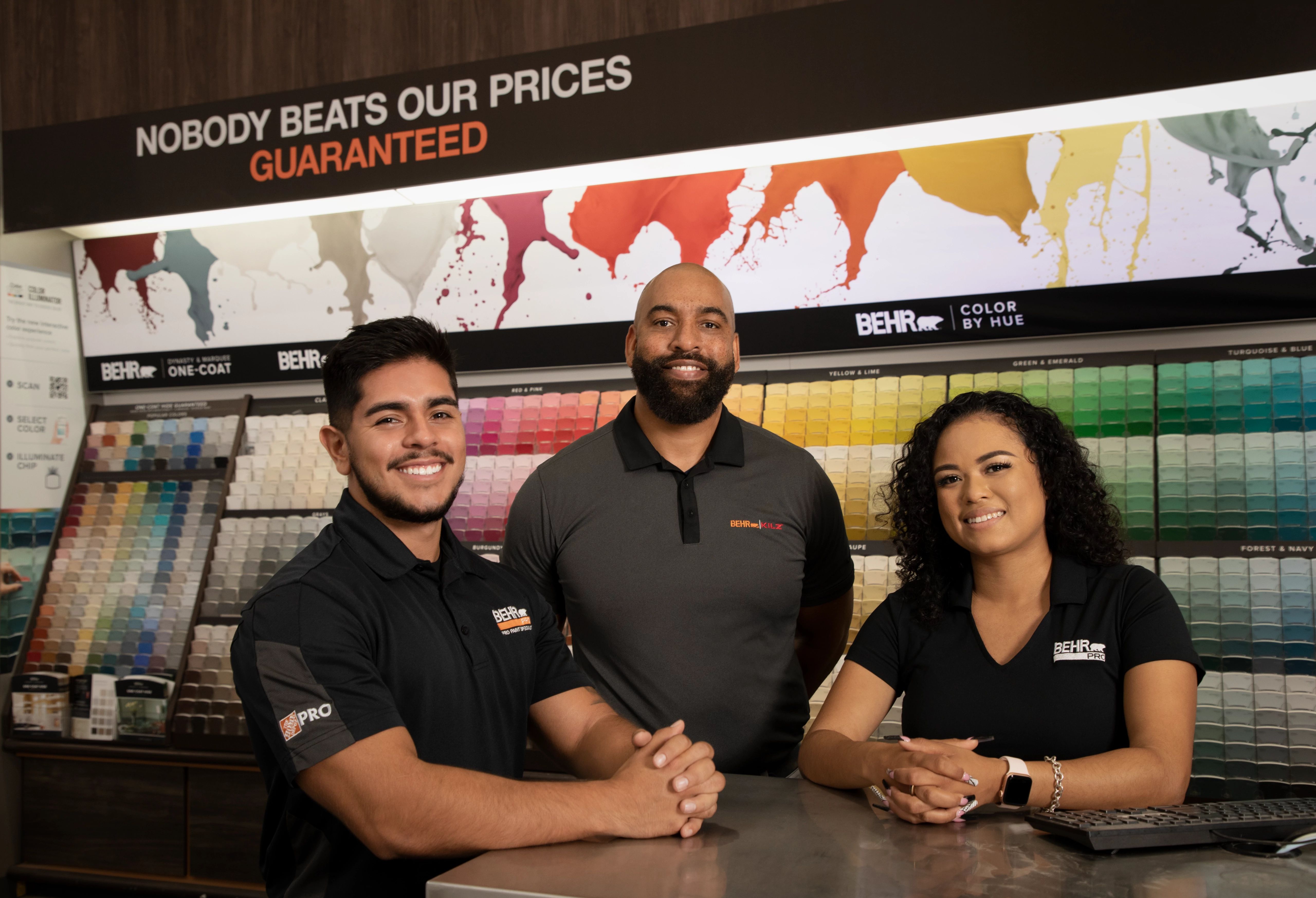
Behr Paint Company is excited to announce the winners of its first-ever Student Design Competition. The competition was created in partnership with MattoBoard, a 3D virtual sampling platform, to champion emerging designers by providing opportunities to showcase and celebrate their talents.   About the Design Competition Behr invited design students to submit an original design plan for any commercial space such as hospitality, workplace, healthcare, multifamily and more. The design theme, “No Clear Boundaries,” drew inspiration from the BEHR® 2025 Commercial Color Forecast, which celebrates the fluidity between designed environments that reflect the intersection of the past and future, digital and physical, and timeless and modern.   Entrants were required to incorporate colors from the BEHR 2025 Commercial Color Forecast in their design along with Behr’s 2025 Color of the Year, Rumors, a deep and timeless shade of ruby red.     Judging criteria included: Originality, Creativity and Style of Overall Design Plan (40%) Creative Expression in Use of Behr Paint Colors (40%) Creativity of MattoBoard in Entry (20%)   The judging panel included Erika Woelfel, VP of Color & Creative at Behr; Adam Ailion, Architect and CEO / Co-Founder of MattoBoard; Kayla Kratz, Director of Color & Designer Segment at Behr; and Amber Jones, Director of Architect & Designer Strategic Initiatives at Behr.   
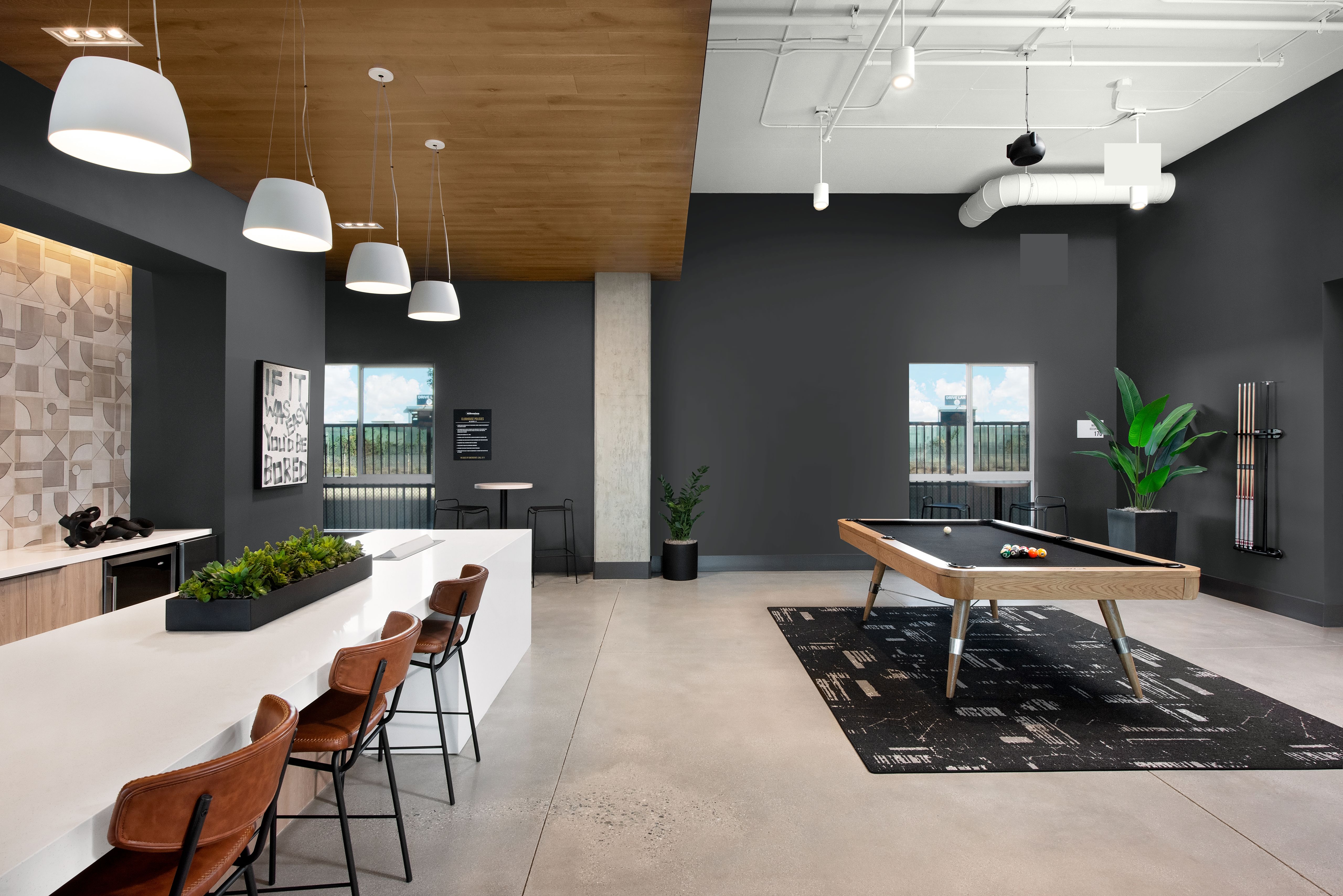
Grand Prize Winner: Leanne Hlavka BOUNDLESS Women’s Work and Play Center​ BOUNDLESS is a women’s work and play center that blends work, childcare, and social settings into a seamless, multi-functional environment. Inspired by Behr’s design theme, “No Clear Boundaries,” the space removes traditional divisions between work, motherhood, and social life, creating a space where working women and mothers can be productive, supported, and fulfilled.     The center incorporates timeless mid-century modern design elements—open floor plans, clerestory windows, and materials like wood and raw finishes—while fluidly connecting indoor and outdoor areas. This style uses color to define the spaces where there are otherwise “no clear boundaries”, reinforcing the concept’s openness to blur the boundaries of the spaces women work, play, live, and learn in.     With color paramount to the design, a palette was curated in timeless earth tones and bold saturation for a modern touch. Rumors MQ1-15 was prioritized in the workspace for its sophistication to create a feeling of intimacy for focused work, with Wild Berry P110-6 adding a pop of femininity and playfulness to this non-traditional center. Colorful Leaves M190-7, Flaming Torch PPU3-03 and Wild Ginger M270-7 create an ascending transition, while Boreal N420-5 and Fresh Artichoke M340-5 work in synergy in the outdoor courtyard. Audition MQ5-36 brings a calming presence to the nursing room, and Baronial Brown N170-7 and Leather Work S240-7 add depth to the beam ceiling, altogether bringing BOUNDLESS to life.   3D Materials Board Using MattoBoard   About LeAnne LeAnne Hlavka is a Bachelor of Arts student at the Interior Designers Institute in Newport Beach, CA. She is passionate about commercial design, biophilic design, and historic preservation. Balancing studies with motherhood, she is excited to pursue interior design as her second career. For her Grand Prize entry, LeAnne was awarded a $3,000 cash prize and a one-year MattoBoard Pro subscription. Her design school also received $1,000.     
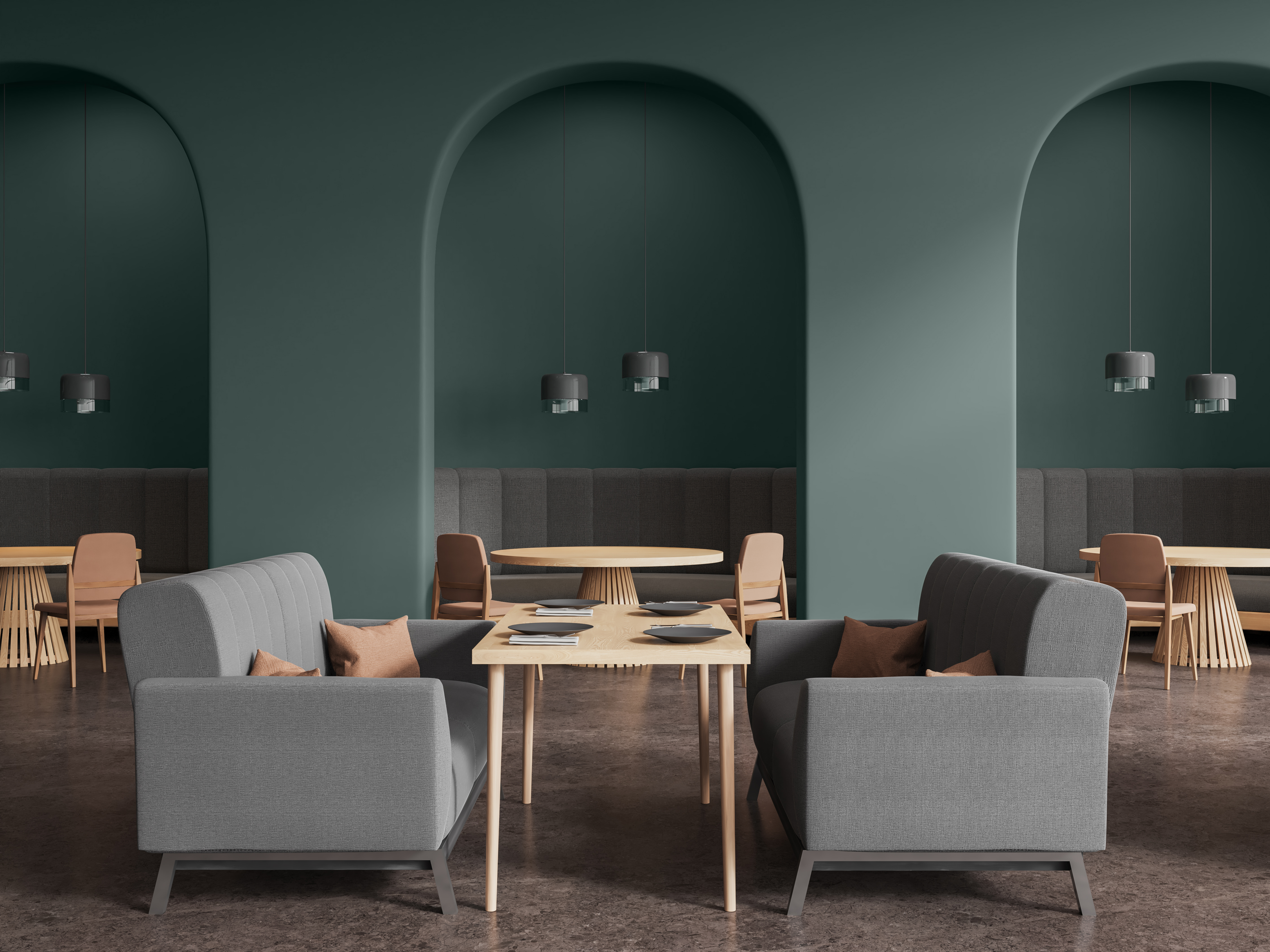
First Prize Winner: Mary Dilanchian “Aeternum” Echoes in Mauve- The Eternal Glow of Rumors​ Featuring colors from the BEHR 2025 Commercial Color Forecast, the Schiaparelli-inspired fashion pavilion in Rotterdam comes alive as the sun begins to set, transforming with the fading light. At its heart, Behr’s 2025 Color of the Year: Rumors MQ1-15, glows as dusk falls, reflecting the muted hues of a Rotterdam sunset. It becomes a beacon, interacting with reflective surfaces to create a dynamic play of color and shadow while paying homage to the natural beauty of the site and enhancing the pavilion’s presence.     Supporting this central glow, Behr’s Wild Ginger M270-7 adds depth and richness with warm, earthy undertones. Baronial Brown N170-7 serves as an anchor, grounding the design in a sense of stability and connection to the earth. Even Better Beige DC-010, used on the pavilion’s supportive skin structure, provides a soft, neutral backdrop, enhancing the pavilion’s skeletal design, and Limo-scene N560-7 acts as an accent, adding a subtle coolness to the pavilion.     Together, these colors transform the pavilion into a cohesive, living organism that shifts with the changing light, creating a vibrant and harmonious interplay that honors the themes of rebirth, transformation, and layered experiences. This palette elevates the pavilion from a mere structure to an evolving masterpiece that embodies the essence of fashion, architecture, and the Rotterdam landscape.   3D Materials Board Using MattoBoard   About Mary Mary is an Interior Architecture student at Woodbury University in Burbank, CA, driven by a passion for creating immersive designs that connect people to their spaces. She thrives on creating meaningful experiences and has a keen eye for detail and experiential design. Mary was awarded a $1,500 cash prize and a one-year MattoBoard Pro subscription for her First Place Prize entry.     Second Prize Winner: Brittany Marie Ott Urban Sipology From Grapes to Glass: Urban Sipology redefines wine tasting in Chicago, blending the city’s industrial history with a sleek, modern aesthetic for today’s youthful, vibrant audience. This innovative venue reimagines tradition while catering to diverse, modern tastes.     The venue offers a warm, sophisticated atmosphere with oxidized steel, earthy leather, and bronzed metals, complemented by ambient lighting that creates an inviting environment. Designed with fluidity in mind, the space echoes the winemaking process—filtration, flow, and bottling—to create a sense of graceful movement. Behr’s Rumors MQ1-15 provides a sultry and sophisticated energy—perfect for a wine venue.     Guests can enjoy a trendy, inclusive space featuring an extensive wine display, casual tasting bar, private nooks, seasonal patio, and soft background music, making it ideal for winding down with friends. The design begins with a narrow retail corridor, guiding visitors into an expansive tasting area that mirrors the richness and joy of each sip. This intentional layout reflects the progression of wine tasting—starting with anticipation, leading to discovery, and ending with delight.   3D Materials Board Using MattoBoard   About Brittany Brittany Ott, a senior at East Carolina University, is pursuing a Bachelor of Science in Interior Design. She’s passionate about designing functional, impactful spaces that elevate human performance and leave lasting impressions. Brittany was awarded a $500 cash prize and a one-year MattoBoard Pro subscription for her Second Place Prize entry.     Learn more about the Student Design Competition here.  
2024 BEHR Student Design Competition_Banner_418x232
2024 Student Design Competition Winners Announced
Have you heard about the BEHR® 2025 Color of the Year? Rumor has it, it’s the perfect hue to make a statement in any commercial or residential space.     It’s true, our Color of the Year, Rumors, is a deep red that adds warmth and draws a rich allure to hospitality, retail and other dynamic spaces. Designers and paint professionals alike can offer Rumors with confidence on projects to make a powerful and fearless statement. This tone is the perfect shade that captivates and enhances the built environment.     Let this elevated color speak volumes, no matter the scale of your project. Rumors will create an energy that evokes beauty and vitality.         With its vibrant tone, Rumors is a great choice for creating a dramatic and charming environment. Whether the space is large or small, Rumors packs a punch with a touch of luxe.         Pair Rumors with light neutrals like greige, tan and gray to balance hospitality spaces and create depth.         Or create a sense of enclosure by drenching the color in a room for a rich and modern look. This can be particularly effective in larger rooms where your client wants a space that fuels productivity.         Now’s the time to give your clients a compelling look with BEHR Rumors.   Rumors is part of fifteen distinct hues in the BEHR 2025 Color Trends collection. Create an inviting atmosphere with these nostalgic and personal colors. Pair warm neutrals with jewel tones and nature-based hues for timeless charm in commercial and residential spaces.     WORKPLACE | Walls: Aerial View S530-3   MULTIFAMILY | Walls: Boreal N420-5   EDUCATION | Walls: Jackfruit PPU6-07   RESIDENTIAL | Walls: Even Better Beige DC-010     To explore the 2025 Color of the Year and Color Trends, visit behrpro.com/2025coty.  
BEHR 2025 COTY Rumors
2025 Color of the Year: Rumors
As the global workforce evolves, workplace designers are prioritizing innovation, wellness, and collaboration. Gone are the days of dull, uninspiring offices with cubicles stifling creativity. Instead, companies are investing in dynamic spaces tailored to diverse employee needs and workstyles. Workplace expectations for 2024 and beyond center on promoting flexibility, connection, wellbeing, and sustainability. Recognizing how the pandemic significantly altered how and where we work, employers are focusing on meeting the needs of an ever-changing workforce. With that in mind, let’s explore the trends shaping today’s workplaces and office paint color pairings.     1. Hybrid is Here to Stay The COVID-19 pandemic reshaped our work landscape significantly. In 2023, some companies mandated a return to the office, highlighting a contrast between workers adjusting to the “new normal” and businesses eager to restore the “old normal.” Yet, according to Gallup, 53 percent of U.S. workers prefer a hybrid model, while 21 percent opt for full remote work.   To create an atmosphere that provides employees a welcoming transition between home and the office, consider choosing elevated neutrals for an office space. Pairing subtle, yet nuanced, shades — such as Tranquil Gray DC-007, a delicate taupe gray, or Taupe Tease N210-1, a light neutral gray —with a cool beige like Cotton Knit PPU7-11 creates a sense of warmth while maintaining a professional feel.   Windows & Ceiling: Cotton Knit PPU7-11 | Panels: Tranquil Gray DC-007     2. Attracting Millennials, Gen Z Back to the Office Millennials and Gen Z are not just the future of the workforce; they’re redefining where and how we work. These generations value flexibility, aesthetics, and a culture that fosters creativity. Offices need to offer more than just workstations and amenities; they should be vibrant environments that inspire.   A pivotal strategy for fostering a connection with these generations is creating a vibrant atmosphere environment that beckons them into the heart of the workplace. Consider playing with the light, dark and neutral hues. For example, cultivate a productive yet calming environment by combining Mountain Olive N350-7A, a deep olive green, and Even Better Beige DC-010, a warm neutral, with a bold pop of color like Tart Orange HDC-MD-27. To cultivate a sleek, sophisticated impression, combine these bright hues with BEHR’s 2024 Color of the Year Cracked Pepper PPU18-01.   Ceiling & Right Wall: Even Better Beige DC-010 | Back Wall: Mountain Olive N350-7A | Ceiling Accent: Tart Orange HDC-MD-27 | Ceiling Behind Panels: Cracked Pepper PPU18-01     3. Energizing Hues Foster Collaboration The emphasis on collaboration and innovation has led to the rise of modifiable workspaces. To truly energize these spaces, go bold with colors that ignite creativity and encourage interaction. Consider an optimistic, gold-tinged hue like Dandelion Wish MQ4-12 or an energetic retro orange like Flaming Torch PPU3-03 and confident New Age Blue PPU15-05 to infuse life into collaborative zones, breakout areas, and communal spaces.   Walls: Blank Canvas DC-003 | Nook Wall: New Age Blue PPU15-05 | Cove Wall: Dandelion Wish MQ4-12     4. Biophilic Design Biophilia: The business world continues to recognize the vital benefits of bringing nature into the workplace, as elements such as natural light, indoor plants, and organic materials can improve air quality, reduce stress, and increase productivity.   When it comes to color, opt for a palette-cleansing white like Winter White DC-004 with an ocean-inspired cool hue like Yacht Blue S490-4 — creating a sense of tranquility and relaxation.   Walls: Winter White DC-004 | Ceiling & Accent: Yacht Blue S490-4   For more biophilic color inspiration, visit our BEHR® BioNature Collection — 50 colors to infuse harmony and wellbeing into built environments to elevate the human experience.     5. Restore, Recharge, Revitalize “Resimercial” Design: Blurring the lines between home and work, this uber-cozy trend integrates elements to inspire comfort and creativity. Envision plush sofas, soft lighting, and personal touches that make employees feel relaxed and inspired — a home away from home.   To create an authentic and peaceful environment, embrace forest-inspired greens like Meteorological N430-6 to accent a comforting neutral like Dove HDC-MD-21.   Ceiling & Right Wall: Meteorological N430-6 | Back Wall: Dove HDC-MD-21   By incorporating residential-inspired elements, such as relaxing furnishings and personalized decor, offices can be a space where employees feel at ease, fostering satisfaction and wellbeing.     6. Soothing Seclusion Responding to today’s emphasis on mental wellness, office designs are incorporating private pods or alcoves that provide employees space to focus and relax, while allowing them to escape the hustle and bustle of the office environment. Providing such sanctuaries can reduce stress levels and improve productivity.   Try adding a pop of color to a ceiling installation with a smoky turquoise like Sophisticated Teal HDC-CL-22 and create depth by using a tone-on-tone combination of warm and peaceful hues such as Toasty Gray N320-2 and Grant Gray HDC-AC-19.   Art Ceiling Accent: Sophisticated Teal HDC-CL-22 | Left Wall, Conference Room Back Wall & Lobby Desk: Toasty Gray N320-2 | Office Wall: Grant Gray HDC-AC-19   The future of work presents a compelling opportunity for businesses, designers, and architects to reimagine office spaces as dynamic and human-centric environments. By integrating flexibility, technology, nature, and inclusivity, we can create workplaces that not only meet the functional needs of teams, but also inspire creativity, foster collaboration, and enhance employee wellbeing.   To learn more about the many color services Behr offers and to contact an Architect & Design Rep, please visit behr.com/designer.
Office Trends for 2024 & Beyond
Color plays a pivotal role in your projects, whether you’re a professional painter, property manager, or designer. It’s often the final touch to attracting residents, enticing building occupants, or enhancing curb appeal. Behr Paint offers a variety of color services to help you and your clients see the potential of every color and combination for their project. Our services are designed to empower you, providing the support necessary to bring any job from vision to reality, no matter how big or small. From custom color matching to color renderings to full-size drawdowns, discover the many color services Behr has to offer.     Custom Color Matching Whether you need to match a corporate color scheme or a shade of carpet, we’ve got you covered. Our cutting-edge color matching technology will convert any sample into a digital color representation. We can also confidently match any competitive color for your job, including popular Kelly-Moore colors like Swiss Coffee 23, Bone 27, and San Francisco Fog 5822*. Simply bring a sample to your local The Home Depot store and we’ll match it.     BEHR® Pro Visualizer & Digital Color Renderings Visualize BEHR® Paint color schemes for your exterior projects in real-time with the BEHR® Pro Visualizer, an online color rendering tool to help speed up the color selection process. Your BEHR® Pro Rep will upload an image of your project, allowing you to select colors and schemes and see a “before and after” preview. Once ready, you can download a shareable document for you and your client to determine final details. Ask your local Rep about the tool here.     We also offer digital color renderings. Make your client’s color vision come to life with a digital mapping of their project. They’ll see digital renderings of different paint color combinations to help them make an informed color decision with confidence.     Full-Size Drawdown Samples If you need to show color to your clients in a larger size than a paint chip, we offer full-size drawdowns to help visualize colors on any given project. Whether your client is debating between shades or finalizing their color scheme, full-size drawdowns offer a more accurate representation of how the color will appear on a larger scale so you can better envision color on a larger surface area.     Color Books & Boards Our color books offer a complete archive of every color and every product used on every surface on your project, including coatings, specifications, and warranties to help streamline future maintenance. We also offer color boards, perfect for showcasing color schemes and palettes. These 20″ x 30″ boards are an impactful way to share the color story of a project so every stakeholder can understand the vision and align on the project direction.     Color Services for Your Every Need At Behr, we believe that color has the power to transform spaces and elevate experiences. With our comprehensive color services, we’re dedicated to helping you and your client’s vision come to life for any project. Contact your local BEHR Pro Rep to learn more.     *Kelly-Moore Swiss Coffee 23, Bone 27, and San Francisco Fog 5822 are names of Kelly-Moore, which is being used for identification purposes only. Behr has created a comparable color using industry standard technology.  
The Search for Skilled Workers
Behr’s Comprehensive Color Services
Load More
Shop Behr Products
Explore more on homedepot.com
BS_THD_Logo_Exclusive_RGB (1)