As our world becomes more digital, many painting contractors have focused their marketing attention on search, paid ads, and social media to keep the digital lead funnel full. However, it’s important to remember that a laser-sharp focus on client care, reputation, and strong relationships can keep another lead funnel full: referrals.
Recently, we sat down with two long-time contractors, both recipients of multiple industry awards recognizing them for excellent craftsmanship and customer satisfaction.
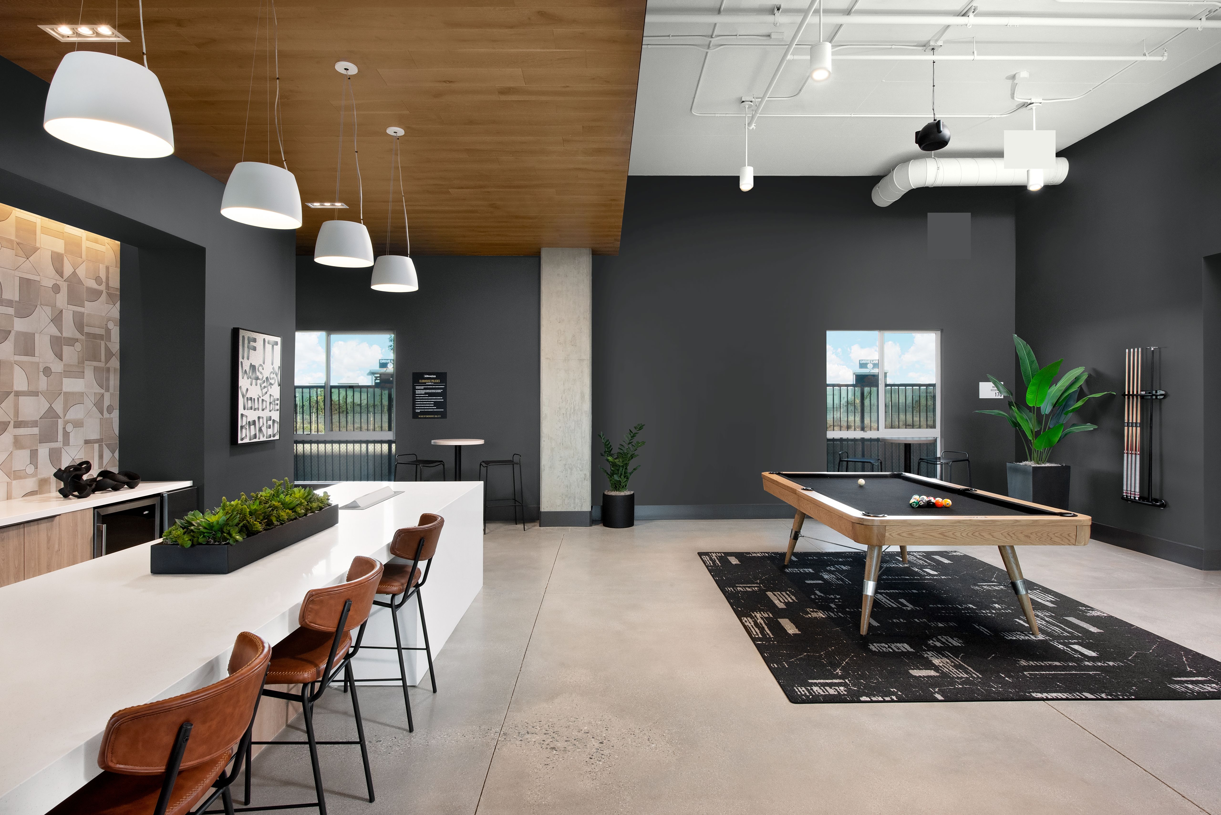
Alex Wendt is the Vice President and Junior Decorator of Ecclesiastical Studios and Sons, a Missouri-based painting company founded in 1956, focusing on historic church restorations, including plaster repair, decorative painting, altars, statues, gold gilding, and stenciling
Chad Lyons is the owner of Lyons Painting and Design, a Washington-based residential and commercial painting company serving the Puget Sound area outside of Seattle and the I-5 corridor. With the average employee tenure of 8-10 years, the crews have deep knowledge and exceptional skills.
They discussed how overcoming application challenges, adaptability when surprises pop up, and strong client communications ensure a smooth customer experience that leads to positive word of mouth and referrals.
Emily Howard: How is the painting market looking for 2026?
Alex Wendt: For us, it’s been pretty steady the last five years. Before that, we had some experiences with slower years where the jobs were smaller. I credit word of mouth and the work we’ve done on our website and social media for our steady work recently.
You know, everybody said word of mouth is dead, but in our experience, it’s still there. Priests talk to each other. A lot of them went to seminary together, and they regularly attend retreats together. If you bring value and do what you say you’re going to do, people will talk about you. Word of mouth has been extremely valuable to us.
Chad Lyons: We’re having a much better start to 2026 than 2025. The first quarter of last year was rough, but we’ve had a much better winter so far this year. However, I am hearing locally that there is a slowdown in new projects. The cost of building in the Northwest is high right now for both materials and labor. I don’t think the slowdown is long-term because there are too many people moving to the area for new construction not to come back. But in the short term, high costs combined with higher interest rates are pricing a lot of people out.
We feel fortunate that we have a strong workload because so many of our competitors don’t, but we’re cautious. We’re leaning into the grassroots of sales and marketing with a lot of client care and maintaining our reputation. We know our current client is our referral for our next job.
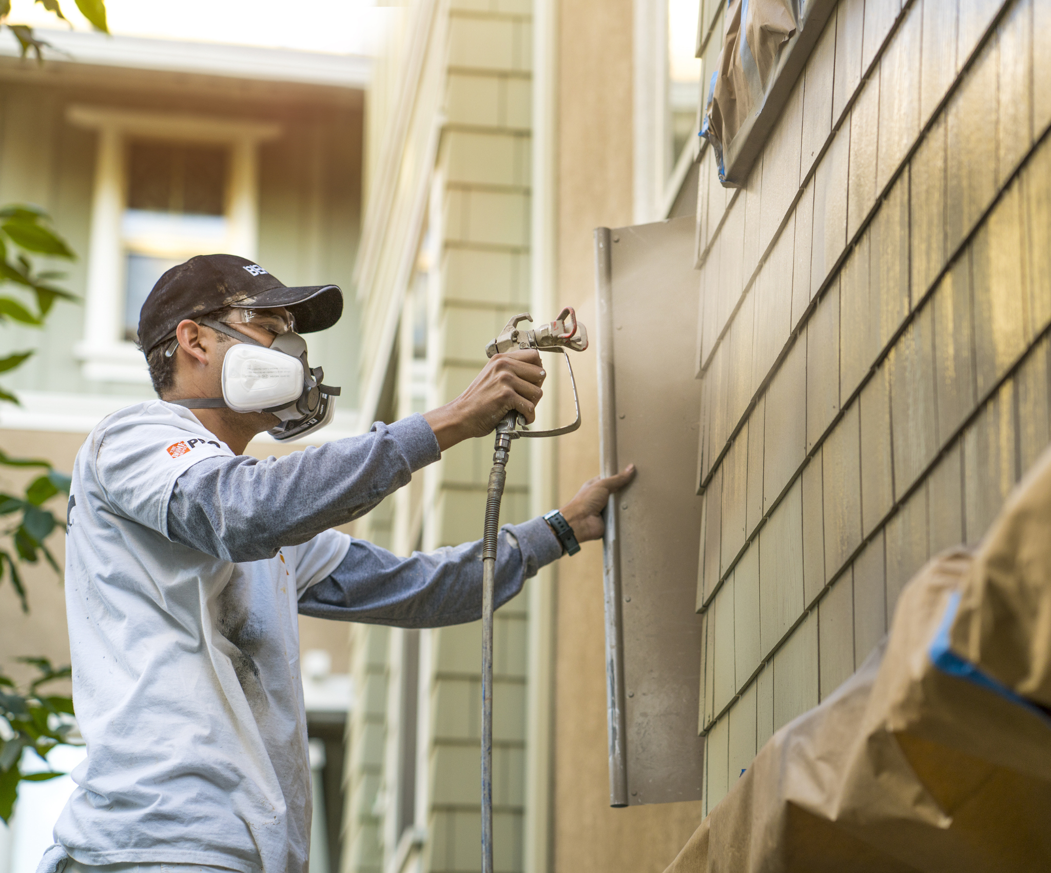
One of the best ways that a pro can build a strong reputation is by solving tough painting challenges. What are some of the challenges you face in application?
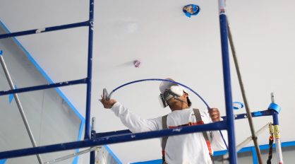
AW: For us, because we’re working over plaster in churches, we have trouble with wax. It’s tough because a lot of times you can’t see it on the substrate until you start painting.
We also deal with a lot of water leaks, plaster repair, and refinishing woodwork. To add to that, you never know what products were used in the last repaint. We use a lot of Shellac primer. It sticks to just about anything, and it sands it nicely.
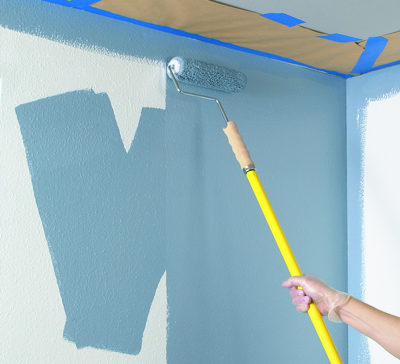
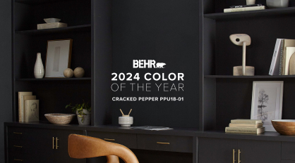
Darker colors were also a struggle for years. We use a lot of deep base colors like red and blue. It would take three, four, or five coats to get it to cover. We switched to Behr Paint about 15 years ago, and we never went back. What I love about Behr is that after two coats of a dark color, it looks great.
CL: Me too. I’ve been really impressed with the BEHR MARQUEE® paint line for its ultra-deep base.
Because we do a lot of historic restorations as well, we often see signs that the last contractor had a lack of substrate, application, or product knowledge. A lot of times, we show up and find that they used poor processes or the wrong product for the project. It’s so important that pros understand products and how atmospheric conditions affect how they perform.
Another challenge we work hard to overcome is understanding the customers’ goals and budget so that we can set the project up for success. Not everyone can afford the Cadillac of painting jobs, so it’s our job to know where we can step back on product and prep when a budget is tight and still give them a good result.
What’s your strategy for meeting their budget while also guiding them towards the proper products and processes for a lasting finish?
CL: We have a multitude of approaches. From an estimating standpoint, we make sure we are really up to speed on product knowledge, substrate knowledge, and how different conditions affect application and longevity. We educate the client about these things from the start.
On the operations side, we are sure that they are well-versed in the same things. That way, when a pressure wash reveals something the estimator couldn’t see, the team can pivot. Sometimes you have to go to the client and make adjustments to the scope of work, but sometimes we can change how we approach the project to achieve a lasting finish.
We want our crew to speak up if the product specified no longer meets the needs of the situation, but we also want to think creatively about how we move forward.
AW: We charge a fee for site visits and estimates because they require travel and are an intensive process. We make it a priority to answer all their questions and learn as much as we can about their expectations. We also take time to alert them to problem areas and do a rendition with what it could all look like.
I also agree with Chad. When you run into problems you have to adjust. It’s so important to come up with creative solutions and think outside the box and find a way to move forward.
CL: Exactly. We always want the client to understand the challenge, how we’re pivoting, and why.
To learn more about how Behr Paint can help you, contact a BEHR Pro Rep.
Business Building
Pro Spotlight
Pro Tips
How Painting Contractors Build Reputation