
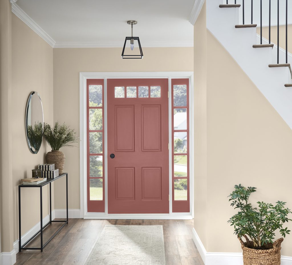
Cotton Grey HDC-NT-20 is the perfect neutral backdrop for any room in your home. We love this relaxing color. Cotton Grey HDC-NT-20 is so calm and soothing. It’s not to light, not too dark and definitely not drab. It looks lovely in natural light as well in the evening when it is lit up with a warm glow.
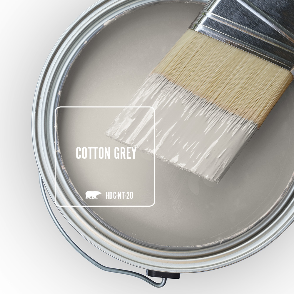
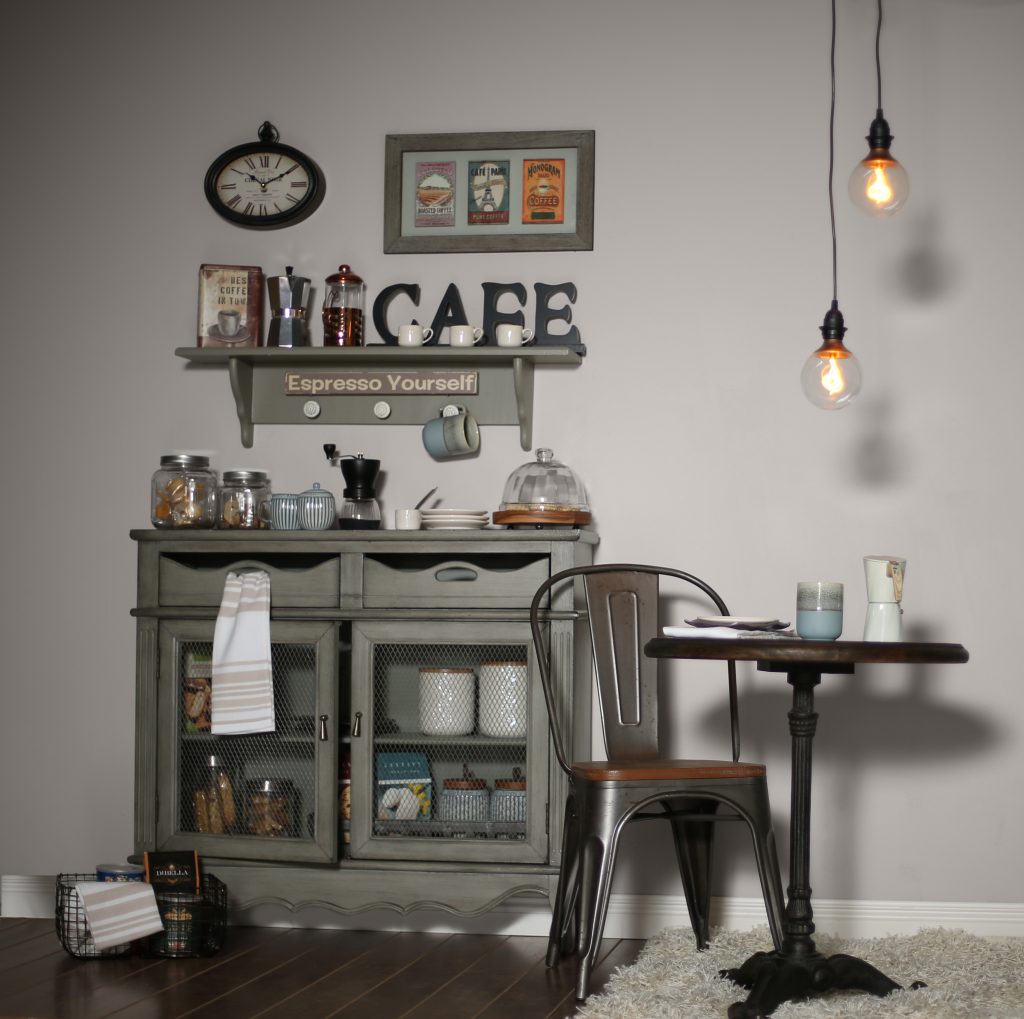
We used Cotton Grey HDC-NT-20 on the walls for this cozy in-home coffee bar. This grey is very versatile, making it easy to coordinate with other colors. You can add pops of bright hues to create a livelier feel. Or as we did, add some dusty soft hues to keep the mood undisturbed.
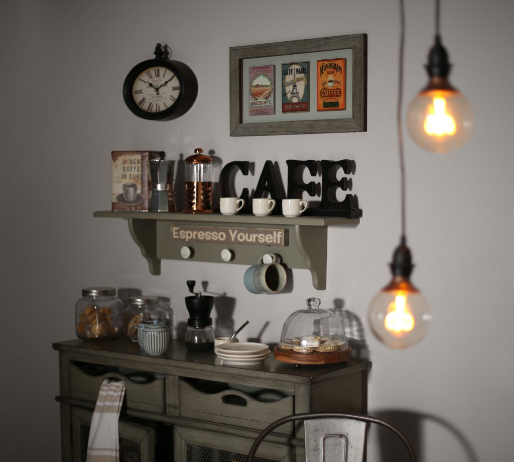
To create this atmosphere, we found an old cabinet that we used to display our coffee amenities. We filled it with a mix of fresh beans, vintage grinders, espresso cups, and scrumptious treats. Added some clever puns and bistro words. Lastly, we placed a small table with pendant lighting just above.
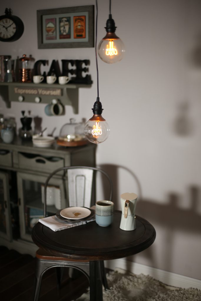
There is nothing better than the energizing aroma of fresh coffee brewing in your home. especially when paired with the calming feel of Cotton Grey HDC-NT-20. In the morning this color is bright and alive making this the perfect spot to wake up with a fresh cup of coffee. As the day draws to an end, this color becomes a cozy backdrop for a soothing place to unwind.
For more color trend inspiration visit our 2019 Color Trends page on behr.com.
Colorfully yours,
Larayne
Hi! I just painted my kitchen Cotton Grey, and I LOVE it. Now it’s time to paint my kitchen cabinets, and I’m having a hard time choosing the right shades to compliment the wall color. I’m wanting a two-color look, so I *think* I’ve chosen power grey for the lower cabinets (open to better suggestions though!). However, I can’t find the right shade of white for the uppers, which get lots of sunlight. So far I’ve bought samples of and tried:
silent white (love the color, but not enough contrast with cotton grey)
Bakery Box (too stark bright-white)
White metal (blue hue in the sunlight)
and Diamonds Therapy (greige-ish in the sunlight, blended with cotton grey walls.
I’ve also tried “white”, which is closest to what I’m wanting, but still not perfect. Any recommendations would be great!!!
Hello Jordan, thank you for visiting our blog!
This is helpful information!
So Power Gray will work for your bottom cabinets if you decide on that color then for your upper cabinets you can try Silky White PPU7-12.
Another combination with Silky White as the upper cabinets I recommend Fashion Gray PPU18-15 for bottom cabinets. Just so you have two different options but I recommend testing each of these colors to see what you prefer.
Hope this helps!
Colorfully Yours,
Deanna
Hi. I’m looking for a neutral color for our master bedroom that would blend well with a light/med. grey carpet and a taupe bed set. And yes, the carpet and bed set blend well.
Hello Kandi, thank you for visiting our blog!
We recommend the following neutral tones.
Creamy Mushroom PPU5-13, Chic Gray PPU26-10, Wheat Bread 720C-3 or Greige PPU24-11.
Hope this helps!
Colorfully Yours,
Deanna