Contact a Pro Rep
BEHR® 2025 Color of the Year: Rumors
Make a statement with Rumors, a deep ruby red that adds warmth and rich allure to spaces.
Explore Rumors
BEHR® 2025 Commercial Color Forecast
A visionary palette of 50 colors for commercial spaces of the future.
Explore Palette
BEHR® BioNature Collection
50 colors to infuse harmony and wellbeing into built environments to elevate the human experience.
Explore Palette
The Search for Skilled Workers
Find tips on building your network, hiring, and retaining employees.
Learn More
BEHR® DESIGNER COLLECTION Palette
See Behr’s hyper-curated collection of our top white, neutral and accent colors.
Learn More
Featured Content:
Pro painters are experts in substrate, process and product, but they’re not the only ones committed to delivering a lasting and beautiful paint job. There’s another group just as committed to product performance, and it’s the paint chemists creating the product in the can.     The chemist’s job requires spending countless hours formulating and testing paint products in a combination of scenarios. Chemists work tirelessly to arm you with the right products and information that ultimately lead to a paint job that gets referrals and return business.   So, what do years of diligent work in the lab teach? And what can pro painters learn from chemists? Hint: A lot!   Research Fellow and Formulator Hai Nguyen has been innovating at Behr Paint Company for 17 years. Much of his time is spent researching raw materials and developing products. But when he isn’t in the lab, he’s working directly with pro painters onsite to tackle challenges and provide solutions. Nguyen shared some advice that can help contractors choose the right products, avoid coating failures and become an important resource for customers.   Hai Nguyen   Know what you are buying and why. Varying substrates and conditions require specific coating solutions for the best results. While many products are versatile and can be used on a range of surfaces, they may not always be the best choice for every application.”   As a pro, you need a deep bench of products and a strong understanding of where those products perform best so you can educate your customer and avoid coating failures.        Glossy surfaces need to be sanded, even when using a bonding primer. Painting or repainting a glossy surface is one of the more advanced jobs painters are tasked with. It’s the project most often botched by homeowners, and proper prep and product choice are crucial to success. While bonding primers are designed to bond to tough-to-paint surfaces, sanding creates a rougher surface that allows the primer to grip better, improving overall adhesion,” says Nguyen.   Alkalinity in new substrates is high. This means a primer for a new substrate is a must. A primer seals that substrate so that the final coating doesn’t blister or suffer from color burnout. Of course, you can use paint and primer in one, but you should apply two coats on a new substrate to avoid a coating failure.     When choosing premium paint, don’t just look at volume solids. Pro painters frequently talk about volume solids; however, the type of solids added is even more important. More solids don’t mean more premium pigments. Ask yourself what would happen if you were to put in extender, which is a low-grade pigment, versus titanium dioxide, which is a high-grade pigment. If you put in more extender, then you drive up volume solids, but that doesn’t mean that the product is more premium. Actually, it’s now the opposite because you’ve reduced the overall amount of titanium, which gives the wet and dry hide, and substituted it with a low-grade pigment that doesn’t hide well at all,” Nguyen explains.   Refer to a product’s technical data sheet (TDS) and safety data sheet (SDS) for additional details about the materials used in the can of paint.   BEHR® products aren’t just for the DIY customer. Behr has a long history of creating highly rated DIY products, which are often recognized as one of the best value products in the industry. The team has leveraged that expertise to create outstanding products for paint professionals as well. My job specifically focuses on paints designed for pro painters. We have a whole team of experienced pro formulators tasked with creating high-performing paint products for pros,” says Nguyen.     Chemists not only formulate paints that solve a host of challenges, but they also possess an abundance of information that can help pros achieve successful paint jobs and solve difficult coatings challenges.   If you have paint questions or want to learn more, contact your local BEHR Pro Rep.  
Paint Chemist in the BEHR Research & Devlopment Laboratory
Paint Tips From a Chemist
When you get color questions during the estimate, you may be tempted to say, “That’s not my area of expertise.” But before you do, consider that color is one of the most important decisions of any project and a motivating factor for homeowners wanting a new paint job. A painter who can help a homeowner with paint color selection may get the estimate signed and the job scheduled faster versus one who is lost in uncertainty.   So, what do pro painters need to know about color? Here are some color questions homeowners typically ask and some strategies to help you answer so you can close the paint job. Dining Room | Wall: Aerial View S530-3; Side Wall: Blank Canvas DC-003   What paint colors are trending? Erika Woelfel, VP of Color and Creative Services at Behr Paint Company, notes some exciting trends that we’re seeing in the industry.   Biophilic movement: Woelfel notes that blues and greens are color families that have been trending for several years, saying, “We’ve seen a biophilic movement (bringing nature into the built environment) in both residential and commercial spaces that plays a big part in this. These natural hues bring a relaxing aesthetic and often coordinate well with other colors, materials and finishes.” Behr offers a BioNature Collection which includes 50 colors to infuse harmony and wellbeing into built environments to elevate the human experience. Neutrals: For homeowners looking to keep their space cozy, she says to look for colors that are warm and enveloping. “You’re looking for some of those golden beiges and taupes.” Greige: Grays have been classic sellers for many years, however, Woelfel noted that the hues have been trending lighter. “They are more like light taupe than a gray. Grays have been evolving into some of those warmer, neutral colors.” Dramatic: Many are looking to add something bold to their space. “People have been using darker colors on their walls, including soft blacks like Cracked Pepper and deeper jewel tones like Rumors – our 2025 Color of the Year – as an accent color or a pop of color on doors and cabinets.”   Kitchen | Base Cabinets: Rumors MQ1-15; Walls and Upper Cabinets: Blank Canvas DC-003; Island: Oxford Street N270-4   To keep yourself up to date on trends, check out our annual 2025 Color Trends to awaken your clients’ spaces with endless expression. And be sure to regularly browse curated colors and trends with the ColorSmart by BEHR® tool, which includes a color wheel to explore color combinations and find the closest BEHR matched color. A little time studying can make you a treasure trove of knowledge for your clients.   What colors pair with the existing materials and finishes in my space? Finding complementary colors to existing items in a home can sometimes lead to indecision. Color tools can empower your client to make informed color choices.   Fan decks give the client a full range of choices to hold up next to materials and finishes in their space. Color cards at The Home Depot also provide inspiration for color and furniture pairings so your client can choose color with confidence. If you’re working on an exterior project and want to show your client before and after photos with their chosen color scheme, your local BEHR Pro Rep can upload images of the project to the BEHR Pro Visualizer. You’ll then be able to download the images and review the options with your client.   Will the colors look the same in different settings? Color is complex. As a painter, you know you can apply the same color in different settings, and it may look slightly different depending on the lighting and surroundings.   Remind your clients of this, and then use fan decks and drawdowns under different lighting conditions to illustrate how it will look at different times of the day. Sampling the color in different areas can also give a preview of the final result. Whether you provide those color samples or give your client instructions on what to pick up at The Home Depot, discussing and testing how light, sheen and surroundings play with color is smart business.   Do you remember what colors I’ve used in the past? Maintaining records of paint colors from previous projects in an organized system demonstrates your professionalism and dedication to your clients. Plus, it’s an effective way to encourage repeat business.   Behr offers color books that include every product and color used in a project. It’s an excellent option to keep accurate information in an attractive format. What color do you recommend? Many pro painters wonder what to do when homeowners want a color recommendation. No one wants to be on the hook if the color doesn’t turn out to their liking. The final color choice should be made by the homeowner, and you want them to sign off on that choice. But you can still provide inspiration and be a helpful guide. Consider these strategies to get the creative juices flowing:   Questions: Ask thoughtful and detailed questions to find out more about the purpose and desire for the space. Your portfolio: Don’t be bashful about using past paint projects and testimonials to inspire ideas. This demonstrates your knowledge of color and gives the client a peek at your past happy clientele, building further trust. BEHR® DESIGNER COLLECTION: “The DESIGNER COLLECTION palette has 30 colors that are tried-and-true best sellers. This is a great starting point for thinking about color,” says Woelfel.   Kitchen | Cabinets: White 52; Wall: First Snow DC-006; Island: N480-5 Adirondack Blue   Once your client has narrowed down the color scheme, help them use the tools and techniques above to make final selections and visualize their newly painted space.   In the end, color is just one more tool to help you close more estimates and build a reputable painting business.   If you have additional questions or want to learn more, contact your local BEHR Pro Rep.  
What homeowners wish pro painters knew about color
What Homeowners Wish Pro Painters Knew About Color
Have you heard about the BEHR® 2025 Color of the Year? Rumor has it, it’s the perfect hue to make a statement in any commercial or residential space.     It’s true, our Color of the Year, Rumors, is a deep red that adds warmth and draws a rich allure to hospitality, retail and other dynamic spaces. Designers and paint professionals alike can offer Rumors with confidence on projects to make a powerful and fearless statement. This tone is the perfect shade that captivates and enhances the built environment.     Let this elevated color speak volumes, no matter the scale of your project. Rumors will create an energy that evokes beauty and vitality.         With its vibrant tone, Rumors is a great choice for creating a dramatic and charming environment. Whether the space is large or small, Rumors packs a punch with a touch of luxe.         Pair Rumors with light neutrals like greige, tan and gray to balance hospitality spaces and create depth.         Or create a sense of enclosure by drenching the color in a room for a rich and modern look. This can be particularly effective in larger rooms where your client wants a space that fuels productivity.         Now’s the time to give your clients a compelling look with BEHR Rumors.   Rumors is part of fifteen distinct hues in the BEHR 2025 Color Trends collection. Create an inviting atmosphere with these nostalgic and personal colors. Pair warm neutrals with jewel tones and nature-based hues for timeless charm in commercial and residential spaces.     WORKPLACE | Walls: Aerial View S530-3   MULTIFAMILY | Walls: Boreal N420-5   EDUCATION | Walls: Jackfruit PPU6-07   RESIDENTIAL | Walls: Even Better Beige DC-010     To explore the 2025 Color of the Year and Color Trends, visit behrpro.com/2025coty.  
BEHR 2025 COTY Rumors
2025 Color of the Year: Rumors
Determining whether one coat or two coats of paint are needed for an exterior repaint depends on several factors, including budget, condition of the surface, paint types and quality, and desired longevity and appearance. Let’s explore when it’s appropriate to opt for one coat vs two coats of paint.     ONE COAT   Good Surface Condition: If the existing paint is in good condition, with no significant damage, peeling, or discoloration, a single coat may be sufficient to refresh the appearance and provide adequate protection.     High-Quality Paint: Using a high-quality paint with excellent durability may allow for one-coat application, especially if the color change is minimal and the surface is properly prepared.     Maintenance Coating: In some cases, a single coat may serve as a maintenance coating to touch up areas with minor wear and tear, extending the life of the paint job without the need for extensive surface preparation.     TWO COATS   Weathered Surfaces: If the existing paint is weathered, faded, or peeling, applying two coats is generally recommended to ensure proper coverage, adhesion, and protection against moisture and UV damage.     Drastic Color Change: When changing the color significantly, especially from dark to light or vice versa, two coats are typically needed to achieve uniform coverage and prevent the previous color from showing through.     Porous Surfaces: Porous or uneven surfaces such as bare wood, stucco, or masonry may require two coats to seal and provide adequate coverage, promoting paint adhesion and preventing moisture intrusion.     Longevity: For long-lasting results and enhanced durability, especially in harsh climates (e.g., coastal areas) or high-traffic areas, two coats offer better protection against the elements, extending the lifespan of the paint job.     Ultimately, the decision between one coat and two coats of exterior paint application for an HOA depends on factors such as budget constraints, desired durability and appearance, surface condition, and manufacturer recommendations. By understanding the specific needs and preferences of the community, you can make a more informed decision that best suits the property. Contact your local BEHR® Pro Rep or consult with a painting professional for additional questions.  
One Coat Vs Two Coats of Paint
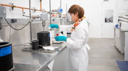
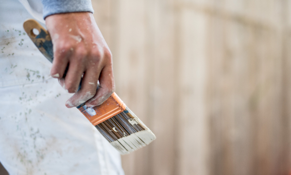
As the global workforce evolves, workplace designers are prioritizing innovation, wellness, and collaboration. Gone are the days of dull, uninspiring offices with cubicles stifling creativity. Instead, companies are investing in dynamic spaces tailored to diverse employee needs and workstyles. Workplace expectations for 2024 and beyond center on promoting flexibility, connection, wellbeing, and sustainability. Recognizing how the pandemic significantly altered how and where we work, employers are focusing on meeting the needs of an ever-changing workforce. With that in mind, let’s explore the trends shaping today’s workplaces and office paint color pairings.     1. Hybrid is Here to Stay The COVID-19 pandemic reshaped our work landscape significantly. In 2023, some companies mandated a return to the office, highlighting a contrast between workers adjusting to the “new normal” and businesses eager to restore the “old normal.” Yet, according to Gallup, 53 percent of U.S. workers prefer a hybrid model, while 21 percent opt for full remote work.   To create an atmosphere that provides employees a welcoming transition between home and the office, consider choosing elevated neutrals for an office space. Pairing subtle, yet nuanced, shades — such as Tranquil Gray DC-007, a delicate taupe gray, or Taupe Tease N210-1, a light neutral gray —with a cool beige like Cotton Knit PPU7-11 creates a sense of warmth while maintaining a professional feel.   Windows & Ceiling: Cotton Knit PPU7-11 | Panels: Tranquil Gray DC-007     
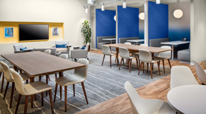
2. Attracting Millennials, Gen Z Back to the Office Millennials and Gen Z are not just the future of the workforce; they’re redefining where and how we work. These generations value flexibility, aesthetics, and a culture that fosters creativity. Offices need to offer more than just workstations and amenities; they should be vibrant environments that inspire.   A pivotal strategy for fostering a connection with these generations is creating a vibrant atmosphere environment that beckons them into the heart of the workplace. Consider playing with the light, dark and neutral hues. For example, cultivate a productive yet calming environment by combining Mountain Olive N350-7A, a deep olive green, and Even Better Beige DC-010, a warm neutral, with a bold pop of color like Tart Orange HDC-MD-27. To cultivate a sleek, sophisticated impression, combine these bright hues with BEHR’s 2024 Color of the Year Cracked Pepper PPU18-01.   Ceiling & Right Wall: Even Better Beige DC-010 | Back Wall: Mountain Olive N350-7A | Ceiling Accent: Tart Orange HDC-MD-27 | Ceiling Behind Panels: Cracked Pepper PPU18-01     3. Energizing Hues Foster Collaboration The emphasis on collaboration and innovation has led to the rise of modifiable workspaces. To truly energize these spaces, go bold with colors that ignite creativity and encourage interaction. Consider an optimistic, gold-tinged hue like Dandelion Wish MQ4-12 or an energetic retro orange like Flaming Torch PPU3-03 and confident New Age Blue PPU15-05 to infuse life into collaborative zones, breakout areas, and communal spaces.   Walls: Blank Canvas DC-003 | Nook Wall: New Age Blue PPU15-05 | Cove Wall: Dandelion Wish MQ4-12     4. Biophilic Design Biophilia: The business world continues to recognize the vital benefits of bringing nature into the workplace, as elements such as natural light, indoor plants, and organic materials can improve air quality, reduce stress, and increase productivity.   When it comes to color, opt for a palette-cleansing white like Winter White DC-004 with an ocean-inspired cool hue like Yacht Blue S490-4 — creating a sense of tranquility and relaxation.   Walls: Winter White DC-004 | Ceiling & Accent: Yacht Blue S490-4   For more biophilic color inspiration, visit our BEHR® BioNature Collection — 50 colors to infuse harmony and wellbeing into built environments to elevate the human experience.     
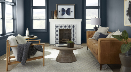
5. Restore, Recharge, Revitalize “Resimercial” Design: Blurring the lines between home and work, this uber-cozy trend integrates elements to inspire comfort and creativity. Envision plush sofas, soft lighting, and personal touches that make employees feel relaxed and inspired — a home away from home.   To create an authentic and peaceful environment, embrace forest-inspired greens like Meteorological N430-6 to accent a comforting neutral like Dove HDC-MD-21.   Ceiling & Right Wall: Meteorological N430-6 | Back Wall: Dove HDC-MD-21   By incorporating residential-inspired elements, such as relaxing furnishings and personalized decor, offices can be a space where employees feel at ease, fostering satisfaction and wellbeing.     
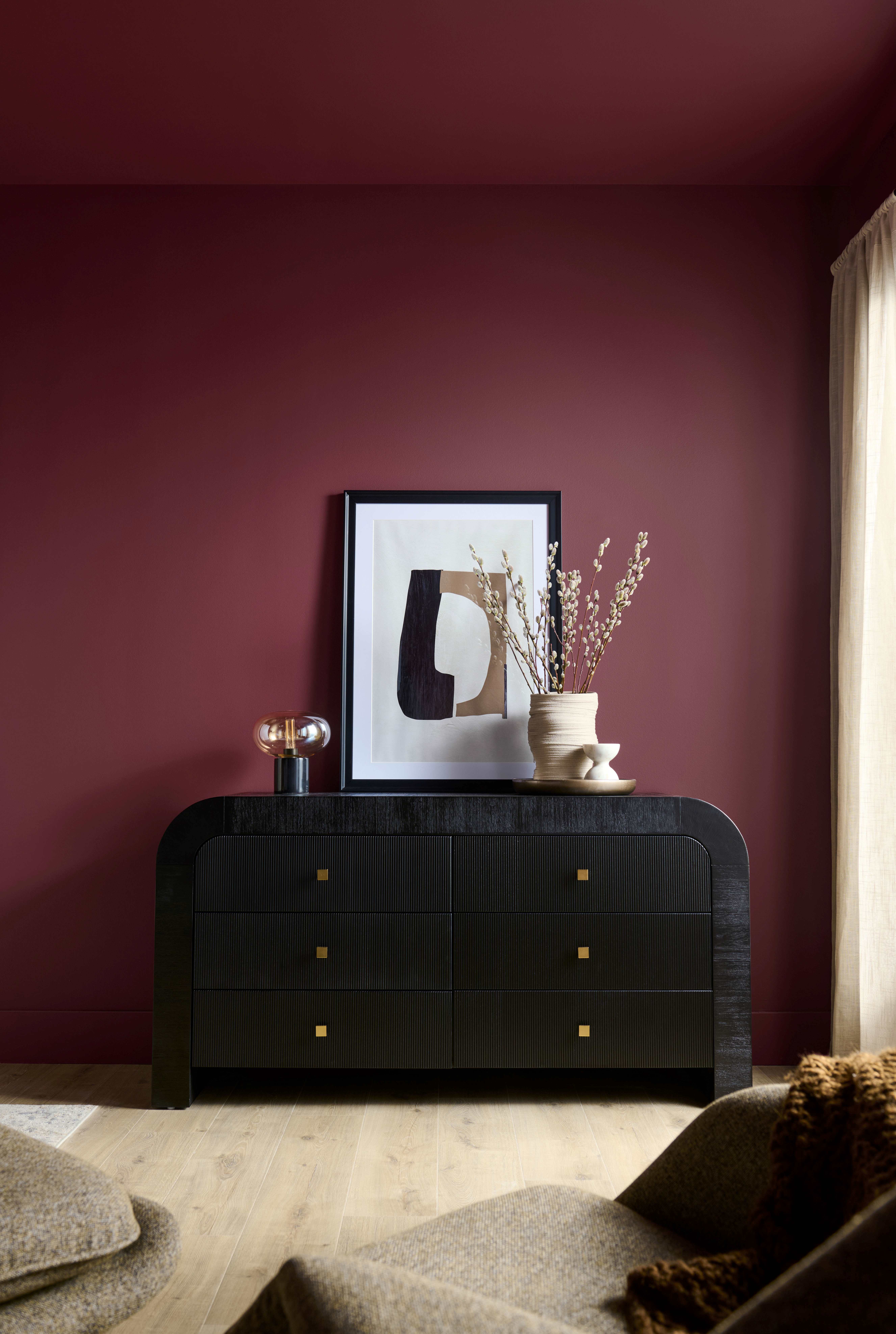
6. Soothing Seclusion Responding to today’s emphasis on mental wellness, office designs are incorporating private pods or alcoves that provide employees space to focus and relax, while allowing them to escape the hustle and bustle of the office environment. Providing such sanctuaries can reduce stress levels and improve productivity.   Try adding a pop of color to a ceiling installation with a smoky turquoise like Sophisticated Teal HDC-CL-22 and create depth by using a tone-on-tone combination of warm and peaceful hues such as Toasty Gray N320-2 and Grant Gray HDC-AC-19.   Art Ceiling Accent: Sophisticated Teal HDC-CL-22 | Left Wall, Conference Room Back Wall & Lobby Desk: Toasty Gray N320-2 | Office Wall: Grant Gray HDC-AC-19   The future of work presents a compelling opportunity for businesses, designers, and architects to reimagine office spaces as dynamic and human-centric environments. By integrating flexibility, technology, nature, and inclusivity, we can create workplaces that not only meet the functional needs of teams, but also inspire creativity, foster collaboration, and enhance employee wellbeing.   To learn more about the many color services Behr offers and to contact an Architect & Design Rep, please visit behr.com/designer.
Office Trends for 2024 & Beyond
Color plays a pivotal role in your projects, whether you’re a professional painter, property manager, or designer. It’s often the final touch to attracting residents, enticing building occupants, or enhancing curb appeal. Behr Paint offers a variety of color services to help you and your clients see the potential of every color and combination for their project. Our services are designed to empower you, providing the support necessary to bring any job from vision to reality, no matter how big or small. From custom color matching to color renderings to full-size drawdowns, discover the many color services Behr has to offer.     Custom Color Matching Whether you need to match a corporate color scheme or a shade of carpet, we’ve got you covered. Our cutting-edge color matching technology will convert any sample into a digital color representation. We can also confidently match any competitive color for your job, including popular Kelly-Moore colors like Swiss Coffee 23, Bone 27, and San Francisco Fog 5822*. Simply bring a sample to your local The Home Depot store and we’ll match it.     BEHR® Pro Visualizer & Digital Color Renderings Visualize BEHR® Paint color schemes for your exterior projects in real-time with the BEHR® Pro Visualizer, an online color rendering tool to help speed up the color selection process. Your BEHR® Pro Rep will upload an image of your project, allowing you to select colors and schemes and see a “before and after” preview. Once ready, you can download a shareable document for you and your client to determine final details. Ask your local Rep about the tool here.     We also offer digital color renderings. Make your client’s color vision come to life with a digital mapping of their project. They’ll see digital renderings of different paint color combinations to help them make an informed color decision with confidence.     Full-Size Drawdown Samples If you need to show color to your clients in a larger size than a paint chip, we offer full-size drawdowns to help visualize colors on any given project. Whether your client is debating between shades or finalizing their color scheme, full-size drawdowns offer a more accurate representation of how the color will appear on a larger scale so you can better envision color on a larger surface area.     Color Books & Boards Our color books offer a complete archive of every color and every product used on every surface on your project, including coatings, specifications, and warranties to help streamline future maintenance. We also offer color boards, perfect for showcasing color schemes and palettes. These 20″ x 30″ boards are an impactful way to share the color story of a project so every stakeholder can understand the vision and align on the project direction.     Color Services for Your Every Need At Behr, we believe that color has the power to transform spaces and elevate experiences. With our comprehensive color services, we’re dedicated to helping you and your client’s vision come to life for any project. Contact your local BEHR Pro Rep to learn more.     *Kelly-Moore Swiss Coffee 23, Bone 27, and San Francisco Fog 5822 are names of Kelly-Moore, which is being used for identification purposes only. Behr has created a comparable color using industry standard technology.  
The Search for Skilled Workers
Behr’s Comprehensive Color Services
As the design world continues to evolve in 2024 and beyond, there’s a fluidity in how we live, play, and work. This post-COVID era is reshaping the way we occupy spaces, bringing more flexibility into the conversation. Multifunctional spaces are more prominent than ever as we break through traditional norms and create areas that offer both productivity and pause.   BEHR® 2025 Commercial Color Forecast In today’s commercial landscape, there are no clear boundaries. From home-inspired workspaces to luxe recreational facilities, the lines are blurred in how spaces are defined. This trend served as the inspiration behind our BEHR® 2025 Commercial Color Forecast, which reflects the rising design movement of blurring boundaries between past and future, timeless and modern, and technology and nature.   The five themes in this palette are a nod to the fluid world we live in, with colors ranging from neutral to bold, traditional to grandiose, and cool to warm tones. Each subpalette has versatility for a wide range of uses in both residential and commercial spaces.   Limitless Whites White paint colors are often the foundation for a project and a canvas for boundary blurring. These warm hues are versatile, approachable, and barely there. Use them to visually soften surfaces and textures to create effortless style.   Back Wall: Gallery White PPU12-12  |  Desk: Bakery Box BL-W09   Bleisure Blurring the boundaries between business and leisure, these colors are adventurous and travel inspired. The bright pops of color are indicative of the hues we find in nature with familiar mid-tones that inspire creativity and evoke joy.   Wall: Venus Teal PPU13-08  |  Accent: Dandelion Wish MQ4-12   Renew-trals These colors are neutral and nuanced with a sense of healing and connection. The earthen mid-tones blur the boundaries between today and tomorrow’s neutrals with a lived-in and memorable quality.   Wall: Boreal N420-5  |  Accent: Colorful Leaves M190-7   Grand-luxe Timeless meets luxury in these rich, deep hues. The bold colors are versatile and sophisticated, grounding spaces with premium, aged quality.   Back Wall & Trim: Limo-Scene N560-7  |  Accents: Leather Work S240-7, Amazon Jungle PPU9-24 & Very Navy M500-7   AI-sthetic Blur the lines of the physical and digital world with this AI-inspired palette. Powdery pastels are anchored by dark and light pops of colors to create surface dimension and soften contemporary, technologically forward spaces.   Left Wall: Autumn Blush S220-1  |  Right Wall: Dove HDC-MD-21  |  Accents: Breathe S360-2, Flowerpot S180-3, Pimento P180-6 & Violet Aura M550-5   Commercial Color Forecast Workshop The colors in this palette were largely inspired by our first-ever Commercial Color Forecast Workshop held at our Southern California headquarters. Six commercial designers from various commercial backgrounds came together to explore the driving influences behind color and trends alongside Behr color experts in this immersive in-person experience. The designers also curated palettes based on industry trends and their own insights and expertise. The emerging themes from the workshop were the basis for the 2025 Commercial Color Forecast palette direction.     Are you a commercial designer interested in design trends and color forecasting? Fill out the form on this page to receive updates on our next workshop.  
BEHR® 2025 Commercial Color Forecast
Stepping into a new industry has its challenges, and Christina Rampulla has tackled them all. From working in a daycare center to a tanning salon to a gym, Christina has taken on several different opportunities during her career. As a wife and mother from Slatington, PA with a degree in communication from Kutztown University, she’s always dedicated her personal and professional life to service. Whether it be taking care of her daughter or caring for customers, one commonality between all these roles is serving others. So how did she find herself working for a professional painting company?     Three years ago, Christina accepted an open General Manager role at Ryan Amato Painting LLC in Easton, PA. The position matched her values, experience, and qualifications, and soon after meeting with Owner Ryan Amato, Christina joined the team.     Ryan Amato Painting is a family-owned and operated company specializing in both residential and commercial painting services. They boast a wide range of capabilities, including interior and exterior painting, cabinet refinishing, pressure washing, and epoxy flooring & countertops.     With an open mind and willingness to learn, Christina jumped right into the business and started by observing various roles at the company. She takes pride in all that she’s learned, from how to measure a room, to the type of products needed for a given scope of work, to the different paint hues and sheens needed for a space.     As a woman in the professional painting industry, Christina is incredibly proud of how much she’s accomplished and the confidence she exudes when serving customers. It’s true some people find it surprising to hear my voice on the other end of the phone speaking about paint and epoxy!” Christina remarks.     Christina is often the first person to connect with clients and vendors, a responsibility that she does not take lightly. She says, I enjoy building relationships with our clients throughout a project. It’s a pleasure and responsibility of mine that I love doing.”     Her commitment to serving customers exemplifies her dedication and passion to continuously improving her craft. We all know our strengths and limits. It’s important that no matter what service industry you’re in, enjoy it and own it!” Christina exclaims.     To learn more about Women in PaintTM and hear other professional women painters’ stories, visit behr.com/womeninpaint.  
Christina Rampulla_Thumbnail
Serving Others with Passion & Purpose
Wood stains have the power to transform ordinary surfaces into timeless expressions of personal style. To elevate the aesthetic of your clients’ outdoor spaces this spring, BEHR® has announced its 2024 Exterior Stain Color of the Year, Tugboat – a brownish grey wood stain reminiscent of weathered materials from boats at sea.   Deck: Tugboat SC-141   The sophisticated blend of muted tones brings subtle color to exterior surfaces while enhancing the natural wood grain for a timeless finish. The versatility of Tugboat adds organic beauty and effortless character with a nautical twist to enrich your clients’ residential or commercial outdoor environments. Tugboat Featured in Solid Color (SC-141) & Semi-Transparent (ST-141) Stain   Both solid and semi-transparent finishes offer a polished look on decks, fences, porches, patio ceilings, railings and more.   Deck: Tugboat ST-141   Apply Tugboat in a solid finish to a wooden fence for a striking visual boundary that blends seamlessly with natural surroundings.   Fence: Tugboat SC-141   Or choose Tugboat in a semi-transparent finish for a front door and port ceiling to add charm and depth to an entry space.   Front Door & Port Ceiling: Tugboat ST-141   The versatility of Tugboat allows for the ease of application on various architectural styles and building materials to create a cohesive and inviting façade.   Exterior Accent: Tugboat SC-141   Give your clients a visually appealing outdoor living space with a wood-stained ceiling featuring Tugboat for a warm and comforting atmosphere.   Ceiling: Tugboat ST-141   Embrace the nautical allure of Tugboat for a refined and captivating outdoor ambiance.   To learn more about Tugboat, exterior wood stain project inspiration, and application tips, visit behrpro.com/2024staincoty.   Note: The 2024 Exterior Stain Color of the Year Tugboat is available exclusively at The Home Depot® in a variety of BEHR® Products, including the #1 rated exterior solid stain, BEHR PREMIUM® Solid Color Waterproofing Stain & Sealer, as well as BEHR PREMIUM® Semi-Transparent Waterproofing Stain & Sealer, BEHR PREMIUM® Advanced DeckOver®, BEHR® Solid Color House & Fence Wood Stain, and BEHR DECKplus® Solid Color Waterproofing Wood Stain.  
2024 Exterior Stain Color of the Year: Tugboat
Load More
Shop Behr Products
Explore more on homedepot.com
BS_THD_Logo_Exclusive_RGB (1)